
 v0.2.0
simple_progress_indicators
고정 색상과 그라데이션을 갖춘 간단한 진행률 인디케이터 패키지입니다. 진행률 표시 또는 간단한 애니메이션에 사용할 수 있습니다.
40좋아요 7.1천30일 다운로드140Pub 점수
AndroidiOSWebmacOSWindowsLinux
고정 색상과 그라데이션을 갖춘 간단한 진행 표시기 플러터 패키지입니다. 진행 상황을 표시하거나 간단한 애니메이션에 사용할 수 있습니다.

{"sdk":"flutter"}{"sdk":"flutter"}^2.0.1아래는 영문 원문 스냅샷입니다. 최신 내용은 GitHub에서 확인하세요.
Simple progress indicators package with solid colors and gradients. Can be used to show progress or for simple progress bar animation.
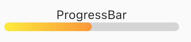
ProgressBar is a basic linear indicator widget. It's a Stateless Widget that produces basic horizontal rounded rectangle with optional background rounded rectangle underneath.
Include it in your build method like:
  @override
  Widget build(BuildContext context) {
    return const MaterialApp(
      home: Scaffold(
        body: Center(
          child: ProgressBar(
            value: 0.5,
            //specify only one: color or gradient
            //color:Colors.red,
            gradient: LinearGradient(
              begin: Alignment.topLeft,
              end: Alignment.bottomRight,
              colors: [Colors.yellowAccent, Colors.deepOrange],
            ),
          ),
        ),
      ),
    );
  }
It has several configurable parameters:
value - current indicator value, where 0.0 is 0% progress, 1.0 is 100% progresswidth - indicator width, defaults to 200.0height - indicator height, defaults to 10.0color - solid indicator fill colorgradient - gradient fill, accepts Gradient classbackgroundColor - solid indicator background color, defaults to transparentMinimum working widget requires only a value and color OR gradient property. NOTE: Specifying both properties is not accepted.
ProgressBarAnimation is a simple animating progress bar widget.
It animates ProgressBar widget for a given duration.
Animation starts at the time the widget is built.
It has several configurable parameters:
duration - 0% to 100% animation durationwidth - indicator width, defaults to 200.0height - indicator height, defaults to 10.0color - solid indicator fill colorgradient - gradient fill, accepts Gradient classbackgroundColor - solid indicator background color, defaults to transparentcurve - animation curve, defaults to linear. For other curves check CurvesProgressBarAnimation(
duration: const Duration(seconds: 2),
gradient: const LinearGradient(
colors: [
Colors.blue,
Colors.purple,
],
),
backgroundColor: Colors.grey.withOpacity(0.4),
),
AnimatedProgressBar is a ImplicitlyAnimatedWidget. It behaves like other flutter AnimatedFoo widgets. This animates value parameter changes for a given duration. Animation starts only when one (initial) value changes to other (final) value. See the example below.
It has several configurable parameters:
value - value widget animates to, need to be changedduration - initial value to final value animation durationwidth - indicator width, defaults to 200.0height - indicator height, defaults to 10.0color - solid indicator fill colorgradient - gradient fill, accepts Gradient classbackgroundColor - solid indicator background color, defaults to transparentcurve - animation curve, defaults to linear. For other curves check CurvesonEnd - callback to trigger additional actions (e.g. another animation) at the end of the current animationAnimatedProgressBar(
value: full ? 1.0 : 0.0,
duration: const Duration(seconds: 3),
gradient: const LinearGradient(
colors: [
Colors.amber,
Colors.red,
],
),
backgroundColor: Colors.grey.withOpacity(0.4),
),
For full demo check examples folder.
For issues and animation ideas visit issues section on github homepage.