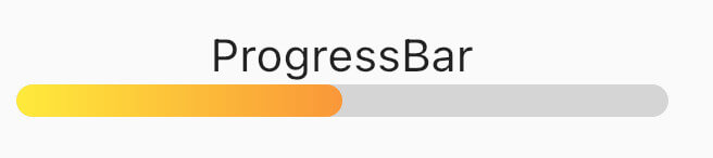
단순한 진행률 인디케이터를 제공하며 고체 색상과 그라데이션 지원을 갖춘 가벼운 플러터 패키지입니다. 앱에서 로딩 상태를 표시하거나 미묘한 애니메이션을 만드는 데 이상적입니다. 패키지는 쉽게 통합 가능하며 여러 플랫폼에서 깔끔하고 사용자 정의 가능한 시각 피드백을 제공합니다. Android, iOS, Web, macOS, Windows, Linux를 모두 지원하여 크로스플랫폼 개발에 유용합니다. 복잡한 설정 없이 최소한의 디자인으로 효과적인 진행률 시각화를 원하는 개발자를 위한 것입니다.
사용 사례
로딩 상태 표시기
애니메이션 진행 표시
간단한 UI 피드백
크로스 플랫폼 진행 막대
사용자 정의 가능한 로딩 애니메이션
앱 스플래시 화면
주요 기능
단색 진행 막대
그라데이션 지원
최소 구성
크로스 플랫폼 호환성
간편한 통합
경량 크기
적합한 대상
초보자 플러터 개발자
간단한 앱 인터페이스
로딩 UX 개선
빠른 프로토타이핑
경량 지표가 필요한 앱
양식 또는 다운로드에서의 시각적 피드백
고려 사항
제한된 사용자 정의 옵션
고급 스타일링 기능 없음
복잡한 애니메이션에 적합하지 않습니다
기본적인 진행 요구 사항에 가장 적합
내장된 일시정지/재개 컨트롤 없음
외부 종속성 관리에 의존합니다
원본 README
연결된 소스 저장소의 README 원문 스냅샷입니다. 최신 내용은 저장소에서 확인하세요.
Simple progress indicators package with solid colors and gradients. Can be used to show progress or for simple progress bar animation.
ProgressBar is a basic linear indicator widget. It's a Stateless Widget that produces basic horizontal rounded rectangle with optional background rounded rectangle underneath.
Include it in your build method like:
backgroundColor - solid indicator background color, defaults to transparent
Minimum working widget requires only a value and color OR gradient property. NOTE: Specifying both properties is not accepted.
ProgressBarAnimation
ProgressBarAnimation is a simple animating progress bar widget.
It animates ProgressBar widget for a given duration.
Animation starts at the time the widget is built.
AnimatedProgressBar is a ImplicitlyAnimatedWidget. It behaves like other flutter AnimatedFoo widgets. This animates value parameter changes for a given duration. Animation starts only when one (initial) value changes to other (final) value. See the example below.
It has several configurable parameters:
value - value widget animates to, need to be changed
duration - initial value to final value animation duration