


 v0.0.7
dialogs
이 플러터 패키지는 사용자 정의 옵션이 있는 세심하게 설계된 대화 상자를 제공합니다.
26좋아요 13730일 다운로드130Pub 점수
AndroidiOSWebmacOSWindowsLinux
대화 상자

아래는 영문 원문 스냅샷입니다. 최신 내용은 GitHub에서 확인하세요.
This flutter package provides aesthetically designed dialog box with customization options.
legacy_progress_dialog
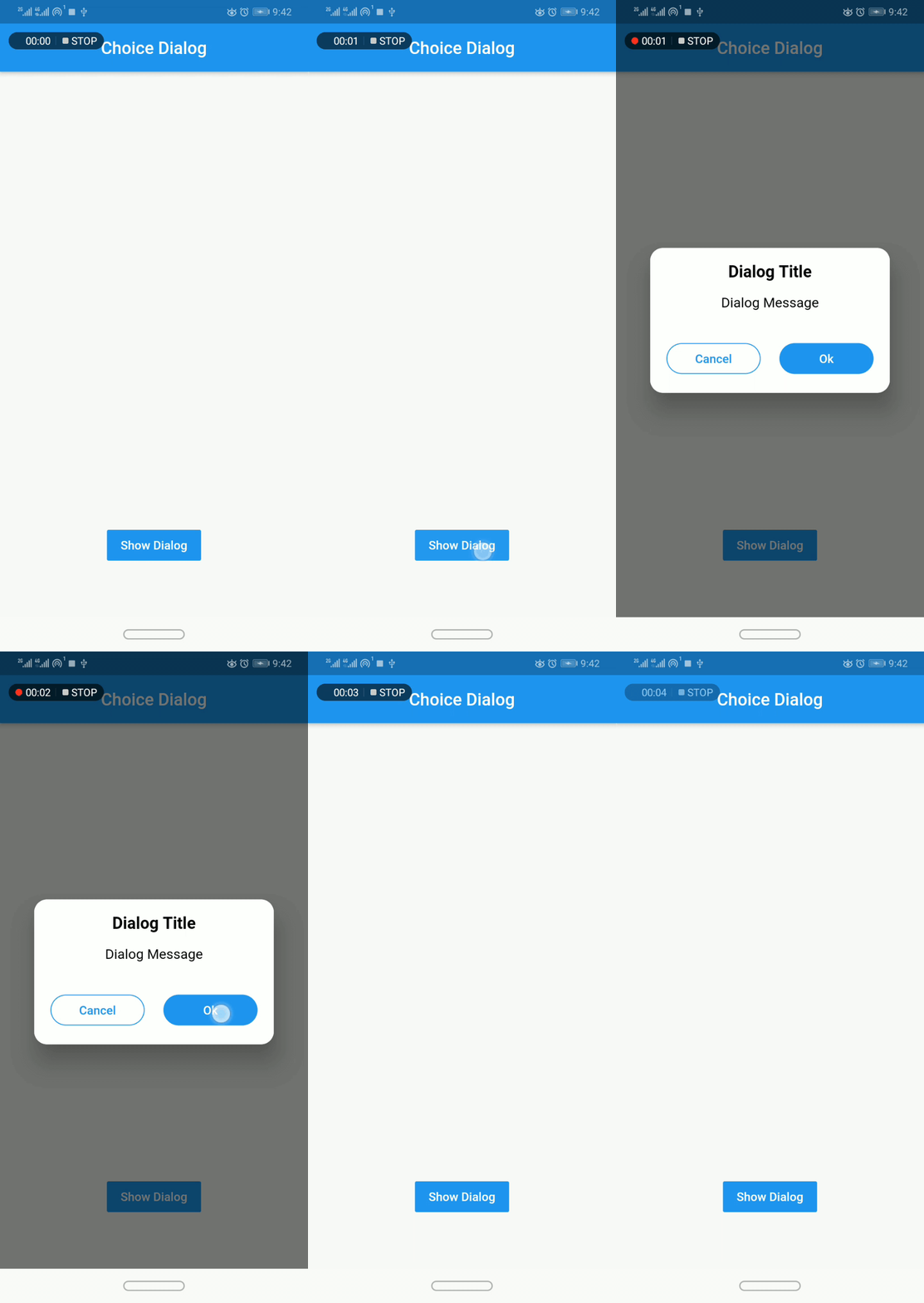
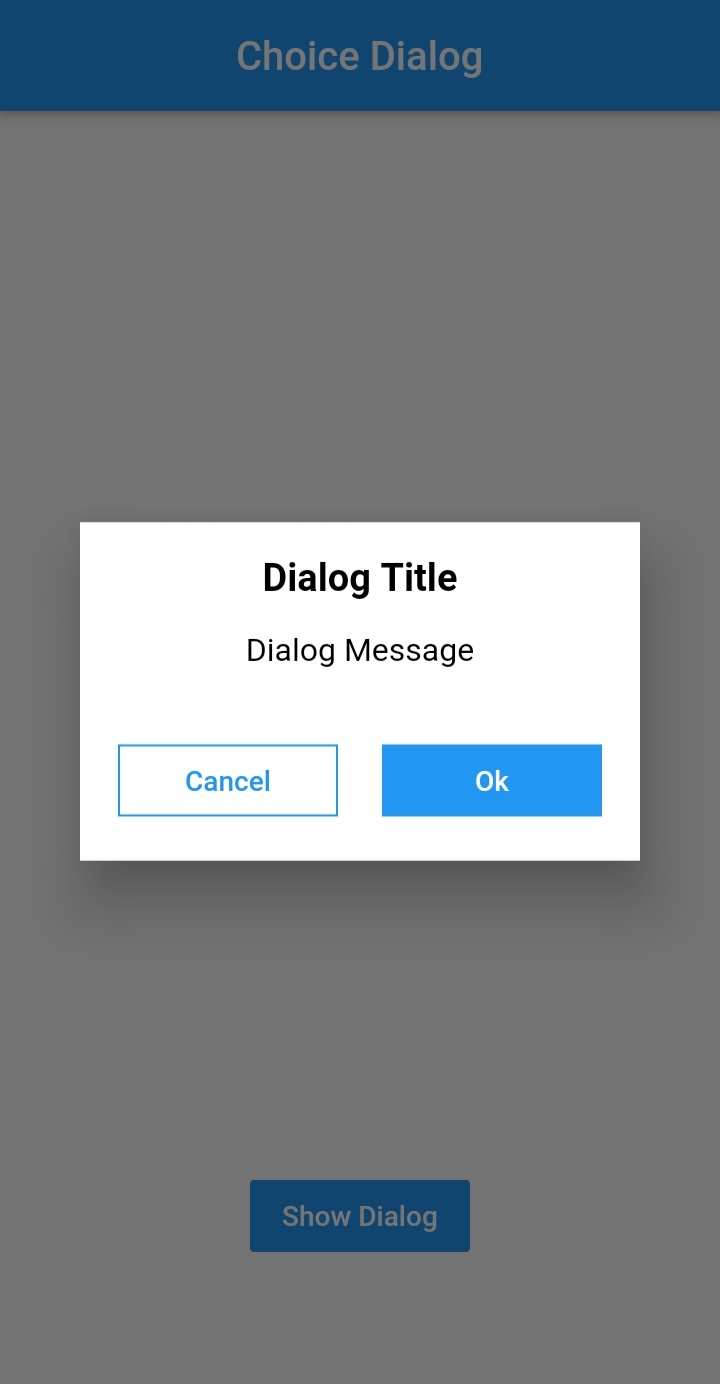
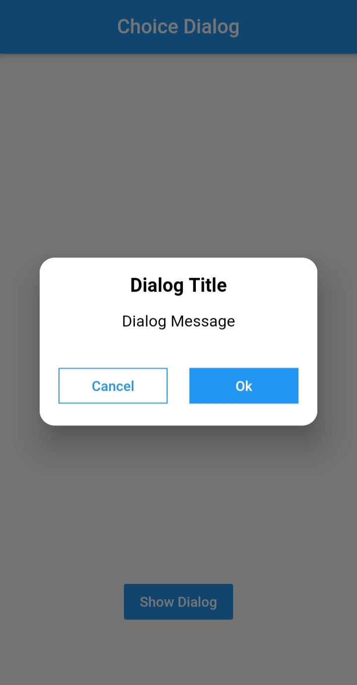
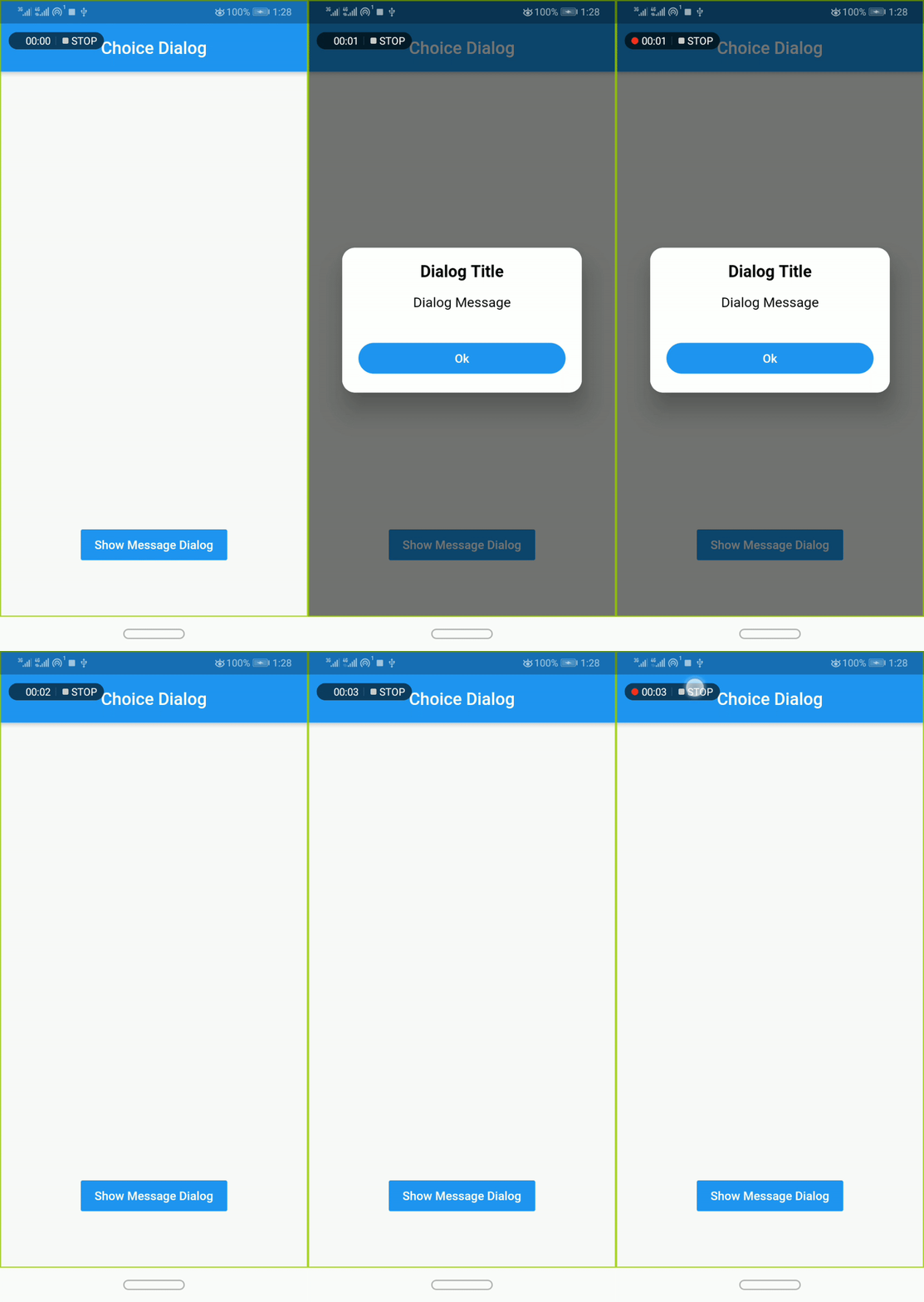
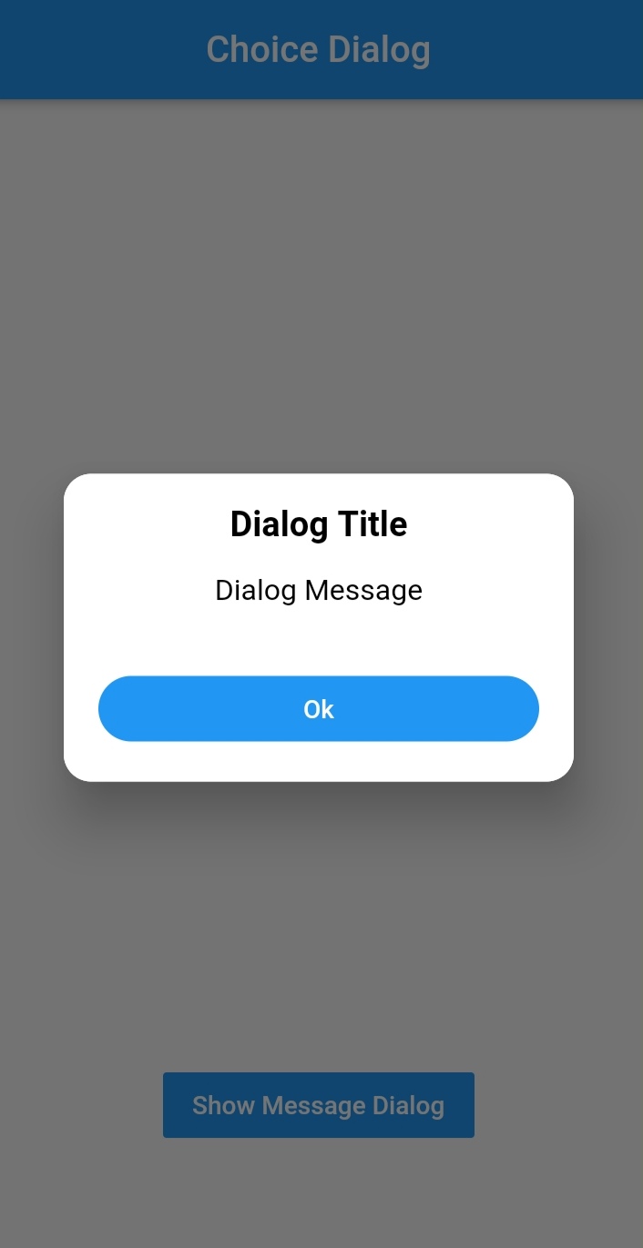
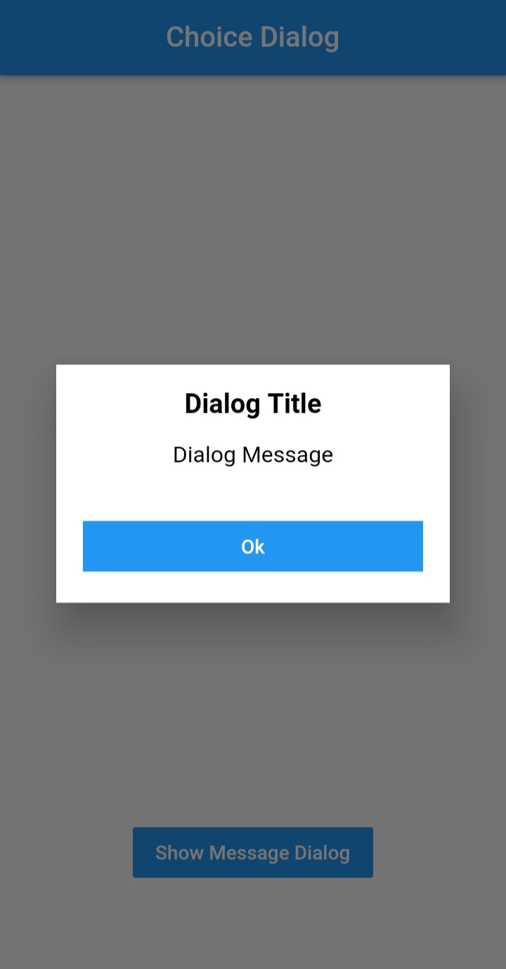


To use this plugin, add dialogs as a
dependency in your pubspec.yaml file.
import 'package:dialogs/dialogs.dart';ChoiceDialog().show() function to display the dialog.
ChoiceDialog().show(context);
##OR
final choiceDialog = ChoiceDialog();
choiceDialog.show(context);
MessageDialog().show() function and call the Choice Dialog .
MessageDialog().show(context);
final messageDialog = MessageDialog();
choiceDialog.show(context);
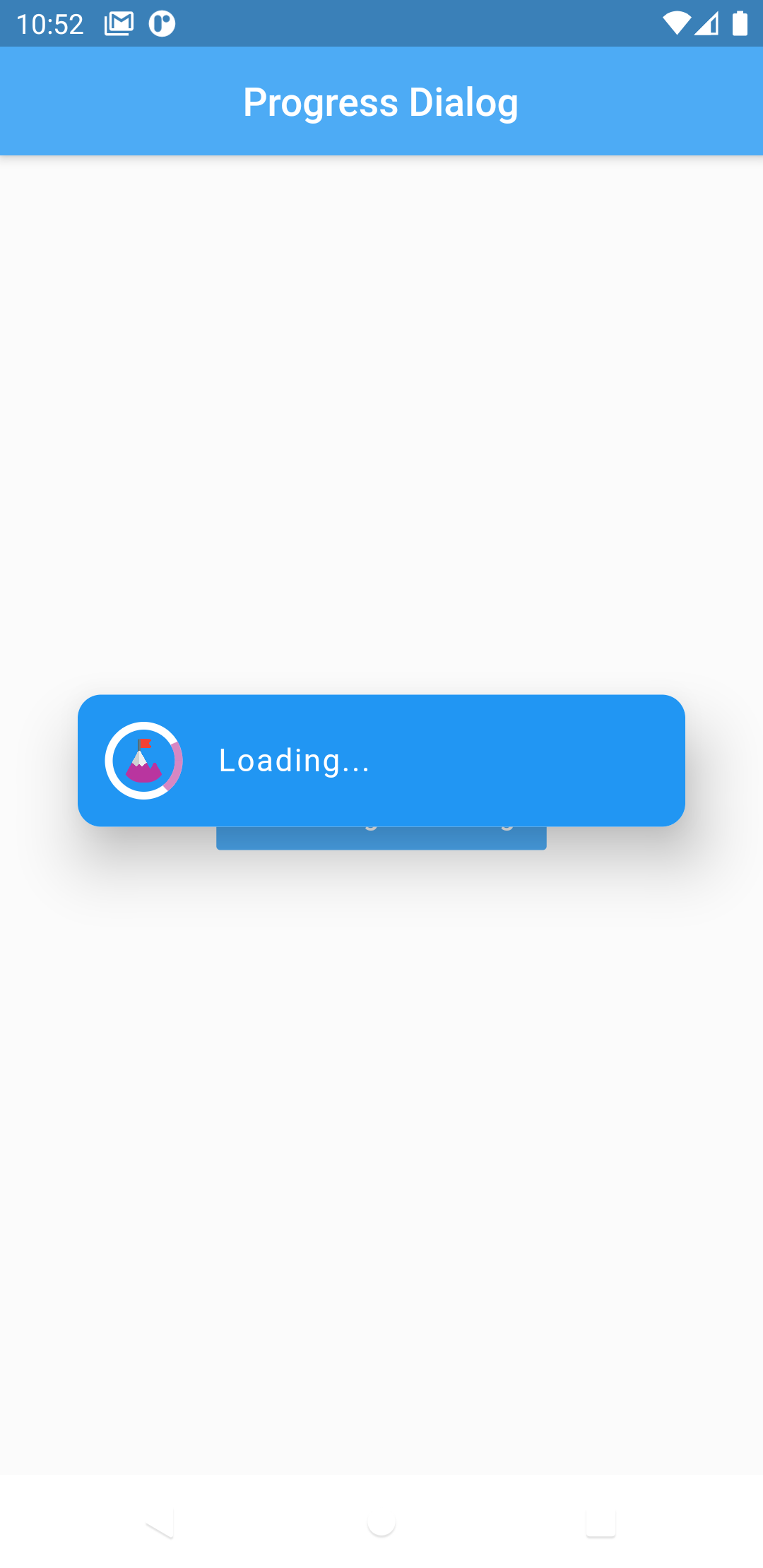
//Create an instance of ProgressDialog
ProgressDialog progressDialog = ProgressDialog(
                  context: context,
                  backgroundColor: Colors.blue,
                  textColor: Colors.White,
                );
// show dialog
progressDialog.show();

//close dialog
progressDialog.dismiss();
In order to add the ChoiceDialog, MessageDialog to your app, there are several attributes that are important parameters that you might need frequently:
| Attribute | Type | Default | Required | Description |
|---|---|---|---|---|
buttonOkOnPressed |
Function() |
Navigator.pop(context) |
No |
This function will be registered as the callback of 'Ok' button. |
buttonCancelOnPressed |
Function() |
Navigator.pop(context) |
No |
This function will be registered as the callback of 'Cancel' button. |
dialogRadius |
double |
15.0 |
No |
Determines the borderRadius of dialog box. |
buttonRadius |
double |
18.0 |
No |
Determines the borderRadius of action buttons. |
iconButtonOk |
Icon |
null |
No |
Renders a FlatButton with the provided icon for positive action. |
iconButtonCancel |
Icon |
null |
No |
Renders a FlatButton with the provided icon for negative action. |
show() also provides some useful parameters of showDialog() function
| Attribute | Type | Default | Required | Description |
|---|---|---|---|---|
context |
BuildContext |
Null |
Yes |
The context argument is used to look up the Navigator and Theme for the dialog. |
barrierDismissible |
bool |
true |
No |
Indicates whether tapping on the barrier will dismiss the dialog. |
barrierColor |
Color |
Colors.black54 |
No |
Specifies the color of the modal barrier that darkens everything below the dialog. |
Made with contributors-img.
의존성 목록 2 개
{"sdk":"flutter"}{"sdk":"flutter"}사용 목적에 따라 검색하고 개발 활동을 비교한 뒤 원본 저장소에서 요구 사항을 확인하세요.
“A repository is the most basic element of GitHub.”
GitHub Docs — About repositories ↗