패키지, 저장소 및 앱 카테고리 검색

dialogs 표지
패키지 상세v0.0.7

dialogs

이 플러터 패키지는 사용자 정의 옵션이 있는 세심하게 설계된 대화 상자를 제공합니다.

AndroidiOSWebmacOSWindowsLinux
30일 다운로드
137
좋아요
26
Pub 점수
130

패키지 설치

flutter pub add dialogs

패키지 개요

공개 정보를 바탕으로 생성한 선택 가이드입니다.

dialogs 패키지는 Flutter 애플리케이션을 위한 아름답게 디자인된 사용자 정의 가능한 다이얼로그 컴포넌트 모음을 제공합니다. 세심한 주의와 사용자 경험에 중점을 두어 모든 플랫폼에서 일관되고 현대적인 다이얼로그 인터페이스를 제공합니다. 개발자는 앱의 디자인 언어에 맞게 쉽게 통합하고 맞춤화할 수 있으며, 스타일, 애니메이션 및 동작 옵션이 있습니다. 이 패키지는 Android, iOS, Web, macOS, Windows, Linux를 지원하여 크로스플랫폼 호환성을 보장합니다. 경고, 확인 및 사용자 지정 모달을 세련되게 표시하는 데 이상적입니다.

사용 사례

  • 경고 메시지 표시
  • 사용자 확인 처리
  • 사용자 정의 모달 대화 상자 만들기
  • 로딩 표시기 표시
  • 폼 검증 피드백 구현
  • 다양한 플랫폼 간 UI 일관성 향상

주요 기능

  • 아름답고 현대적인 디자인
  • 풍부한 사용자 정의 옵션
  • 크로스 플랫폼 지원
  • Flutter와의 간편한 통합
  • 내장 애니메이션
  • 반응형 레이아웃 처리

적합한 대상

  • 정교한 대화 상자를 찾는 플러터 개발자
  • 다양한 플랫폼 간에 일관된 UI가 필요한 앱
  • 사용자 경험에 초점을 맞춘 프로젝트
  • 빠른 대화 구현을 원하는 개발자
  • 디자인 일관성에 집중하는 팀
  • 경량 대화 솔루션을 필요로 하는 애플리케이션

고려 사항

  • 다이얼로그 컴포넌트만 제한
  • 사용자 지정에는 특정 API를 배워야 할 수 있습니다
  • 복잡한 탐색 흐름에 적합하지 않습니다
  • Flutter의 Material 또는 Cupertino 테마에 의존합니다
  • 비표준 사용 사례를 위해 추가적인 스타일링이 필요할 수 있습니다
  • 내장된 국제화 지원 없음

원본 README

연결된 소스 저장소의 README 원문 스냅샷입니다. 최신 내용은 저장소에서 확인하세요.

Dialogs - dialogs

This flutter package provides aesthetically designed dialog box with customization options.

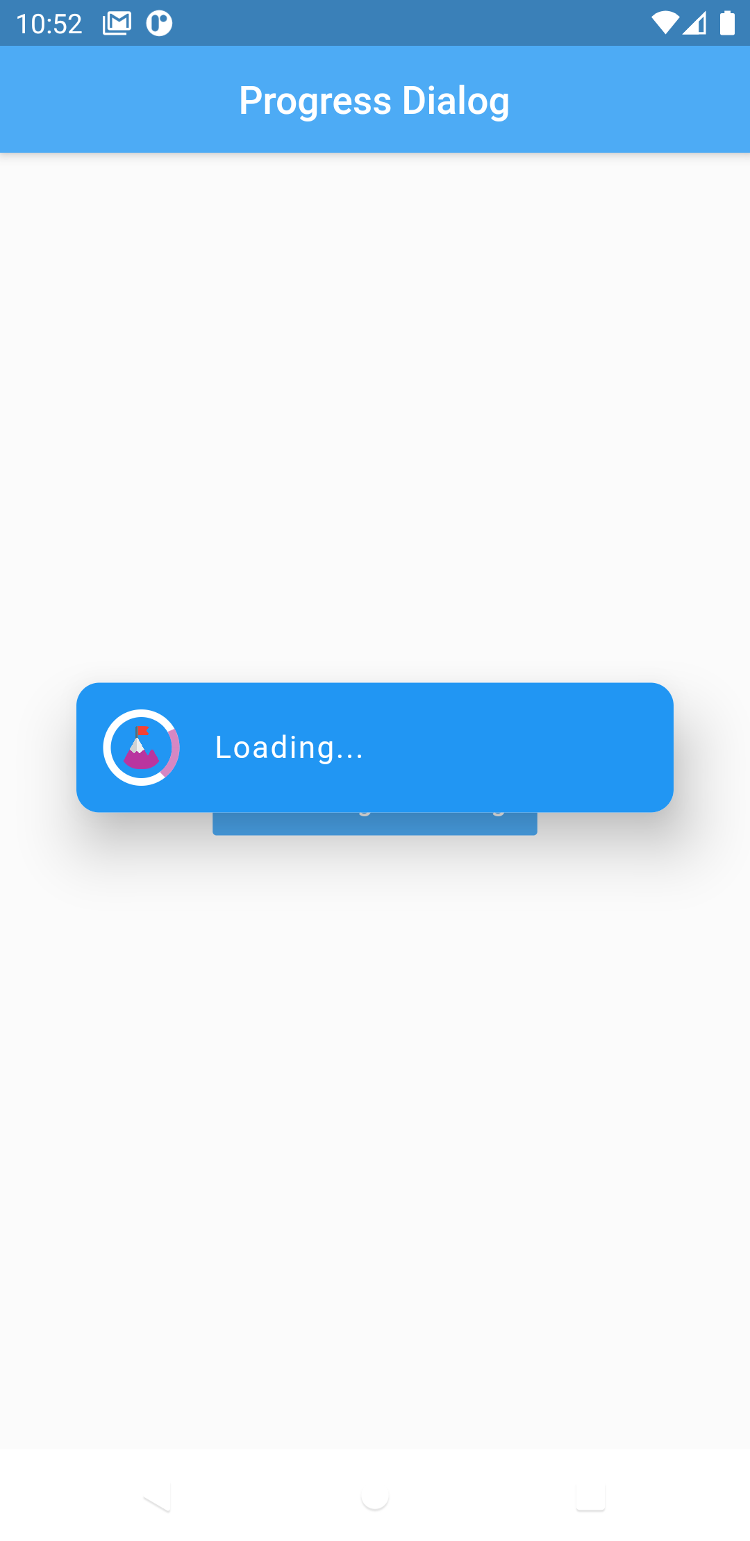
Now comes with legacy_progress_dialog

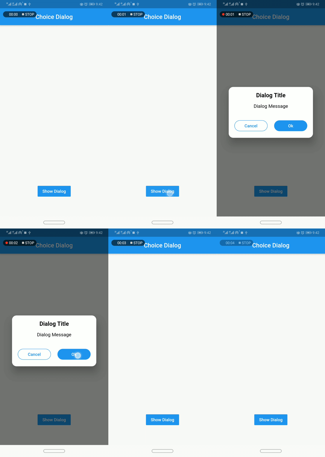
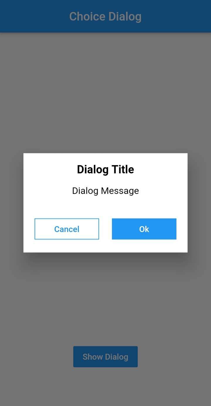
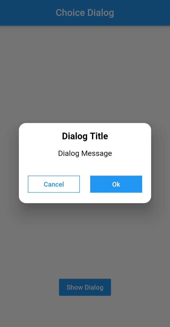
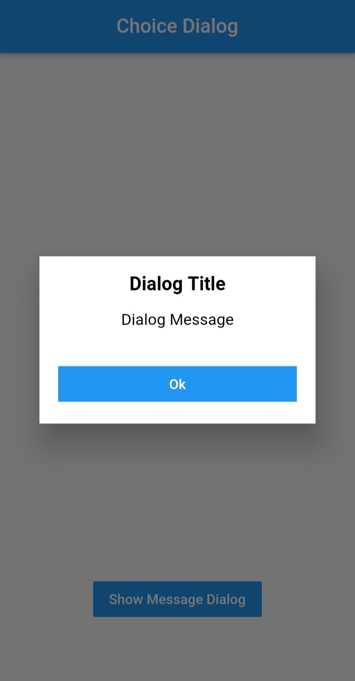
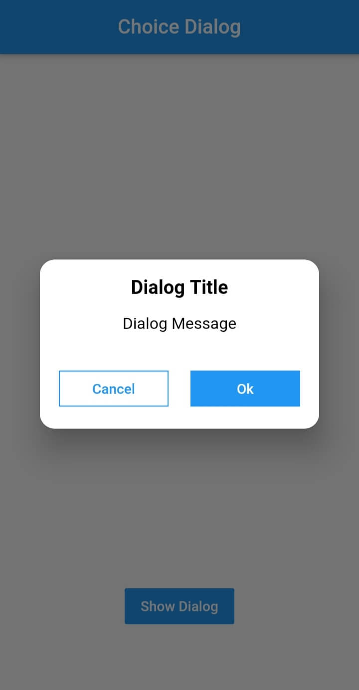
Choice Dialog

Choice Dialog Choice Dialog Rectangular Choice Dialog Rectangular Buttons

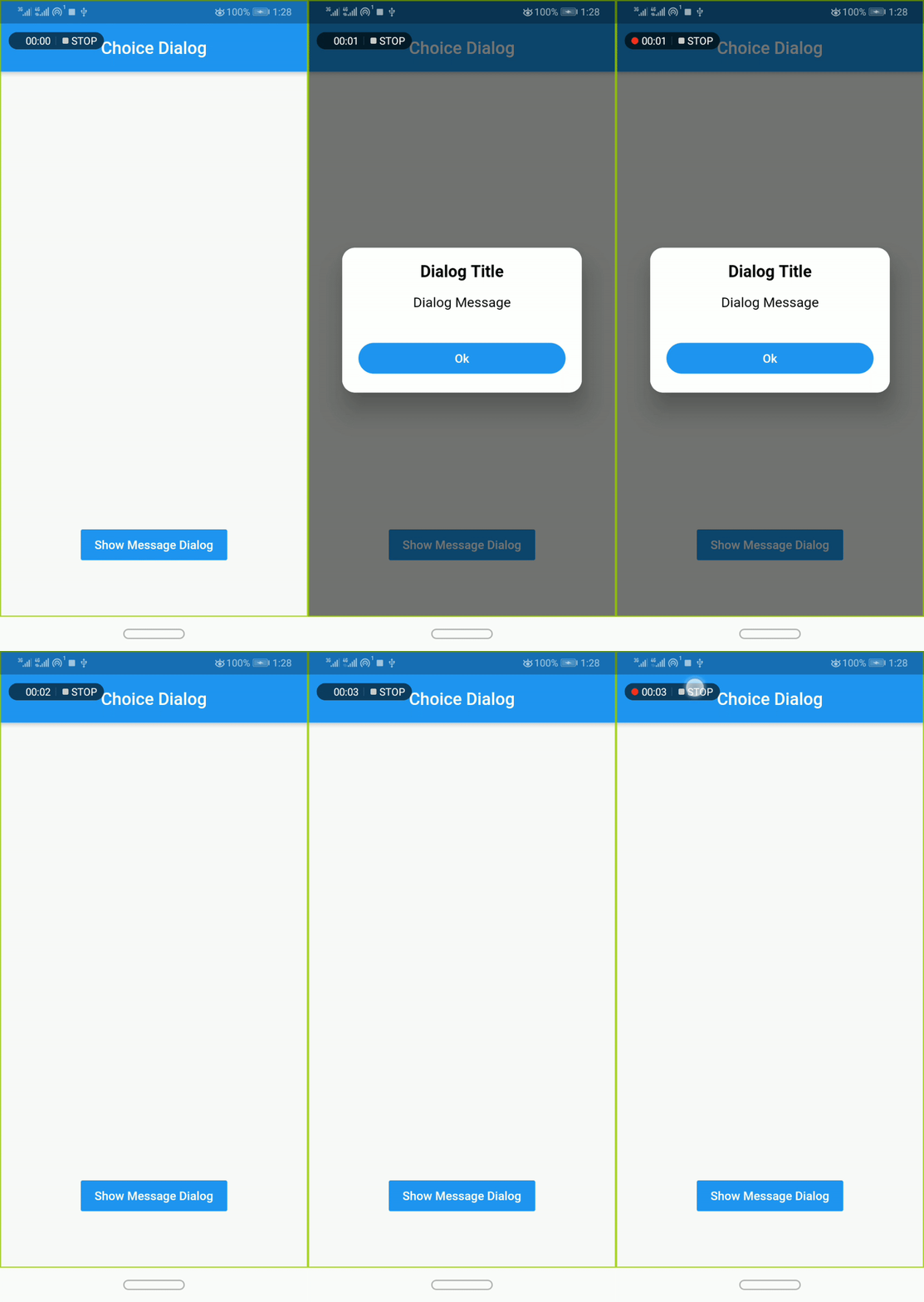
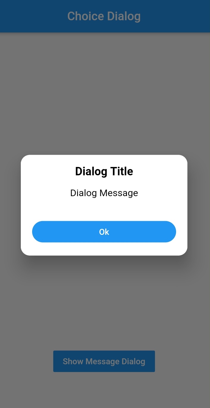
Message Dialog

Message Dialog Gif Message Dialog Message Dialog

Pub Version GitHub Workflow Status Github Stars GitHub

Simple Usage

To use this plugin, add dialogs as a dependency in your pubspec.yaml file.

Implementation:
  • import 'package:dialogs/dialogs.dart';
ChoiceDialog
  • use ChoiceDialog().show() function to display the dialog.

ChoiceDialog().show(context);

##OR


final choiceDialog = ChoiceDialog();
choiceDialog.show(context);

MessageDialog
  • use MessageDialog().show() function and call the Choice Dialog .

MessageDialog().show(context);

OR


final messageDialog = MessageDialog();
choiceDialog.show(context);

Show progress dialog :
//Create an instance of ProgressDialog
ProgressDialog progressDialog = ProgressDialog(
                  context: context,
                  backgroundColor: Colors.blue,
                  textColor: Colors.White,
                );
// show dialog
progressDialog.show();

//close dialog
progressDialog.dismiss();

You are good to go 💯


In order to add the ChoiceDialog, MessageDialog to your app, there are several attributes that are important parameters that you might need frequently:

Attribute Type Default Required Description
buttonOkOnPressed Function() Navigator.pop(context) No This function will be registered as the callback of 'Ok' button.
buttonCancelOnPressed Function() Navigator.pop(context) No This function will be registered as the callback of 'Cancel' button.
dialogRadius double 15.0 No Determines the borderRadius of dialog box.
buttonRadius double 18.0 No Determines the borderRadius of action buttons.
iconButtonOk Icon null No Renders a FlatButton with the provided icon for positive action.
iconButtonCancel Icon null No Renders a FlatButton with the provided icon for negative action.


show() also provides some useful parameters of showDialog() function

Attribute Type Default Required Description
context BuildContext Null Yes The context argument is used to look up the Navigator and Theme for the dialog.
barrierDismissible bool true No Indicates whether tapping on the barrier will dismiss the dialog.
barrierColor Color Colors.black54 No Specifies the color of the modal barrier that darkens everything below the dialog.

CREDITS

Contributors

Made with contributors-img.

카테고리

소스 저장소

이 패키지를 사용하는 프로젝트

아직 데이터가 없습니다.