
 v0.4.4
well_formed
폼 관련 코드 작성의 부담을 줄이기 위해 설계된 폼 필드 패키지입니다. 필드 마스킹, 검증, 스마트 트리밍 등 다양한 기능을 제공합니다.
24좋아요 5330일 다운로드150Pub 점수
AndroidiOSWebmacOSWindowsLinux
개발자가 양식 관련 코드 작성에서 많은 부담을 덜 수 있도록 설계된 플러터 폼 필드 패키지입니다. 필드 마스킹, 검증, 스마트 트리밍 등이 포함되어 있습니다.

{"sdk":"flutter"}^1.1.1^2.3.0{"sdk":"flutter"}^2.3.0아래는 영문 원문 스냅샷입니다. 최신 내용은 GitHub에서 확인하세요.
EO-Color logo
EO principles respected here DevOps By Rultor.com
build codecov CodeFactor Grade style: lint Hits-of-Code
Well-Formed is a form field package designed to relieve developers of much of the form-related coding. This is achieved by providing automatic field validation and masking, smart trimming, and more.
In addition, this package aims to:
In order to be a reliable package, every class is well-documented and fully unit-tested by a CI/CD pipeline with rigorous quality gates.
Most of the form fields in this package are built on top of the
TextFormField
widget so that they remain fully compatible with the
Form widget. This is
important to avoid erroneous (buggy) behavior, such as when a field does not
reset when its parent Form widget gets reset.
Besides supporting most of the TextFormField properties, additional properties
have been introduced to facilitate the creation of "Smarter" form fields with
stunning capabilities such as:
blank property.blank,
malformed, long, etc. In addition, you can pass extra validation steps to
the validator property.strip property to
false.onSaved,onChanged, onFieldSubmitted. To
enable it, simply set the trim property to true.TextInputType.emailAddress, which is
optimized for entering email addresses.The code below demonstrates how to use the
EmailField
widget with the trim property set to true. Thus, the entered value gets
trimmed before any validation takes place. Furthermore, this example also
illustrates some important features:
  …
  // the form's mandatory state key
  final formKey = GlobalKey<FormState>();
  …
  @override
  Widget build(BuildContext context) {
    return Form(
      key: formKey,
      child: Column(children: [
        EmailField.len(
          50, // limits the input length to up to 50 characters
          trim: true, // trims the entered email
          blank: 'Inform the email', // error message if the field is left blank
          malformed: 'Invalid email', // error message if the email is invalid
          long: 'The email is too long', // error message for long emails
          decoration: const InputDecoration(
            labelText: 'Enter an email with up to 50 characters',
          ),
        ),
      ]),
    );
  }
The complete list of form fields along with more detailed information about each one (constructors, parameters, etc.):
Form fields related to Brazil.
Most form fields in this library are masked fields, so whenever you see a '#' character in the documentation, you should think of it as a placeholder for a single digit [0-9].
BrMobileField is a masked (##) #####-#### form field for Brazilian mobile numbers.
BrMobileField(
  strip: true, // remove non-digit characters when submitted/saved/changed.
  blank: 'Please enter the mobile number', // the error message if the field is left blank
  malformed: 'Invalid mobile number', // the error message if the number is malformed
  decoration: InputDecoration(labelText: 'Enter a mobile number'),
);
BrPhoneField is a masked (##) ####-#### form field for Brazilian landline telephone numbers.
BrPhoneField(
  strip: true, // remove non-digit characters when submitted/saved/changed.
  blank: 'Please enter the phone number', // the error message if the field is left blank
  malformed: 'Invalid phone number', // the error message if the number is invalid
  decoration: InputDecoration(labelText: 'Enter a phone number'),
);
CepField is a masked #####-### form field for CEP (Código de Endereçamento Postal — Brazilian Postal Code).
CepField(
  strip: true, // remove non-digit characters when submitted/saved/changed.
  blank: 'Please enter the CEP', // the error message if the field is left blank
  malformed: 'Invalid CEP', // the error message if the CEP is invalid
  decoration: InputDecoration(labelText: 'Enter a CEP'),
);
CnpjField is a masked ##.###.###/####-## form field for CNPJ (Cadastro Nacional da Pessoa Jurídica — Brazilian Company's Registered Number).
CnpjField(
  strip: true, // remove non-digit characters when submitted/saved/changed.
  blank: 'Please enter the CNPJ', // the error message if the field is left blank
  malformed: 'Invalid CNPJ', // the error message if the CNPJ is invalid
  decoration: InputDecoration(labelText: 'Enter a CNPJ'),
);
CpfField is a masked ###.###.###-## form field for CPF (Cadastro da Pessoa Física; it is a kind of social security number).
CnpjField(
  strip: true, // remove non-digit characters when submitted/saved/changed.
  blank: 'Please enter the CPF', // the error message if the field is left blank
  malformed: 'Invalid CPF', // the error message if the CPF is invalid
  decoration: InputDecoration(labelText: 'Enter a CPF'),
);
Core components.
BasicTextField is a text form field that can be made required and/or have its input data trimmed.
BasicTextField.max(
  50, // limits the input length to 50 characters
  trim: true, // trims the entered data when submitted/saved/changed
  blank: 'Please enter your full name', // the error message if the field is left blank
  long: 'The name is too long', // the error message if the input is longer than 50 characters
  decoration: InputDecoration(labelText: 'Enter your full name (up to 50 chars)'),
);
WellFormed is a convenient and well-formed form widget! It builds a Form widget within a structure consisting of a SafeArea and a Column.
Internet related form fields.
EmailField is a form field optimized for emails. You can limit the length of an email by using the EmailField.len constructor.
EmailField.len(
  50, // limits the input length to up to 50 characters
  trim: true, // trims the entered email
  blank: 'Inform the email', // error message if the field is left blank
  malformed: 'Invalid email', // error message if the email is malformed
  long: 'The email is too long', // error message for long emails
  decoration: InputDecoration(
    labelText: 'Enter an email with up to 50 characters',
  ),
),
Numeric: form fields related to numbers or digits. A few examples of numeric entries are:
DigitField is a digit-only form field. It is the ideal form field for verification codes, PIN numbers, etc. Examples of valid entries are: 0123, 1111, 090909.
DigitField(
  blank: 'Please enter the verification code', // the error message if the field is left blank
  malformed:'non-digit character(s)' // the error message for malformed data.
  decoration: InputDecoration(labelText: 'Verification code'),
);
You can constrain the range of allowed input values in various ways through the following named constructors:
HexField is a hexadecimal form field. It accepts the digits 0123456789 and the letters AaBbCcDdEeFf. Example of valid entries: 123, 45fe, CafeBabe.
HexField(
  blank: 'Please enter the device hex number', // the error message if the field is left blank
  malformed:'non-hex character(s)' // the error message for malformed data.
  decoration: InputDecoration(labelText: 'Enter a device hex number'),
);
You can constrain the range of allowed input values in various ways through the following named constructors:
IntField is the form field for integers. It is the ideal form field for entering the quantity of an item, the number of children, age, etc.
IntField(
  blank: 'Please enter the number of items to purchase', // the error message if the field is left blank
  malformed:'non-digit character(s)' // the error message for malformed data.
  decoration: InputDecoration(labelText: 'Number of items'),
);
You can constrain the range of allowed input values in various ways through the following named constructors:
NumField is the floating-point form field. It is the ideal form field for displaying the total price of a shopping cart, getting an auction bid, etc.
NumField(
  blank: 'Please enter your bid amount', // the error message if the field is left blank
  malformed:'non-numeric character(s)' // the error message for malformed data.
  decoration: InputDecoration(labelText: 'Enter your bid'),
);
You can constrain the range of allowed input values in various ways through the following named constructors:
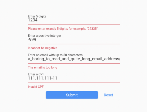
The demo application provides a fully working example, focused on demonstrating exactly five widgets in action — WellFormed, DigitField, IntField, EmailField, and CpfField. You can take the code in this demo and experiment with it.
To run the demo application:
git clone https://github.com/dartoos-dev/well_formed.git
cd well_formed/example/
flutter run -d chrome
This should launch the demo application on Chrome in debug mode.
well_formed_demo_app
blank-fields
invalid-inputs
valid-inputs
Regarding compatibility with the TextFormField class, some properties were left out for one of two reasons:
autovalidate and maxLengthEnforced properties.Brightness? keyboardAppearance,
Color? cursorColor,
FocusNode? focusNode,
GestureTapCallback? onTap,
InputCounterWidgetBuilder? buildCounter,
Iterable<String>? autofillHints,
MaxLengthEnforcement? maxLengthEnforcement,
Radius? cursorRadius,
ScrollController? scrollController,
ScrollPhysics? scrollPhysics,
SmartDashesType? smartDashesType,
SmartQuotesType? smartQuotesType,
StrutStyle? strutStyle,
TextAlignVertical? textAlignVertical,
TextCapitalization textCapitalization,
TextSelectionControls? selectionControls,
ToolbarOptions? toolbarOptions,
bool autofocus,
bool enableSuggestions,
bool expands,
bool? showCursor,
double cursorWidth,
double? cursorHeight,
int? maxLines,
int? minLines,
Contributors are welcome!
Make sure the command below passes before making a Pull Request.
flutter analyze && flutter test