
 v3.0.3
auth_buttons
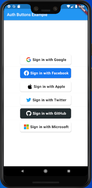
Auth Buttons는 Google, Facebook, Apple 및 Twitter와 같은 가장 인기 있는 소셜 네트워크로 인증하는 데 사용할 수 있는 버튼을 포함한 플러터 위젯 라이브러리입니다.
198좋아요 3.2천30일 다운로드140Pub 점수
AndroidiOSWebmacOSWindowsLinux
Auth Buttons는 가장 인기 있는 소셜 네트워크로 인증하는 데 사용할 수 있는 버튼을 포함한 플러터 위젯 라이브러리입니다.

{"sdk":"flutter"}^2.0.7^6.2.1^4.0.0{"sdk":"flutter"}아래는 영문 원문 스냅샷입니다. 최신 내용은 GitHub에서 확인하세요.
Auth Buttons is a flutter widget library, include buttons for authenticating with the most popular social networks like: Google, Facebook, Apple and too other.
dependencies:
  auth_buttons: <^last>
$ flutter pub get
import 'package:auth_buttons/auth_buttons.dart';
We recommend you to using show special when you want use some button.
show help you importing part of library.
import 'package:auth_buttons/auth_buttons.dart'
    show GoogleAuthButton, AuthButtonStyle, AuthButtonType, AuthIconType;
We also recommend you to using the latest version.
From the version 3.0.0
all AuthButtons
are following the system mode.
see ThemeMode
for more info.
From the version 3.0.0 you're able to
regroup AuthButton
s for sharing style properties,
to do this use the already existing AuthButtonGroup.
From the version 2.0.0 disabled state is supported.
There are three Types you can choose between them:
If you plain to use a non existing AuthButton like: Linkedin or any others along with the existing
one,
than make your custom one just use CustomAuthButton this provide you with a fast way to do so.
You need to use just the following code:
GoogleAuthButton(
  onPressed: () {},
),
| Light | Dark |
|---|---|
| default-button-default-icon | dark-default-button-default-icon |
GoogleAuthButton(
  onPressed: () {},
  style: AuthButtonStyle(
    iconType: AuthIconType.outlined,
  ),
),
| Light | Dark |
|---|---|
| default-button-outlined-icon | dark-default-button-outlined-icon |
GoogleAuthButton(
  onPressed: () {},
  style: AuthButtonStyle(
    iconType: AuthIconType.secondary,
  ),
),
| Light | Dark |
|---|---|
| default-button-secondary-icon | dark-default-button-secondary-icon |
GoogleAuthButton(
  onPressed: () {},
  style: AuthButtonStyle(
    buttonType: AuthButtonType.icon,
  ),
),
| Light | Dark |
|---|---|
| icon-button-default-icon | dark-icon-button-default-icon |
GoogleAuthButton(
  onPressed: () {},
  style: AuthButtonStyle(
    buttonType: AuthButtonType.icon,
    iconType: AuthIconType.outlined,
  ),
),
| Light | Dark |
|---|---|
| icon-button-outlined-icon | dark-icon-button-outlined-icon |
GoogleAuthButton(
  onPressed: () {},
  style: AuthButtonStyle(
    buttonType: AuthButtonType.icon,
    iconType: AuthIconType.secondary,
  ),
),
| Light | Dark |
|---|---|
| icon-button-secondary-icon | dark-icon-button-secondary-icon |
GoogleAuthButton(
  onPressed: () {},
  style: AuthButtonStyle(
    buttonType: AuthButtonType.secondary,
  ),
),
| Light | Dark |
|---|---|
| secondary-button-default-icon | dark-secondary-button-default-icon |
GoogleAuthButton(
  onPressed: () {},
  style: AuthButtonStyle(
    buttonType: AuthButtonType.secondary,
    iconType: AuthIconType.outlined,
  ),
),
| Light | Dark |
|---|---|
| secondary-button-outlined-icon | dark-secondary-button-outlined-icon |
GoogleAuthButton(
  onPressed: () {},
  style: AuthButtonStyle(
    buttonType: AuthButtonType.secondary,
    iconType: AuthIconType.secondary,
  ),
),
| Light | Dark |
|---|---|
| secondary-button-secondary-icon | dark-secondary-button-secondary-icon |
| Light | Dark |
|---|---|
| disabled-buttons | dark-disabled-buttons |
Do same think with the other buttons, when you want to customize any button you can do it just passing a property which you want.
Example
auth button group usecaseAuthButtonGroup(
style: const AuthButtonStyle(
width: 180,
height: 50,
borderColor: Colors.purple,
borderWidth: 3.0,
margin: EdgeInsets.only(bottom: 8.0),
),
buttons: [
GoogleAuthButton(),
AppleAuthButton(),
//....
]
),
Secondary | Icon
:-----------------------------------------------------------------------------------------------------------------------------------------------------------------------------------------------------:|:-------------------------: auth button group secondary buttons | auth-button-group-icon-buttons
Full property you can pass:
GoogleAuthButton(
  key: const ValueKey<String>(''),
  onPressed: () {},
  onLongPress: () {},
  onHover: (bool value) {},
  onFocusChange: (bool value) {},
  focusNode: FocusNode(),
  autofocus: false,
  text: 'Sign in with Google',
  isLoading: false,
  themeMode: ThemeMode.system,
  textDirection: TextDirection.ltr,
  materialStyle: ButtonStyle(),
  style: AuthButtonStyle(
    buttonColor: Colors.blue,
    splashColor: Colors.red,
    elevation: 2.0,
    borderRadius: 99.0,
    textStyle: TextStyle(),
    padding: const EdgeInsets.all(8.0),
    margin: const EdgeInsets.all(8.0),
    borderColor: Colors.amber,
    borderWidth: 3.0,
    buttonType: AuthButtonType.secondary,
    width: 300.0,
    height: 50.0,
    iconSize: 40.0,
    separator: 20.0,
    iconBackground: Colors.white,
    iconType: AuthIconType.outlined,
    shadowColor: Colors.pink,
    progressIndicatorColor: Colors.blue,
    progressIndicatorValueColor: Colors.grey[300],
    progressIndicatorStrokeWidth: 2.0,
    progressIndicatorValue: 1.0,
    iconColor: Colors.purple,
    progressIndicatorType: AuthIndicatorType.circular,
    visualDensity: VisualDensity.standard,
    tapTargetSize: MaterialTapTargetSize.shrinkWrap,
),