패키지, 저장소 및 앱 카테고리 검색

auth_buttons 표지
패키지 상세v3.0.3

auth_buttons

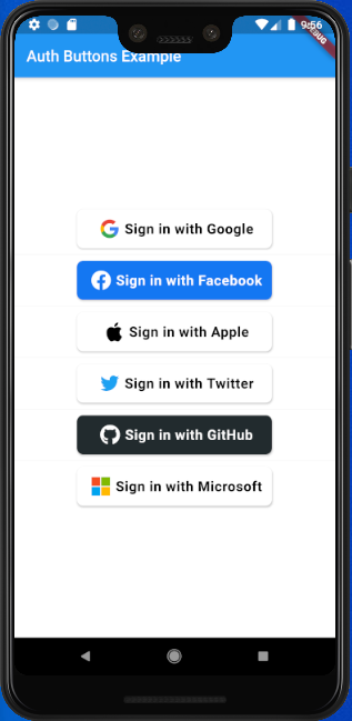
Auth Buttons는 Google, Facebook, Apple 및 Twitter와 같은 가장 인기 있는 소셜 네트워크로 인증하는 데 사용할 수 있는 버튼을 포함한 플러터 위젯 라이브러리입니다.

AndroidiOSWebmacOSWindowsLinux
30일 다운로드
5천
좋아요
199
Pub 점수
140

패키지 설치

flutter pub add auth_buttons

패키지 개요

공개 정보를 바탕으로 생성한 선택 가이드입니다.

Auth Buttons는 Google, Facebook, Apple, Twitter와 같은 인기 있는 소셜 네트워크용 즉시 사용 가능한 인증 버튼을 제공하는 Flutter 위젯 라이브러리입니다. 소셜 로그인 기능의 통합을 간소화하도록 설계되어 플랫폼 간 일관성 있고 시각적으로 매력적인 버튼을 제공합니다. 이 패키지는 Android, iOS, Web, macOS, Windows, Linux를 지원하여 크로스플랫폼 호환성을 보장합니다. 봐일러플레이트 코드를 줄이고 제3자 인증 흐름의 구현을 간소화함으로써 사용자 경험을 향상시킵니다.

사용 사례

  • 소셜 로그인 통합
  • 소셜 계정을 통한 사용자 온보딩
  • 크로스 플랫폼 인증 UI
  • 간소화된 OAuth 버튼 구현
  • 간편한 로그인 워크플로우

주요 기능

  • 사전 구축된 소셜 로그인 버튼
  • Google, Facebook, Apple 및 Twitter 지원
  • 크로스 플랫폼 호환성
  • 디바이스 간 일관된 사용자 인터페이스
  • 최소 설정으로 간편한 통합
  • 사용자 지정 가능한 버튼 스타일

적합한 대상

  • 소셜 로그인을 사용하여 앱을 개발하는 개발자
  • 빠른 인증 UI 구성 요소가 필요한 프로젝트
  • 다중 플랫폼을 대상으로 하는 앱
  • 개발 속도를 우선시하는 팀
  • 프론트엔드 중심의 인증 구현

고려 사항

  • OAuth 설정을 위해 추가 구성이 필요합니다
  • 기반 플랫폼 SDK에 따라 다릅니다
  • 오류 상태에 대해 사용자 지정 처리가 필요할 수 있습니다
  • 사전 정의된 소셜 제공자에 한정
  • 사용자 정의 인증 방법에 적합하지 않습니다

원본 README

연결된 소스 저장소의 README 원문 스냅샷입니다. 최신 내용은 저장소에서 확인하세요.

auth_buttons

Github stars Pub Version

Auth Buttons is a flutter widget library, include buttons for authenticating with the most popular social networks like: Google, Facebook, Apple and too other.

Installation

  1. Add this to your packages pubspec.yaml file:
dependencies:
  auth_buttons: <^last>
  1. Install it You can install it from the command line:
$ flutter pub get
  1. Import it Now in Dart code, you can use:
import 'package:auth_buttons/auth_buttons.dart';

Recommendation

We recommend you to using show special when you want use some button. show help you importing part of library.

import 'package:auth_buttons/auth_buttons.dart'
    show GoogleAuthButton, AuthButtonStyle, AuthButtonType, AuthIconType;

We also recommend you to using the latest version.

Overview

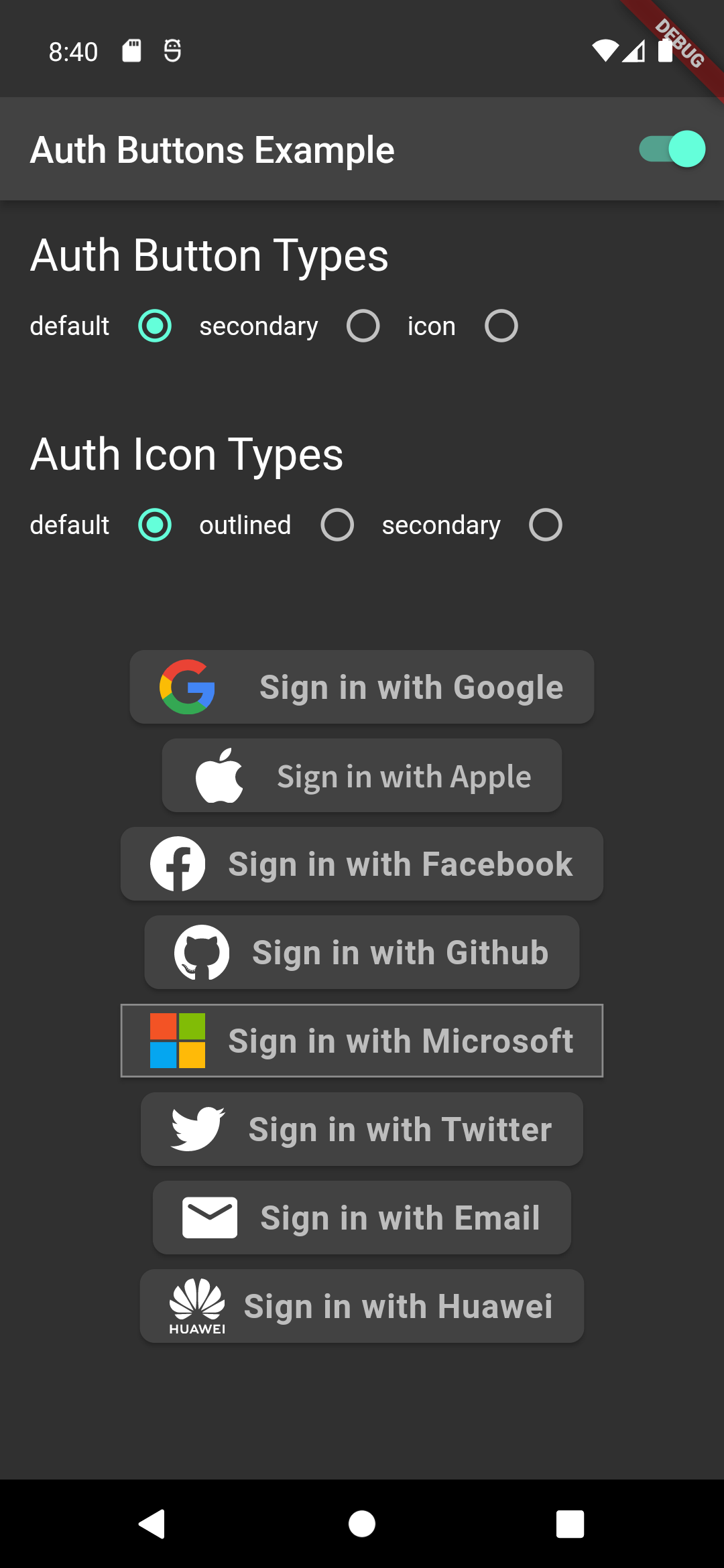
From the version 3.0.0 all AuthButtons are following the system mode. see ThemeMode for more info.

From the version 3.0.0 you're able to regroup AuthButton s for sharing style properties, to do this use the already existing AuthButtonGroup.

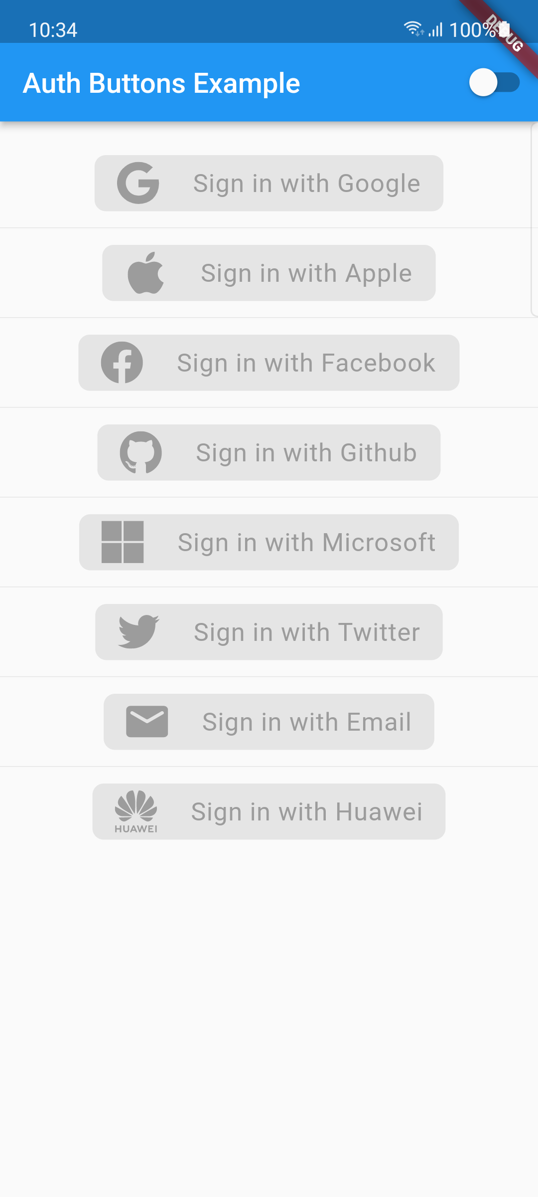
From the version 2.0.0 disabled state is supported.

  1. Enabled
  2. Disabled

There are three Types you can choose between them:

  1. Default
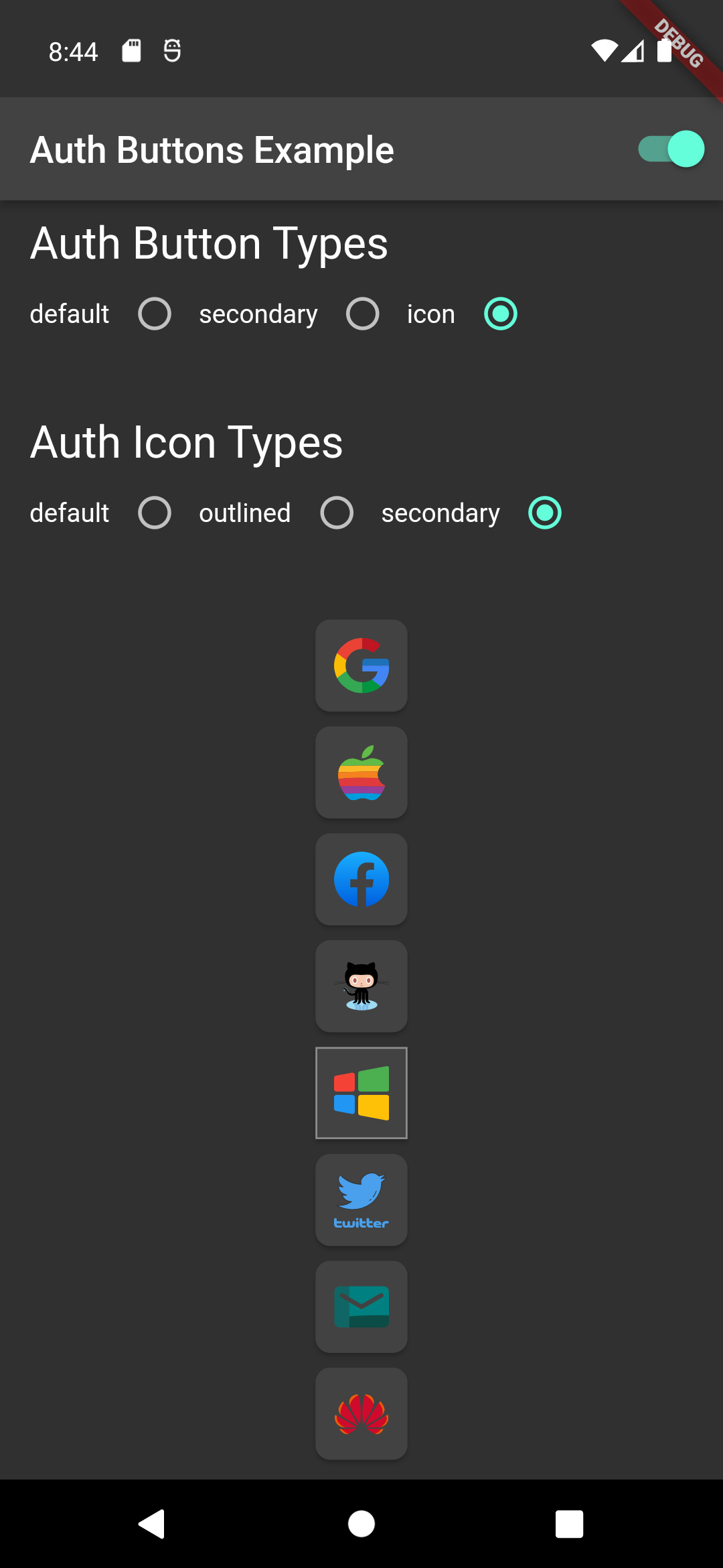
  2. Icon
  3. Secondary

Suggestion

If you plain to use a non existing AuthButton like: Linkedin or any others along with the existing one, than make your custom one just use CustomAuthButton this provide you with a fast way to do so.

Using

Enabled State.

You need to use just the following code:

Default Type
GoogleAuthButton(
  onPressed: () {},
),
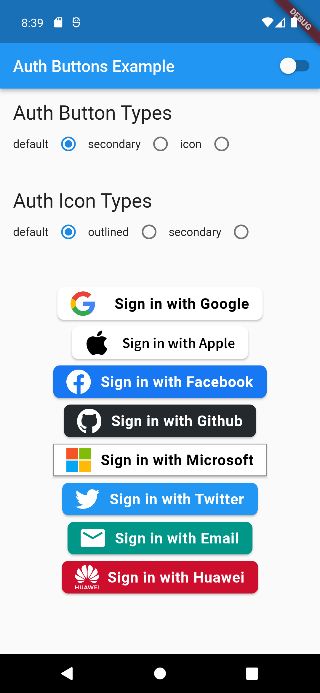
Light Dark
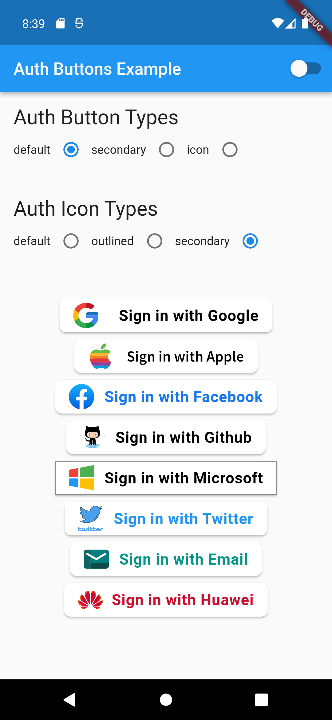
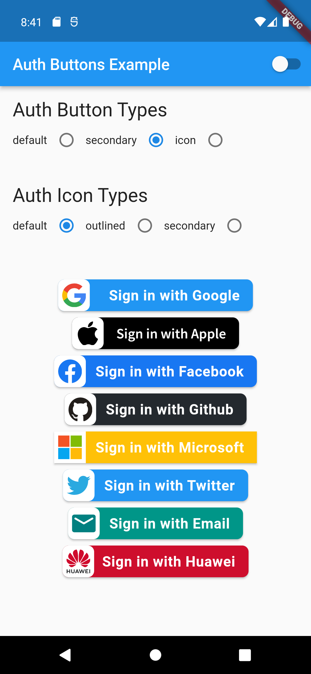
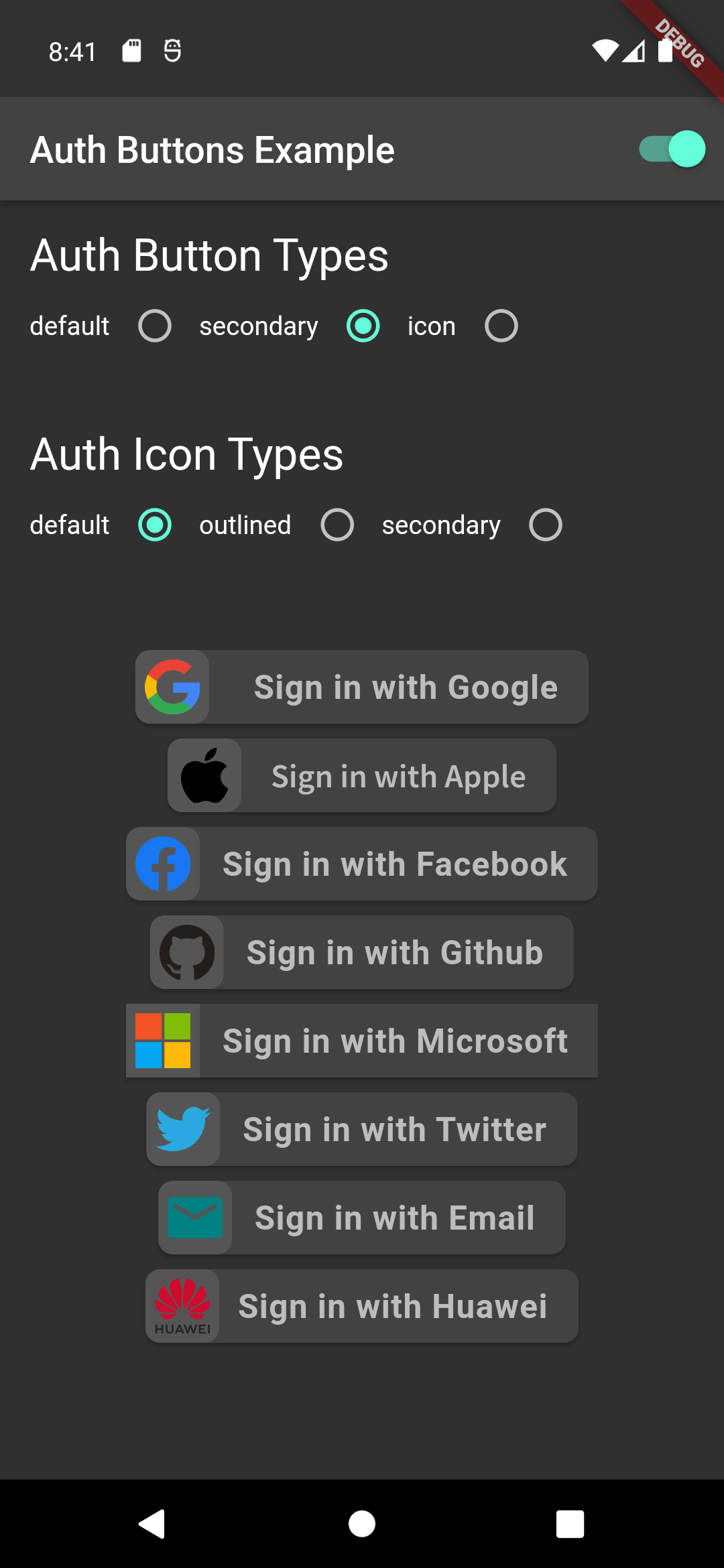
default-button-default-icon dark-default-button-default-icon
GoogleAuthButton(
  onPressed: () {},
  style: AuthButtonStyle(
    iconType: AuthIconType.outlined,
  ),
),
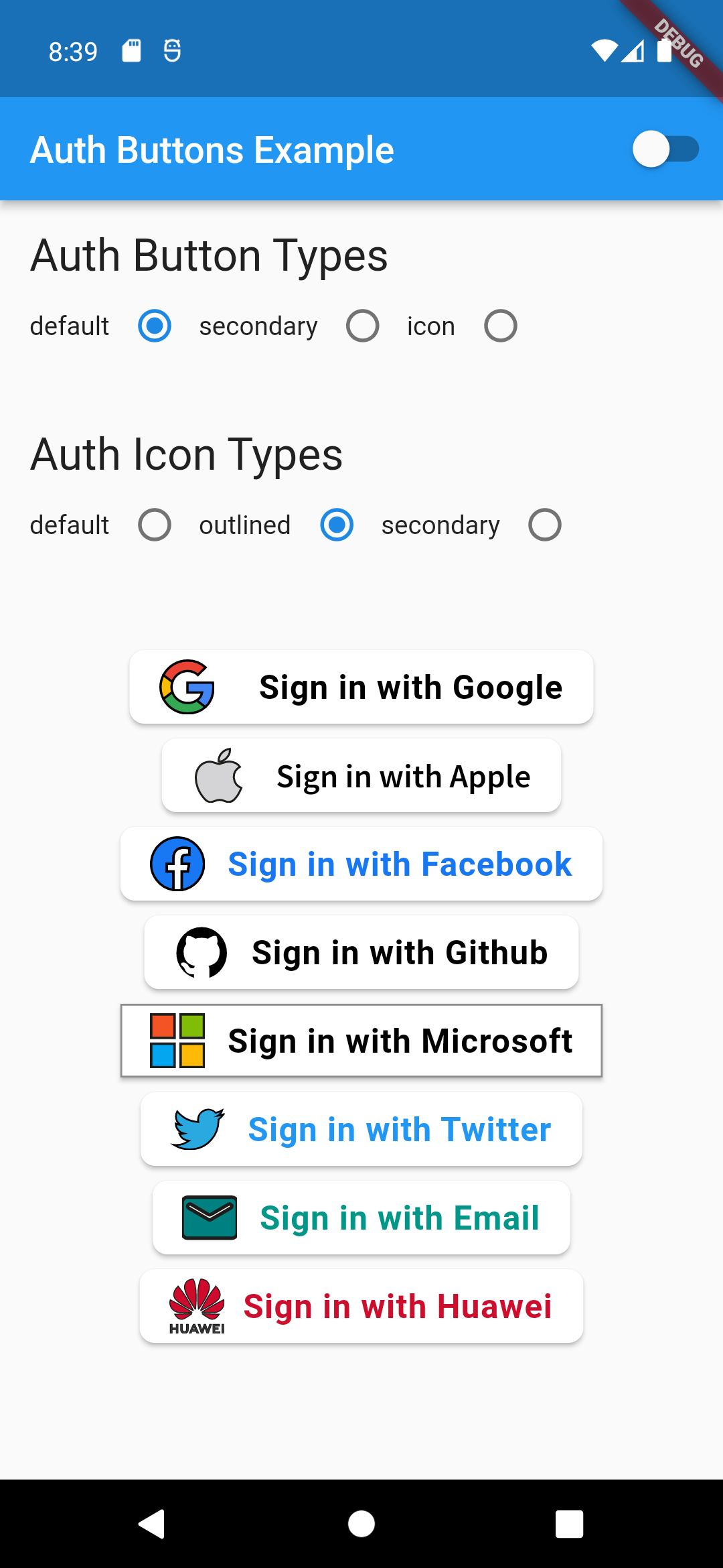
Light Dark
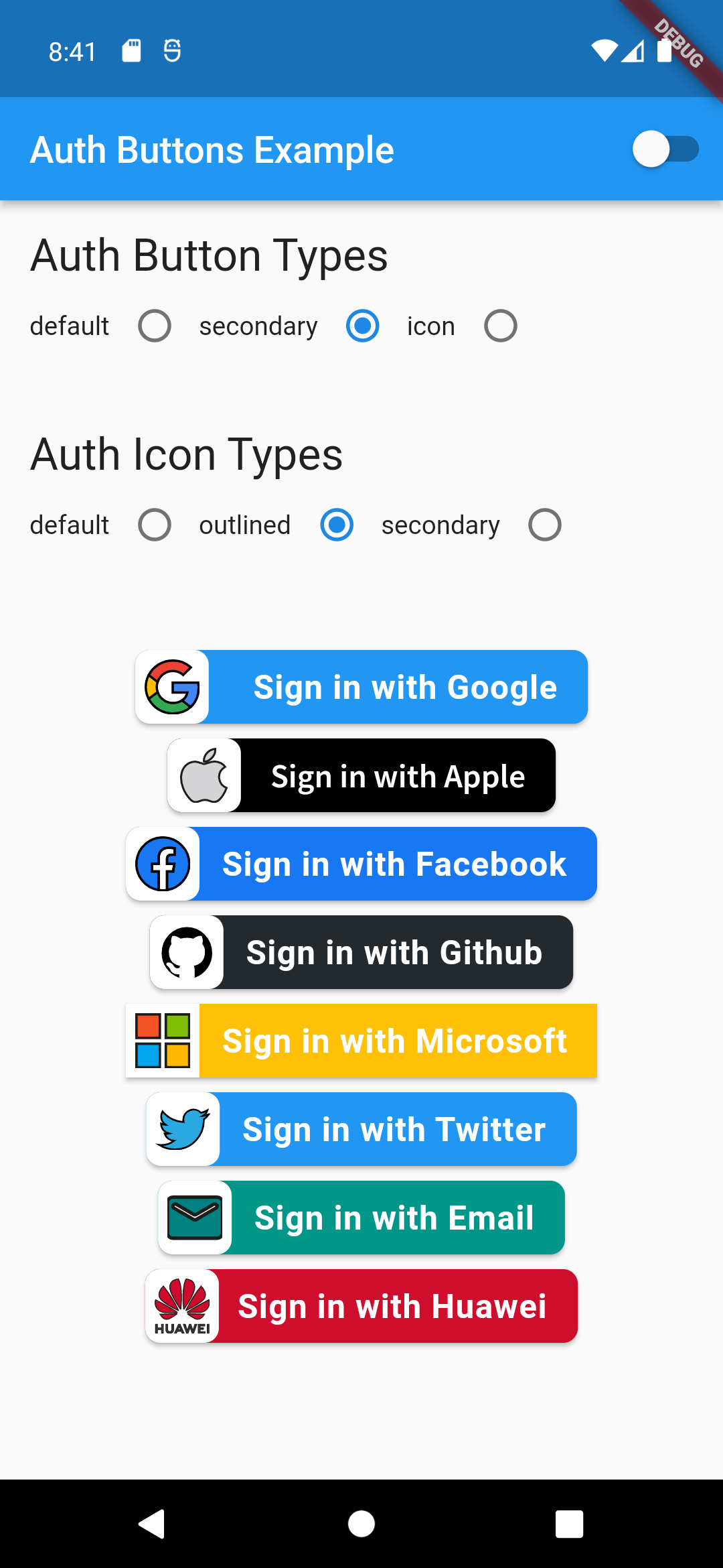
default-button-outlined-icon dark-default-button-outlined-icon
GoogleAuthButton(
  onPressed: () {},
  style: AuthButtonStyle(
    iconType: AuthIconType.secondary,
  ),
),
Light Dark
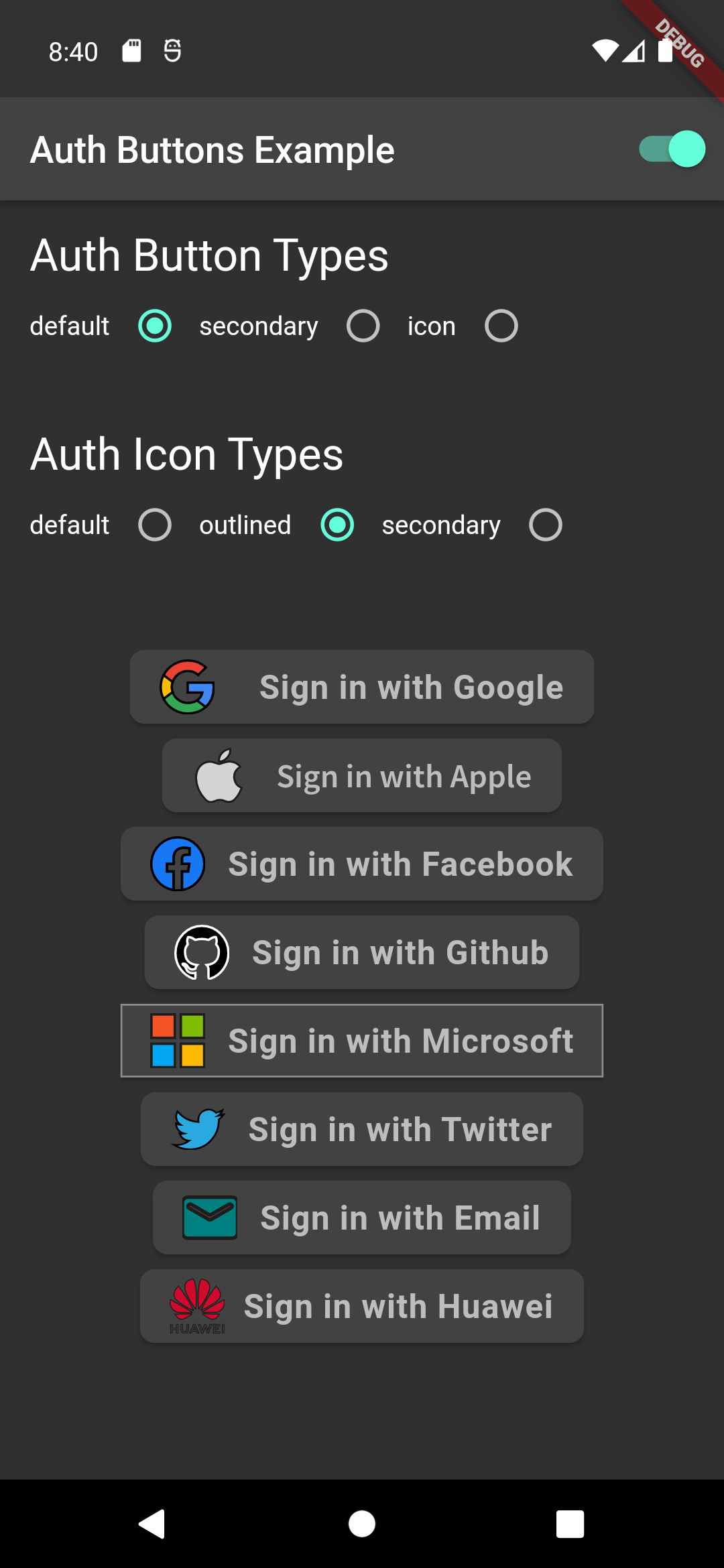
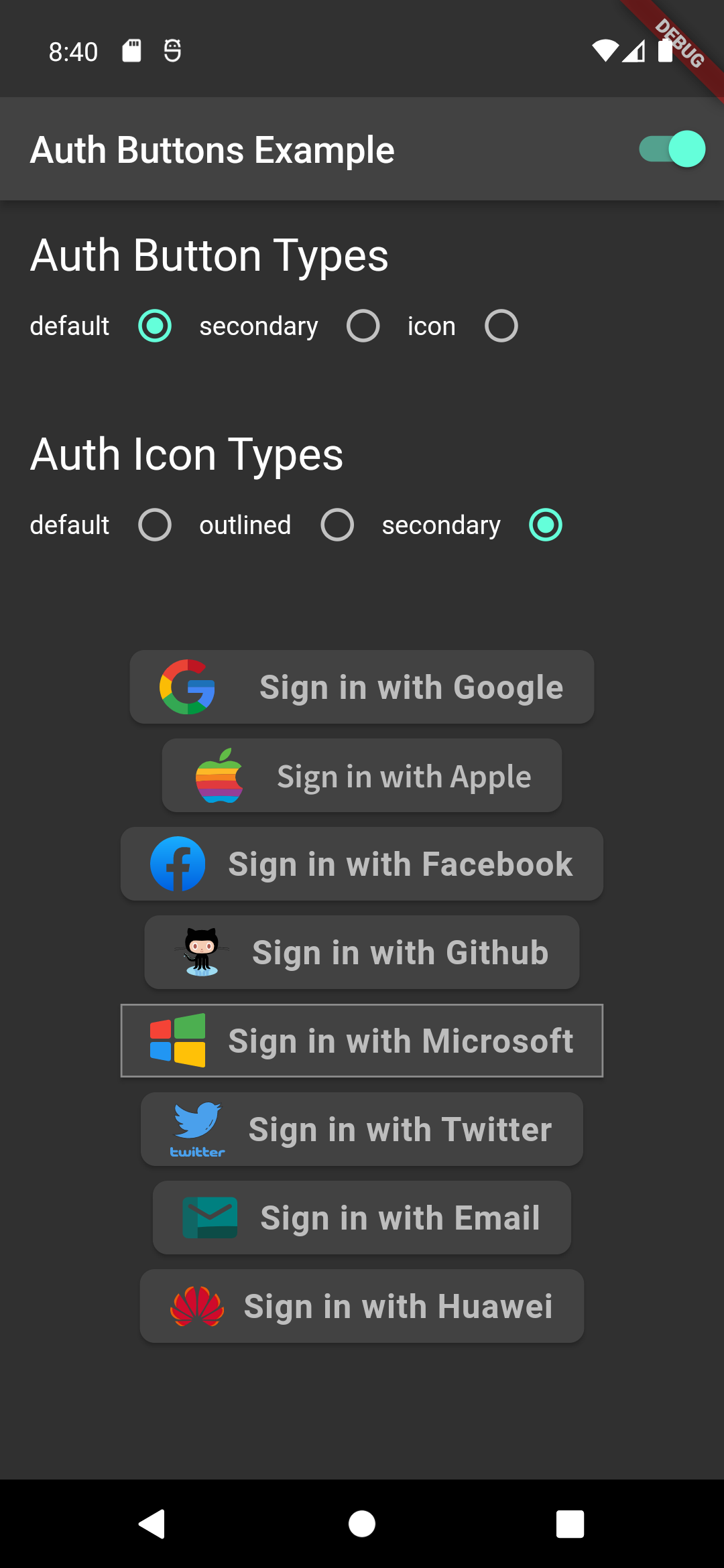
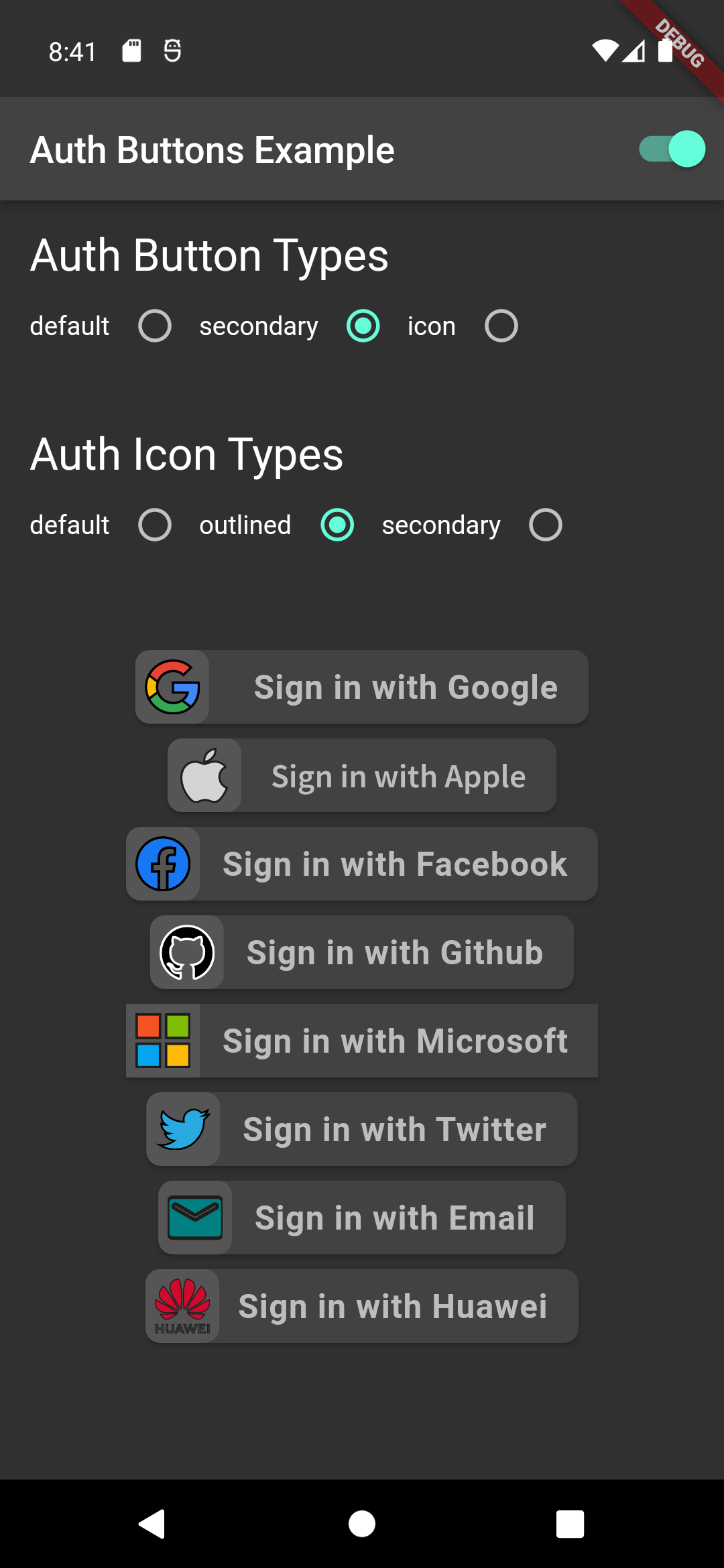
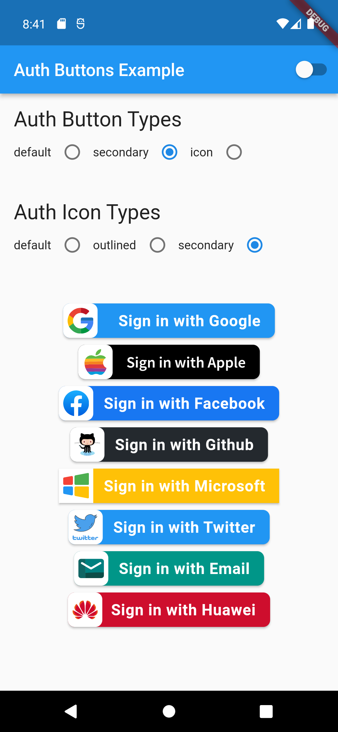
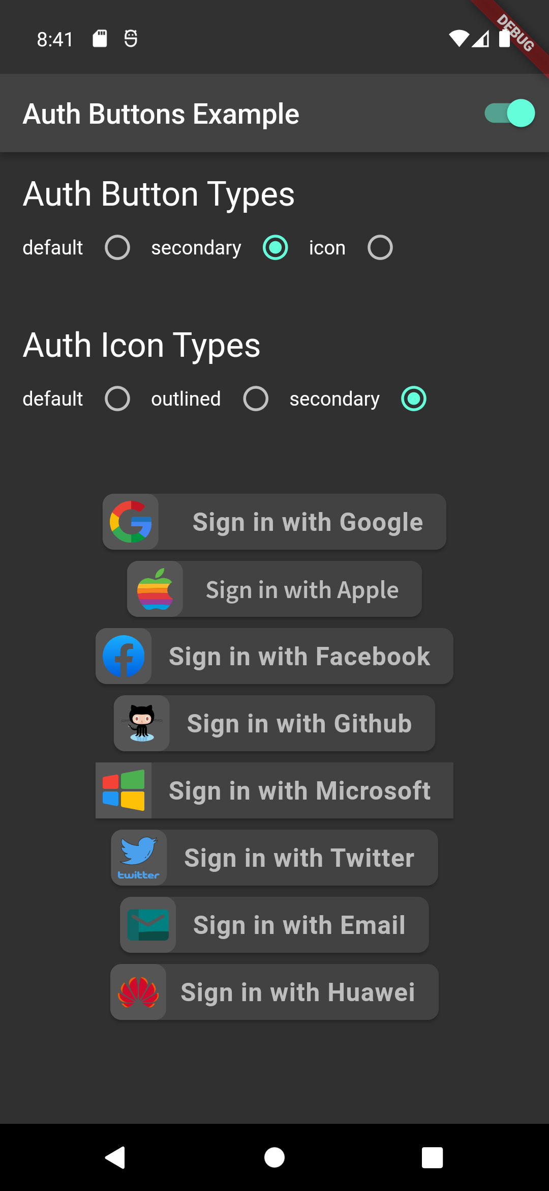
default-button-secondary-icon dark-default-button-secondary-icon
Icon Type
GoogleAuthButton(
  onPressed: () {},
  style: AuthButtonStyle(
    buttonType: AuthButtonType.icon,
  ),
),
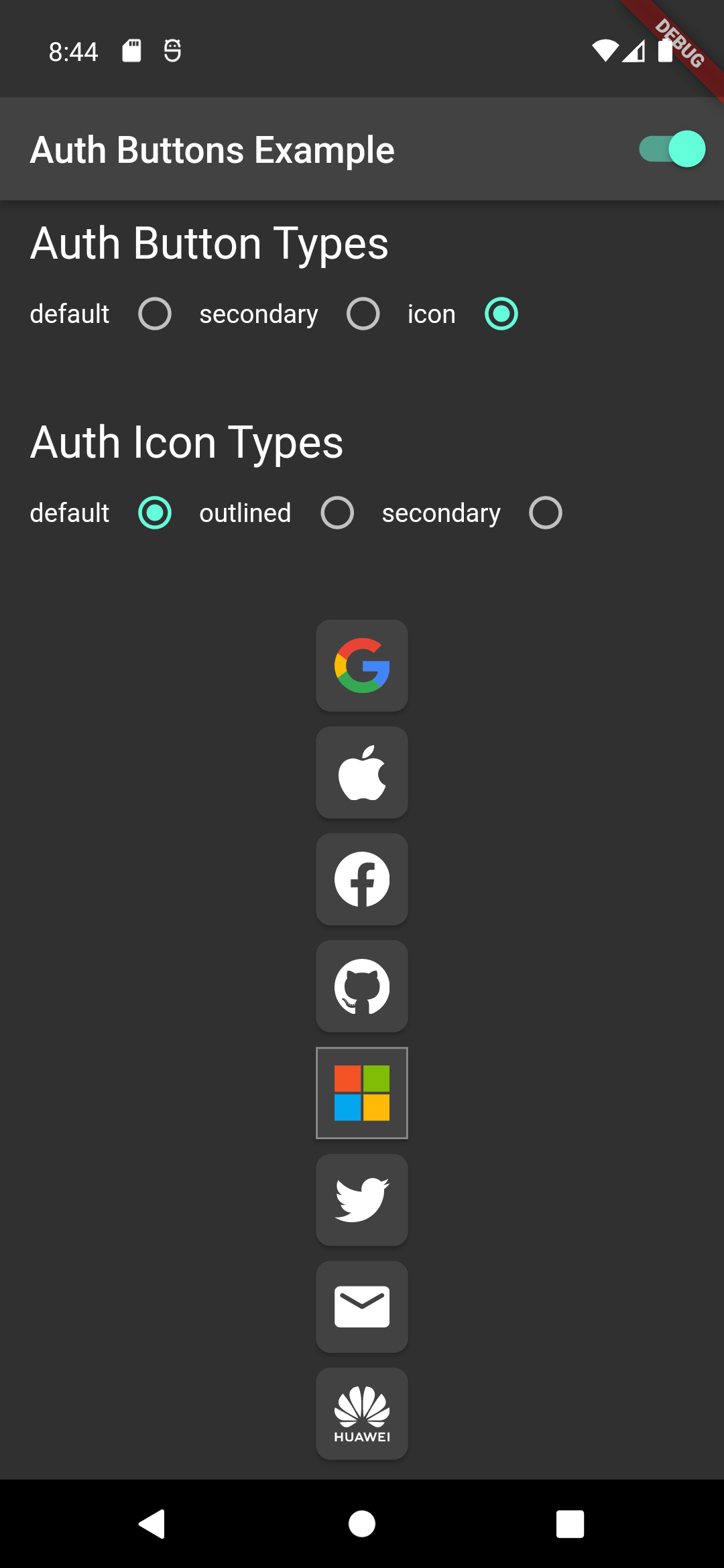
Light Dark
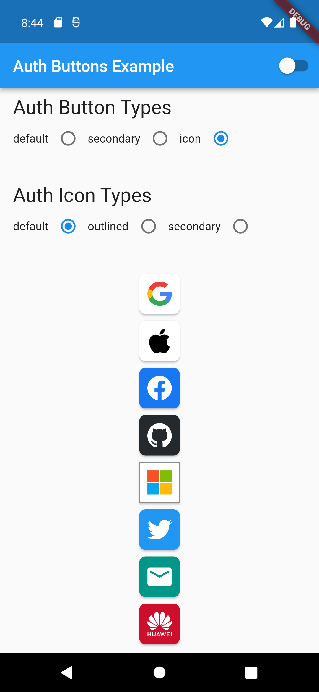
icon-button-default-icon dark-icon-button-default-icon
GoogleAuthButton(
  onPressed: () {},
  style: AuthButtonStyle(
    buttonType: AuthButtonType.icon,
    iconType: AuthIconType.outlined,
  ),
),
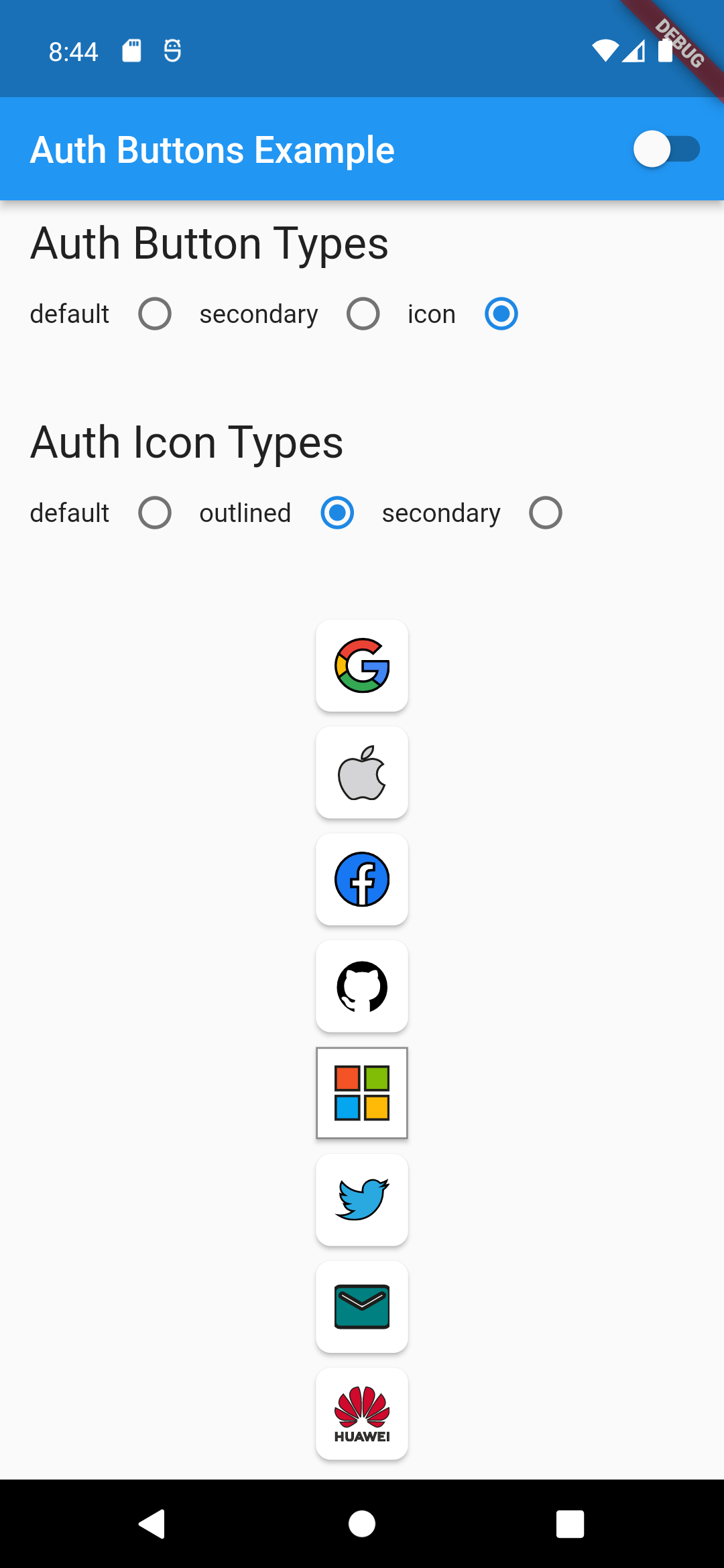
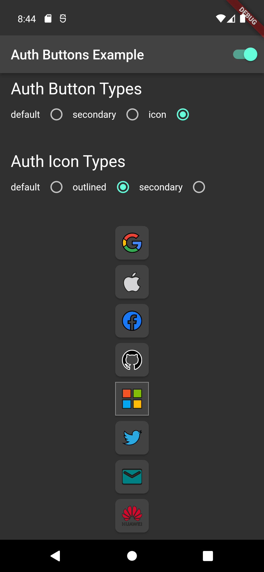
Light Dark
icon-button-outlined-icon dark-icon-button-outlined-icon
GoogleAuthButton(
  onPressed: () {},
  style: AuthButtonStyle(
    buttonType: AuthButtonType.icon,
    iconType: AuthIconType.secondary,
  ),
),
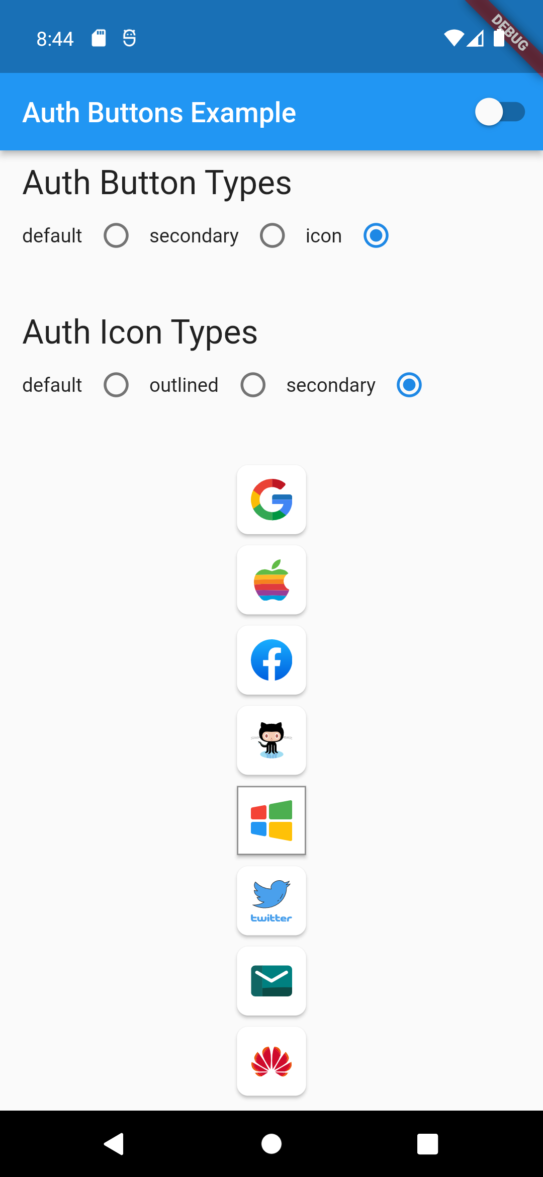
Light Dark
icon-button-secondary-icon dark-icon-button-secondary-icon
Secondary Type
GoogleAuthButton(
  onPressed: () {},
  style: AuthButtonStyle(
    buttonType: AuthButtonType.secondary,
  ),
),
Light Dark
secondary-button-default-icon dark-secondary-button-default-icon
GoogleAuthButton(
  onPressed: () {},
  style: AuthButtonStyle(
    buttonType: AuthButtonType.secondary,
    iconType: AuthIconType.outlined,
  ),
),
Light Dark
secondary-button-outlined-icon dark-secondary-button-outlined-icon
GoogleAuthButton(
  onPressed: () {},
  style: AuthButtonStyle(
    buttonType: AuthButtonType.secondary,
    iconType: AuthIconType.secondary,
  ),
),
Light Dark
secondary-button-secondary-icon dark-secondary-button-secondary-icon
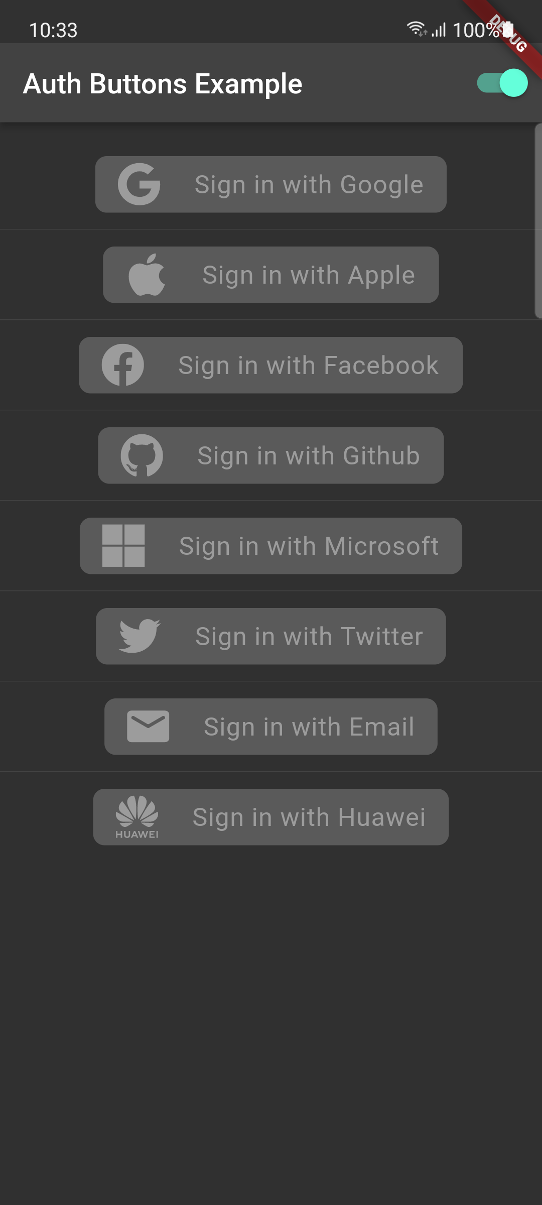
Disabled State
Light Dark
disabled-buttons dark-disabled-buttons

Do same think with the other buttons, when you want to customize any button you can do it just passing a property which you want.

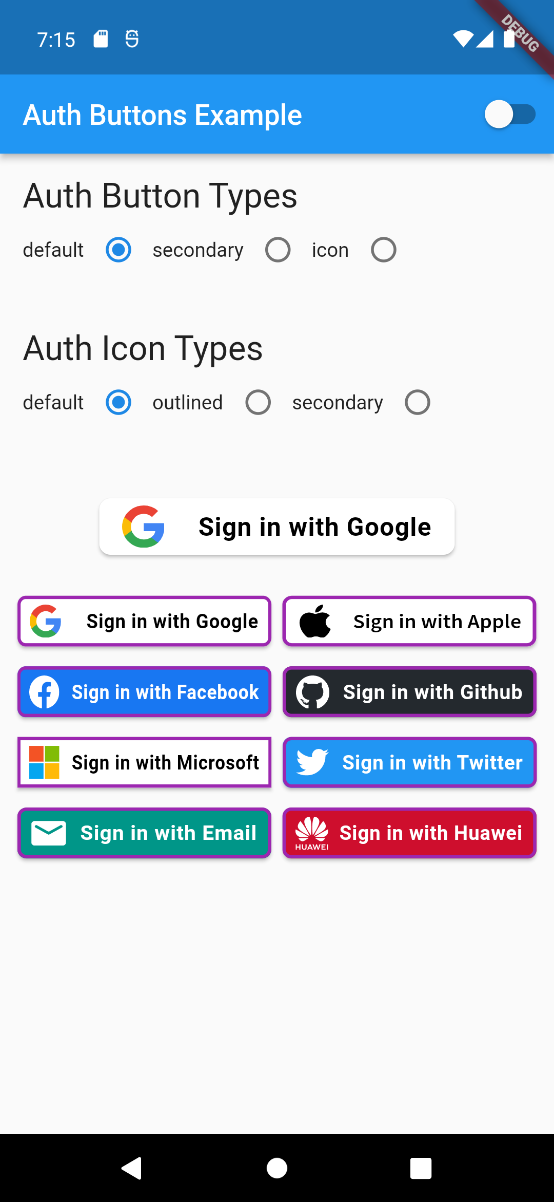
Grouped buttons

Example

auth button group usecase
AuthButtonGroup(
  style: const AuthButtonStyle(
    width: 180,
    height: 50,
    borderColor: Colors.purple,
    borderWidth: 3.0,
    margin: EdgeInsets.only(bottom: 8.0),
  ),
  buttons: [
    GoogleAuthButton(),
    AppleAuthButton(),
    //....
  ]
),
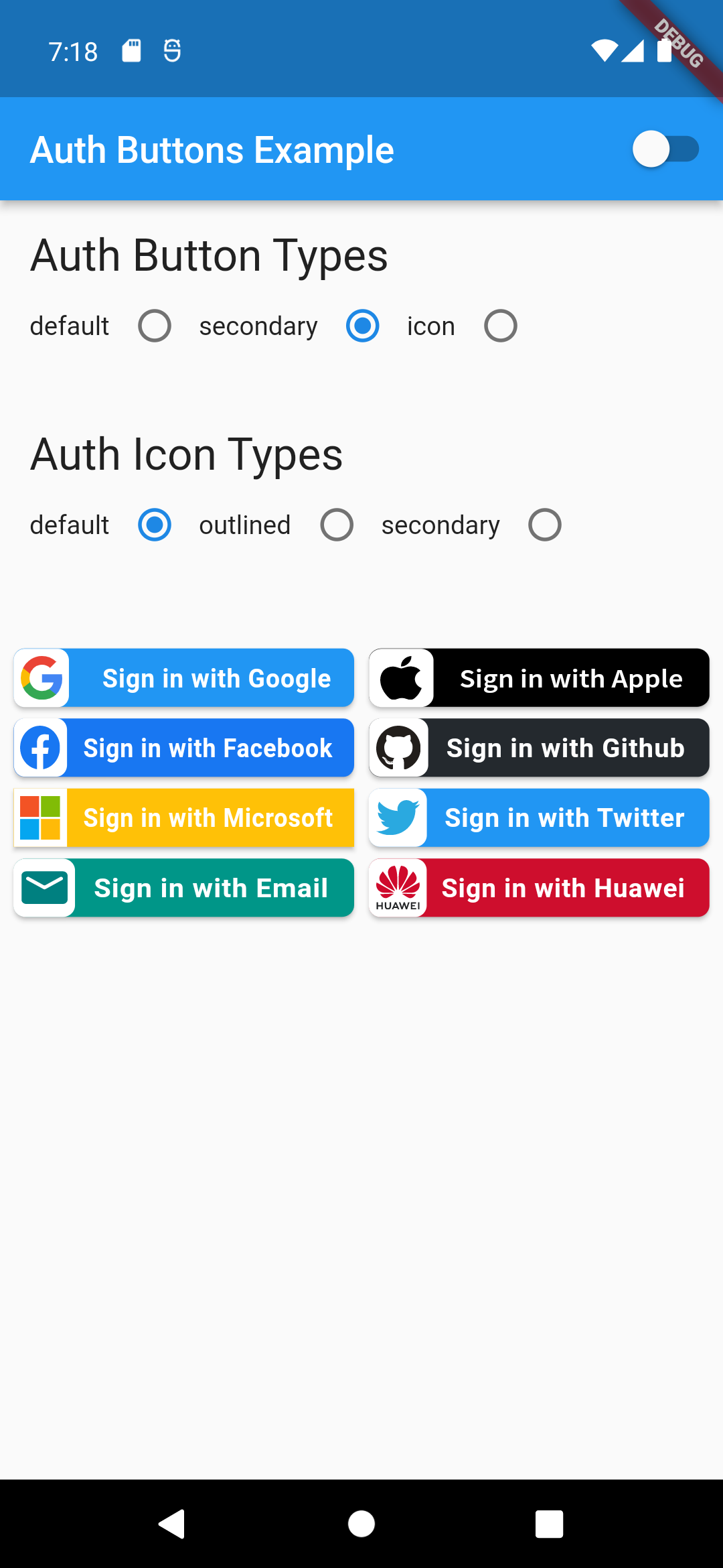
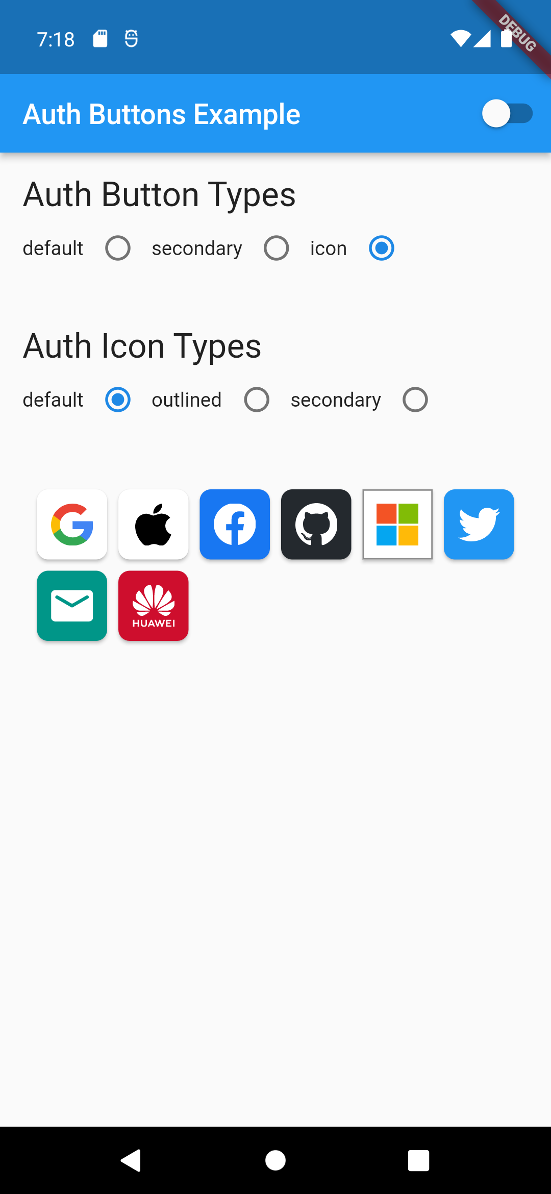
                                                                                           Secondary                                                                                               |  Icon

:-----------------------------------------------------------------------------------------------------------------------------------------------------------------------------------------------------:|:-------------------------: auth button group secondary buttons | auth-button-group-icon-buttons

Full property you can pass:

GoogleAuthButton(
  key: const ValueKey<String>(''),
  onPressed: () {},
  onLongPress: () {},
  onHover: (bool value) {},
  onFocusChange: (bool value) {},
  focusNode: FocusNode(),
  autofocus: false,
  text: 'Sign in with Google',
  isLoading: false,
  themeMode: ThemeMode.system,
  textDirection: TextDirection.ltr,
  materialStyle: ButtonStyle(),
  style: AuthButtonStyle(
    buttonColor: Colors.blue,
    splashColor: Colors.red,
    elevation: 2.0,
    borderRadius: 99.0,
    textStyle: TextStyle(),
    padding: const EdgeInsets.all(8.0),
    margin: const EdgeInsets.all(8.0),
    borderColor: Colors.amber,
    borderWidth: 3.0,
    buttonType: AuthButtonType.secondary,
    width: 300.0,
    height: 50.0,
    iconSize: 40.0,
    separator: 20.0,
    iconBackground: Colors.white,
    iconType: AuthIconType.outlined,
    shadowColor: Colors.pink,
    progressIndicatorColor: Colors.blue,
    progressIndicatorValueColor: Colors.grey[300],
    progressIndicatorStrokeWidth: 2.0,
    progressIndicatorValue: 1.0,
    iconColor: Colors.purple,
    progressIndicatorType: AuthIndicatorType.circular,
    visualDensity: VisualDensity.standard,
    tapTargetSize: MaterialTapTargetSize.shrinkWrap,
),

return up

카테고리

의존성

의존성 목록 2 개

소스 저장소

이 패키지를 사용하는 프로젝트

아직 데이터가 없습니다.