
 v0.0.6
flutter_tabbar_lite
FlutterTabBarLite는 애니메이션과 수평 및 수직 기능을 갖춘 사용자 정의 탭 바 위젯입니다.
7좋아요 6830일 다운로드145Pub 점수
AndroidiOSWebmacOSWindowsLinux
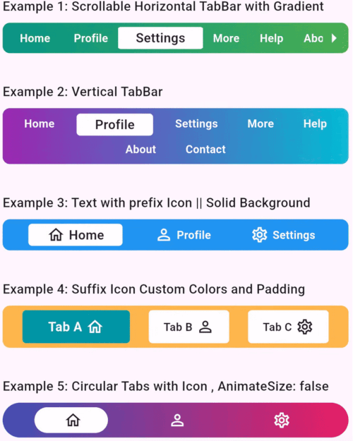
Flutter 애플리케이션용으로 완전히 사용자 정의 가능하고 애니메이션 효과가 있는 탭 바 위젯입니다. 탐색을 직관적이고 시각적으로 매력적으로 만들도록 설계되었으며, 이 패키지는 현대적이고 동적인 탭 인터페이스를 만드는 데 이상적입니다.

{"sdk":"flutter"}{"sdk":"flutter"}아래는 영문 원문 스냅샷입니다. 최신 내용은 GitHub에서 확인하세요.
A fully customizable and animated tab bar widget for Flutter applications. Designed to make navigation intuitive and visually appealing, this package is perfect for creating modern and dynamic tab interfaces.
FlutterTabBarLite
Add the following to your pubspec.yaml file:
dependencies:
  flutter_tabbar_lite: ^0.0.6
Run the command to fetch the package:
flutter pub get
import 'package:flutter/material.dart';
import 'package:flutter_tab_bar/flutter_tabbar_lite.dart';

void main() => runApp(const MyApp());

class MyApp extends StatelessWidget {
  const MyApp({super.key});

  @override
  Widget build(BuildContext context) {
    return MaterialApp(
      home: Scaffold(
        appBar: AppBar(title: const Text("FlutterTabBarLite Horizontal Example")),
        body: Column(
          children: [
            FlutterTabBarLite.horizontal(
              scrollable: true,
              titles: const [
                "Home",
                "Profile",
                "Settings",
                "More",
                "Help",
                "About",
                "Contact"
              ],
              gradient: const LinearGradient(
                colors: [Colors.teal, Colors.green],
                begin: Alignment.centerLeft,
                end: Alignment.centerRight,
              ),
              onTabChange: (index) {
                print("Scrollable TabBar - Selected Tab: $index");
              },
            ),
          ],
        ),
      ),
    );
  }
}
import 'package:flutter/material.dart';
import 'package:flutter_tab_bar/flutter_tabbar_lite.dart';

void main() => runApp(const MyApp());

class MyApp extends StatelessWidget {
  const MyApp({super.key});

  @override
  Widget build(BuildContext context) {
    return MaterialApp(
      home: Scaffold(
        appBar: AppBar(title: const Text("FlutterTabBarLite Vertical Example")),
        body: Column(
          children: [
            FlutterTabBarLite.vertical(
              itemMargin: const EdgeInsets.symmetric(horizontal: 8, vertical: 2),
              titles: const [
                "Home",
                "Profile",
                "Settings",
                "More",
                "Help",
                "About",
                "Contact"
              ],
              gradient: const LinearGradient(
                colors: [Colors.purple, Colors.cyan],
                begin: Alignment.centerLeft,
                end: Alignment.centerRight,
              ),
              onTabChange: (index) {
                print("Selected Tab: $index");
              },
            ),
          ],
        ),
      ),
    );
  }
}
| Property | Type | Default Value | Description |
|---|---|---|---|
scrollable |
bool |
false |
Enables horizontal scrolling for tabs. |
titles |
List<String> |
["Tab 1", "Tab 2"] |
Titles for each tab. |
prefixIcons |
List<IconData>? |
null |
Icons before titles. |
suffixIcons |
List<IconData>? |
null |
Icons after titles. |
backgroundColor |
Color? |
Colors.blue |
Tab bar background color. |
selectedTextColor |
Color |
Colors.black87 |
Color for the selected tab's text. |
unselectedItemTextColor |
Color |
Colors.white |
Color for unselected tab's text. |
gradient |
LinearGradient? |
null |
Gradient applied to the tab bar. |
borderRadius |
double? |
8.0 |
Border radius for TabBar |
itemBorderRadius |
double? |
4.0 |
Border radius for TabBar Item |
itemMargin |
EdgeInsets? |
null |
Margin for TabBar Item |
onTabChange |
Function(int)? |
null |
Callback function invoked on tab change. |
horizontal |
constructor |
null |
Constructor to use horizontal tab bar |
vertical |
constructor |
null |
Constructor to use vertical TabBar |
Contributions are welcome! Please fork the repository, make changes, and submit a pull request. Refer to the CONTRIBUTING.md for more details.
This project is licensed under the MIT License. See the LICENSE file for details.
Developed with ❤️ by Khandakar Amir Hamza
GitHub Profile | Portfolio:amirhamza.com
Check the example directory for a fully functional implementation. Run it locally using:
cd example
flutter run
If you encounter any issues or have suggestions, please create an issue in the GitHub repository.