패키지, 저장소 및 앱 카테고리 검색

flutter_tabbar_lite 표지
패키지 상세v0.0.6

flutter_tabbar_lite

FlutterTabBarLite는 애니메이션과 수평 및 수직 기능을 갖춘 사용자 정의 탭 바 위젯입니다.

AndroidiOSWebmacOSWindowsLinux
30일 다운로드
65
좋아요
9
Pub 점수
145

패키지 설치

flutter pub add flutter_tabbar_lite

패키지 개요

공개 정보를 바탕으로 생성한 선택 가이드입니다.

FlutterTabBarLite는 수평 및 수직 레이아웃을 지원하며 부드러운 애니메이션 효과를 제공하는 플러터용 가볍고 사용자 정의 가능한 탭 바 위젯입니다. 단순성과 성능을 고려하여 설계되었으며, 안드로이드, iOS, 웹, 맥OS, 윈도우, 리눅스 등 다양한 플랫폼에서 애니메이션 탭 전환을 쉽게 구현할 수 있도록 해줍니다. 탭 간 이동 시 유연한 시각적 피드백을 통해 사용자 경험을 향상시킵니다. 최소한의 설정으로 높은 유연성을 갖춘 직관적인 탭 기반 네비게이션을 필요로 하는 앱에 이상적입니다.

사용 사례

  • 모바일 앱에서의 간단한 탭 탐색
  • 작은 UI를 위한 수직 탭 레이아웃
  • 웹 애플리케이션에서의 애니메이티드 탭 전환
  • 다시보드용 사용자 정의 탭 스타일
  • 다중 플랫폼 플러터 앱에서의 탐색

주요 기능

  • 수평 및 수직 탭 지원
  • 부드러운 애니메이션 전환
  • 가볍고 성능이 뛰어남
  • 크로스 플랫폼 호환성
  • 기존 Flutter 프로젝트와의 간편한 통합
  • 사용자 정의 가능한 외관 및 동작

적합한 대상

  • 간단한 탭 바 솔루션을 찾는 개발자
  • 애니메이션 탭 상호작용이 필요한 앱
  • 다중 플랫폼 플러터 애플리케이션
  • 유연한 탭 레이아웃을 원하는 UI 디자이너
  • 최소 종속성을 우선시하는 프로젝트

고려 사항

  • 기본 탭 기능에만 제한됨(고급 스와이프 제스처 없음)
  • 복잡한 디자인을 위해 맞춤 스타일링이 필요할 수 있습니다
  • 애니메이션은 플랫폼에 따라 약간 다를 수 있습니다
  • 매우 동적인 탭 콘텐츠 관리에 적합하지 않습니다
  • 정적 또는 반정적 탭 구조에 가장 적합

원본 README

연결된 소스 저장소의 README 원문 스냅샷입니다. 최신 내용은 저장소에서 확인하세요.

FlutterTabBarLite

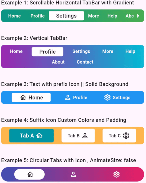
A fully customizable and animated tab bar widget for Flutter applications. Designed to make navigation intuitive and visually appealing, this package is perfect for creating modern and dynamic tab interfaces.

FlutterTabBarLite

Features

  • Customizable Titles: Unique titles to each tab.
  • Icon Support: Include prefix and suffix icons for enhanced aesthetics.
  • Scrollable & Fixed Layouts: Choose between scrollable and fixed tab bar layouts.
  • Gradient Backgrounds: Apply gradients for a modern look.
  • Responsive Design: Fully responsive for various screen sizes.
  • Tab Change Callback: Get notified when the user switches tabs.
  • Tab Axis Horizontal & Vertical: Horizontal and Vertical Tabs.

Installation

Add the following to your pubspec.yaml file:

dependencies:
  flutter_tabbar_lite: ^0.0.6

Run the command to fetch the package:

flutter pub get

Usage

FlutterTabBarLite Horizontal Example
import 'package:flutter/material.dart';
import 'package:flutter_tab_bar/flutter_tabbar_lite.dart';

void main() => runApp(const MyApp());

class MyApp extends StatelessWidget {
  const MyApp({super.key});

  @override
  Widget build(BuildContext context) {
    return MaterialApp(
      home: Scaffold(
        appBar: AppBar(title: const Text("FlutterTabBarLite Horizontal Example")),
        body: Column(
          children: [
            FlutterTabBarLite.horizontal(
              scrollable: true,
              titles: const [
                "Home",
                "Profile",
                "Settings",
                "More",
                "Help",
                "About",
                "Contact"
              ],
              gradient: const LinearGradient(
                colors: [Colors.teal, Colors.green],
                begin: Alignment.centerLeft,
                end: Alignment.centerRight,
              ),
              onTabChange: (index) {
                print("Scrollable TabBar - Selected Tab: $index");
              },
            ),
          ],
        ),
      ),
    );
  }
}
Flutter TabBarLite Vertical Example
import 'package:flutter/material.dart';
import 'package:flutter_tab_bar/flutter_tabbar_lite.dart';

void main() => runApp(const MyApp());

class MyApp extends StatelessWidget {
  const MyApp({super.key});

  @override
  Widget build(BuildContext context) {
    return MaterialApp(
      home: Scaffold(
        appBar: AppBar(title: const Text("FlutterTabBarLite Vertical Example")),
        body: Column(
          children: [
            FlutterTabBarLite.vertical(
              itemMargin: const EdgeInsets.symmetric(horizontal: 8, vertical: 2),
              titles: const [
                "Home",
                "Profile",
                "Settings",
                "More",
                "Help",
                "About",
                "Contact"
              ],
              gradient: const LinearGradient(
                colors: [Colors.purple, Colors.cyan],
                begin: Alignment.centerLeft,
                end: Alignment.centerRight,
              ),
              onTabChange: (index) {
                print("Selected Tab: $index");
              },
            ),
          ],
        ),
      ),
    );
  }
}

Properties

Property Type Default Value Description
scrollable bool false Enables horizontal scrolling for tabs.
titles List<String> ["Tab 1", "Tab 2"] Titles for each tab.
prefixIcons List<IconData>? null Icons before titles.
suffixIcons List<IconData>? null Icons after titles.
backgroundColor Color? Colors.blue Tab bar background color.
selectedTextColor Color Colors.black87 Color for the selected tab's text.
unselectedItemTextColor Color Colors.white Color for unselected tab's text.
gradient LinearGradient? null Gradient applied to the tab bar.
borderRadius double? 8.0 Border radius for TabBar
itemBorderRadius double? 4.0 Border radius for TabBar Item
itemMargin EdgeInsets? null Margin for TabBar Item
onTabChange Function(int)? null Callback function invoked on tab change.
horizontal constructor null Constructor to use horizontal tab bar
vertical constructor null Constructor to use vertical TabBar

Contributions

Contributions are welcome! Please fork the repository, make changes, and submit a pull request. Refer to the CONTRIBUTING.md for more details.


License

This project is licensed under the MIT License. See the LICENSE file for details.


Author

Developed with ❤️ by Khandakar Amir Hamza
GitHub Profile | Portfolio:amirhamza.com


Example App

Check the example directory for a fully functional implementation. Run it locally using:

cd example
flutter run

Feedback

If you encounter any issues or have suggestions, please create an issue in the GitHub repository.

카테고리

소스 저장소

이 패키지를 사용하는 프로젝트

아직 데이터가 없습니다.