
 v0.1.5
simple_grid
부트스트랩을 영감으로 삼은 동적 그리드로, 그리드 레이아웃을 설명하는 데 사용할 수 있습니다. 이 패키지는 순수하게 MediaQuery를 사용하며, 렌더링에 대해 걱정할 필요가 없습니다.
79좋아요 54430일 다운로드160Pub 점수
AndroidiOSWebmacOSWindowsLinux
부트스트랩을 영감으로 삼아, 부트스트랩 그리드처럼 사용할 수 있는 동적 그리드 레이아웃입니다. 크기는 Material UI의 브레이크포인트를 따릅니다. 하지만 걱정하지 마세요. 여기에서 설명한 것처럼 사용자 정의 브레이크포인트를 설정할 수 있습니다. 이 패키지는 순수하게 MediaQuery를 사용하며, 렌더링에 대해 걱정할 필요가 없습니다.

{"sdk":"flutter"}{"sdk":"flutter"}아래는 영문 원문 스냅샷입니다. 최신 내용은 GitHub에서 확인하세요.
Indonesian documentation is here
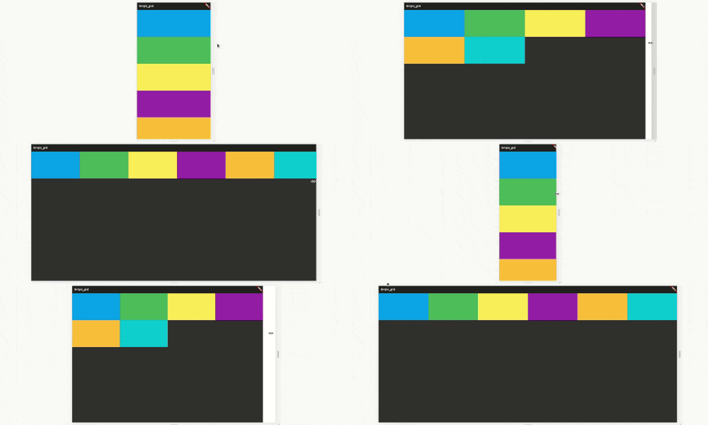
Inspired by bootstrap , This is dynamic grid layout that you can use Like a bootstrap grid, but the size following material UI break points. You can also customize your break point like here. This package purely using mediaquery, don't worry about the render.
code example here https://raw.githubusercontent.com/nggepe/simple_grid/master/doc/demo-grid.gif
code example here https://raw.githubusercontent.com/nggepe/simple_grid/master/doc/order-example.gif
Bootstrap, material-ui or another web-grid always use 12 size. Here is the image example: https://raw.githubusercontent.com/nggepe/simple_grid/master/doc/grid-example.png
There are 4 classes that you have to now, these are:
SpGrid is the container of grid, more information hereSpGridItem is the children of SpGrid, more information hereSpGridSize is the class that you can declare the maximum of the screen size, more information hereSpOrder, this class is a sort class. when you use 1 of it's value, the value will create an ordering when the screen on the value condition. more information hereSpGrid(width: MediaQuery.of(context).size.width, children: [
SpGridItem(
xs: 12,
sm: 6,
md: 4,
lg: 3,
child: Container(
color: Colors.blue,
height: 200,
),
),
SpGridItem(
xs: 12,
sm: 6,
md: 4,
lg: 3,
child: Container(
color: Colors.green,
height: 200,
),
),
SpGridItem(
xs: 12,
sm: 6,
md: 4,
lg: 3,
child: Container(
color: Colors.yellow,
height: 200,
),
),
SpGridItem(
xs: 12,
sm: 6,
md: 4,
lg: 3,
child: Container(
color: Colors.purple,
height: 200,
),
),
]);
import 'package:flutter/material.dart';
import 'package:simple_grid/simple_grid.dart';

void main() {
  runApp(MyApp());
}

class MyApp extends StatelessWidget {
  @override
  Widget build(BuildContext context) {
    return MaterialApp(
      title: 'Simple_grid',
      theme: ThemeData(
        brightness: Brightness.dark,
      ),
      home: MyHomePage(),
    );
  }
}

class MyHomePage extends StatelessWidget {
  @override
  Widget build(BuildContext context) {
    return Scaffold(
      appBar: AppBar(
        title: Text("SIMPLE GRID EXAMPLE"),
      ),
      body: SpGrid(
        width: MediaQuery.of(context).size.width,
        spacing: 10,
        runSpacing: 10,
        children: [
          SpGridItem(
            xs: 12,
            md: 6,
            order: SpOrder(sm: 1, xs: 1),
            child: Container(
              height: 200,
              child: Column(
                mainAxisAlignment: MainAxisAlignment.center,
                children: [
                  Text(
                    "Hello!",
                    style: TextStyle(fontSize: 40),
                    textAlign: TextAlign.center,
                  ),
                  SizedBox(
                    height: 10,
                  ),
                  Text(
                    "I'm John Doe and I Love Programming",
                    style: TextStyle(fontSize: 25),
                    textAlign: TextAlign.center,
                  ),
                ],
              ),
            ),
          ),
          SpGridItem(
            xs: 12,
            md: 6,
            order: SpOrder(sm: 0, xs: 0),
            child: Container(
              height: 200,
              decoration: BoxDecoration(
                  image: DecorationImage(
                      image: NetworkImage(
                          "https://raw.githubusercontent.com/nggepe/simple_grid/master/doc/john.png"))),
            ),
          ),
        ],
      ),
    );
  }
}
SpGrid(
  width: MediaQuery.of(context).size.width,
  gridSize: SpGridSize(xs: 0, sm: 500, md: 768, lg: 980, xl: 1200),
  children:[],
)