
 v1.0.1
animated_rating_stars
상호작용 가능한 별 기반 평가를 위한 매우 사용자 정의 가능한 Flutter 평점 바 위젯입니다.
54좋아요 1.3천30일 다운로드140Pub 점수
AndroidiOSWebmacOSWindowsLinux
nikunj22/animated_rating_stars open-source repository details.

{"sdk":"flutter"}{"sdk":"flutter"}^2.0.2{"sdk":"flutter"}^2.0.0아래는 영문 원문 스냅샷입니다. 최신 내용은 GitHub에서 확인하세요.
Package Version Package Downloads GitHub Stars GitHub Forks License
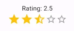
AnimatedRatingStars is a highly customizable animated rating bar widget for Flutter. It allows users to interactively provide ratings by tapping on stars. The package offers a wide range of customization options and is designed to be easy to integrate into your Flutter applications.
DEMO1 DEMO2 DEMO3
To use this package, add animated_rating_stars as a dependency in your pubspec.yaml file:
dependencies:
  animated_rating_stars: ^1.0.1
Then, run flutter pub get to fetch the package.
Import the package in your Dart code:
import 'package:animated_rating_stars/animated_rating_stars.dart';
Now, you can use the AnimatedRatingStars widget in your Flutter app:
AnimatedRatingStars(
  initialRating: 3.5,
  minRating: 0.0,
  maxRating: 5.0,
  filledColor: Colors.amber,
  emptyColor: Colors.grey,
  filledIcon: Icons.star,
  halfFilledIcon: Icons.star_half,
  emptyIcon: Icons.star_border,
  onChanged: (double rating) {
    // Handle the rating change here
    print('Rating: $rating');
  },
  displayRatingValue: true,
  interactiveTooltips: true,
  customFilledIcon: Icons.star,
  customHalfFilledIcon: Icons.star_half,
  customEmptyIcon: Icons.star_border,
  starSize: 30.0,
  animationDuration: Duration(milliseconds: 300),
  animationCurve: Curves.easeInOut,
  readOnly: false,
)
Customize the properties according to your requirements. The onChanged callback is called when the rating changes.
For more examples and usage details, refer to the examples directory included with this package.
You can customize the appearance and behavior of the rating bar using the following properties:
initialRating: The initial rating value.minRating: The minimum rating value.maxRating: The maximum rating value.filledColor: The color for filled stars.emptyColor: The color for empty stars.filledIcon: The icon used for filled stars.halfFilledIcon: The icon used for half-filled stars.emptyIcon: The icon used for empty stars.displayRatingValue: Show or hide the rating value.interactiveTooltips: Enable interactive tooltips for half-filled stars.customFilledIcon: Use a custom icon for filled stars.customHalfFilledIcon: Use a custom icon for half-filled stars.customEmptyIcon: Use a custom icon for empty stars.starSize: Set the size of each star.animationDuration: Adjust the duration of the animation when the rating changes.animationCurve: Define the animation curve for the rating change.readOnly: Make the widget read-only.Contributions and feedback are welcome! If you encounter any issues or have feature requests, please open an issue on GitHub.
This package is distributed under the MIT License. See LICENSE for details.
For more Flutter packages and development resources, visit pub.dev.