
 v4.1.0
titled_navigation_bar
클릭 시 부드러운 애니메이션을 갖춘 아름답고 깔끔하며 간단한 하단 탐색 바입니다. 이 패키지는 매우 사용자 정의가 가능하며, 자세한 내용은 아래를 참조하세요.
142좋아요 8030일 다운로드40Pub 점수
플랫폼 정보 없음
선택된 항목을 전환할 때 부드러운 애니메이션을 제공하는 아름답고 간단한 하단 탐색 바입니다.

{"sdk":"flutter"}{"sdk":"flutter"}아래는 영문 원문 스냅샷입니다. 최신 내용은 GitHub에서 확인하세요.
Pub Awesome Flutter
A beautiful, clean and simple bottom navigation bar with smooth animation on click. This package is high customizable, read more bellow for more details.
You can see the source code of this lib inside the /lib folder.
Default Mode Gif
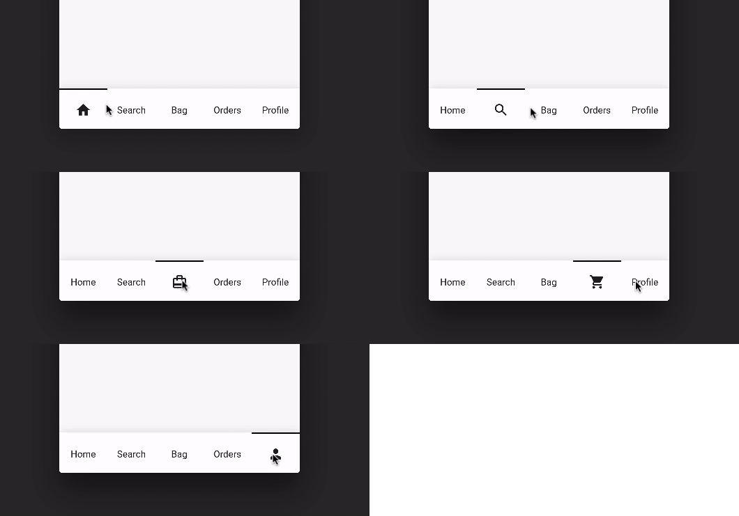
Reversed Mode Gif
Follow these steps to use this library
dependencies:
  ...
  titled_navigation_bar: ^5.0.0-nullsafety.0
import 'package:titled_navigation_bar/titled_navigation_bar.dart';
bottomNavigationBar: TitledBottomNavigationBar(
  currentIndex: 2, // Use this to update the Bar giving a position
  onTap: (index){
    print("Selected Index: $index");
  },
  items: [
      TitledNavigationBarItem(title: Text('Home'), icon: Icons.home),
      TitledNavigationBarItem(title: Text('Search'), icon: Icons.search),
      TitledNavigationBarItem(title: Text('Bag'), icon: Icons.card_travel),
      TitledNavigationBarItem(title: Text('Orders'), icon: Icons.shopping_cart),
      TitledNavigationBarItem(title: Text('Profile'), icon: Icons.person_outline),
  ]
)
onTap - Use this to get notified when an item is clicked, you can retrieve the current item's index on this function. Should not be null!
items - The items of your bottom navigation bar. Use the TitledNavigationBarItem class to add items. Should not be null!
curve - Use this to define your custom curve animation. Should not be null!
reverse - If true, the visible widget of the selected item will be the Text (with the title of the item). If false, the visible widget of the selected item will be the icon. Default to false
activeColor - The active Text/Icon color. The default color is the indicatorColor of your app Theme.
inactiveColor - The inactive Text/Icon color. The default is the black color.
indicatorColor - The indicator color. The default color is the indicatorColor of your app Theme.
currentIndex - Use this to update the Bar giving a position.
enableShadow - Use this to remove the NavigationBar's shadow
icon -The icon of this item. This will be used as default state if reverse mode is disabled
title - The title of this item. This will be used as default state if reverse mode is enabled