Flutter용 시각적으로 매력적이고 미니멀한 하단 탐색 바로 선택 시 부드럽고 애니메이션 효과가 있는 전환을 제공합니다. 매우 사용자 정의 가능하여 개발자가 앱 디자인에 맞게 외관과 동작을 조정할 수 있습니다. 깔끔한 미학과 직관적인 사용자 상호작용에 중점을 두어 현대적이고 세련된 인터페이스를 우선시하는 앱에 적합합니다. 간단한 pub 명령어로 쉽게 통합 가능하며 성능과 사용성에 주의를 기울여 유지보수됩니다.
사용 사례
세련된 하단 탭 네비게이션 바가 필요한 모바일 앱
사용자 정의 가능한 탐색 경험
시각적 완성도와 사용자 경험에 중점을 둔 앱
간단하지만 우아한 UI 컴포넌트
애니메이션 상태 변경이 있는 탐색 막대
주요 기능
부드러운 클릭 애니메이션
매우 사용자 정의 가능한 디자인
미니멀하고 깔끔한 미학
Flutter와의 간편한 통합
동적 레이블 스타일링 지원
적합한 대상
현대적인 네비게이션 UI를 찾는 Flutter 개발자
디자인 일관성을 강조하는 프로젝트
여러 탭 또는 섹션이 있는 앱
경량 네비게이션 솔루션을 원하는 개발자
디자인 중심의 모바일 애플리케이션
고려 사항
제한된 플랫폼별 사용자 정의
내장 아이콘 지원 없음(수동 설정 필요)
간단한 탐색 패턴에 가장 적합
복잡한 레이아웃을 위해 추가 스타일링이 필요할 수 있습니다
매우 큰 탐색 세트에 최적화되지 않음
원본 README
연결된 소스 저장소의 README 원문 스냅샷입니다. 최신 내용은 저장소에서 확인하세요.
Titled Bottom Navigation Bar
A beautiful, clean and simple bottom navigation bar with smooth animation on click. This package is high customizable, read more bellow for more details.
You can see the source code of this lib inside the /lib folder.
Show some :heart: and star the repo to support this project
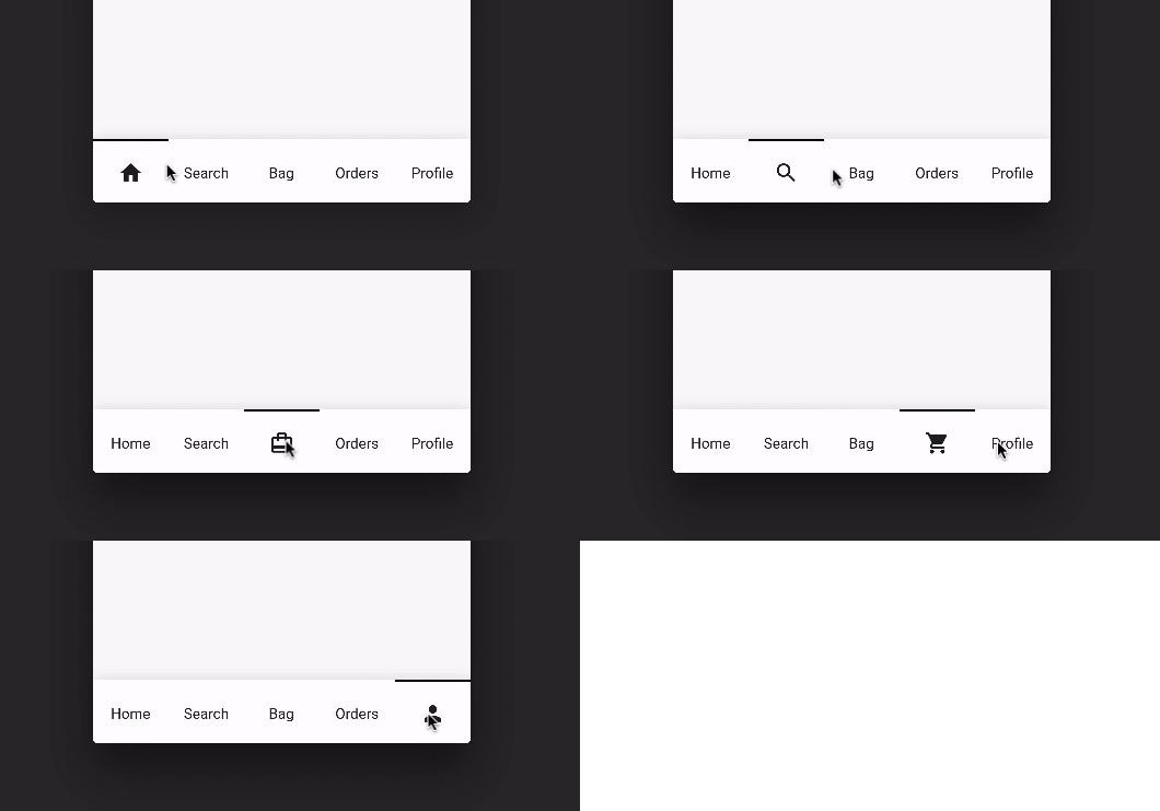
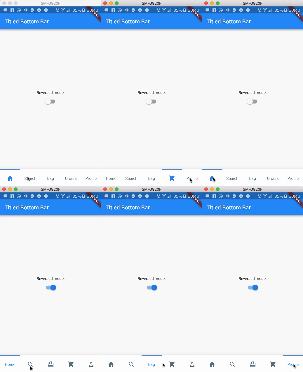
Preview (default mode)
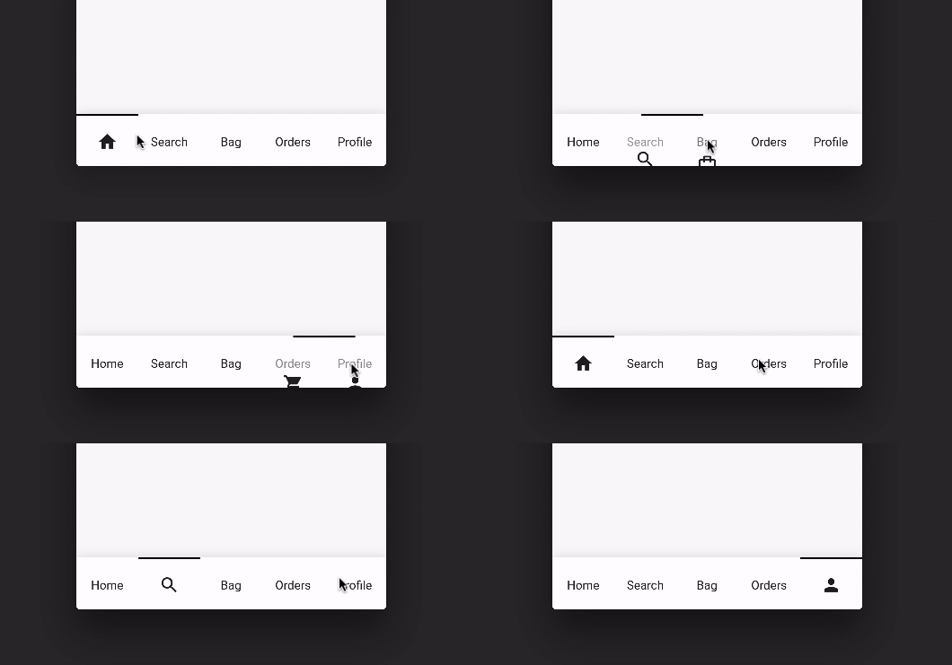
Preview (with reverse mode)
Package overview
[x] Custom icon color
[x] Custom indicator color
[x] Support from two to five items
[x] Reverse mode (show selected item as icon or title)
[x] Option to define custom item background color
[x] Use currentIndex property to update the Bar giving a tab position
[x] No need setState(...) to update the current index
[x] Support RTL TextDirection (thanks to Victor Uvarov)
bottomNavigationBar: TitledBottomNavigationBar(
  currentIndex: 2, // Use this to update the Bar giving a position
  onTap: (index){
    print("Selected Index: $index");
  },
  items: [
      TitledNavigationBarItem(title: Text('Home'), icon: Icons.home),
      TitledNavigationBarItem(title: Text('Search'), icon: Icons.search),
      TitledNavigationBarItem(title: Text('Bag'), icon: Icons.card_travel),
      TitledNavigationBarItem(title: Text('Orders'), icon: Icons.shopping_cart),
      TitledNavigationBarItem(title: Text('Profile'), icon: Icons.person_outline),
  ]
)
Customization (Optional)
TitledBottomNavigationBar
onTap - Use this to get notified when an item is clicked, you can retrieve the current item's index on this function. Should not be null! items - The items of your bottom navigation bar. Use the TitledNavigationBarItem class to add items. Should not be null! curve - Use this to define your custom curve animation. Should not be null! reverse - If true, the visible widget of the selected item will be the Text (with the title of the item). If false, the visible widget of the selected item will be the icon. Default to false activeColor - The active Text/Icon color. The default color is the indicatorColor of your app Theme. inactiveColor - The inactive Text/Icon color. The default is the black color. indicatorColor - The indicator color. The default color is the indicatorColor of your app Theme. currentIndex - Use this to update the Bar giving a position. enableShadow - Use this to remove the NavigationBar's shadow
TitledNavigationBarItem
icon -The icon of this item. This will be used as default state if reverse mode is disabled title - The title of this item. This will be used as default state if reverse mode is enabled