
 v0.0.13
rounded_expansion_tile
Flutter 애플리케이션용 간단한 ExpansionTile로 테두리 반경이 있습니다.
28좋아요 1.4천30일 다운로드135Pub 점수
AndroidiOSWebmacOSWindowsLinux
둥근 사각형이 있는 간단한 확장 타일

{"sdk":"flutter"}{"sdk":"flutter"}^1.0.0아래는 영문 원문 스냅샷입니다. 최신 내용은 GitHub에서 확인하세요.
A simple combination of widgets to provide an Expansiontile with rounded corners. This widget uses default Flutter widgets only and is available for each platform.
This Widget returns a column with a ListTile and a ListView. It has all properties of the ListTile width a few custom inputfield. Simply load the widget in your pubspec yaml and start using it.
autofocus
contentPadding
dense
enabled
enableFeedback
focusColor
focusNode
horizontalTitleGap
hoverColor
isThreeLine
key
leading
minLeadingWidth
minVerticalPadding
mouseCursor
onLongPress
selected
selectedTileColor
shape
subtitle
title
tileColor
trailing
visualDensity
onTap
initiallyExpanded
Shape()The shape will be used for the shape of the ListTile, not for the children. This is visible when pressed and will be shown in the ink splash.
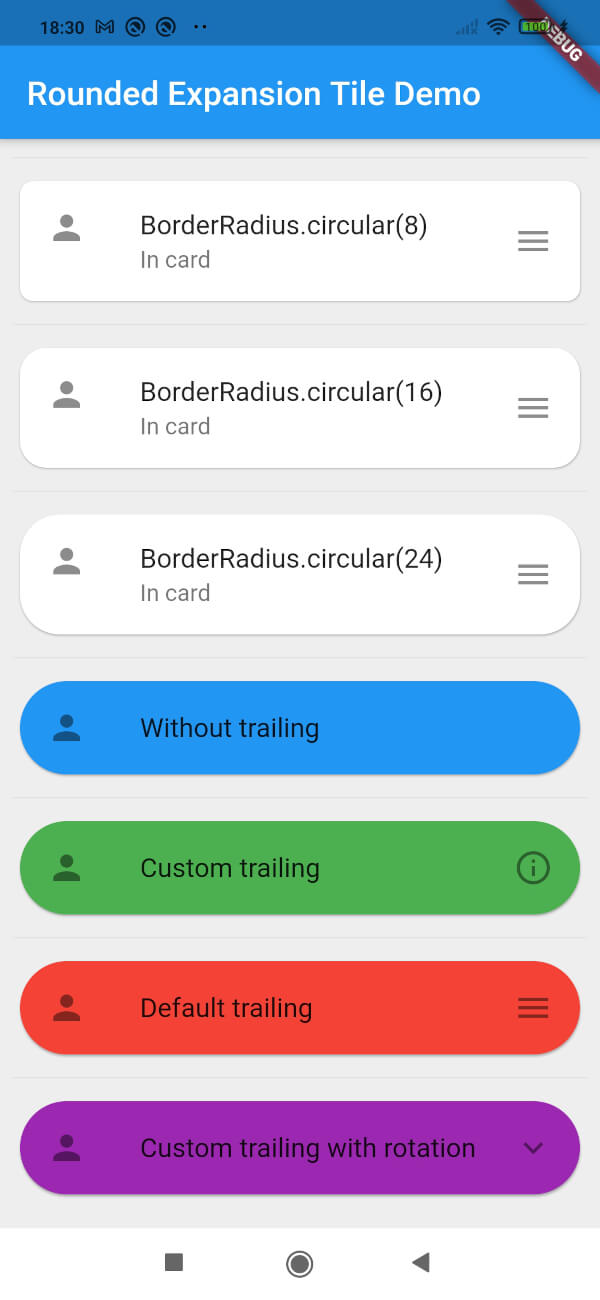
Use the RoundedExpansionTile in a Card-widget with the same shape for the best result.
Card(
    shape: RoundedRectangleBorder(borderRadius: BorderRadius.circular(16)),
    child: RoundedExpansionTile(
        shape: RoundedRectangleBorder(borderRadius: BorderRadius.circular(16)),
        title: Text('Some title'),
        children: [
            child1,
            child2,
            child3,
            ...
        ],
    ),
),
Duration()This will be used to show the expansion animation. It is used for the Expansion it self and the rotation / animation of the Icon. By default the duration is 500 milliseconds.
List<Widget>[]The children that will be displayd when the ListTile is expanded.
EdgeInsets()The padding around the children. This is not the same as the contentpadding.
Curve()The curve used for the children animation. By default it uses Curves.fastLinearToSlowEaseIn
Widget()When provided this will override the default hamburger menu icon (AnimatedIcon). This icon will rotate by default but can be set to false see rotateTrailing.
boolRotate the custom trailing icon when provided. By default this is true. When set to false the icon stays the same. Provide the trailing with an arrow down to make the widget look like the default ExpansionTile.
boolWhen set to true there will be no trailing at all. Even when provided custom trailing this bool will prevent it from being shown.
Screenshot of example app