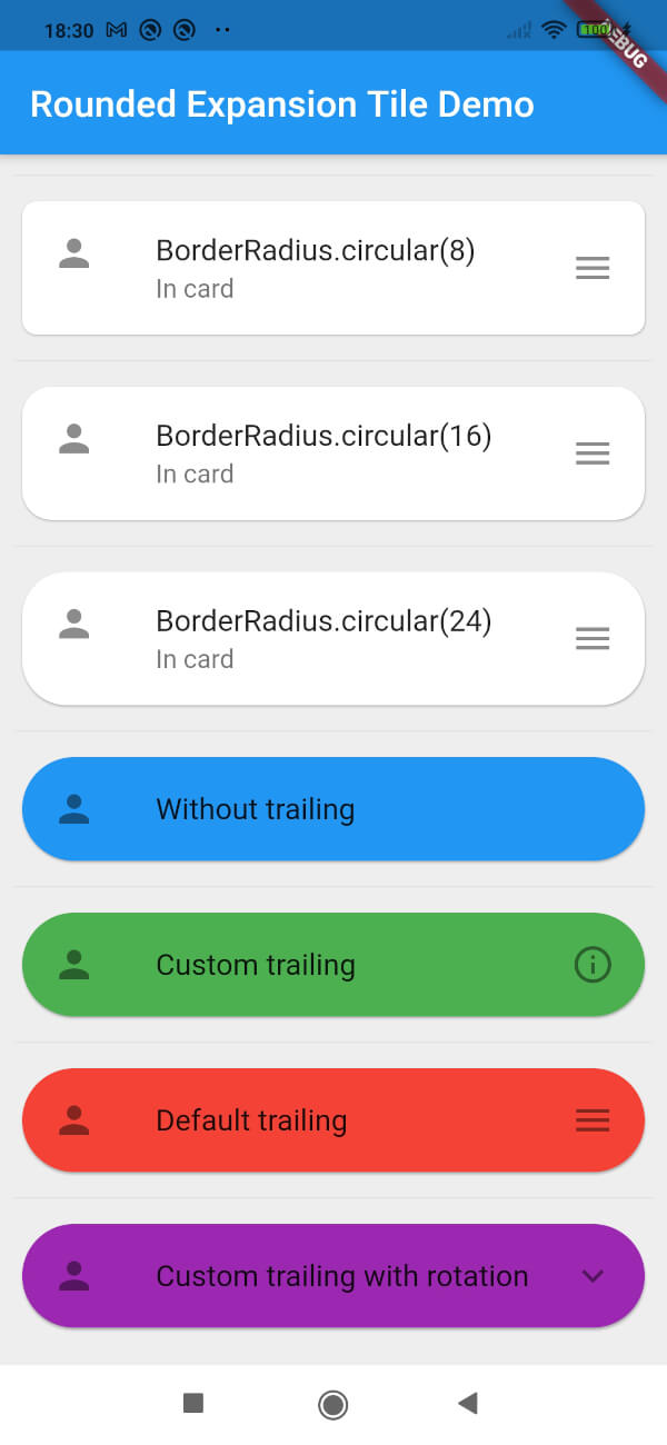
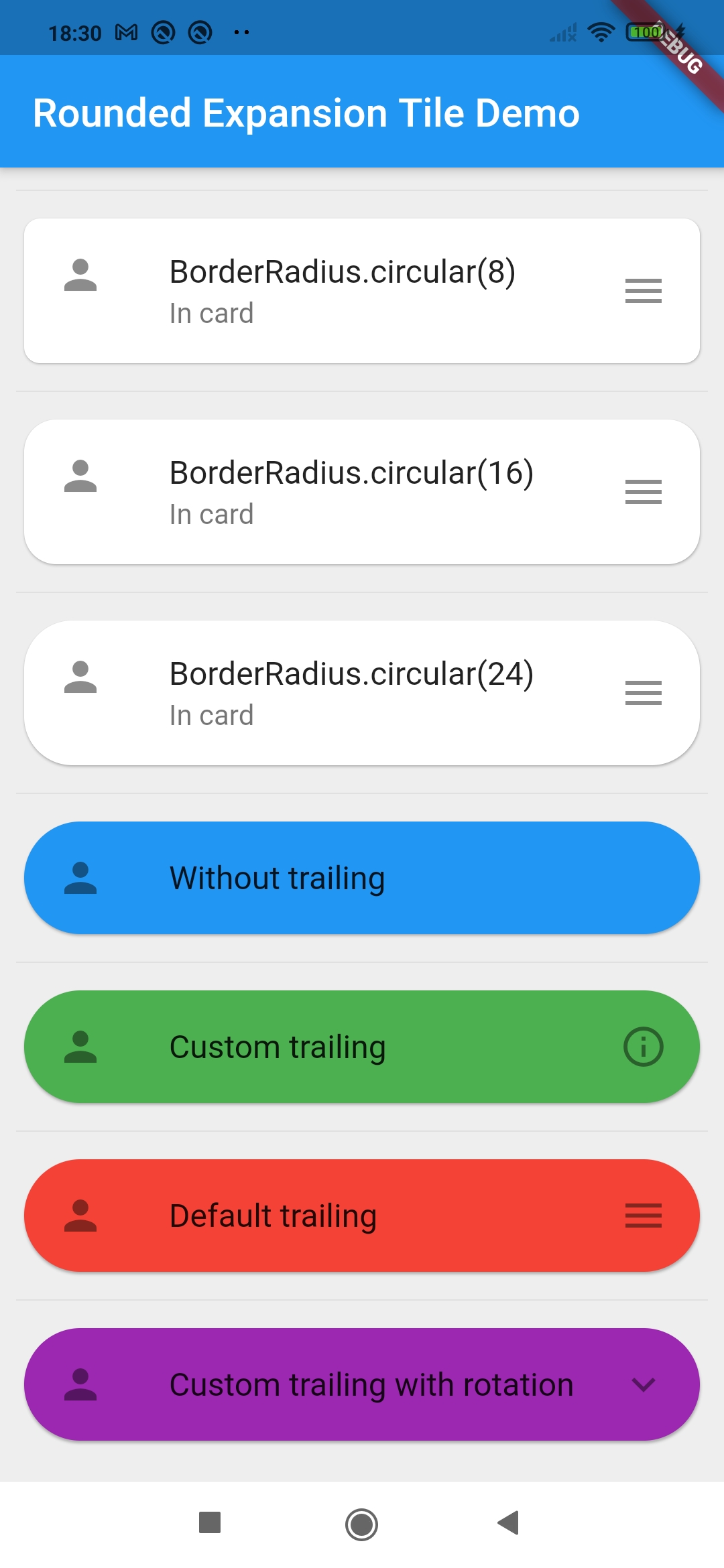
사용자 정의 가능한 테두리 반지름을 제공하는 개선된 ExpansionTile을 제공하는 플러터 패키지로, 접기 가능한 콘텐츠 섹션에 현대적이고 시각적으로 매력적인 디자인을 제공합니다. 간단함과 통합성을 위해 제작되었으며, 모든 플랫폼에서 표준 ExpansionTile에 둥근 모서리를 추가합니다. 모바일 및 웹 애플리케이션에서 깔끔하고 사용자 친화적인 인터페이스를 만들기에 적합합니다. 이 패키지는 가볍고 플러터의 핵심 위젯과 호환됩니다.
사용 사례
양식에서 스타일이 적용된 접을 수 있는 섹션 만들기
다시보드에서 반응형 애코디언 디자인하기
둥근 상호작용 요소를 통한 UI 일관성 향상
접근성 있는 탐색 패널 구축
전자상거래 앱에서 확장 가능한 제품 세부 정보 구현
주요 기능
사용자 정의 가능한 테두리 반지름
크로스 플랫폼 지원 (Android, iOS, Web, macOS, Windows, Linux)
기존 Flutter 프로젝트와의 간단한 통합
표준 ExpansionTile 확장
경량이며 최소한의 종속성
적합한 대상
정교한 UI 컴포넌트를 찾는 개발자
시각적 일관성에 중점을 둔 UI 디자이너
일관된 둥근 카드 유사 확장이 필요한 프로젝트
다중 플랫폼을 대상으로 하는 앱
Flutter 초보자가 위젯 사용자 정의 탐색 중
고려 사항
테두리 반지름 스타일링에만 제한
표준 ExpansionTile 외에 추가 애니메이션은 포함되어 있지 않습니다
필요한 경우 수동으로 콘텐츠 패딩을 처리해야 합니다
기본 설정 외에 내장된 아이콘 또는 제목 사용자 지정 기능 없음
복잡한 레이아웃 없이 간단한 확장 사용 사례에 가장 적합
원본 README
연결된 소스 저장소의 README 원문 스냅샷입니다. 최신 내용은 저장소에서 확인하세요.
Rounded Expansiontile
A simple combination of widgets to provide an Expansiontile with rounded corners.
This widget uses default Flutter widgets only and is available for each platform.
Getting Started
This Widget returns a column with a ListTile and a ListView. It has all properties of the ListTile width a few custom inputfield.
Simply load the widget in your pubspec yaml and start using it.
Inputfields
Default ListTile and ExpansionTile inputfields
autofocus
contentPadding
dense
enabled
enableFeedback
focusColor
focusNode
horizontalTitleGap
hoverColor
isThreeLine
key
leading
minLeadingWidth
minVerticalPadding
mouseCursor
onLongPress
selected
selectedTileColor
shape
subtitle
title
tileColor
trailing
visualDensity
onTap
initiallyExpanded
Extra inputfields and tips
shapeShape()
The shape will be used for the shape of the ListTile, not for the children. This is visible when pressed and will be shown in the ink splash.
Use the RoundedExpansionTile in a Card-widget with the same shape for the best result.
This will be used to show the expansion animation. It is used for the Expansion it self and the rotation / animation of the Icon. By default the duration is 500 milliseconds.
childrenList<Widget>[]
The children that will be displayd when the ListTile is expanded.
childrenPaddingEdgeInsets()
The padding around the children. This is not the same as the contentpadding.
curveCurve()
The curve used for the children animation. By default it uses Curves.fastLinearToSlowEaseIn
trailingWidget()
When provided this will override the default hamburger menu icon (AnimatedIcon). This icon will rotate by default but can be set to false see rotateTrailing.
rotateTrailingbool
Rotate the custom trailing icon when provided. By default this is true. When set to false the icon stays the same. Provide the trailing with an arrow down to make the widget look like the default ExpansionTile.
noTrailing bool
When set to true there will be no trailing at all. Even when provided custom trailing this bool will prevent it from being shown.