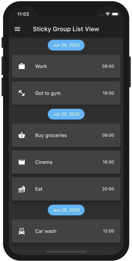
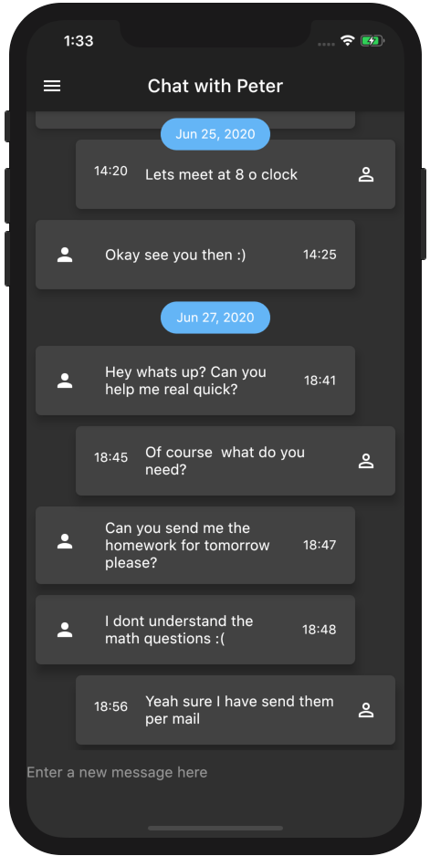
ScrollablePositionedList를 확장하여 그룹화된 목록 섹션과 스티키 헤더를 지원하는 플러터 패키지입니다. 사용자는 항목을 논리적인 그룹으로 정리할 수 있으며, 사용자가 콘텐츠를 스크롤할 때 섹션 헤더가 화면 상단에 고정됩니다. 연락처, 메시지 또는 제품 카탈로그와 같이 명확한 분류가 있는 긴 목록에 적합합니다. 이 패키지는 모든 주요 플랫폼을 지원하며 기존의 플러터 앱과 원활하게 통합됩니다.
사용 사례
알파벳 순으로 연락처 정리하기
날짜별로 채팅 메시지 표시
분류된 제품 목록 만들기
검색 가능한 디렉터리 만들기
그룹화된 작업 목록 구현
주요 기능
스티키 섹션 헤더
스크롤 가능한 그룹 항목 지원
크로스 플랫폼 호환성
ScrollablePositionedList과의 간편한 통합
사용자 지정 가능한 헤더 스타일
적합한 대상
분류된 데이터를 가진 앱
긴 스크롤 가능한 목록
섹션 탐색이 필요한 사용자 인터페이스
ScrollablePositionedList를 사용하는 개발자
반응형 그룹 헤더가 필요한 프로젝트
고려 사항
항목 키를 주의 깊게 다뤄야 합니다
매우 큰 데이터 세트에서는 성능에 영향을 줄 수 있습니다
헤더 동작은 스크롤 위치에 따라 달라집니다
제한된 내장 애니메이션
스크롤되지 않는 레이아웃에는 적합하지 않습니다
원본 README
연결된 소스 저장소의 README 원문 스냅샷입니다. 최신 내용은 저장소에서 확인하세요.
A ListView in which list items can be grouped to sections. Based on scrollable_positioned_list, which enables programatically scrolling of the list.
Features
Easy creation of chat-like interfaces.
List items can be separated in groups.
For the groups an individual header can be set.
Sticky headers with floating option.
All fields from ScrollablePositionedList available.
By using a pre defined element identifier. The identifier is defined by a Function which takes one element and returns a unique identifier of any type.
The methods scrollToElement and jumpToElement can be used to jump to an element by providing the elements identifier instead of the index:
A list of the data you want to display in the list
required
-
itemBuilder / indexedItemBuilder
Function which returns an Widget which defines the item. indexedItemBuilder provides the current index as well. If both are defined indexedItemBuilder is preferred
yes, either of them
-
groupBy
Function which maps an element to its grouped value
required
-
groupSeparatorBuilder
Function which gets a element and returns an Widget which defines the group header separator
required
-
separator
A Widget which defines a separator between items inside a group
no
no separator
floatingHeader
When set to true the sticky header will float over the list
no
false
stickyHeaderBackgroundColor
Defines the background color of the sticky header
no
Color(0xffF7F7F7)
itemScrollController
Instead of an ItemScrollController a GroupedItemScrollController needs to be provided.
no
-
elementIdentifier
Used by itemScrollController and defines the unique identifier for each element.
no
-
order
Change to StickyGroupedListOrder.DESC to reverse the group sorting
no
StickyGroupedListOrder.ASC
groupComparator
Can be used to define a custom sorting for the groups. Otherwise the natural sorting order is used
no
-
itemComparator
Can be used to define a custom sorting for the elements inside each group. Otherwise the natural sorting order is used
no
-
reverse
Scrolls in opposite from reading direction (Starting at bottom and scrolling up). Same as in scrollable_positioned_list.
no
false
GroupedItemScrollController.srollTo() and GroupedItemScrollController.jumpTo() automatic set the alignment so that the item is fully visible aligned under the group header. Both methods take automaticAlignment as a additional optional paramenter which needs to be set to true if alignment is specified.
Also the fields from ScrollablePositionedList.builder can be used.
Highlight - Chat Dialog
Easy creation of chat-like dialogs.
Just set the option reverse to true and the option order to StickyGroupedListOrder.DESC. A full example can be found in the examples.
The list will be scrolled to the end in the initial state and therefore scrolling will be against redeaing direction.
Difference between grouped_list and sticky_grouped_list:
TThe list views in the GroupedList package are based on the default flutter listview and the silver list. This package is based on the scrollable_positioned_list which enables the possibility to programatically scroll to certain positions in the list. So if you need the ability to programatically scroll the list use the this package otherwise I would recommend to use the GroupedList package.