
 v0.0.1
card_actions
Potencialize seus cartões com ações personalizadas e melhorias usando nosso pacote Flutter.
72Curtidas 599Downloads em 30 dias150Pontos Pub
AndroidiOSWebmacOSWindowsLinux
Potencialize seus cartões com ações personalizadas e melhorias usando nosso pacote Flutter.

{"sdk":"flutter"}^6.0.5^2.0.0{"sdk":"flutter"}Texto original em inglês. Visite o GitHub para a versão atual.
https://raw.githubusercontent.com/AbianS/card_actions/HEAD/example/screenshots/logo.gif
To use this card actions package, you need to add the dependencies in pubspec.yaml file.
dependencies:
    card_actions: ^0.0.1
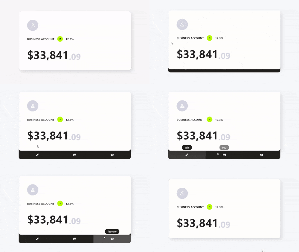
To use card actions is very simple, just wrap your card with our CardActions widget,
CardActions(
    ...
    child: YourCard() // here would be your card
)
CardActions needs the parameters width, height and actions
width is the width of the widgetheight is the height of the widgetactions is a list of CardActionButton.CardActions(
width: //your card width
height: // your card height
actions: <CardActionButton>[
CardActionButton(
icon: Icon(
Icons.edit,
color: Colors.white,
), // Icon
label: 'edit',
onPress: () {},
), // CardActionButton
]
child: yourCard(), // here would be your card
)
https://raw.githubusercontent.com/AbianS/card_actions/HEAD/example/screenshots/first.gif
You can add more buttons if you prefer
...
actions: [
    CardActionButton(
        icon: Icon(
            Icons.edit,
            color: Colors.white,
        ),
        label: 'edit',
        onPress: () {},
    ),
    CardActionButton(
        icon: Icon(
            Icons.payment_rounded,
            color: Colors.white,
        ),
        label: 'Pay',
        onPress: () {},
    ),
    CardActionButton(
        icon: Icon(
            Icons.remove_red_eye_sharp,
            color: Colors.white,
        ),
        label: 'Preview',
        onPress: () {},
    ),
]
https://raw.githubusercontent.com/AbianS/card_actions/HEAD/example/screenshots/second.gif
If you want to change the direction of the hover, you can use the axisDirection property of the CardAction to change it.
the axisDirection property receives a enum of type CardActionAxis at the moment we only have bottom and right.
| CardActionAxis.bottom | CardActionAxis.right |
|---|---|
| https://raw.githubusercontent.com/AbianS/card_actions/HEAD/example/screenshots/second.gif | https://raw.githubusercontent.com/AbianS/card_actions/HEAD/example/screenshots/horizontal.gif |
https://raw.githubusercontent.com/AbianS/card_actions/HEAD/example/screenshots/counter.gif
To make this example, we will need to configure more things, but it will be very simple, the first thing is that we change the background color for it we have to use the property backgroundColor then an important part is that we change the design of the cursor when it is on top of the buttons and this we can do it in two ways:
In the CardAction we have the buttonsCursor property that serves to change the cursor to ALL the buttons.
In the CardActionButton we have the cursor property to change the cursor to that specific button.
Important. If you use both options at the same time the button will prioritize its own
cursorsetting over the global setting withbuttonsCursor.
and finally we add the necessary functions to the buttons by means of its onPress method.
...
actions: [
    CardActionButton(
        icon: Icon(
            Icons.add,
            color: Colors.white,
            size: 30,
        ),
        label: 'Increment',
        onPress: increment // method to increase the counter,
    ),
    CardActionButton(
        icon: Icon(
            Icons.restore_sharp,
            color: Colors.white,
            size: 30,
        ),
        label: 'Reset',
        onPress: () {
            // reset the counter
            setState(() {
            counter = 0;
            });
        },
    ),
    CardActionButton(
        icon: Icon(
            Icons.remove,
            color: Colors.white,
            size: 30,
        ),
        label: 'Decrement',
        onPress: decrement // method for decrementing the counter
    ),
]
| Property | Type | Default | Description |
|---|---|---|---|
| width | double | required | widget width |
| height | double | required | widget height |
| cardCursor | MouseCursor | SystemMouseCursors.basic | the type of cursor displayed when hovering on the card |
| buttonsCursor | MouseCursor | SystemMouseCursors.basic | the type of cursor displayed when hovering over buttons |
| borderRadius | double | 0 | rounded card edges |
| showToolTip | bool | true | Show/Hide toolTips |
| axisDirection | CardActionAxis | CardActionAxis.bottom | CardActions Axis Direction |
| splashColor | Color | Colors.white24 | Splash color when hovering |
| backgroundColor | Color | Color(0xff242120) | Background color |
| closeCardWhenExecuteFunction | bool | false | close the card when you press a button |
| Property | Type | Default | Description |
|---|---|---|---|
| icon | Icon | required | Button icon |
| label | String | required | text to be displayed in the Tool Tip |
| onPress | VoidCallback | required | callback to be executed when you press the button |
| closeCardWhenPress | bool | false | when you press the button, the card closes. |
| cursor | MouseCursor? | null | Cursor displayed when hovering on the button |