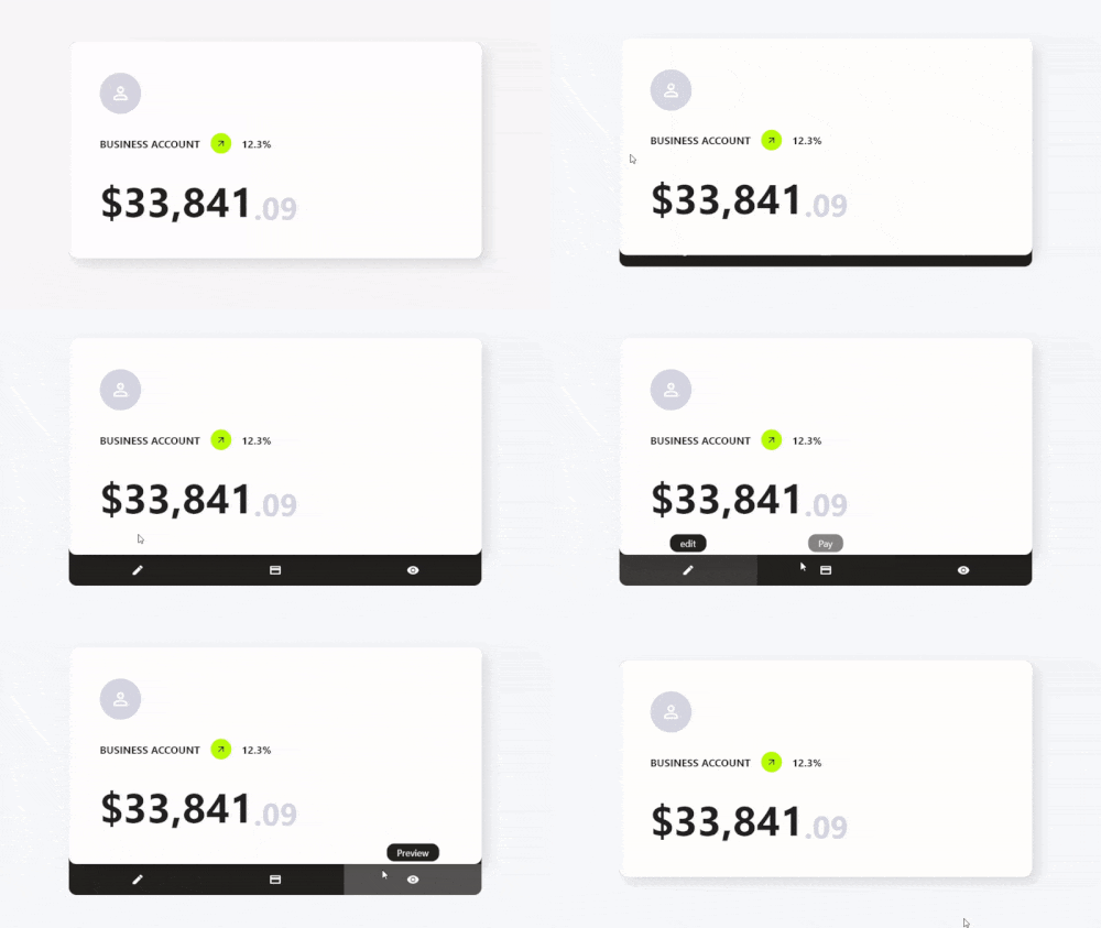
Orientação gerada a partir de informações públicas. Apenas para referência.
Card Actions é um pacote Flutter que aprimora widgets de cartão com ações personalizáveis e recursos interativos. Permite aos desenvolvedores adicionar gestos de deslize, interações com toque e mudanças dinâmicas no conteúdo aos cartões, melhorando o engajamento do usuário. Projetado para uso em listas, painéis ou interfaces baseadas em cartões, suporta múltiplas plataformas, incluindo Android, iOS, Web, macOS, Windows e Linux. O pacote se integra sem problemas a projetos Flutter existentes por meio de um simples comando pub add. Sua arquitetura leve foca em desempenho e facilidade de uso, tornando-o ideal para interfaces modernas e responsivas baseadas em cartões.
Casos de uso
Deslizes de cartão interativos
Atualizações dinâmicas de conteúdo do cartão
interações de cartão acionadas por gestos
Painéis baseados em cartões
Feedback do usuário por meio de ações de cartão
Melhorias de cartão multiplataforma
Principais recursos
Suporte a ação por deslize
Respostas personalizáveis a toques e gestos
Leve e performático
Compatibilidade multiplataforma
Integração fácil com o Flutter
Manipuladores de ação extensíveis
Indicado para
Desenvolvedores construindo interfaces com muitos cartões
Aplicativos que exigem elementos de cartão interativos
Aplicativos móveis e web multiplataforma
Sistemas de design com componentes de cartão reutilizáveis
Prototipagem de layouts interativos
Considerações
Requer entendimento do sistema de gestos do Flutter
Pode ser necessário estilização adicional para interações complexas
Mais adequado para comportamentos simples a moderadamente complexos de cartão
Não destinado à navegação em tela cheia
Limitado a interações de nível de cartão
README original
Snapshot do README original do repositório-fonte vinculado. Consulte o repositório para o conteúdo mais recente.
Features
✨ Simple Use
⚙️ Great Customization
🌍 Expand the functionality of your cards
🛑 Not use for mobile devices, will soon be available for use on those platforms.
Getting Started
To use this card actions package, you need to add the dependencies in pubspec.yaml file.
dependencies:card_actions:^0.0.1
Use
To use card actions is very simple, just wrap your card with our CardActions widget,
CardActions(
    ...
    child: YourCard() // here would be your card
)
Basic Setup
CardActions needs the parameters width, height and actions
width is the width of the widget
height is the height of the widget
actions is a list of CardActionButton.
CardActions(
    width: //your card width
    height: // your card height
    actions: <CardActionButton>[
        CardActionButton(
            icon: Icon(
                Icons.edit,
                color: Colors.white,
            ), // Icon
            label: 'edit',
            onPress: () {},
        ), // CardActionButton
    ]
    child: yourCard(), // here would be your card
)
If you want to change the direction of the hover, you can use the axisDirection property of the CardAction to change it.
the axisDirection property receives a enum of type CardActionAxis at the moment we only have bottom and right.
CardActionAxis.bottom
CardActionAxis.right
Example
To make this example, we will need to configure more things, but it will be very simple, the first thing is that we change the background color for it we have to use the property backgroundColor then an important part is that we change the design of the cursor when it is on top of the buttons and this we can do it in two ways:
In the CardAction we have the buttonsCursor property that serves to change the cursor to ALL the buttons.
In the CardActionButton we have the cursor property to change the cursor to that specific button.
Important.
If you use both options at the same time the button will prioritize its own cursor setting over the global setting with buttonsCursor.
and finally we add the necessary functions to the buttons by means of its onPress method.