
Arborio
Uma árvore elegante e flexível com animação. Exiba dados hierárquicos no Flutter.

- Estrelas
- 14
- Forks
- 4
- Último push (UTC)
- 15 de dez. de 2024
- Status do projeto
- Ativo
README original
Texto original em inglês. Visite o GitHub para a versão atual.
Arborio


An elegant, flexible Treeview with Animation. Display hierarchical data in Flutter.

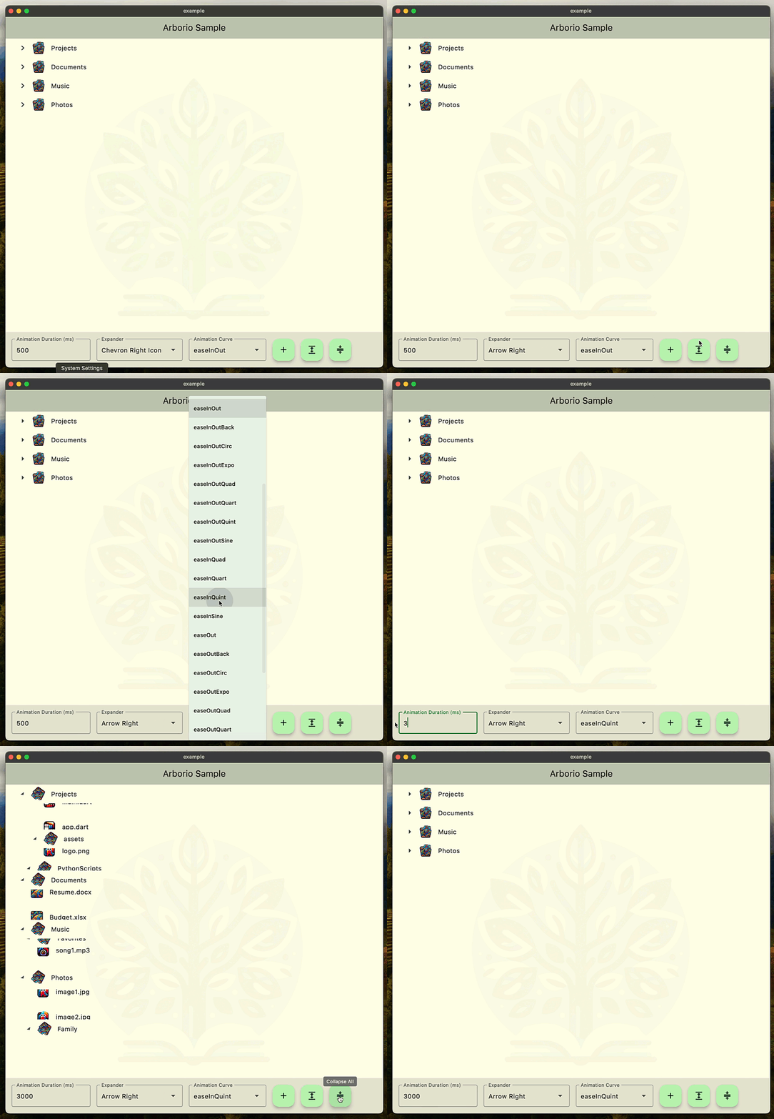
Check out the live sample app here
Features
- 🌳 Hierarchical data display with unlimited nesting
- ✨ Smooth animations for expand/collapse operations
- 🎨 Fully customizable node and expander appearance
- 🔑 Global key support for programmatic control
- 🎯 Type-safe with generics support
- 📱 Responsive and mobile-friendly
Basic Usage
Here's a simple example of how to create a tree view:
import 'package:arborio/tree_view.dart';
import 'package:flutter/material.dart';

enum ElementType { file, folder }

// Define your data type
class FileSystemElement {
  FileSystemElement(this.name, this.type);
  final String name;
  final ElementType type;
}

// Create tree nodes
final nodes = [
  TreeNode<FileSystemElement>(
    const Key('root'),
    FileSystemElement('Documents', ElementType.folder),
    [
      TreeNode<FileSystemElement>(
        const Key('child1'),
        FileSystemElement('report.pdf', ElementType.file),
      ),
    ],
  ),
];

void main() {
  runApp(const MyApp());
}

class MyApp extends StatelessWidget {
  const MyApp({super.key});

  @override
  Widget build(BuildContext context) => MaterialApp(
        home: Scaffold(
          body: TreeView<FileSystemElement>(
            nodes: nodes,
            builder: (context, node, isSelected, animation, select) => Row(
              children: [
                Icon(
                  node.data.type == ElementType.folder
                      ? Icons.folder
                      : Icons.file_copy,
                ),
                Text(node.data.name),
              ],
            ),
            expanderBuilder: (context, isExpanded, animation) =>
                RotationTransition(
              turns: animation,
              child: const Icon(Icons.chevron_right),
            ),
          ),
        ),
        debugShowCheckedModeBanner: false,
      );
}
Using TreeViewKey
The TreeViewKey allows programmatic control of the tree view:
// Create a key
const treeViewKey = TreeViewKey<FileSystemElement>();

// Use it in your TreeView
TreeView<FileSystemElement>(
  key: treeViewKey,
  nodes: nodes,
  builder: (context, node, isSelected, animation, select) {
    // ... node builder implementation
  },
  expanderBuilder: (context, isExpanded, animation) {
    return RotationTransition(
      turns: animation,
      child: const Icon(Icons.chevron_right),
    );
  },
)
Node Management
You can dynamically add or remove nodes using the tree's state. This example uses mutable state for simplicitly, but you can achieve the same result with immutable data classes.
// Add a new node
FloatingActionButton(
  onPressed: () => setState(() {
    nodes.add(
      TreeNode(
        const Key('newnode'),
        FileSystemElement('New Folder', ElementType.folder),
      ),
    );
  }),
  child: const Icon(Icons.add),
),

// Expand/collapse all nodes
FloatingActionButton(
  onPressed: () => setState(() {
    treeViewKey.currentState?.expandAll();
  }),
  child: const Icon(Icons.expand),
),

FloatingActionButton(
  onPressed: () => setState(() {
    treeViewKey.currentState?.collapseAll();
  }),
  child: const Icon(Icons.compress),
),
Handling Node Events
TreeView<FileSystemElement>(
  onExpansionChanged: (node, expanded) {
    print('Node ${node.data.name} is now ${expanded ? 'expanded' : 'collapsed'}');
  },
  onSelectionChanged: (node) {
    print('Selected node: ${node.data.name}');
  },
  expanderBuilder: (context, isExpanded, animation) {
    return RotationTransition(
      turns: animation,
      child: const Icon(Icons.chevron_right),
    );
  },
)
Customizing Node Appearance
The builder parameter gives you full control over node appearance, along with an animation variable so you can respond to changes over time:
builder: (context, node, isSelected, animation, select) {
  return InkWell(
    onTap: () => select(node),
    child: Container(
      color: isSelected ? Colors.blue.withOpacity(0.1) : null,
      padding: const EdgeInsets.all(8),
      child: Row(
        children: [
          if (node.data.type == ElementType.folder)
            RotationTransition(
              turns: animation,
              child: const Icon(Icons.folder),
            )
          else
            const Icon(Icons.file_copy),
          const SizedBox(width: 8),
          Text(node.data.name),
        ],
      ),
    ),
  );
}
Contributing
Contributions are welcome! Please feel free to submit a Pull Request.
License
This project is licensed under the BSD 3-Clause - see the LICENSE file for details.

Christian Findlay ↗
Categorias
Dependências usadas
Lista de dependências 6 itens
- cupertino_icons
^1.0.2 - flutter
{"sdk":"flutter"} - arborio_sampleDesenvolvimento
{"path":"example"} - austerityDesenvolvimento
^1.1.0 - flutter_lintsDesenvolvimento
^2.0.0 - flutter_testDesenvolvimento
{"sdk":"flutter"}
Como escolher um repositório para seu projeto?
Filtre pelo caso de uso, compare a atividade e confira o projeto original antes de adotá-lo.
- Busque por nome, autor ou descrição e filtre por tema.
- Compare estrelas, forks e envios recentes. Estrelas indicam interesse, mas não garantem qualidade.
- Confira o README, a licença e as issues no GitHub antes de usar o projeto.
Fontes e manutenção
“A repository is the most basic element of GitHub.”
GitHub Docs — About repositories ↗