
 v0.3.0
simple_fontellico_progress_dialog
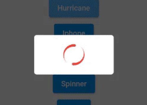
Este pacote ajuda você a renderizar um diálogo de progresso com diferentes tipos de indicador de carregamento.
60Curtidas 880Downloads em 30 dias150Pontos Pub
AndroidiOSWebmacOSWindowsLinux
Projeto Flutter para exibir um pequeno diálogo modal com um indicador de carregamento e texto.

{"sdk":"flutter"}{"sdk":"flutter"}Texto original em inglês. Visite o GitHub para a versão atual.
This package helps to render a progress dialog window with different types of loading indicator.
Include simple_fontellico_progress_dialog in your pubspec.yaml file:
dependencies:
  flutter:
    sdk: flutter
  simple_fontellico_progress_dialog: version
To use this package, just import it into your file, create a new instance, pass the context as parameter(required).
import 'package:simple_fontellico_progress_dialog/simple_fontico_loading.dart';

...

SimpleFontelicoProgressDialog _dialog = SimpleFontelicoProgressDialog(context: context);
...

void showDialog() async{
  _dialog.show(message: 'Loading...', type: type);
  await Future.delayed(Duration(seconds: 1));
  _dialog.hide();
}

...
| Name | Description | Required | Default |
|---|---|---|---|
| context | Buildcontext to render the dialog | True | |
| barrierDimisable | Boolean value to indicate barrierDimisable on dialog | True |
To show a dialog, use the show method, to hide it, use the hide method. Simple like that.
| Name | Description | Required | Default |
|---|---|---|---|
| message | String to set a message into the dialog | True | |
| type | Simple dialog type (normal, threeline, multiline, refresh, hurricane, phoenix, iphone) | False | normal |
| width | Double value to set the dialog width | False | 100 |
| height | Double value to set the dialog height | False | 120 |
| elevation | Double value to set the dialog elevation | False | 5.0 |
| radius | Double value to set the dialog border radius | False | 5.0 |
| backgroundColor | Color value to set the dialog background color | False | Colors.white |
| indicatorColor | Color value to set the indicator color | False | Colors.blue[600] |
| duration | Duration value to animate loading indicator | False | 1000 miliseconds |
| horizontal | Boolean value to set if loading has to show on horizontal | False | false |
| separation | Double value to set the separation between loading and text | False | 10.0 |
| textStyle | Style to customize the text inside dialog | False | TextStyle(fontSize: 14) |
| textAlign | Alignment of the message | False | TextAlign.center |
| hideText | Boolean value to hide the text widget | False | false |
| loadingIndicator | Widget to use when type is set on custom. | False (Required when type is custom) |
| Name | Description | Required | Default |
|---|---|---|---|
| message | String to update the message inside an opened dialgo | True |