Buscar pacotes, repositórios e categorias de apps

Repositório GitHubartembark/simple_progress_indicators

simple_progress_indicators

Pacote Flutter de indicadores de progresso simples com cores sólidas e gradientes. Pode ser usado para mostrar progresso ou para animações simples.

Capa do projeto simple_progress_indicators
Estrelas
5
Forks
2
Último push (UTC)
1 de mai. de 2023
Status do projeto
Ativo

README original

Texto original em inglês. Visite o GitHub para a versão atual.

Simple progress indicators package with solid colors and gradients. Can be used to show progress or for simple progress bar animation.

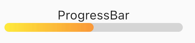
How it looks

Table of contents

Usage

Linear Progress indicator

ProgressBar

ProgressBar is a basic linear indicator widget. It's a Stateless Widget that produces basic horizontal rounded rectangle with optional background rounded rectangle underneath. Include it in your build method like:

  @override
  Widget build(BuildContext context) {
    return const MaterialApp(
      home: Scaffold(
        body: Center(
          child: ProgressBar(
            value: 0.5,
            //specify only one: color or gradient
            //color:Colors.red,
            gradient: LinearGradient(
              begin: Alignment.topLeft,
              end: Alignment.bottomRight,
              colors: [Colors.yellowAccent, Colors.deepOrange],
            ),
          ),
        ),
      ),
    );
  }

It has several configurable parameters:

  • value - current indicator value, where 0.0 is 0% progress, 1.0 is 100% progress
  • width - indicator width, defaults to 200.0
  • height - indicator height, defaults to 10.0
  • color - solid indicator fill color
  • gradient - gradient fill, accepts Gradient class
  • backgroundColor - solid indicator background color, defaults to transparent

Minimum working widget requires only a value and color OR gradient property. NOTE: Specifying both properties is not accepted.

ProgressBarAnimation

ProgressBarAnimation is a simple animating progress bar widget. It animates ProgressBar widget for a given duration. Animation starts at the time the widget is built.

It has several configurable parameters:

  • duration - 0% to 100% animation duration
  • width - indicator width, defaults to 200.0
  • height - indicator height, defaults to 10.0
  • color - solid indicator fill color
  • gradient - gradient fill, accepts Gradient class
  • backgroundColor - solid indicator background color, defaults to transparent
  • curve - animation curve, defaults to linear. For other curves check Curves
ProgressBarAnimation(  
  duration: const Duration(seconds: 2),  
  gradient: const LinearGradient(  
    colors: [  
      Colors.blue,  
      Colors.purple,  
    ],  
  ),  
  backgroundColor: Colors.grey.withOpacity(0.4),  
),
AnimatedProgressBar

AnimatedProgressBar is a ImplicitlyAnimatedWidget. It behaves like other flutter AnimatedFoo widgets. This animates value parameter changes for a given duration. Animation starts only when one (initial) value changes to other (final) value. See the example below.

It has several configurable parameters:

  • value - value widget animates to, need to be changed
  • duration - initial value to final value animation duration
  • width - indicator width, defaults to 200.0
  • height - indicator height, defaults to 10.0
  • color - solid indicator fill color
  • gradient - gradient fill, accepts Gradient class
  • backgroundColor - solid indicator background color, defaults to transparent
  • curve - animation curve, defaults to linear. For other curves check Curves
  • onEnd - callback to trigger additional actions (e.g. another animation) at the end of the current animation
AnimatedProgressBar(  
  value: full ? 1.0 : 0.0,  
  duration: const Duration(seconds: 3),  
  gradient: const LinearGradient(  
    colors: [  
      Colors.amber,  
      Colors.red,  
    ],  
  ),  
  backgroundColor: Colors.grey.withOpacity(0.4),  
),

For full demo check examples folder.

Animation demo

Additional information

For issues and animation ideas visit issues section on github homepage.

Artem Barkalov GitHub avatar
Autor no GitHub

Artem Barkalov ↗

LinguagensDartHTMLSwiftKotlinObjective-C

Pacotes publicados por este repositório

Dependências usadas

Lista de dependências 3 itens

  • flutter{"sdk":"flutter"}
  • flutter_testDesenvolvimento{"sdk":"flutter"}
  • flutter_lintsDesenvolvimento^2.0.1

Como escolher um repositório para seu projeto?

Filtre pelo caso de uso, compare a atividade e confira o projeto original antes de adotá-lo.

  1. Busque por nome, autor ou descrição e filtre por tema.
  2. Compare estrelas, forks e envios recentes. Estrelas indicam interesse, mas não garantem qualidade.
  3. Confira o README, a licença e as issues no GitHub antes de usar o projeto.

Fontes e manutenção

“A repository is the most basic element of GitHub.”

GitHub Docs — About repositories ↗