

 v1.0.2
create_date_picker
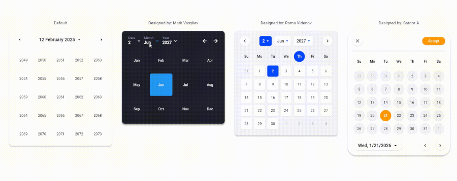
Seletor de data 99% personalizável
7Curtidas 193Downloads em 30 dias150Pontos Pub
AndroidiOSWebmacOSWindowsLinux
ccprogrammer/create-date-picker open-source repository details.

Texto original em inglês. Visite o GitHub para a versão atual.
The CreateDatePicker package enables you to create a fully customizable date picker. You can create your own component without worrying about the functionality and place it anywhere to match your design

To integrate the package into your Flutter application is very easy, you just need to add the Widget and customize every component and place it anywhere with the builder property:
    CreateDatePicker(
            width: 450,
            initialViewState: ViewState.date,
            initialDate: DateTime(2027, 6, 2),
            minDateTime: DateTime(2024, 5, 1),
            maxDateTime: DateTime(2029, 5, 1),
            restrictedDates: restrictedDates,
            weekLabels: weekLabels,
            monthLabels: monthLabels,
            leftArrowBuilder: _leftArrowBuilder,
            rightArrowBuilder: _rightArrowBuilder,
            dateViewButtonBuilder: _dateViewButtonBuilder,
            monthViewButtonBuilder: _monthViewButtonBuilder,
            yearViewButtonBuilder: _yearViewButtonBuilder,
            weekdayCellBuilder: _weekdayCellBuilder,
            dateCellBuilder: _dateCellBuilder,
            monthCellBuilder: _monthCellBuilder,
            yearCellBuilder: _yearCellBuilder,
            onViewStateChanged: _changeViewState,
            onSelectedDateChanged: _onSelectedDateChanged,
            builder: _createDatePickerBuilder,
        ),
NOTE: To place all the component together and anywhere, use builder property.
CreateDatePickerinitialViewState: The initial view state of the picker (date, month, or year).
initialDate: The initially selected date.
minDateTime: The minimum selectable date.
maxDateTime: The maximum selectable date.
restrictedDates: A list of dates that cannot be selected.
weekLabels: Labels for the days of the week (e.g., Sunday, Monday). Must contain exactly 7 items.
monthLabels: Labels for the months of the year (e.g., January, February). Must contain exactly 12 items.
width: The width of the picker.
elevation: Sets the default elevation of the date picker.
popupMenuOffset: Offset for the popup menu.
popupMenuPosition: Position of the popup menu (above or below the trigger).
builder: Custom builder for the entire picker. Allows placing and customizing components using individual builders.
leftArrowBuilder: Custom builder for the left navigation arrow.
rightArrowBuilder: Custom builder for the right navigation arrow.
popupSelectedDateBuilder: Custom builder for the popup displaying the selected date.
dateViewButtonBuilder: Custom builder for the button to switch to the date view.
monthViewButtonBuilder: Custom builder for the button to switch to the month view.
yearViewButtonBuilder: Custom builder for the button to switch to the year view.
weekdayCellBuilder: Custom builder for the weekday cells.
dateCellBuilder: Custom builder for the date cells.
monthCellBuilder: Custom builder for the month cells.
yearCellBuilder: Custom builder for the year cells.
onViewStateChanged: Callback triggered when the view state changes.
onSelectedDateChanged: Callback triggered when the selected date changes.
Currently, the package is only for a single datetime picker. Support for multiple pickers will be coming soon.
Contributions are welcome! Please open an issue or submit a pull request if you have any improvements or bug fixes.
This project is licensed under the MIT License. See the LICENSE file for details.
If you find this package helpful and want to support its development, consider making a donation. Thank you for your support!

Lista de dependências 3 itens
{"sdk":"flutter"}{"sdk":"flutter"}^5.0.0Filtre pelo caso de uso, compare a atividade e confira o projeto original antes de adotá-lo.
“A repository is the most basic element of GitHub.”
GitHub Docs — About repositories ↗