

 v2.0.1+1
outline_gradient_button
O pacote OutlineGradientButton foi desenvolvido para criar botões com contorno em gradiente.
97Curtidas 22Downloads em 30 dias150Pontos Pub
AndroidiOSWebmacOSWindowsLinux
Um pacote Flutter para criar botões com contorno em gradiente.

Texto original em inglês. Visite o GitHub para a versão atual.

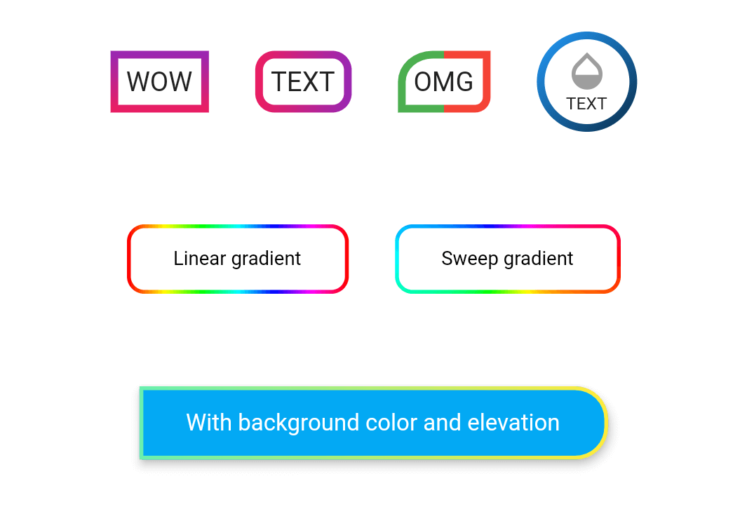
Take a look at the provided example for how to use the OutlineGradientButton.

OutlineGradientButton(
  child: Text('WOW'),
  gradient: LinearGradient(
    colors: [Colors.purple, Colors.pink],
    begin: Alignment.topCenter,
    end: Alignment.bottomCenter,
  ),
  strokeWidth: 4,
),

OutlineGradientButton(
  child: Text('TEXT'),
  gradient: LinearGradient(colors: [Colors.pink, Colors.purple]),
  strokeWidth: 4,
  radius: Radius.circular(8),
),

OutlineGradientButton(
  child: Text('OMG'),
  gradient: LinearGradient(
    stops: [0, 0.5, 0.5, 1],
    colors: [Colors.green, Colors.green, Colors.red, Colors.red],
  ),
  strokeWidth: 4,
  corners: Corners(topLeft: Radius.elliptical(16, 14), bottomRight: Radius.circular(6)),
),

OutlineGradientButton(
  child: SizedBox(
    width: 52,
    height: 52,
    child: Column(
      mainAxisSize: MainAxisSize.min,
      mainAxisAlignment: MainAxisAlignment.center,
      children: <Widget>[
        Icon(Icons.opacity, color: Colors.grey, size: 24),
        Text('TEXT', style: TextStyle(fontSize: 9)),
      ],
    ),
  ),
  gradient: LinearGradient(
    colors: [Colors.blue, Colors.black],
    begin: Alignment(-1, -1),
    end: Alignment(2, 2),
  ),
  strokeWidth: 4,
  padding: EdgeInsets.zero,
  radius: Radius.circular(26),
),

OutlineGradientButton(
  child: Text('Linear gradient', style: TextStyle(color: Colors.black, fontSize: 10)),
  gradient: LinearGradient(
    colors: List.generate(360, (h) => HSLColor.fromAHSL(1, h.toDouble(), 1, 0.5).toColor()),
  ),
  strokeWidth: 2,
  padding: EdgeInsets.symmetric(horizontal: 24, vertical: 12),
  radius: Radius.circular(8),
),

OutlineGradientButton(
  child: Text('Sweep gradient', style: TextStyle(color: Colors.black, fontSize: 10)),
  gradient: SweepGradient(
    colors: List.generate(360, (h) => HSLColor.fromAHSL(1, h.toDouble(), 1, 0.5).toColor()),
  ),
  strokeWidth: 2,
  padding: EdgeInsets.symmetric(horizontal: 24, vertical: 12),
  radius: Radius.circular(8),
),

OutlineGradientButton(
  child: Text('With background color and elevation', style: TextStyle(color: Colors.white, fontSize: 12)),
  gradient: LinearGradient(colors: [Colors.greenAccent, Colors.yellow]),
  strokeWidth: 2,
  padding: EdgeInsets.symmetric(horizontal: 24, vertical: 12),
  corners: Corners(topRight: Radius.circular(16), bottomRight: Radius.circular(16)),
  backgroundColor: Colors.lightBlue,
  elevation: 4,
  inkWell: true,
  onTap: () => showSnack('onTap'),
  onDoubleTap: () => showSnack('onDoubleTap'),
  onLongPress: () => showSnack('onLongPress'),
),
Lista de dependências 1 itens
{"sdk":"flutter"}Filtre pelo caso de uso, compare a atividade e confira o projeto original antes de adotá-lo.
“A repository is the most basic element of GitHub.”
GitHub Docs — About repositories ↗