
 v5.0.0
bottom_picker
Uma maneira fácil que permite criar um seletor de item inferior ou um seletor de data e hora com parâmetros mínimos
368Curtidas 11,8 milDownloads em 30 dias160Pontos Pub
AndroidiOSmacOSWindowsLinux
koukibadr/Bottom-Picker open-source repository details.

^1.0.0{"sdk":"flutter"}^1.0.0{"sdk":"flutter"}^6.0.0Texto original em inglês. Visite o GitHub para a versão atual.
A comprehensive and highly customizable bottom sheet picker widget for Flutter that brings beautiful, native-like pickers to all platforms.
Pub Version License GitHub stars
Bottom Picker DemoNew in v5.0.0: Full support for the latest Flutter version >=3.44.0 with decoupled Material UI and Cupertino UI themes, providing better flexibility and cleaner architecture.
| Simple Item Picker | Date & Time Picker |
|---|---|
| Simple Item Picker | Date Time Picker |
| Time Picker | Date Picker |
|---|---|
| Time Picker | Date Picker |
| Range Picker (Arabic) | Range Picker |
|---|---|
| Range Picker Arabic | Range Picker |
The simplest way to get started with Bottom Picker:
import 'package:bottom_picker/bottom_picker.dart';

// Simple item picker
BottomPicker(
  items: ['Item 1', 'Item 2', 'Item 3'],
  onSubmit: (selectedItem) => print('Selected: $selectedItem'),
).show(context);

// Date picker
BottomPicker.date(
  initialDateTime: DateTime.now(),
  onSubmit: (selectedDate) => print('Selected: $selectedDate'),
).show(context);

// Time picker
BottomPicker.time(
  initialTime: Time(h: 12, m: 0),
  onSubmit: (time) => print('Selected: ${time.h}:${time.m}'),
).show(context);
Add bottom_picker to your pubspec.yaml file:
dependencies:
  bottom_picker: ^5.0.0
Then run:
flutter pub get
  /// Renders the header component of the bottom picker
  final Widget Function(BuildContext context)? headerBuilder;

  ///defines whether the bottom picker is dismissable or not
  ///by default it's set to false
  ///
  final bool dismissable;

  ///list of items (List of widgets) used to create simple item picker (required)
  ///and should not be empty or null
  ///
  ///for date/dateTime/time items parameter is not available
  late List<T>? items;

  /// Callback function used to build the item widget for each item in the list.
  /// only for simple item picker, for date/time/dateTime picker this parameter is not available
  /// if Null the picker will display [Text] widget with the item.toString() value
  Widget Function(T item, int index)? itemBuilder;

  ///Nullable function, invoked when navigating between picker items
  ///whether it's date picker or simple item picker it will return a value DateTime or int(index)
  late Function(T)? onChange;

  /// Predicate function used to filter items in the search field
  /// if not null the search field will be displayed and the user can filter the items based on the predicate
  /// Takes two parameters: the item and the search query, and returns a boolean indicating whether the item should be filtered out or not.
  SearchItemPredicate<T>? filterPredicate;

  /// The search field text input action, which determines the action button on the keyboard.
  TextInputAction? textInputAction;

  /// The decoration for the search field, which allows customization of the appearance of the search field.
  InputDecoration? searchFieldDecoration;

  ///Nullable function invoked  when clicking on submit button
  ///if the picker  type is date/time/dateTime it will return DateTime value
  ///else it will return the index of the selected item
  late Function(T?)? onSubmit;

  /// Nullable function invoked when the picker get dismissed
  /// it will return the selected value
  late Function(T?)? onDismiss;

  ///Invoked when clicking on the close button
  Function? onCloseButtonPressed;

  ///set the theme of the bottom picker (the button theme)
  ///possible values
  ///```
  ///{
  ///blue,
  ///orange,
  ///temptingAzure,
  ///heavyRain,
  ///plumPlate,
  ///morningSalad
  ///}
  ///```
  final BottomPickerTheme bottomPickerTheme;

  ///used for simple bottom picker
  ///by default it's 0, needs to be in the range [0, this.items.length-1]
  ///otherwise an exception will be thrown
  ///for date and time picker type this parameter is not available
  ///
  late int selectedItemIndex;

  ///The initial date time applied on the date and time picker
  ///by default it's null
  ///
  DateTime? initialDateTime;

  ///The initial time set in the time picker widget
  ///required only when using the `time` constructor
  Time? initialTime;

  /// The initial duration set for the timer picker
  /// By default it's set to null so it's `Duration.zero`
  Duration? initialTimerDuration;

  /// The time picker mode "hm", "hms" or "ms"
  /// By default it's set to "hm"
  CupertinoTimerPickerMode? timerPickerMode;

  /// The timer seconds interval
  /// Cannot be less then 1
  ///
  /// Default value is 1.
  int timerSecondsInterval = 1;

  ///The max time can be set in the time picker widget
  Time? maxTime;

  ///The min time can be set in the time picker widget
  Time? minTime;

  ///The gap between two minutes
  ///by default it's 1 minute
  int minuteInterval = 1;

  ///the max date time on the date picker
  ///by default it's null
  DateTime? maxDateTime;

  ///the minimum date & time applied on the date picker
  ///by default it's null
  ///
  DateTime? minDateTime;

  ///define whether the time uses 24h or 12h format
  ///by default it's false (12h format)
  ///
  late bool use24hFormat;

  ///the padding that will be applied to the button
  ///if the padding is null the button will be rendered null
  @Deprecated('Use buttonBuilder instead')
  final double? buttonPadding;

  ///the width that will be applied to the button
  ///if the buttonWidth is null the button will be rendered with null
  @Deprecated('Use buttonBuilder instead')
  final double? buttonWidth;

  ///the bottom picker background color,
  ///by default it's white
  ///
  final Color backgroundColor;

  ///date order applied on date picker or date time picker
  ///by default it's YYYY/MM/DD
  DatePickerDateOrder? dateOrder;

  ///the picker text style applied on all types of bottom picker
  ///by default `TextStyle(fontSize: 14)`
  TextStyle? pickerTextStyle;

  /// The picker theme data
  final CupertinoTextThemeData? pickerThemeData;

  ///define the picker item extent available only for list items picker
  ///by default it's 35
  late double itemExtent;

  ///the layout orientation of the bottom picker
  ///by default the orientation is set to LTR
  ///```
  ///LAYOUT_ORIENTATION.ltr,
  ///LAYOUT_ORIENTATION.rtl
  ///```
  TextDirection? layoutOrientation;

  ///THe alignment of the bottom picker button
  ///by default it's `MainAxisAlignment.center`
  @Deprecated('Use buttonBuilder instead')
  final MainAxisAlignment buttonAlignment;

  ///bottom picker main widget height
  ///if it's null the bottom picker will get the height from
  ///[bottomPickerHeight] extension on context
  final double? height;

  ///invoked when pressing on the submit button when using range picker
  ///it return two dates (first date, end date)
  ///required when using [BottomPicker.range]
  late Function(DateTime?, DateTime?)? onRangeDateSubmitPressed;

  ///the minimum first date in the date range picker
  ///not required if null no minimum will be set in the date picker
  DateTime? minFirstDate;

  ///the minimum second date in the date range picker
  ///not required if null no minimum will be set in the date picker
  DateTime? minSecondDate;

  ///the maximum first date in the date range picker
  ///not required if null no minimum will be set in the date picker
  DateTime? maxFirstDate;

  ///the maximum second date in the date range picker
  ///not required if null no minimum will be set in the date picker
  DateTime? maxSecondDate;

  ///the initial first date in the date range picker
  ///not required if null no minimum will be set in the date picker
  DateTime? initialFirstDate;

  ///the initial last date in the date range picker
  ///not required if null no minimum will be set in the date picker
  DateTime? initialSecondDate;

  /// A widget overlaid on the picker to highlight the currently selected entry.
  /// The [selectionOverlay] widget drawn above the [CupertinoPicker]'s picker
  /// wheel.
  Widget? selectionOverlay;

  ///The button's widget that will be displayed
  ///if null the button will have a simple 'Select' text in the center
  @Deprecated('Use buttonBuilder instead')
  final Widget? buttonContent;

  ///indicates if the submit button will be displayed or not
  ///by default the submit button is shown
  @Deprecated('Use buttonBuilder instead')
  late bool displaySubmitButton;

  ///a single color will be applied to the button instead of the gradient
  ///themes
  @Deprecated('Use buttonBuilder instead')
  final Color? buttonSingleColor;

  ///to set a custom button theme color use this list
  ///when it's not null it will be applied
  ///
  final List<Color>? gradientColors;

  /// The style that will be applied on the button's widget
  @Deprecated('Use buttonBuilder instead')
  final BoxDecoration? buttonStyle;

  /// The button builder callback that will be used to build the button widget.
  /// If this is provided, it will override the default button widget and any other button-related properties
  /// The callback takes:
  /// - [BuildContext] context: The build context of the button.
  /// - [BottomPicker] instance: The instance of the BottomPicker widget.
  /// and returns a [Widget] that will be used as the button.
  /// If it's null, the default button widget will be used (will be removed in the future).
  final Widget Function(BottomPicker instance, BuildContext context)?
      buttonBuilder;

  /// Invoked when pressing on the submit button when using range picker
  /// it return two dates (first time, end time)
  /// required when using [BottomPicker.rangeTime]
  late Function(DateTime?, DateTime?)? onRangeTimeSubmitPressed;

  /// Function invoked when the picker is dismissed used with range picker
  /// and time range picker.
  late Function(DateTime?, DateTime?)? onRangePickerDismissed;

  ///the minimum first time in the time range picker
  ///not required if null no minimum will be set in the time picker
  DateTime? minFirstTime;

  ///the minimum second time in the time range picker
  ///not required if null no minimum will be set in the time picker
  DateTime? minSecondTime;

  ///the maximum first time in the time range picker
  ///not required if null no minimum will be set in the time picker
  DateTime? maxFirstTime;

  ///the maximum second time in the time range picker
  ///not required if null no minimum will be set in the time picker
  DateTime? maxSecondTime;

  ///the initial first time in the time range picker
  ///not required if null no minimum will be set in the time picker
  DateTime? initialFirstTime;

  ///the initial last time in the time range picker
  ///not required if null no minimum will be set in the time picker
  DateTime? initialSecondTime;

  /// Indicates whether the time seperator (":") will be shown or not.
  bool showTimeSeparator = false;

  /// Indiacate whether the bottom picker will be closed (poped out of the Navigator)
  /// when the submit button is pressed.
  /// By default closeOnSubmit = true.
  bool? closeOnSubmit;

  /// The datepicker calendar type
  List<int> calendarDays = CupertinoDatePickerWidget.fullWeek;

  /// The bottom picker selector diameter ratio.
  final double diameterRatio;

  /// A predicate that can be used to select which hours are selectable.
  SelectableHourPredicate? hourPredicate;

  /// Indicates whether to use SafeArea to avoid content overflow.
  final bool useSafeArea;
The above section contains the complete parameter documentation. Refer to it for detailed API information.
BottomPicker(
  items: List.generate(
    10,
    (index) => "Country $index",
  ),
  headerBuilder: (context) {
    return Row(
      children: [
        Expanded(
          child: Text(
            'Choose your country',
            style: TextStyle(
              fontWeight: FontWeight.bold,
              fontSize: 15,
            ),
          ),
        ),
        InkWell(
          onTap: () {
            Navigator.pop(context);
          },
          child: Icon(Icons.close),
        ),
      ],
    );
  },
 BottomPicker<CountryModel>(
      items: countryList,
      itemBuilder: (item, index) {
        return ListTile(
          leading: CircleAvatar(
            child: Text(item.name.substring(item.name.length - 2)),
          ),
          title: Text(item.name),
          subtitle: Text('Country ID: ${item.id}'),
        );
      },
      onChange: (p0) => log('Selected Item: ${p0.name}'),
      filterPredicate: (item, value) {
        return item.name.toLowerCase().contains(value.toLowerCase());
      },
    ).show(context);
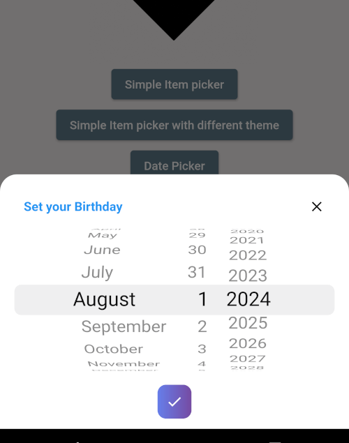
BottomPicker.date(
  headerBuilder: (context) {
    return Row(
      children: [
        Text(
          'Set your Birthday',
          style: TextStyle(
            fontWeight: FontWeight.bold,
            fontSize: 15,
            color: Colors.blue,
          ),
        ),
      ],
    );
  },
  dateOrder: DatePickerDateOrder.dmy,
  initialDateTime: DateTime(1996, 10, 22),
  maxDateTime: DateTime(1998),
  minDateTime: DateTime(1980),
  onChange: (date) {
    print(date);
  },
  onSubmit: (date) {
    print(date);
  },
  onDismiss: (p0) {
    print(p0);
  },
  bottomPickerTheme: BottomPickerTheme.plumPlate,
).show(context);
BottomPicker.year(
  headerBuilder: (context) {
    return Row(
      children: [
        Text(
          'Set your Birthday Year',
          style: TextStyle(
            fontWeight: FontWeight.bold,
            fontSize: 15,
            color: Colors.blue,
          ),
        ),
      ],
    );
  },
  initialDateTime: DateTime(1996),
  maxDateTime: DateTime(1998),
  minDateTime: DateTime(1980),
  onChange: (selectedYear) {
    print(selectedYear);
  },
  onSubmit: (selectedYear) {
    print(selectedYear);
    Navigator.pop(context);
  },
  onDismiss: (p0) {
    print(p0);
  },
  bottomPickerTheme: BottomPickerTheme.plumPlate,
).show(context);
For more comprehensive examples, visit the example folder.
We warmly welcome contributions to the bottom_picker package! Your help in making it even better is highly appreciated.
🐛 Bug Reports
✨ Feature Requests
💻 Code Contributions
git checkout -b feature/your-feature-namegit push origin feature/your-feature-nameWe'll review your contributions promptly and provide constructive feedback. Thank you for helping improve bottom_picker!
This project is licensed under the MIT License - see the LICENSE file for details.
⭐ If you found this package helpful, please consider giving it a star on GitHub!