
 v4.0.3
flutter_slidable
Uma implementação do Flutter de item de lista deslizável com ações de deslize direcionais que podem ser fechadas.
6,1 milCurtidas 729 milDownloads em 30 dias150Pontos Pub
AndroidiOSWebmacOSWindowsLinux
Uma implementação do Flutter de item de lista deslizante com ações de deslizamento direcional.

{"sdk":"flutter"}{"sdk":"flutter"}^0.3.0—Texto original em inglês. Visite o GitHub para a versão atual.
https://raw.githubusercontent.com/letsar/flutter_slidable/assets/flutter_favorite.png Slidable is a Flutter Favorite package!
A Flutter implementation of slidable list item with directional slide actions that can be dismissed.
Our top sponsors are shown below! [Become a Sponsor]
You can read this small guide to migrate from the 0.6 to the 1.0 version: https://github.com/letsar/flutter_slidable/wiki/Migration-from-version-0.6.0-to-version-1.0.0
Scrollable starts to scroll (overridable).In the pubspec.yaml of your flutter project, add the following dependency:
dependencies:
  flutter_slidable: <latest_version>
In your library add the following import:
import 'package:flutter_slidable/flutter_slidable.dart';
Example:
Slidable(
  // Specify a key if the Slidable is dismissible.
  key: const ValueKey(0),

  // The start action pane is the one at the left or the top side.
  startActionPane: ActionPane(
    // A motion is a widget used to control how the pane animates.
    motion: const ScrollMotion(),

    // A pane can dismiss the Slidable.
    dismissible: DismissiblePane(onDismissed: () {}),

    // All actions are defined in the children parameter.
    children: const [
      // A SlidableAction can have an icon and/or a label.
      SlidableAction(
        onPressed: doNothing,
        backgroundColor: Color(0xFFFE4A49),
        foregroundColor: Colors.white,
        icon: Icons.delete,
        label: 'Delete',
      ),
      SlidableAction(
        onPressed: doNothing,
        backgroundColor: Color(0xFF21B7CA),
        foregroundColor: Colors.white,
        icon: Icons.share,
        label: 'Share',
      ),
    ],
  ),

  // The end action pane is the one at the right or the bottom side.
  endActionPane: const ActionPane(
    motion: ScrollMotion(),
    children: [
      SlidableAction(
        // An action can be bigger than the others.
        flex: 2,
        onPressed: doNothing,
        backgroundColor: Color(0xFF7BC043),
        foregroundColor: Colors.white,
        icon: Icons.archive,
        label: 'Archive',
      ),
      SlidableAction(
        onPressed: doNothing,
        backgroundColor: Color(0xFF0392CF),
        foregroundColor: Colors.white,
        icon: Icons.save,
        label: 'Save',
      ),
    ],
  ),

  // The child of the Slidable is what the user sees when the
  // component is not dragged.
  child: const ListTile(title: Text('Slide me')),
),
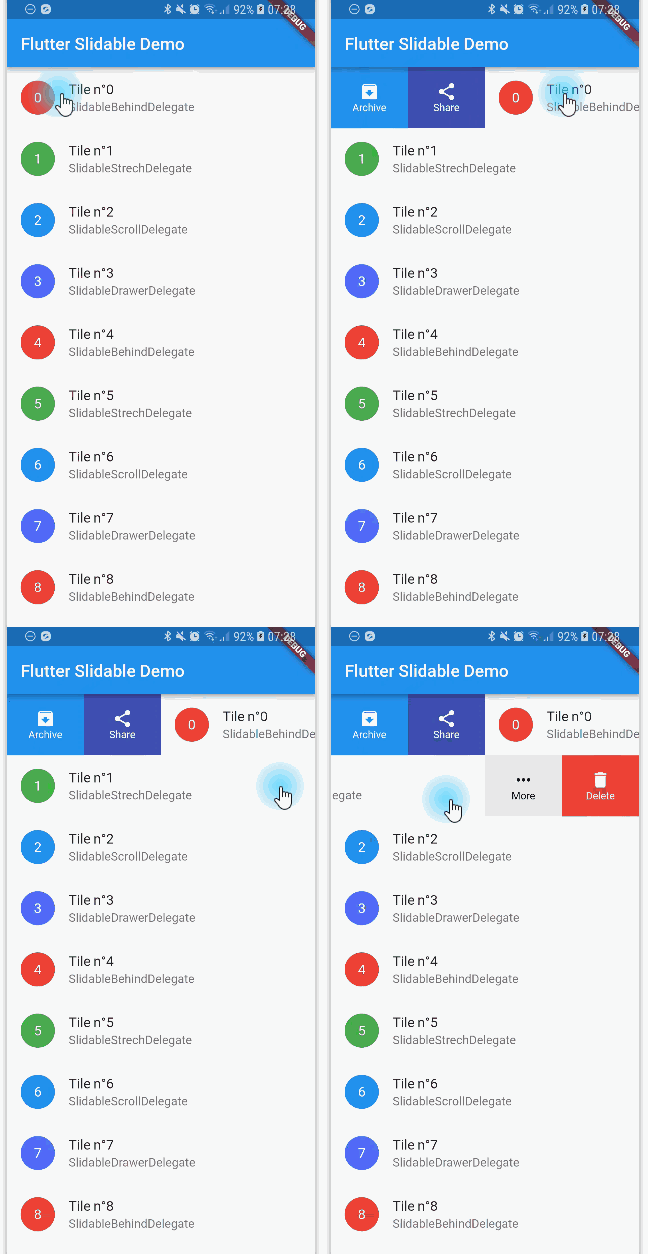
Any ActionPane has a motion parameter which allow you to define how the pane animates when the user drag the Slidable.
The actions appear as if they where behind the Slidable:
Behind Motion
Animate the actions as if they were drawers, when the Slidable is moving:
Drawer Motion
The actions follow the Slidable while it's moving:
Scroll Motion
Animate the actions as if they were streched while the Slidable is moving:
Stretch Motion
You can use SlidableController to open or close the actions programmatically:
final controller = SlidableController();

// ...

Slidable(
  controller: controller,
  // ...
);

// ...

// Open the actions
void _handleOpen() {
  controller.openEndActionPane();
  // OR
  //controller.openStartActionPane();
}

void _handleOpen() {
  controller.close();
}
You can read the FAQ here: https://github.com/letsar/flutter_slidable/wiki/FAQ
I'm working on my packages on my free-time, but I don't have as much time as I would. If this package or any other package I created is helping you, please consider to sponsor me so that I can take time to read the issues, fix bugs, merge pull requests and add features to these packages.
Feel free to contribute to this project.
If you find a bug or want a feature, but don't know how to fix/implement it, please fill an issue.
If you fixed a bug or implemented a feature, please send a pull request.