

 v2.2.1
el_tooltip
ElTooltip, uma dica posicionada inteligentemente. Use-a para exibir um widget dentro de uma dica que você pode personalizar.
163Curtidas 6,8 milDownloads em 30 dias150Pontos Pub
AndroidiOSWebmacOSWindowsLinux
Widget de dica do Flutter com posicionamento inteligente

Texto original em inglês. Visite o GitHub para a versão atual.

Add to your pubspec.yaml
dependencies:
  el_tooltip: <last_version>
Import the library and call the Widget ElTooltip() with the required fields child and content
import 'package:flutter/material.dart';
import 'package:el_tooltip/el_tooltip.dart';

void main() {
  runApp(MaterialApp(
    title: 'Flutter Demo',
    theme: ThemeData(
      primarySwatch: Colors.blue,
    ),
    home: const SafeArea(
      child: Center(
        child: ElTooltip(
          child: Icon(Icons.info_outline),
          content: Text('This is a tooltip'),
        ),
      ),
    ),
  ));
}
| Properties | Required | Default | Description |
|---|---|---|---|
| content | true | What will appear inside the tooltip. | |
| child | true | Widget that represent the button to activate the tooltip (no click method required). | |
| color | false | Colors.white |
Background color of the bubble and the arrow. |
| distance | false | 10.0 |
Space between the child button and the tooltip. |
| padding | false | EdgeInsets.all(14.0) |
Tooltip padding around the content widget. |
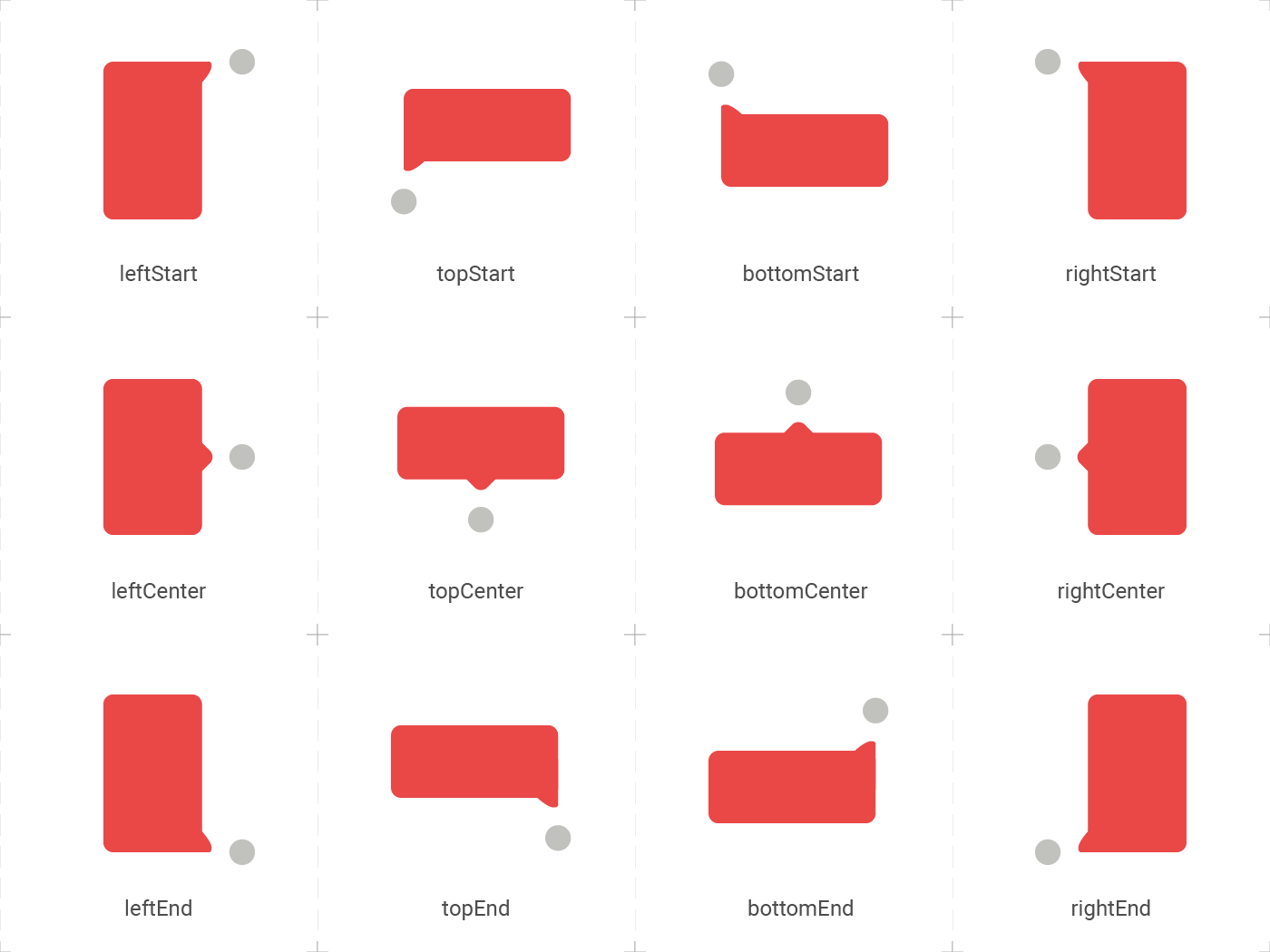
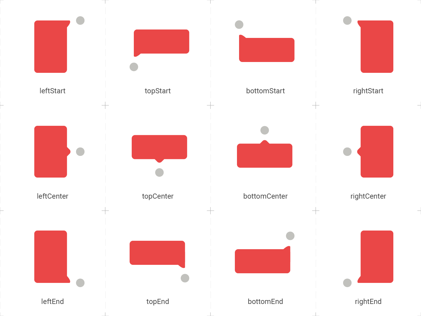
| position | false | topCenter |
Desired position based on the Enum ElTooltipPosition. Can be topStart, topCenter, topEnd, rightStart, rightCenter, rightEnd, bottomStart, bottomCenter, bottomEnd, leftStart, leftCenter, leftEnd, |
| radius | false | Radius.circular(8.0) |
Border radius of the tooltip. |
| showModal | false | true |
Displays a fullscreen dark layer behind the tooltip. |
| showArrow | false | true |
Displays the arrow pointing to the child widget. |
| showChildAboveOverlay | false | true |
Repeats the child above the tooltip overlay. |
| modalConfiguration | false | ModalConfiguration() |
Configures the modal color and opacity if showModal is true. |
| timeout | false | Duration.zero (only disappears on click) |
How many time to wait for the tooltip to disappear. |
| appearAnimationDuration | false | Duration.zero (does not animate) |
Fade In animation duration. |
| disappearAnimationDuration | false | Duration.zero (does not animate) |
Fade Out animation duration. |
| controller | false | null |
ElTooltipController to show and hide the tooltip. |
El tooltip header image was created using macrovector illustration on Freepik
Thanks goes to these wonderful people:
 Marcelo Gil 💻 |
 Matteo Pietro Dazzi 💻 |
 Grzegorz Leoniec 💻 |
Lista de dependências 3 itens
{"sdk":"flutter"}{"sdk":"flutter"}^2.0.0Filtre pelo caso de uso, compare a atividade e confira o projeto original antes de adotá-lo.
“A repository is the most basic element of GitHub.”
GitHub Docs — About repositories ↗