

v1.1.0
responsive_spacing
使用動態間距、邊距、內邊距、間距、正文字號和欄數,讓您的應用具備響應式與自適應功能。
27喜歡 80近 30 天下載150Pub 分數
AndroidiOSWebmacOSWindowsLinux
AlexanderThiele/responsive_spacing open-source repository details.

以下為英文專案原文快照,最新內容請造訪 GitHub。
This plugin helps to design and develop beautiful responsive and adaptive flutter apps.
All design principles have roughly the same elements. For example, Material Design works with margin, gutter, body and has a responsive 12 column system. Our default values are set by the Material Design Guidelines, but you can also easily set your own breakpoints, margins, and spacing.
You can find spacings everywhere in your Project, don't use Magic Numbers, use the context-oriented spacing class instead.
We have developed this plugin so that you can easily make your app adaptive and responsive.
Access your own Spacing-System:
// Example values for a Pixel 7 Pro
context.spacing.xs; // default 2
context.spacing.s; // default 8
context.spacing.m; // default 12
context.spacing.l; // default 16
context.spacing.xl; // default 32
context.spacing.xxl; // default 56

// Example:

// Instead of
SizedBox(height: 8);

// use
SizedBox(height: context.spacing.s); // Wow!
And whenever your design guru wants to modify the values, you only have to modify it in a single file.
Design Gurus are around the world and you will maybe find one in your own company. If you have such a mysterious creature, use the Giga Spacing class for even more fine tuning.
context.gigaSpacing.xxxs; // default 2
context.gigaSpacing.xxs; // default 8
context.gigaSpacing.xs; // default 10
context.gigaSpacing.s; // default 12
context.gigaSpacing.m; // default 16
context.gigaSpacing.l; // default 24
context.gigaSpacing.xl; // default 30
context.gigaSpacing.xxl; // default 40
context.gigaSpacing.xxxl; // default 46
context.gigaSpacing.xxxxl; // default 64
In your main, set the global defaults:
void main() {
  ResponsiveSpacing.setDefaults(
      globalSpacing: MySimpleSpacing(),
  );

  runApp(const MyApp());
}

class MySimpleSpacing extends SpacingCollection {

  @override
  SimpleSpacing get any => const SimpleSpacing(
    xs: 2.0,
    s: 8.0,
    m: 12.0,
    l: 16.0,
    xl: 32.0,
    xxl: 56.0,
  );
}
In the previous Example, we used the any override, this will ignore the layout width. If you want to make the spacings responsive, override the values for xl, lg, md, sm2, sm1 & xs
class MySimpleSpacing extends SpacingCollection {
  @override
  SimpleSpacing get xs => const SimpleSpacing(
        xs: 2.0,
        s: 8.0,
        m: 12.0,
        l: 16.0,
        xl: 32.0,
        xxl: 56.0,
      );

  @override
  SimpleSpacing get sm1 => xs;

  @override
  SimpleSpacing get sm2 => xs;

  @override
  SimpleSpacing get md => const SimpleSpacing(
        xs: 2 * 2.0,
        s: 2 * 8.0,
        m: 2 * 12.0,
        l: 2 * 16.0,
        xl: 2 * 32.0,
        xxl: 2 * 56.0,
      );

  @override
  SimpleSpacing get lg => md;

  @override
  SimpleSpacing get xl => const SimpleSpacing(
        xs: 4 * 2.0,
        s: 4 * 8.0,
        m: 4 * 12.0,
        l: 4 * 16.0,
        xl: 4 * 32.0,
        xxl: 4 * 56.0,
      );
}
Instead of using a Scaffold, use the ResponsiveScaffold:
ResponsiveScaffold(
  appBar: AppBar(
    title: const Text("The Title"),
  ),
  body: YourWidget()
);
And in your Widget, access the Spacing class with Spacing.of(context) or context.spacingConfig which returns an object of ResponsiveData. The object has all necessary spacings.
context.spacingConfig.margin;
context.spacingConfig.padding;
context.spacingConfig.gutter;
context.spacingConfig.body;
context.spacingConfig.layoutColumns;

// You are now good to use these properties in your layout.
For example with a Card:
Card(
  // use margin
  margin: context.spacingConfig.margin.horizontalEdgeInsets,

  child: Padding(

    // use padding
    padding: context.spacingConfig.padding.allEdgeInsets,

    child: Column(
      children: [
        Text("This is a Title"),
        Text("This is the subtitle, usually you explain something")
      ],
    ),
  ),
)
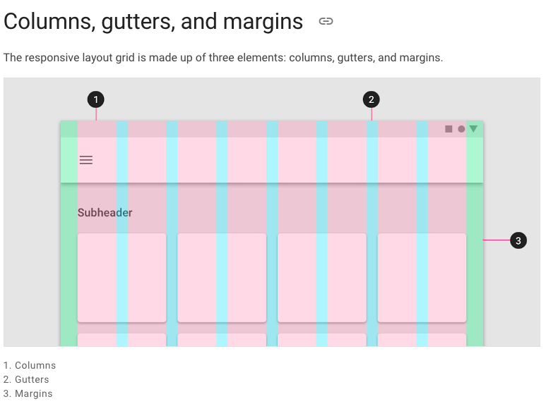
The responsive layout grid is made up of three elements: columns, gutters, and margins. Read everything about Columns, Gutters & Margins on the material guidelines responsive layout page.
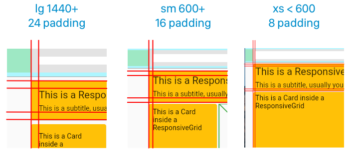
Spacing.of(context).padding

// or

context.spacingConfig.padding
Receive padding for screen sizes:
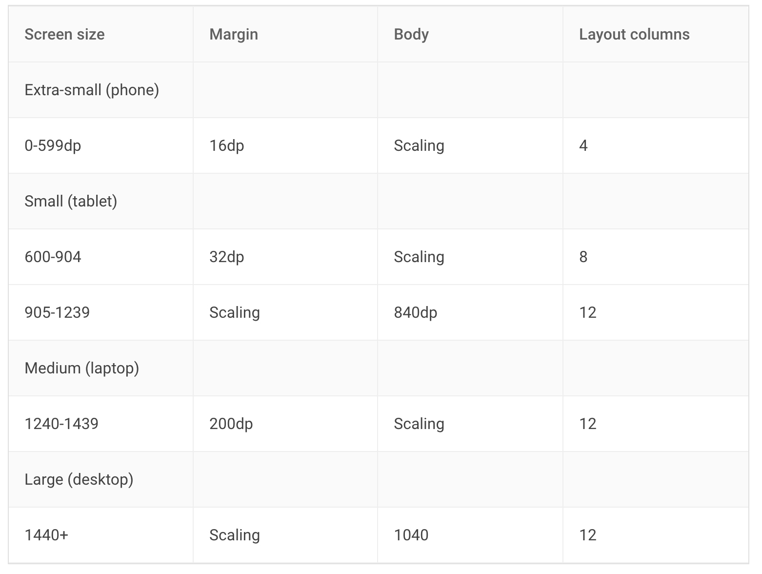
The Material Breakpoints are used for all default values.
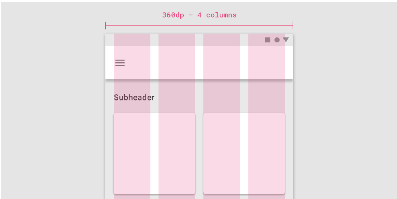
As an example, the 360 size display has 4 columns, a margin of 16, padding of 8 & gutters of 8.
If you combine this now, you get a responsive layout. See it in action:
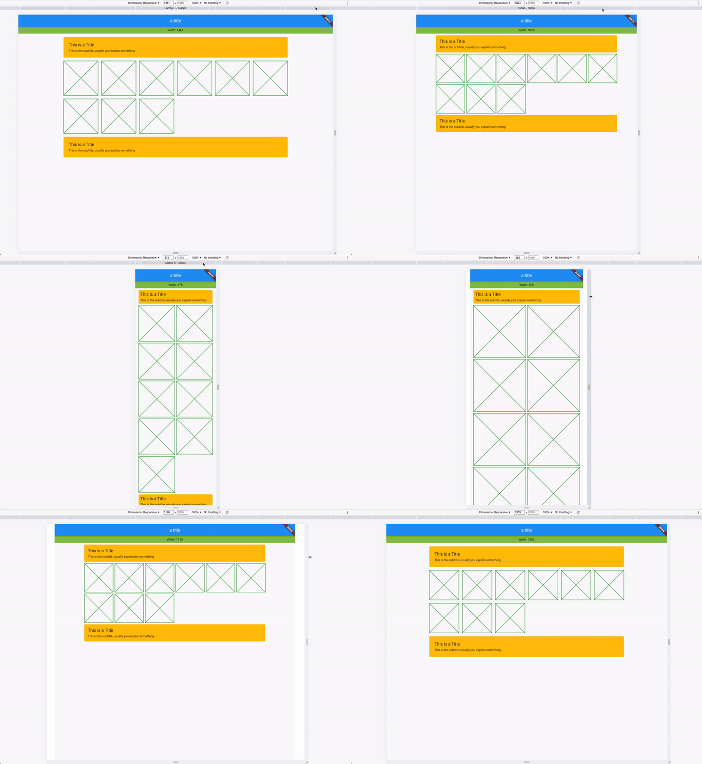
You can also customize your own breakpoints. The default values are Material Design screen sizes:
To customize, use the setDefaults method in your main:
void main() {
  ResponsiveSpacing.setDefaults(
    globalBreakpoints: Breakpoints(
      xl: const BreakpointEntry(2560, enabled: true),
      lg: const BreakpointEntry(1440),
      md: const BreakpointEntry(1240),
      sm2: const BreakpointEntry(905),
      sm1: const BreakpointEntry(600),
    ),
  );

  runApp(const MyApp());
}
Just like the custom breakpoints, you can also set your own spacing, spaces, and margins. Create your own gutter class by extending ResponsiveCollection:
class MyResponsiveGutters extends ResponsiveCollection {
  @override
  ScaledSize xl(double width) => const ScaledSize(size: 16);

  @override
  ScaledSize lg(double width) => const ScaledSize(size: 16);

  @override
  ScaledSize md(double width) => const ScaledSize(size: 8);

  @override
  ScaledSize sm2(double width) => const ScaledSize(size: 4);

  @override
  ScaledSize sm1(double width) => const ScaledSize(size: 4);

  @override
  ScaledSize xs(double width) => const ScaledSize(size: 2);

  @override
  ScaledSize fallback(double width) => const ScaledSize(size: 2);
}
And overwrite the default global gutters in your main:
void main() {
  // optional setting defaults
  ResponsiveSpacing.setDefaults(
    globalGutter: MyResponsiveGutters(),
    globalPadding: MyResponsivePadding()
  );

  runApp(const MyApp());
}
Everything you need is stored in the ResponsiveData class which is accessible via the context.
class ResponsiveData {
  final ScaledSize margin;
  final ScaledSize padding;
  final ScaledSize gutter;
  final ScaledSize body;
  final LayoutColumns layoutColumns;
  // ...
}
There are two types of widgets, the data widgets that create the spacing context and widgets that use the spacing context.
Data widgets create the spacing context and provide responsive values to all widgets created in the tree below. if there are multiple data widgets in the tree, the closest one is taken.
依賴清單 3 項
{"sdk":"flutter"}{"sdk":"flutter"}^2.0.1先依使用情境篩選,再比較專案活躍情況,最後到原始儲存庫確認使用要求。
“A repository is the most basic element of GitHub.”
GitHub Docs — About repositories ↗