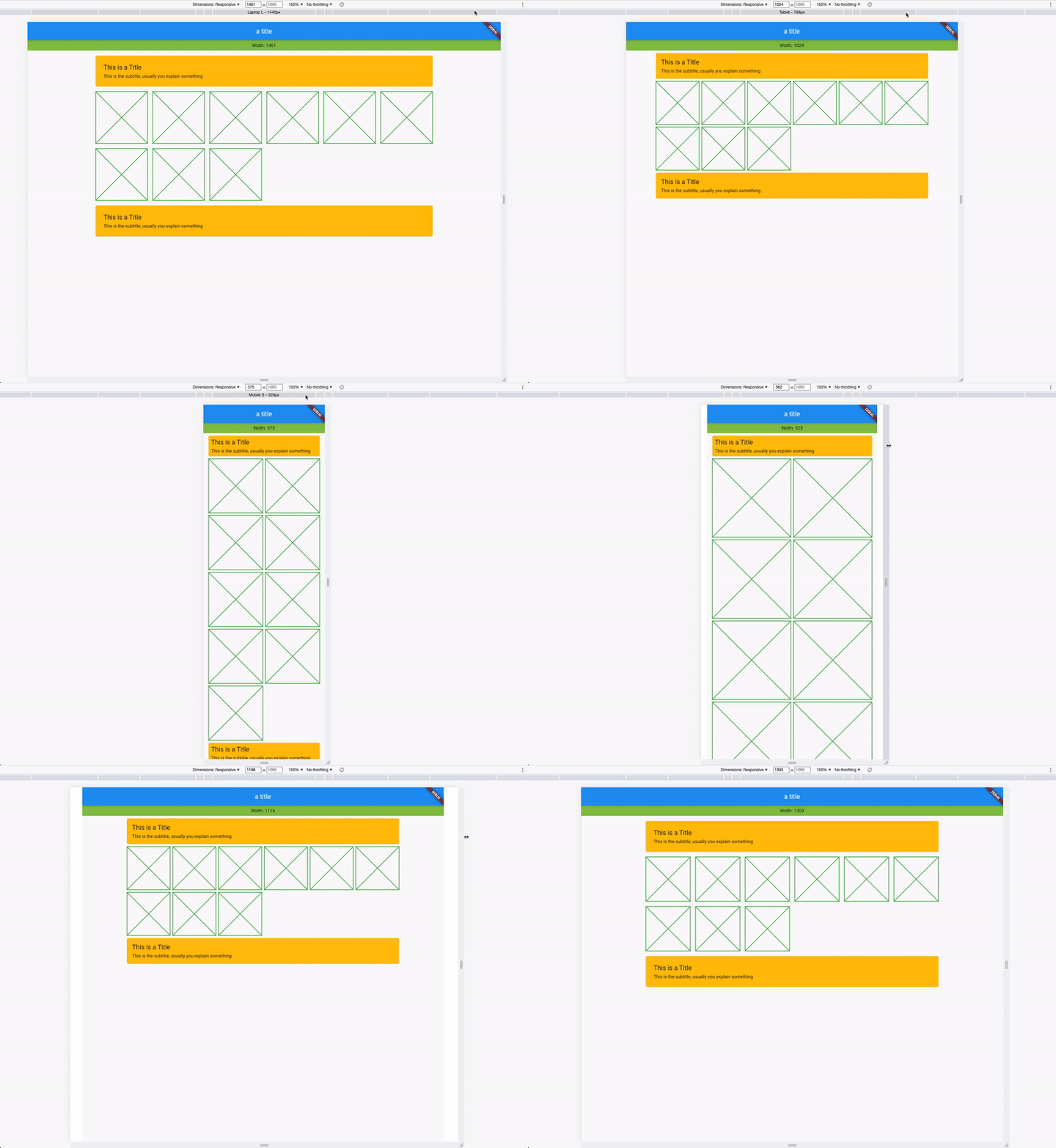
ResponsiveSpacing 是一個 Flutter/Dart 套件,可讓開發者透過根據螢幕尺寸動態調整間距、邊距、內邊距、欄間距、正文字型大小與欄位佈局,建立適應性與響應式使用者介面。它簡化了在 Android、iOS、Web、macOS、Windows 與 Linux 等多個平台上的響應式設計。透過內建的響應式單位與斷點,確保無論裝置尺寸為何,UI 外觀皆能保持一致。非常適合需要彈性佈局卻不需撰寫重複媒體查詢邏輯的應用。
適用情境
建構跨平台響應式佈局
為不同螢幕尺寸調整使用者介面
建立流體網格系統
自動調整填入和邊距
設計可擴展的移動和Web介面
主要特色
基於螢幕尺寸的動態間距
內建響應式斷點
支援邊距、內邊距和間距
跨平台相容性
與現有 Flutter 小部件的輕鬆整合
靈活的欄位和正文字型大小控制
適合對象
開發響應式 Flutter 應用的開發者
針對多個平台的團隊
專注於適應性的UI設計師
需要可擴展佈局系統的專案
具有複雜響應式需求的應用程式
使用建議
新使用者可能需要一個初始的學習曲線
在非常大的小部件樹中效能影響
依賴於準確的螢幕尺寸檢測
最佳搭配一致的設計系統使用
超出提供的響應式單位之外的自訂功能有限
原始 README
以下為關聯原始碼儲存庫的 README 原文快照,最新內容請造訪原始碼儲存庫。
This plugin helps to design and develop beautiful responsive and adaptive flutter apps.
Lightweight, Responsive Spacing
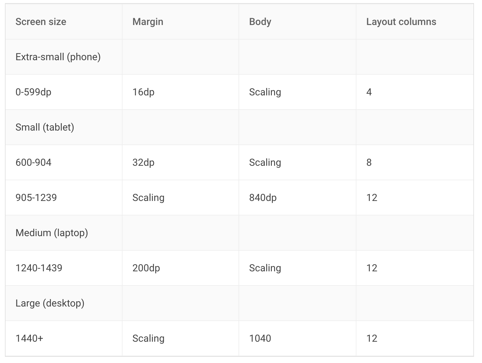
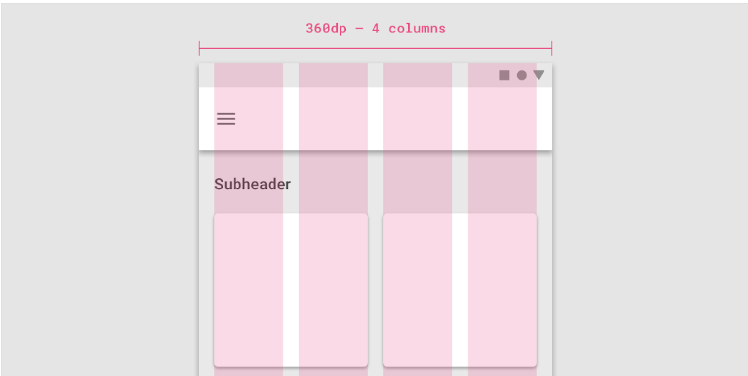
All design principles have roughly the same elements. For example, Material Design works with margin, gutter, body and has a responsive 12 column system.
Our default values are set by the Material Design Guidelines, but you can also easily set your own breakpoints, margins, and spacing.
You can find spacings everywhere in your Project, don't use Magic Numbers, use the context-oriented spacing class instead.
We have developed this plugin so that you can easily make your app adaptive and responsive.
Simple Spacing
Access your own Spacing-System:
// Example values for a Pixel 7 Pro
context.spacing.xs; // default 2
context.spacing.s; // default 8
context.spacing.m; // default 12
context.spacing.l; // default 16
context.spacing.xl; // default 32
context.spacing.xxl; // default 56// Example:// Instead of SizedBox(height: 8);
// useSizedBox(height: context.spacing.s); // Wow!
And whenever your design guru wants to modify the values, you only have to modify it in a single file.
Giga Spacing for all design chads that need more power
Design Gurus are around the world and you will maybe find one in your own company. If you have such a mysterious creature, use the Giga Spacing class for even more fine tuning.
In the previous Example, we used the any override, this will ignore the layout width. If you want to make the spacings responsive, override the values for xl, lg, md, sm2, sm1 & xs
And in your Widget, access the Spacing class with Spacing.of(context) or context.spacingConfig which returns an object of ResponsiveData. The object has all necessary spacings.
context.spacingConfig.margin;
context.spacingConfig.padding;
context.spacingConfig.gutter;
context.spacingConfig.body;
context.spacingConfig.layoutColumns;

// You are now good to use these properties in your layout.
For example with a Card:
Card(
  // use margin
  margin: context.spacingConfig.margin.horizontalEdgeInsets,

  child: Padding(

    // use padding
    padding: context.spacingConfig.padding.allEdgeInsets,

    child: Column(
      children: [
        Text("This is a Title"),
        Text("This is the subtitle, usually you explain something")
      ],
    ),
  ),
)
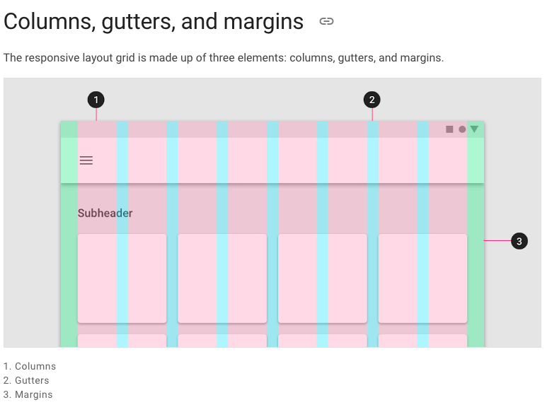
Columns, Gutters & Margins
The responsive layout grid is made up of three elements: columns, gutters, and margins. Read everything about Columns, Gutters & Margins on the material guidelines responsive layout page.
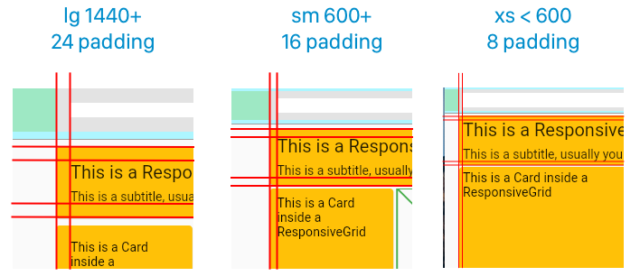
Example: Access global padding setting in your widget:
Spacing.of(context).padding

// or

context.spacingConfig.padding
Just like the custom breakpoints, you can also set your own spacing, spaces, and margins. Create your own gutter class by extending ResponsiveCollection:
There are two types of widgets, the data widgets that create the spacing context and widgets that use the spacing context.
Data Widgets
Data widgets create the spacing context and provide responsive values to all widgets created in the tree below. if there are multiple data widgets in the tree, the closest one is taken.