

 v1.1.5
material_dialogs
一個 Flutter 套件旨在幫助您在應用程式中建立動畫、簡潔、時尚的 Material 對話方塊。
360喜歡 4140近 30 天下載155Pub 分數
AndroidiOSWebmacOSWindowsLinux
一個 Flutter 庫旨在幫助您在應用程式中建立動畫、簡單且時尚的 Material 對話方塊。

以下為英文專案原文快照,最新內容請造訪 GitHub。

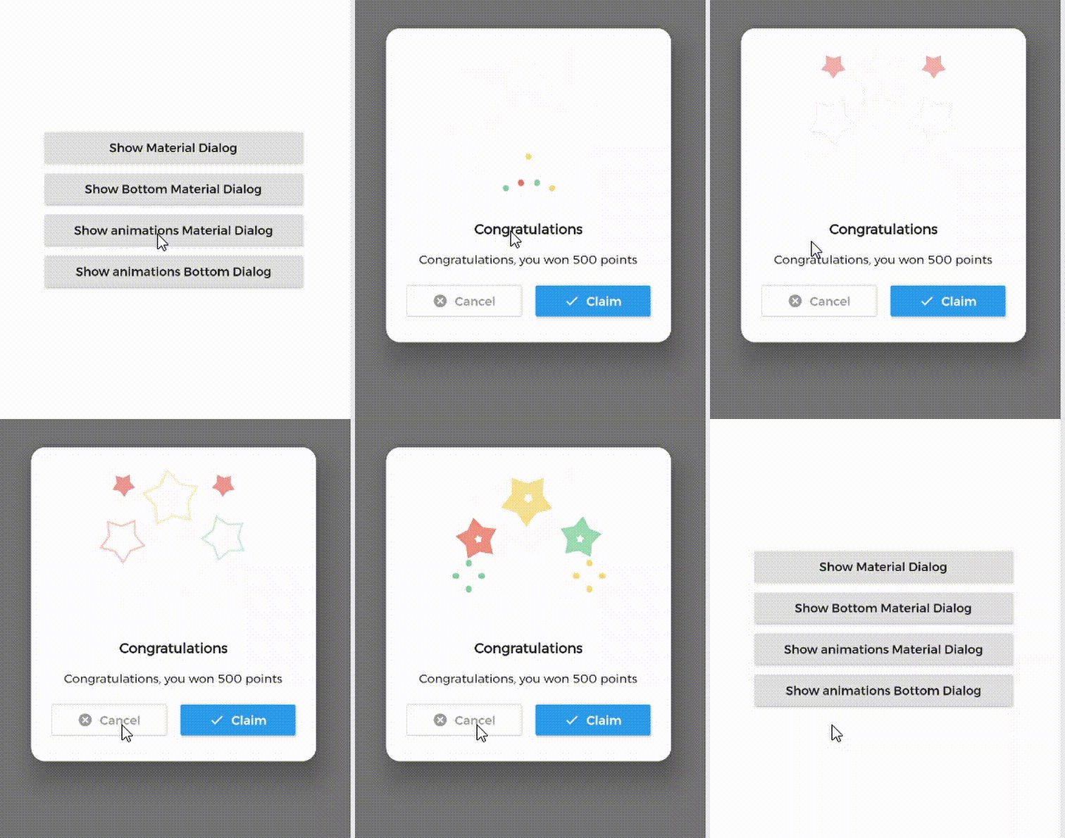
A Flutter library aims to help you create 💪🏻animated, 😃 simple, 😎 stylish Material Dialogs in your app.
| 1. Material Dialog | 2. Animations Material Dialog | 3. Bottom Material Dialog | 4. Animations Bottom Dialog |
|---|---|---|---|
 |
 |
 |
 |
MaterialDialog This Plugin will be useful to create simple, animated, and beautiful dialogs in your next Flutter app. This library implements Airbnb's Lottie library to render After Effects animation in app.
MaterialDialog library provides two types of dialog i.e.
| 1. Material Dialog | 2. Bottom Sheet Material Dialog |
|---|---|
| A normal material dialog which can have one or two buttons. | A Bottom Sheet material dialog which can have one or two buttons, is showed from bottom of device. |
 |
 |
Implementation of Material Dialog library is so easy. You can check /example directory for demo. Let's have look talk in details about it.
In pubspec.yaml
dependencies:
  material_dialogs: _latest_version
Now in your Dart code, you can use:
import 'package:material_dialogs/material_dialogs.dart';
Details see pub.dev.
As there are two types of dialogs in library. Material Dialogs are instantiated as follows.
Dialogs class will be used to create your dialog, below is an example to show your dialog in the app.
Dialogs.materialDialog(
          msg: 'Are you sure ? you can\'t undo this',
          title: "Delete",
          color: Colors.white,
          context: context,
          actions: [
            IconsOutlineButton(
              onPressed: () {},
              text: 'Cancel',
              iconData: Icons.cancel_outlined,
              textStyle: TextStyle(color: Colors.grey),
              iconColor: Colors.grey,
            ),
            IconsButton(
              onPressed: () {},
              text: 'Delete',
              iconData: Icons.delete,
              color: Colors.red,
              textStyle: TextStyle(color: Colors.white),
              iconColor: Colors.white,
            ),
          ])
IconsOutlineButton and IconsButton are both buttons widgets provided by the plugin to make things easier for you read more, you can use any other buttons if you want.
Dialogs class will be used to create your dialog, use bottomMaterialDialog. Below is an example to show your dialog in the app.
Dialogs.bottomMaterialDialog(
          msg: 'Are you sure? you can\'t undo this action',
          title: 'Delete',
          context: context,
          actions: [
            IconsOutlineButton(
              onPressed: () {},
              text: 'Cancel',
              iconData: Icons.cancel_outlined,
              textStyle: TextStyle(color: Colors.grey),
              iconColor: Colors.grey,
            ),
            IconsButton(
              onPressed: () {},
              text: 'Delete',
              iconData: Icons.delete,
              color: Colors.red,
              textStyle: TextStyle(color: Colors.white),
              iconColor: Colors.white,
            ),
          ]),
Animations in this library are implemented using Lottie animation library. You can get free animations files here.
*.json file downloaded from LottieFiles should be placed in flutter project.
For example, here cong_example.json animation file is used in the assets folder to show congratulations animation in the example app.
In code, set lottieBuilder arg in Widget to set Animation to the dialog.
Dialogs.materialDialog(
          color: Colors.white,
          msg: 'Congratulations, you won 500 points',
          title: 'Congratulations',
          lottieBuilder: Lottie.asset(
          'assets/cong_example.json',
          fit: BoxFit.contain,
          ),
          context: context,
          actions: [
            IconsButton(
              onPressed: () {},
              text: 'Claim',
              iconData: Icons.done,
              color: Colors.blue,
              textStyle: TextStyle(color: Colors.white),
              iconColor: Colors.white,
            ),
          ]),
The plugin provide you some out of the box customized buttons to help you creating your dialog.
This widget helps you create an outline button easily
    IconsOutlineButton(
      onPressed: () {},
      text: 'Cancel',
      iconData: Icons.cancel_outlined,
      textStyle: TextStyle(color: Colors.grey),
      iconColor: Colors.grey,
    ),
This widget helps you create a material button with icons in few lines of code
    IconsButton(
      onPressed: () {},
      text: 'Delete',
      iconData: Icons.delete,
      color: Colors.red,
      textStyle: TextStyle(color: Colors.white),
      iconColor: Colors.white,
    ),

You can add your own Widget inside the dialog by using the customView attribute and CustomViewPosition to place it wherever you want.
| Possible values |
|---|
| BEFORE_ANIMATION |
| BEFORE_TITLE (Default) |
| BEFORE_MESSAGE |
| BEFORE_ACTION |
| AFTER_ACTION |
Dialogs.materialDialog(
          color: Colors.white,
          msg: 'Congratulations, you won 500 points',
          title: 'Congratulations',
          lottieBuilder: Lottie.asset(
          'assets/cong_example.json',
          fit: BoxFit.contain,
          ),
          customView: MySuperWidget(),
          customViewPosition: CustomViewPosition.BEFORE_ACTION,
          context: context,
          actions: [
            IconsButton(
              onPressed: () {},
              text: 'Claim',
              iconData: Icons.done,
              color: Colors.blue,
              textStyle: TextStyle(color: Colors.white),
              iconColor: Colors.white,
            ),
          ]),
it's better to make your animation to have the same background color as your dialog's background color, please use lottie editor to remove the background layer of your animation or make it same as your dialog background color before using it in the plugin.
Let's develop with collaborations. We would love to have contributions by raising issues and opening PRs. Filing an issue before PR is must.
This library is built using following open-source libraries.
Project is published under the Apache 2.0 license. Feel free to clone and modify repo as you want, but don't forget to add reference to authors :)
依賴清單 3 項
{"sdk":"flutter"}^3.1.2{"sdk":"flutter"}先依使用情境篩選,再比較專案活躍情況,最後到原始儲存庫確認使用要求。
“A repository is the most basic element of GitHub.”
GitHub Docs — About repositories ↗