
 v0.0.4
awesome_dropdown
一個簡單的下拉庫,支援自訂樣式並控制所有觸控事件。
116喜歡 661近 30 天下載70Pub 分數
平台暫無資料
Faiza-Farooqui/Flutter-CustomizableDropDown open-source repository details.
以下為英文專案原文快照,最新內容請造訪 GitHub。
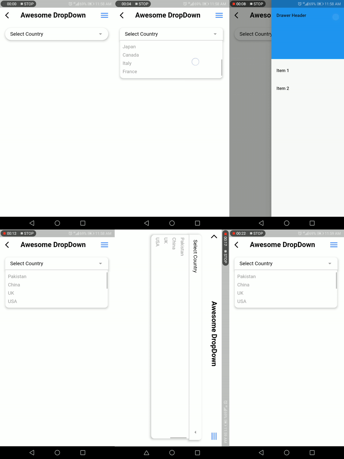
A customizable drop-down library that handles all the touch and clicks events, including iOS and mobile back-pressed callbacks.
Add following dependency in pubspec.yaml file. And add this import to your file.
awesome_dropdown:^0.0.4

import 'package:awesome_dropdown/awesome_dropdown.dart';
Add AwesomeDropdown to the widget tree
AwesomeDropDown(
isPanDown: _isPanDown,
dropDownList: _list,
dropDownIcon: Icon(Icons.arrow_drop_down, color: Colors.grey, size: 23,),
selectedItem: _selectedItem,
onDropDownItemClick: (selectedItem) {
_selectedItem = selectedItem;
},
dropStateChanged: (isOpened) {
_isDropDownOpened = isOpened;
if (!isOpened) {
_isBackPressedOrTouchedOutSide = false; }
},
),
AwesomeDropDown(
isPanDown: _isPanDown,
isBackPressedOrTouchedOutSide:
_isBackPressedOrTouchedOutSide,
dropDownBGColor: Colors.white,
dropDownOverlayBGColor: Colors.transparent,
padding: 8,
dropDownIcon: Icon(Icons.arrow_drop_down, color: Colors.grey, size: 23,),
elevation: 5,
dropDownBorderRadius: 10,
dropDownTopBorderRadius: 50,
dropDownBottomBorderRadius: 50,
dropDownIconBGColor: Colors.transparent,
dropDownList: _list,
selectedItem: _selectedItem,
numOfListItemToShow: 4,
selectedItemTextStyle: TextStyle(
color: Colors.black,
fontSize: 16,
fontWeight: FontWeight.normal),
dropDownListTextStyle: TextStyle(
color: Colors.grey,
fontSize: 15,
backgroundColor: Colors.transparent),
onDropDownItemClick: (selectedItem) {
_selectedItem = selectedItem;
},
dropStateChanged: (isOpened) {
_isDropDownOpened = isOpened;
if (!isOpened) {
_isBackPressedOrTouchedOutSide = false;
}
},
),
Faiza Farooqui & my team members (Hina Hussain, Kamran Khan, Abdul Sattar)

依賴清單 2 項
{"sdk":"flutter"}{"sdk":"flutter"}先依使用情境篩選,再比較專案活躍情況,最後到原始儲存庫確認使用要求。
“A repository is the most basic element of GitHub.”
GitHub Docs — About repositories ↗