
 v2.4.0
bottom_bar_with_sheet
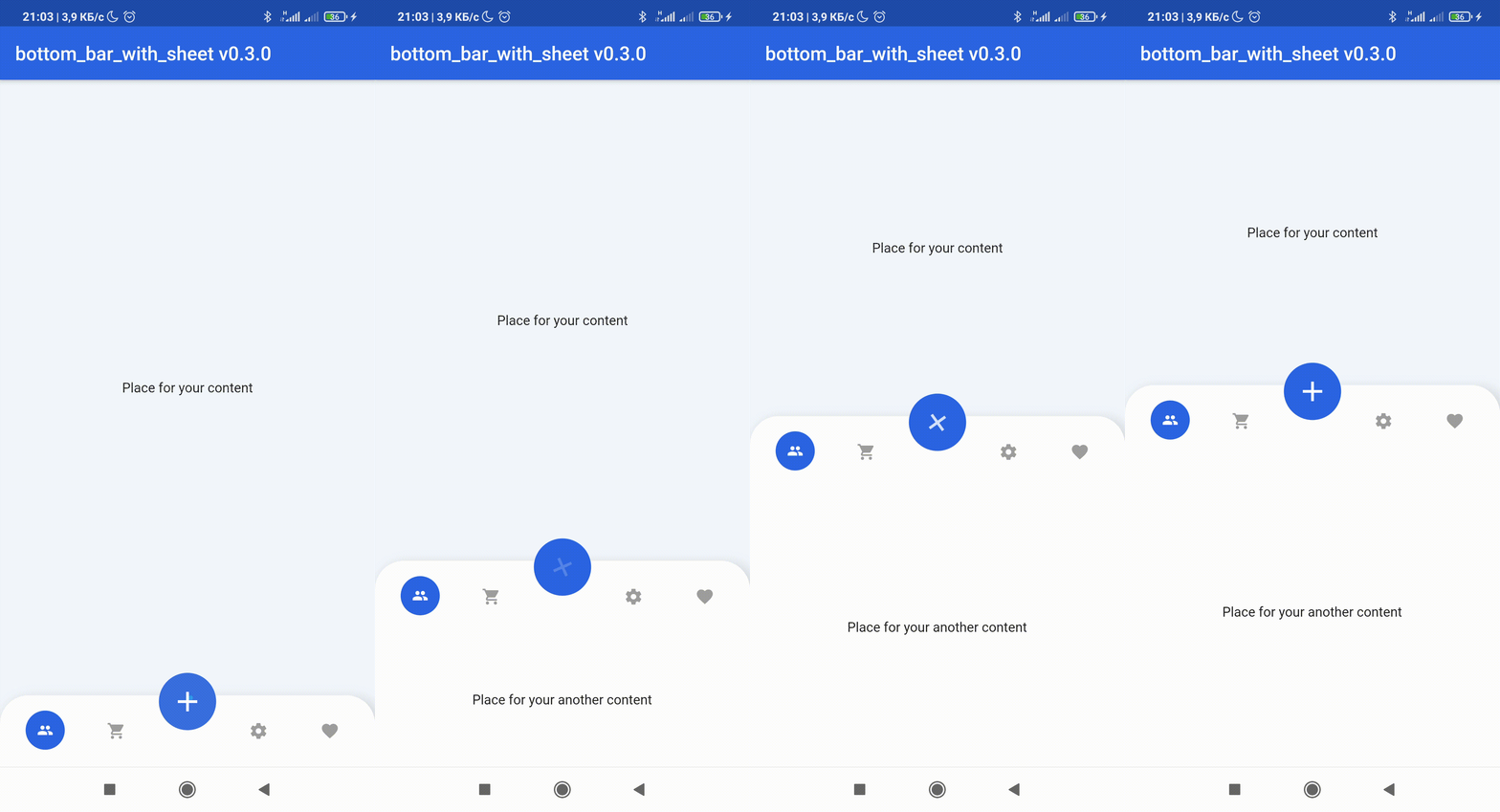
此套件可幫助您建立底部欄,其中包含 FloatingActionButton,可在每個頁面上顯示 BottomSheet 小部件。
613喜歡 226近 30 天下載150Pub 分數
AndroidiOSWebmacOSWindowsLinux
:rocket: Flutter 自訂底部導覽列小部件

{"sdk":"flutter"}{"sdk":"flutter"}以下為英文專案原文快照,最新內容請造訪 GitHub。
Build Status License Pub Stars
Pub likes Pub popularity Pub points
💥Non-standard way to use more space of screens in your application💥
😳Custom bottom Sheet under Bottom Navigation Bar😳
😩Sounds sucks? 😉 First of all look at screens!
| Image | Image | Image | Image |
|---|
dependencies:
  bottom_bar_with_sheet: ^2.4.0
import 'package:bottom_bar_with_sheet/bottom_bar_with_sheet.dart';
Create a Scaffold widget and set bottomNavigationBar with BottomBarWithSheet like in the code below
Scaffold(
  bottomNavigationBar: BottomBarWithSheet(
    controller: _bottomBarController,
    bottomBarTheme: const BottomBarTheme(
      decoration: BoxDecoration(color: Colors.white),
      itemIconColor: Colors.grey,
    ),
    items: const [
      BottomBarWithSheetItem(icon: Icons.people),
      BottomBarWithSheetItem(icon: Icons.favorite),
    ],
  ),
);
More examples you can see here
| Attribute | Type | Annotation |
|---|---|---|
| autoClose | bool | If true the [BottomBarWithSheetItem]'s DO NOT automatically close the child sheet when pressed |
| disableMainActionButton | bool | disable MainActionButton if true , enable if false |
| sheetChild | Widget | that displayed on bottom of BottomBarWithSheet when isOpened == true |
| items | List BottomBarWithSheetItem | navigation buttons of BottomBarWithSheet |
| bottomBarTheme | BottomBarTheme | theme of BottomBarWithSheet |
| mainActionButtonTheme | MainActionButtonTheme | theme of Main Action Button |
| onSelectItem | Function | Callback Function works by clicking on one of items Return int index of selected button |
| duration | Duration | animation time of closing / opening BottomBarWithSheet |
| curve | Curve | the style of animation from the suggested ones of Curve |
| bottomBarMainAxisAlignment | MainAxisAlignment | The direction in which the widget content will line up |
| mainActionButtonBuilder | MainActionButton | Custom version of Main Action Button |
| Attribute | Type | Annotation |
|---|---|---|
| height | double | BottomBarWithSheet icons line height |
| heightOpened | double | BottomBarWithSheet height when isOpened == true |
| heightClosed | double | BottomBarWithSheet height when isOpened == false |
| decoration | BoxDecoration | decoration of BottomBarWithSheet |
| contentPadding | EdgeInsets | create padding between content of widget and sides |
| backgroundColor | Color | BottomBarWithSheet background color |
| selectedItemIconColor | Color | selected item icon color |
| itemIconColor | Color | unselected item icon color |
| selectedItemTextStyle | Color | selected item text style |
| itemTextStyle | Color | unselected item text style |
| selectedItemIconSize | double | size of item icon when item is pressed |
| mainButtonPosition | enum | filed that response for the position of MainActionButton position this field have 3 possible values: MainButtonPosition.left, MainButtonPosition.right , MainButtonPosition.Center |
| isVerticalItemLabel | bool | makes the labels of the items appear vertically or horizontally |
| Attribute | Type | Annotation |
|---|---|---|
| size | double | size of button |
| icon | Widget | icon that displayed in center of MainActionButton |
| color | Color | background color of widget circle |
| splash | Color | splash color of widget circle |
| margin | EdgeInsets | side paddings of Main Action Button |
| transform | Matrix4 | This field can set transform location of Main Action Button |
For help getting started with Flutter, view our online documentation, which offers tutorials, samples, guidance on mobile development, and a full API reference.