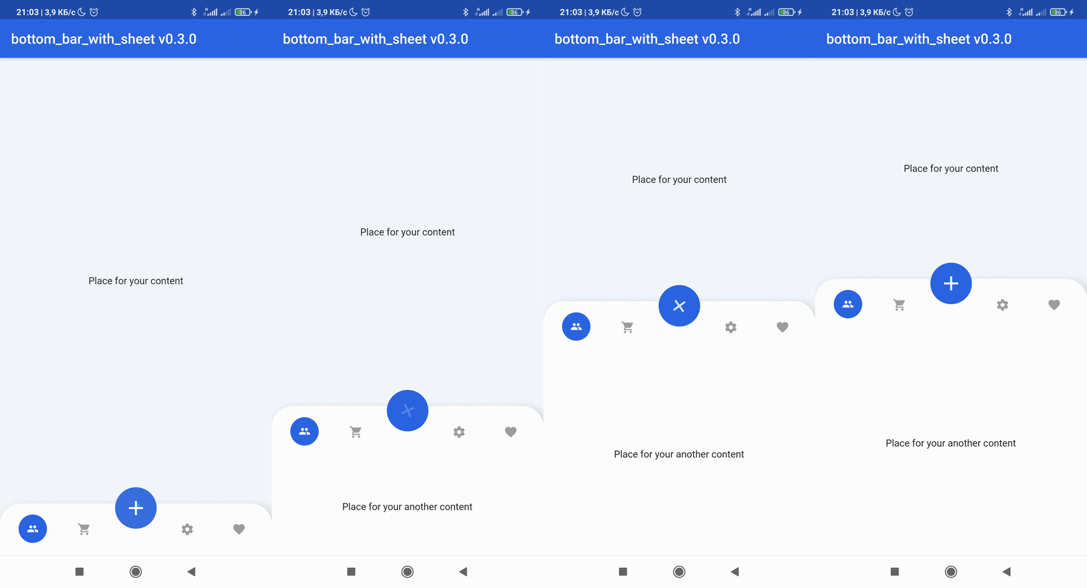
💥Non-standard way to use more space of screens in your application💥
😳Custom bottom Sheet under Bottom Navigation Bar😳
😩Sounds sucks? 😉 First of all look at screens!
If true the [BottomBarWithSheetItem]'s DO NOT automatically close the child sheet when pressed
disableMainActionButton
bool
disable MainActionButton if true , enable if false
sheetChild
Widget
that displayed on bottom of BottomBarWithSheet when isOpened == true
items
List BottomBarWithSheetItem
navigation buttons of BottomBarWithSheet
bottomBarTheme
BottomBarTheme
theme of BottomBarWithSheet
mainActionButtonTheme
MainActionButtonTheme
theme of Main Action Button
onSelectItem
Function
Callback Function works by clicking on one of items Return int index of selected button
duration
Duration
animation time of closing / opening BottomBarWithSheet
curve
Curve
the style of animation from the suggested ones of Curve
bottomBarMainAxisAlignment
MainAxisAlignment
The direction in which the widget content will line up
mainActionButtonBuilder
MainActionButton
Custom version of Main Action Button
Attributes of BottomBarTheme
Attribute
Type
Annotation
height
double
BottomBarWithSheet icons line height
heightOpened
double
BottomBarWithSheet height when isOpened == true
heightClosed
double
BottomBarWithSheet height when isOpened == false
decoration
BoxDecoration
decoration of BottomBarWithSheet
contentPadding
EdgeInsets
create padding between content of widget and sides
backgroundColor
Color
BottomBarWithSheet background color
selectedItemIconColor
Color
selected item icon color
itemIconColor
Color
unselected item icon color
selectedItemTextStyle
Color
selected item text style
itemTextStyle
Color
unselected item text style
selectedItemIconSize
double
size of item icon when item is pressed
mainButtonPosition
enum
filed that response for the position of MainActionButton position this field have 3 possible values: MainButtonPosition.left, MainButtonPosition.right , MainButtonPosition.Center
isVerticalItemLabel
bool
makes the labels of the items appear vertically or horizontally
Attributes of MainActionButtonTheme
Attribute
Type
Annotation
size
double
size of button
icon
Widget
icon that displayed in center of MainActionButton
color
Color
background color of widget circle
splash
Color
splash color of widget circle
margin
EdgeInsets
side paddings of Main Action Button
transform
Matrix4
This field can set transform location of Main Action Button
For help getting started with Flutter, view our
online documentation, which offers tutorials,
samples, guidance on mobile development, and a full API reference.