

 v0.3.2
figma_layout_grid
支援 Figma 的版面網格功能的視覺輔助網格系統
32喜歡 108近 30 天下載160Pub 分數
AndroidiOSWebmacOSWindowsLinux
Iteo/figma_layout_grid open-source repository details.

以下為英文專案原文快照,最新內容請造訪 GitHub。

figma_layout_grid is a Flutter package which imitates Figma's layout grid and all its functionalities. It helps you determine whether your UI components match the design file and align properly.
Wrap a widget with LayoutGrid in order to render a layout grid on top of it.
LayoutGrid(
    ...
    builder: (context) => Scaffold(),
)
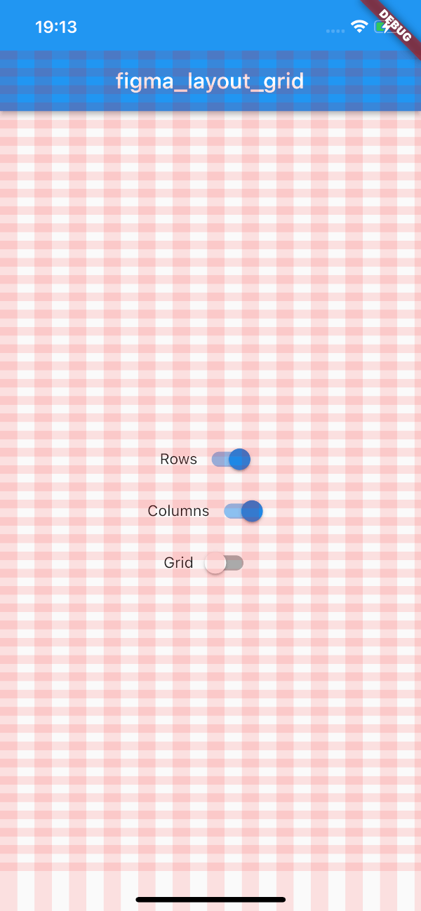
This package supports three types of layout overlays - rows, columns and pixel grid.
Horizontal stripes with specified height, gutter, margin, offset, arrangement and color.
There is a possibility for fixed rows count with passing desired number in a count parameter, otherwise rows are rendered dynamically due to the screen limits.
Example usage
LayoutGrid(
  ...
  rowsParams: const RowsParams(
    offset: 32.0,
    height: 16.0,
    gutter: 16.0,
  ),
  builder: (context) => Scaffold(),
),
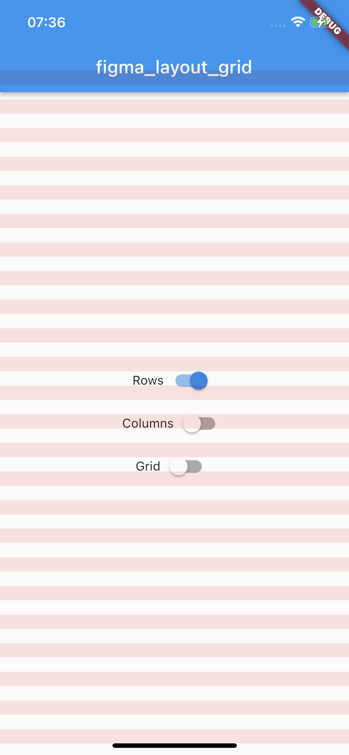
Vertical stripes with specified height, gutter, margin, offset, arrangement and color.
There is a possibility for fixed columns count with passing desired number in a count parameter, otherwise columns are rendered dynamically due to the screen limits.
Example usage
LayoutGrid(
  ...
  columnsParams: const ColumnsParams(
    count: 4,
    width: 64.0,
    margin: 32.0,
  ),
  builder: (context) => Scaffold(),
),
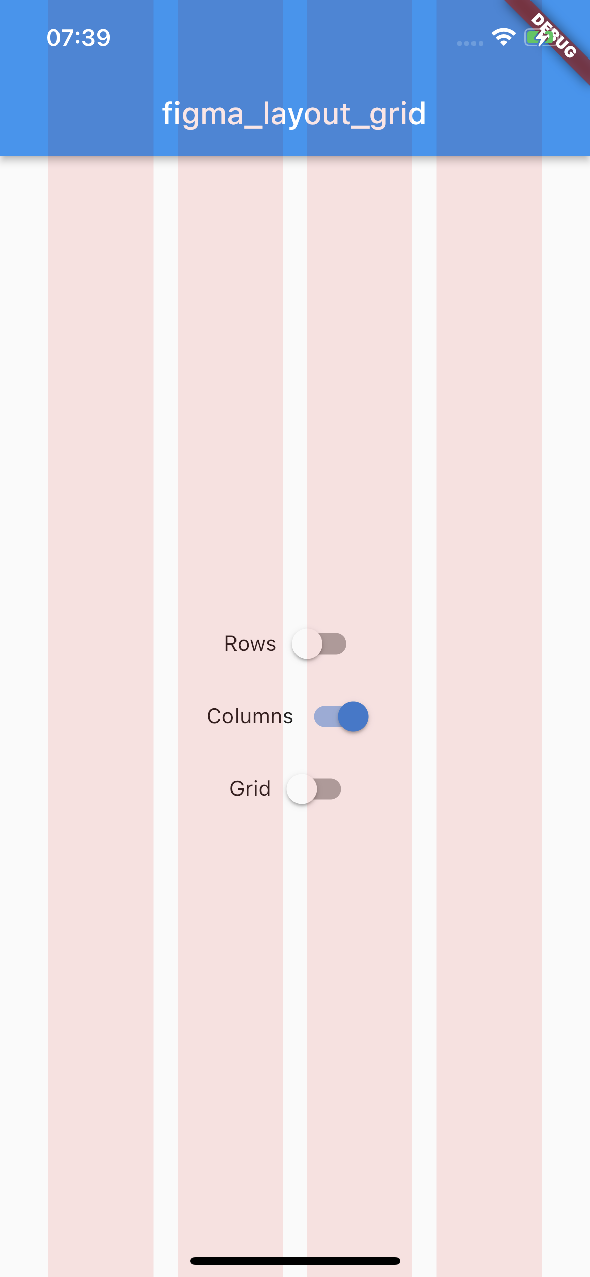
Square pixel grid with fixed spacing and color. The thickness of a grid is set to 1.
Example usage
LayoutGrid(
  ...
  gridParams: const GridParams(
    size: 50.0,
    color: Colors.black26,
  ),
  builder: (context) => Scaffold(),
),
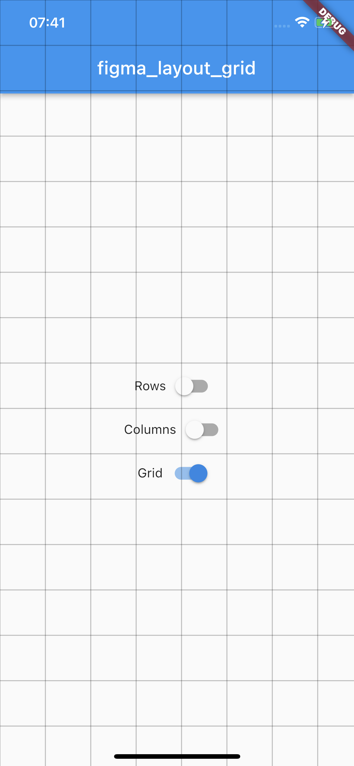
By default all of the layouts are disabled. In order to manage layout grid state you may use LayoutGrid methods which are accessible via builder context.
void LayoutGrid.of(context).showRows() - shows row layout
void LayoutGrid.of(context).hideRows() - hides row layout
void LayoutGrid.of(context).toggleRows() - toggles row layout visibility
bool LayoutGrid.of(context).visibleRows - returns current row layout visibility state
void LayoutGrid.of(context).showColumns() - shows column layout
void LayoutGrid.of(context).hideColumns() - hides column layout
void LayoutGrid.of(context).toggleColumns() - toggles column layout visibility
bool LayoutGrid.of(context).visibleColumns - returns current column layout visibility state
void LayoutGrid.of(context).showGrid() - shows grid layout
void LayoutGrid.of(context).hideGrid() - hides grid layout
void LayoutGrid.of(context).toggleGrid() - toggles grid layout visibility
bool LayoutGrid.of(context).visibleGrid - returns current grid layout visibility state
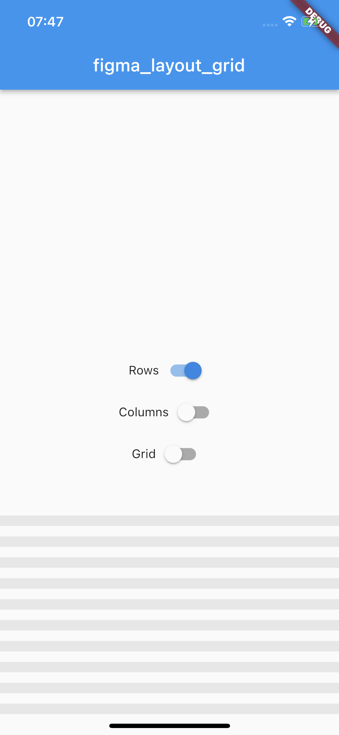
As this package mimics Figma's layout grid features you can directly transfer desired outcome into corresponding parameters. The following example shows columns grid set with count = 10, height = 12, gutter = 12, offset = 24, bottom alignment and some custom color.
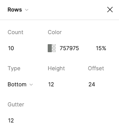
Which translates to this piece of code
LayoutGrid(
  ...
  rowsParams: RowsParams(
    count: 10,
    height: 12.0,
    gutter: 12.0,
    offset: 24.0,
    arrangement: RowsArragement.bottom,
    color: const Color(0xFF757975).withOpacity(0.15),
  ),
  builder: (context) => Scaffold(),
),
And finally to the following UI.
There is also a possibility to enable SafeArea for a specific layout.
Each of the three layers has optional SafeAreaParams within you can pass what SafeArea parts should be handled.
The available options are top, bottom, left and right which correspond to SafeArea's parameters with the same names.
By default SafeArea feature is disabled.
LayoutGrid(
    ...
    rowsParams: const RowsParams(
      safeAreaParams: SafeAreaParams(
        bottom: true,
        top: true,
      ),
    ),
    columnsParams: const ColumnsParams(
      safeAreaParams: SafeAreaParams(
        right: true,
        left: true,
        top: true,
      ),
    ),
    builder: (context) => Scaffold(),
)
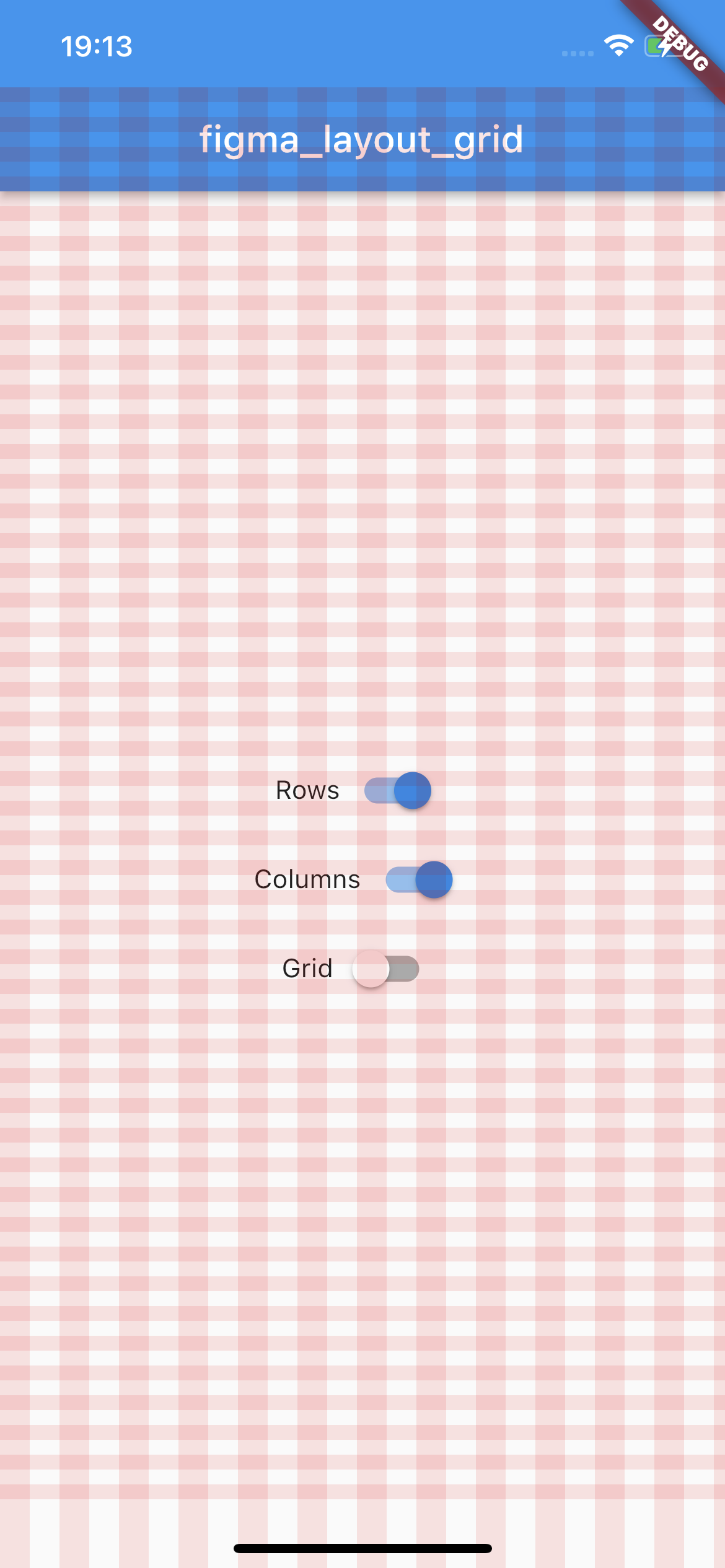
The above snippet will make the grid overlays avoid the device's intrusions.
Try out the example app.
依賴清單 3 項
{"sdk":"flutter"}{"sdk":"flutter"}^2.0.1先依使用情境篩選,再比較專案活躍情況,最後到原始儲存庫確認使用要求。
“A repository is the most basic element of GitHub.”
GitHub Docs — About repositories ↗