搜尋套件、儲存庫與 APP 分類

figma_layout_grid 封面
套件詳情v0.3.2

figma_layout_grid

支援 Figma 的版面網格功能的視覺輔助網格系統

AndroidiOSWebmacOSWindowsLinux
近 30 天下載
108
喜歡數
32
Pub 分數
160

安裝套件

flutter pub add figma_layout_grid

套件介紹

根據套件公開資料產生的選型評估,僅供參考。

一個 Flutter 套件,將 Figma 的版面網格系統實作為視覺輔助,協助開發者將 UI 元素與設計規範一致對齊。它支援 Figma 的網格功能,例如欄位數量、間距大小與偏移量,讓設計與實作之間的版面能精確匹配。此網格以覆蓋層形式顯示於螢幕上,非常適合原型設計與開發。相容所有主要平台,透過彌合 Figma 設計與實際 Flutter 應用之間的差距,提升設計師與開發者之間的協作效率。

適用情境

  • 在Flutter應用中匹配Figma設計
  • 使用視覺網格對齊進行原型設計
  • 設計師與開發人員之間的協作
  • 確保使用者介面版面中的一致性間距
  • 佈局約束的視覺調試

主要特色

  • Figma 風格的網格系統
  • 即時視覺網格疊加
  • 支援欄位、間距與偏移
  • 跨平台相容性
  • 透過 pub add 輕鬆整合
  • 可自訂的網格外觀

適合對象

  • 使用 Flutter 的設計師
  • 遵循Figma設計的Flutter開發人員
  • 使用 Figma 進行 UI/UX 工作流程的團隊
  • 需要像素級佈局對齊的專案
  • 專注於設計一致性的前端團隊

使用建議

  • 網格僅用於視覺輔助,而非版面邏輯
  • 不適用於生產環境的UI渲染
  • 如果過度使用,可能會影響效能
  • 應在發行版本中停用
  • 需要為不同螢幕手動設定

原始 README

以下為關聯原始碼儲存庫的 README 原文快照,最新內容請造訪原始碼儲存庫。

Figma layout grid

pub package  

figma_layout_grid is a Flutter package which imitates Figma's layout grid and all its functionalities. It helps you determine whether your UI components match the design file and align properly.

Basic usage

Wrap a widget with LayoutGrid in order to render a layout grid on top of it.

LayoutGrid(
    ...
    builder: (context) => Scaffold(),
)

Available layouts

This package supports three types of layout overlays - rows, columns and pixel grid.

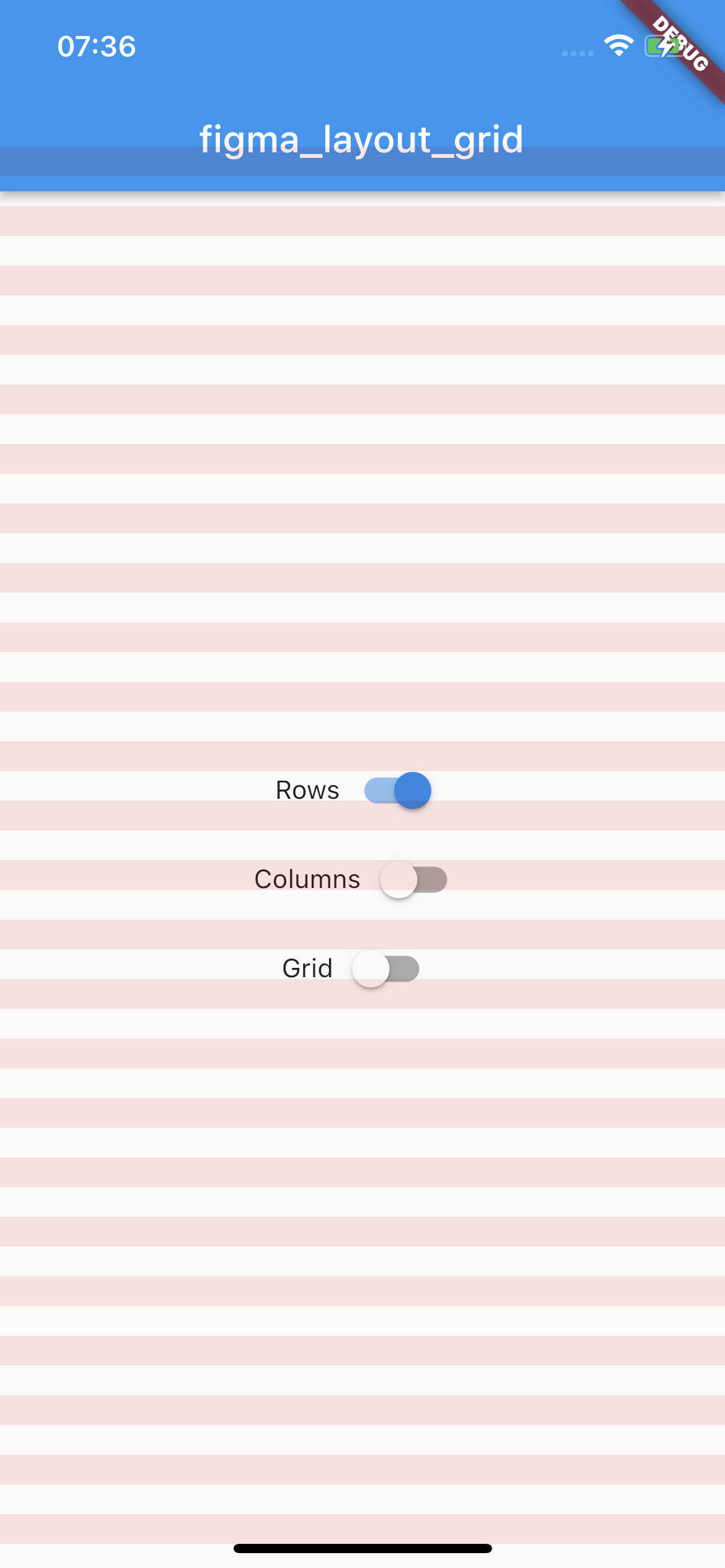
Rows

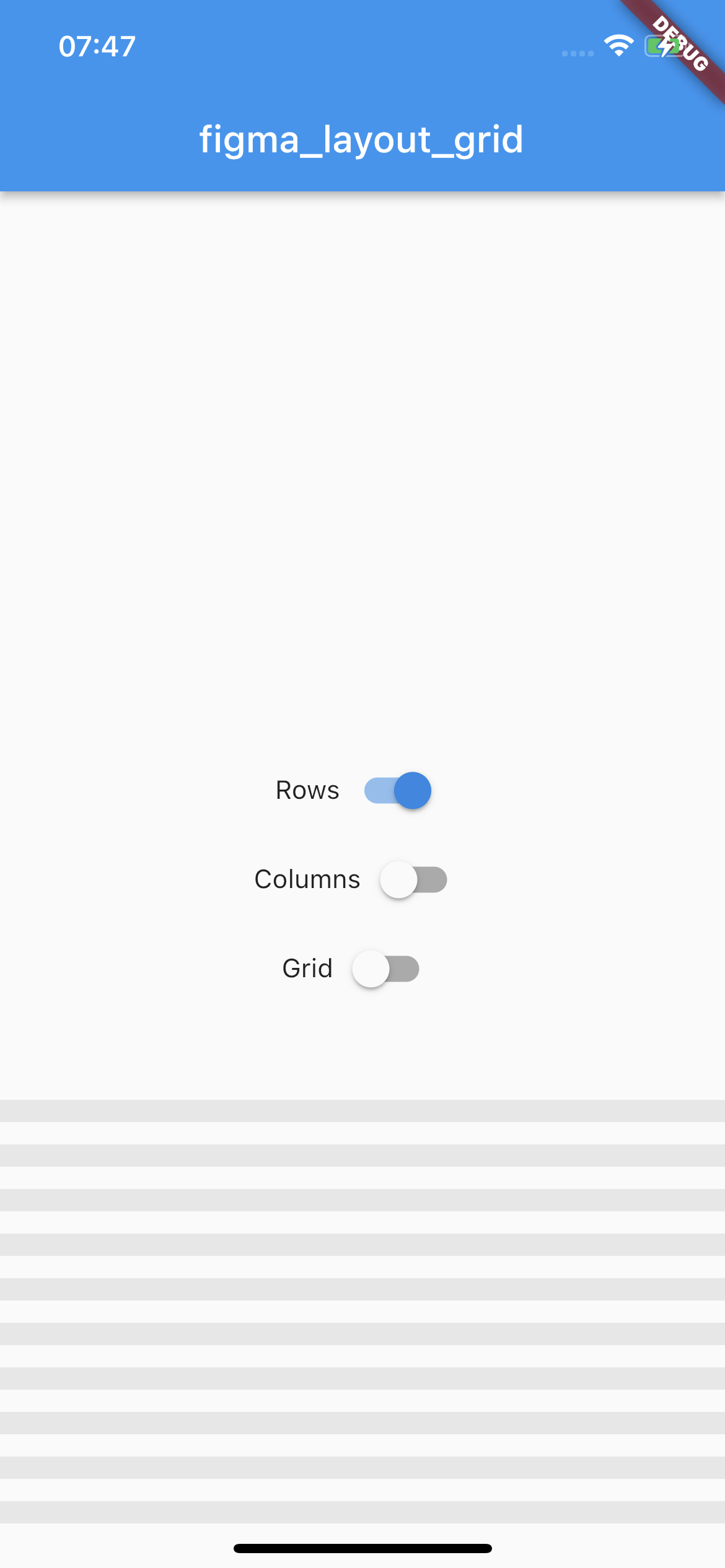
Horizontal stripes with specified height, gutter, margin, offset, arrangement and color. There is a possibility for fixed rows count with passing desired number in a count parameter, otherwise rows are rendered dynamically due to the screen limits.

Example usage

LayoutGrid(
  ...
  rowsParams: const RowsParams(
    offset: 32.0,
    height: 16.0,
    gutter: 16.0,
  ),
  builder: (context) => Scaffold(),
),
rows example image
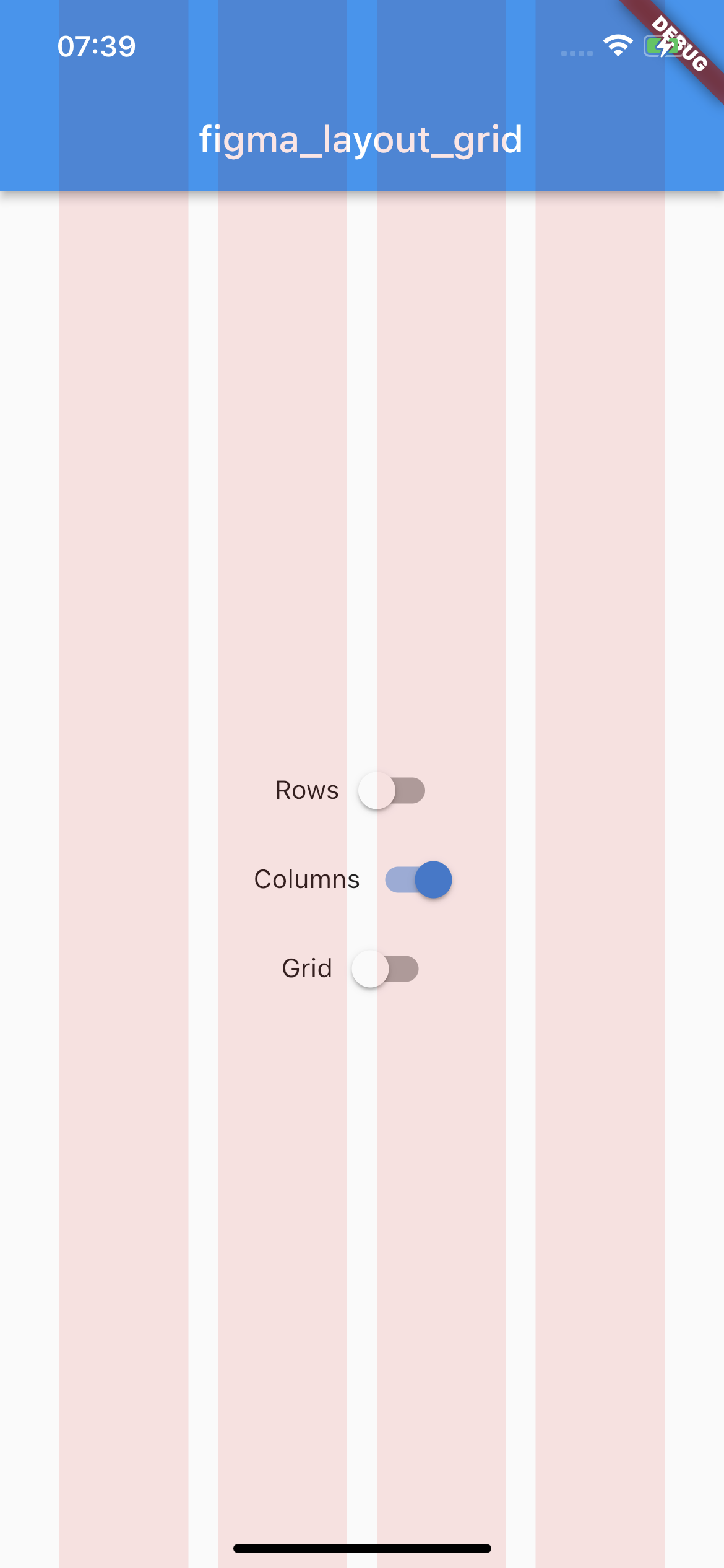
Columns

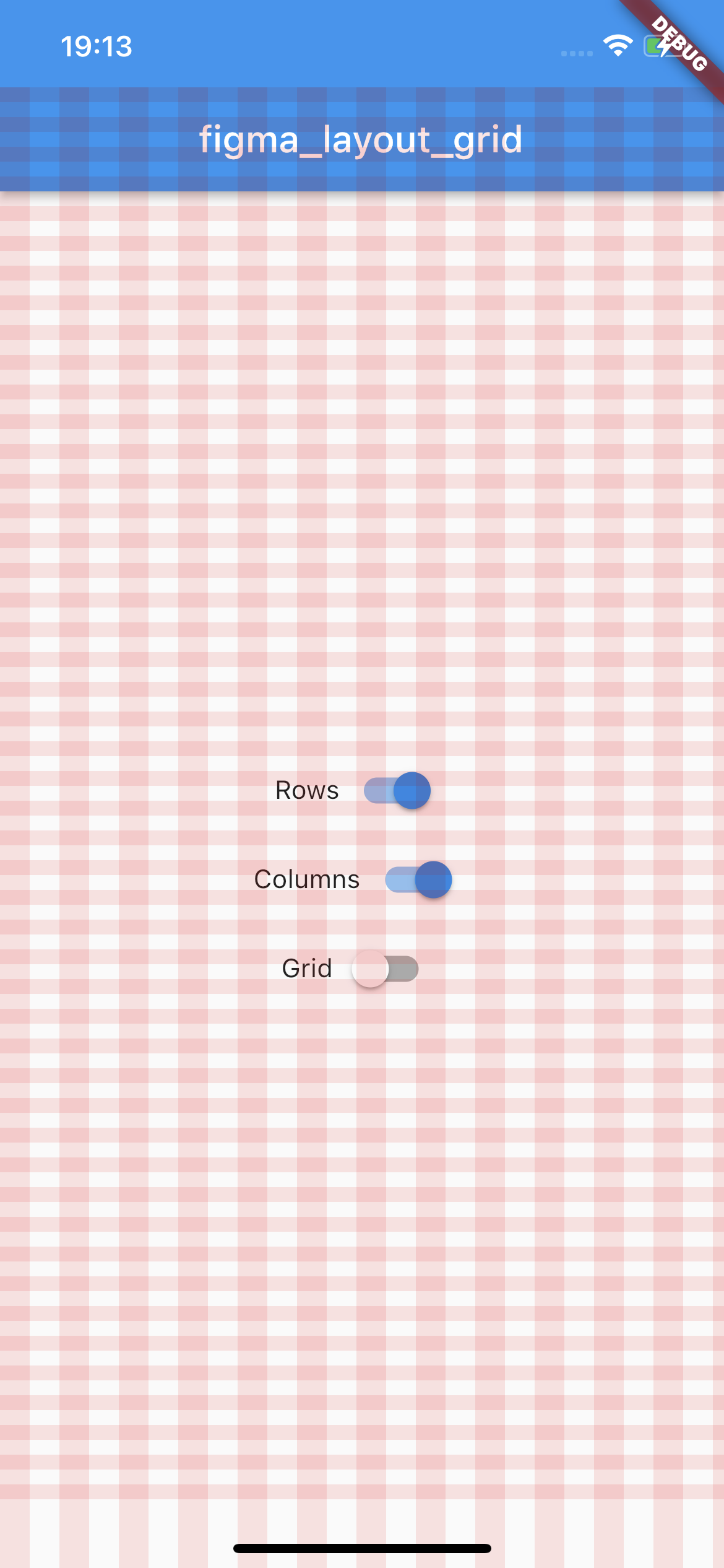
Vertical stripes with specified height, gutter, margin, offset, arrangement and color. There is a possibility for fixed columns count with passing desired number in a count parameter, otherwise columns are rendered dynamically due to the screen limits.

Example usage

LayoutGrid(
  ...
  columnsParams: const ColumnsParams(
    count: 4,
    width: 64.0,
    margin: 32.0,
  ),
  builder: (context) => Scaffold(),
),
columns example image
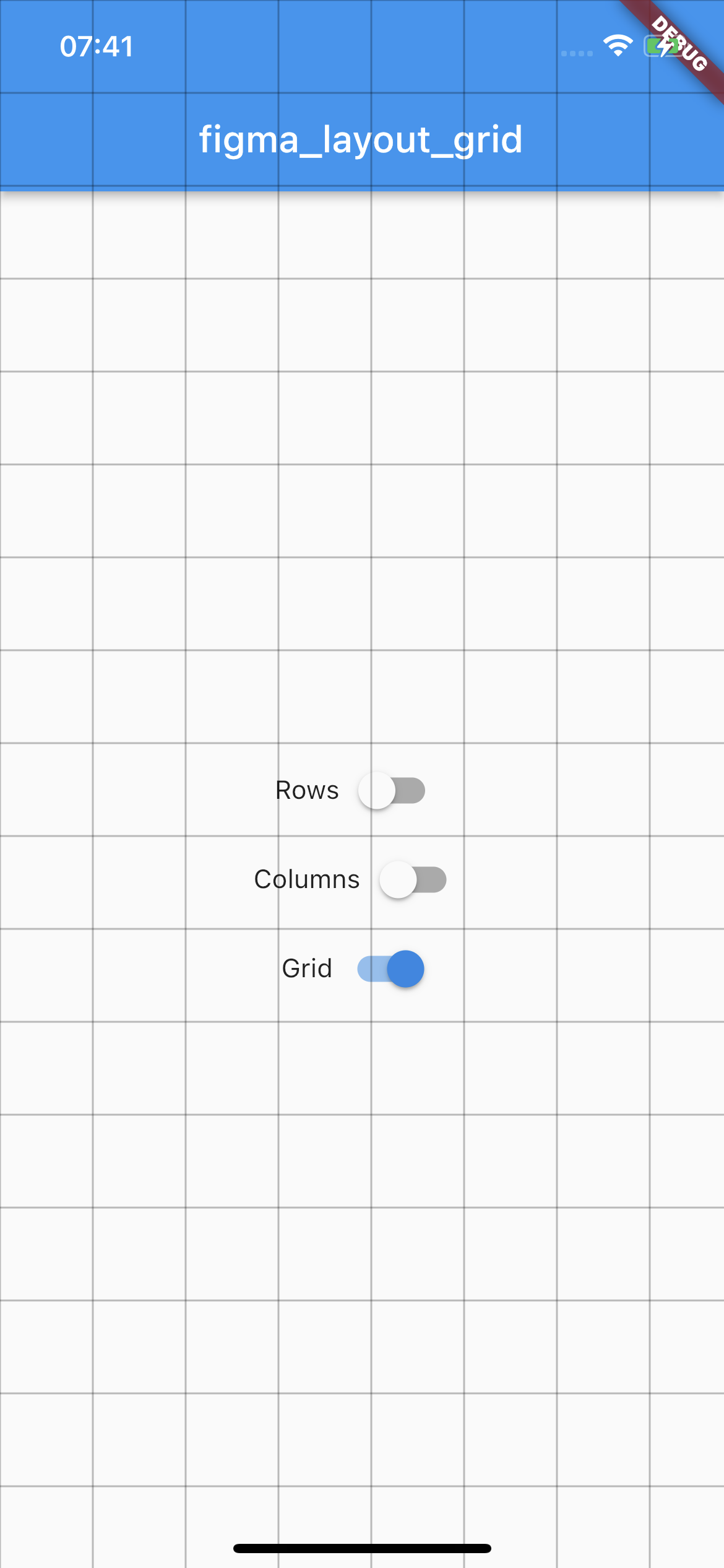
Grid

Square pixel grid with fixed spacing and color. The thickness of a grid is set to 1.

Example usage

LayoutGrid(
  ...
  gridParams: const GridParams(
    size: 50.0,
    color: Colors.black26,
  ),
  builder: (context) => Scaffold(),
),
grid example image

State management

By default all of the layouts are disabled. In order to manage layout grid state you may use LayoutGrid methods which are accessible via builder context.

Rows

void LayoutGrid.of(context).showRows() - shows row layout

void LayoutGrid.of(context).hideRows() - hides row layout

void LayoutGrid.of(context).toggleRows() - toggles row layout visibility

bool LayoutGrid.of(context).visibleRows - returns current row layout visibility state

Columns

void LayoutGrid.of(context).showColumns() - shows column layout

void LayoutGrid.of(context).hideColumns() - hides column layout

void LayoutGrid.of(context).toggleColumns() - toggles column layout visibility

bool LayoutGrid.of(context).visibleColumns - returns current column layout visibility state

Grid

void LayoutGrid.of(context).showGrid() - shows grid layout

void LayoutGrid.of(context).hideGrid() - hides grid layout

void LayoutGrid.of(context).toggleGrid() - toggles grid layout visibility

bool LayoutGrid.of(context).visibleGrid - returns current grid layout visibility state

Parametrization

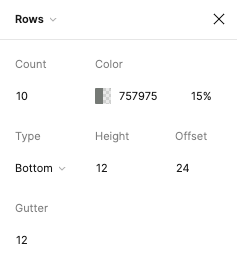
As this package mimics Figma's layout grid features you can directly transfer desired outcome into corresponding parameters. The following example shows columns grid set with count = 10, height = 12, gutter = 12, offset = 24, bottom alignment and some custom color.

figma layout configuration

Which translates to this piece of code

LayoutGrid(
  ...
  rowsParams: RowsParams(
    count: 10,
    height: 12.0,
    gutter: 12.0,
    offset: 24.0,
    arrangement: RowsArragement.bottom,
    color: const Color(0xFF757975).withOpacity(0.15),
  ),
  builder: (context) => Scaffold(),
),

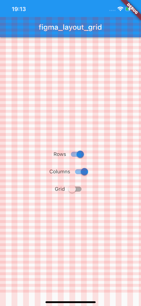
And finally to the following UI.

custom config

There is also a possibility to enable SafeArea for a specific layout.

Each of the three layers has optional SafeAreaParams within you can pass what SafeArea parts should be handled. The available options are top, bottom, left and right which correspond to SafeArea's parameters with the same names.

By default SafeArea feature is disabled.

LayoutGrid(
    ...
    rowsParams: const RowsParams(
      safeAreaParams: SafeAreaParams(
        bottom: true,
        top: true,
      ),
    ),
    columnsParams: const ColumnsParams(
      safeAreaParams: SafeAreaParams(
        right: true,
        left: true,
        top: true,
      ),
    ),
    builder: (context) => Scaffold(),
)

The above snippet will make the grid overlays avoid the device's intrusions.

safe area config

Demo

Try out the example app.

所屬分類

原始碼儲存庫

使用此套件的專案

暫無相關資料。