


 v0.1.3
animated_toggle
Animated Toggle 讓您輕鬆建立自訂的動畫切換按鈕。
29喜歡 196近 30 天下載150Pub 分數
AndroidiOSWebmacOSWindowsLinux
Animated Toggle 讓您輕鬆建立自訂的動畫切換按鈕。

以下為英文專案原文快照,最新內容請造訪 GitHub。



Animated Toggle Give you easy way to make your custom Animated toggle.
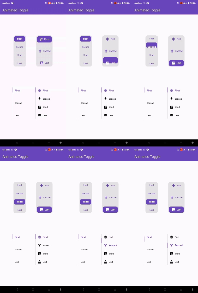
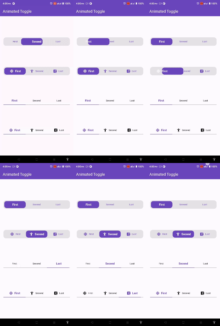
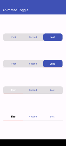
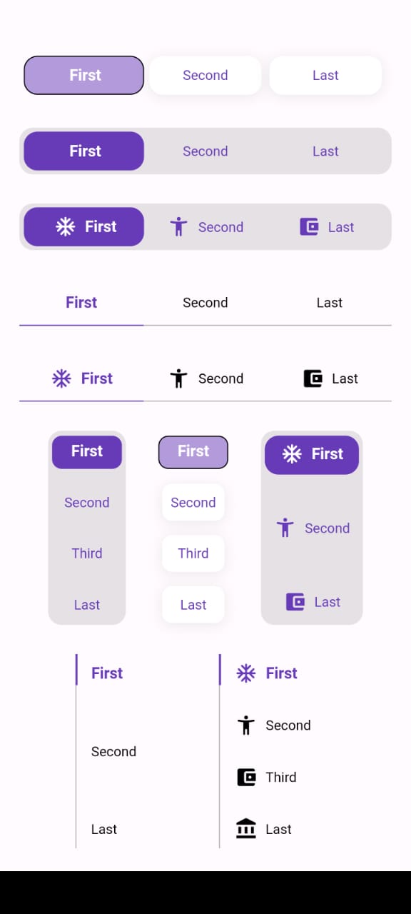
Add this to your pubspec.yaml:
dependencies:
  animated_toggle: ^Last Version
Easy to use the Animated Toggle Package you can handle all colors and width and the height and you can make it vertical or horizontal. You can control the start from left or right if you need this for arabic or english or etc. you can control the Text Style and the padding for the Animated Toggle.
import 'package:animated_toggle/animated_toggle.dart';

void main() {

}

// Start use th package in your State Widget
Horizontal Animated Toggle
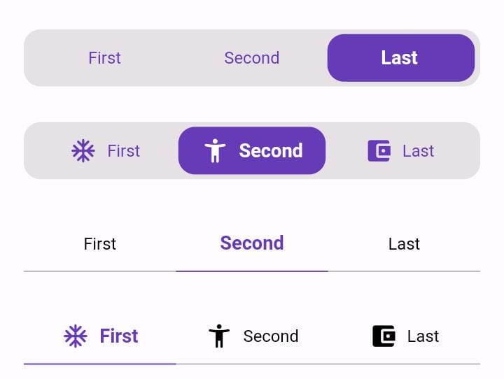
final Duration duration;
final List<String> taps;
final double width;
final double height;
final int initialIndex;
final Color background;
final Color activeColor;
final Color inActiveColor;
final Color underLineColor;
final Color activeUnderLineColor;
final TextStyle activeTextStyle;
final TextStyle inActiveTextStyle;
final double spaceBetween;
final double horizontalPadding;
final double verticalPadding;
final double activeHorizontalPadding;
final double activeVerticalPadding;
final double radius;
final double underLineHeight;
final double activeUnderLineHeight;
final double activeButtonRadius;
final double inActiveButtonRadius;
final Function(int currentIndex, int targetIndex)? onChange;
final bool showUnderLine;
final bool showActiveButtonColor;
final String local;
final List<Widget>? prefixIcons;
final bool showPrefixIcon;
final double spaceBetweenIconAndText;
final List<BoxShadow>? activeBoxShadow;
final List<BoxShadow>? inActiveBoxShadow;
final Border? activeBorder;
final Border? inActiveBorder;
Vertical Animated Toggle
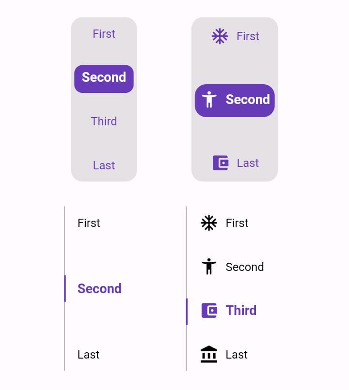
final Duration duration;
final List<String> taps;
final double width;
final double height;
final int initialIndex;
final Color background;
final Color activeColor;
final Color inActiveColor;
final Color sideLineColor;
final Color activeSideLineColor;
final TextStyle activeTextStyle;
final TextStyle inActiveTextStyle;
final double horizontalPadding;
final double verticalPadding;
final double activeHorizontalPadding;
final double activeVerticalPadding;
final double radius;
final double activeButtonHeight;
final double sideLineWidth;
final double activeSideLineWidth;
final double activeButtonRadius;
final double inActiveButtonRadius;
final Function(int currentIndex, int targetIndex)? onChange;
final bool showSideLine;
final bool showActiveButtonColor;
final String local;
final List<Widget>? prefixIcons;
final bool showPrefixIcon;
final double spaceBetweenIconAndText;
final List<BoxShadow>? activeBoxShadow;
final List<BoxShadow>? inActiveBoxShadow;
final Border? activeBorder;
final Border? inActiveBorder;
For More Examples Go To Example Tap
How to use Horizontal Animated Toggle
class MyAnimatedToggle extends StatefulWidget {
  const MyAnimatedToggle({super.key});

  @override
  State<MyAnimatedToggle> createState() => _MyAnimatedToggleState();
}

class _MyAnimatedToggleState extends State<MyAnimatedToggle> {

  @override
  Widget build(BuildContext context) {
    return Scaffold(
      appBar: AppBar(
        backgroundColor: Theme.of(context).colorScheme.inversePrimary,
        title: const Text('Animated Toggle'),
      ),
      body: Center(
        child: AnimatedHorizontalToggle(
          taps: const ['First', 'Second', 'Last'],
          // write you taps names
          width: MediaQuery.of(context).size.width - 40,
          height: 48,
          duration: const Duration(milliseconds: 300),
          initialIndex: 0,
          background: Colors.black.withOpacity(0.1),
          activeColor: Colors.deepPurple,
          // here you can control the active text style
          activeTextStyle: const TextStyle(
              fontSize: 16, fontWeight: FontWeight.w600, color: Colors.white),
          // here you can control the inactive text style
          inActiveTextStyle: const TextStyle(
              fontSize: 14,
              fontWeight: FontWeight.w400,
              color: Colors.deepPurple),
          // the next 2 line if you need to put padding for the inactive buttons
          horizontalPadding: 4,
          verticalPadding: 4,
          // the next 2 line if you need to put padding for the active button
          activeHorizontalPadding: 2,
          activeVerticalPadding: 4,
          radius: 14,
          // you can control the radius for the Animated widget
          activeButtonRadius: 14,
          // you can control the radius for the active button
          onChange: (int currentIndex, int targetIndex) {
            // write Your Personal Code Here
          },
          showActiveButtonColor: true,
          // 'en' mean make the start from left other mean start from right
          local:
          'en', // her you can add the local to control the alignment like if you use en its the normal to start from left to right and if you use ar the will start from right to left
        ),
      ),
    );
  }
}
How to use Vertical Animated Toggle
class MyAnimatedToggle extends StatefulWidget {
  const MyAnimatedToggle({super.key});

  @override
  State<MyAnimatedToggle> createState() => _MyAnimatedToggleState();
}

class _MyAnimatedToggleState extends State<MyAnimatedToggle> {

  @override
  Widget build(BuildContext context) {
    return Scaffold(
      appBar: AppBar(
        backgroundColor: Theme.of(context).colorScheme.inversePrimary,
        title: const Text('Animated Toggle'),
      ),
      body: Center(
        child: AnimatedVerticalToggle(
          taps: const ['First', 'Second', 'Third', 'Last'],
          width: 80,
          height: 200,
          duration: const Duration(milliseconds: 300),
          activeButtonHeight: 34,
          initialIndex: 0,
          background: Colors.black.withOpacity(0.1),
          activeColor: Colors.deepPurple,
          // here you can control the active text style
          activeTextStyle: const TextStyle(
              fontSize: 16,
              fontWeight: FontWeight.w600,
              color: Colors.white),
          // here you can control the inactive text style
          inActiveTextStyle: const TextStyle(
              fontSize: 14,
              fontWeight: FontWeight.w400,
              color: Colors.deepPurple),
          // the next 2 line if you need to put padding for the inactive buttons
          horizontalPadding: 4,
          verticalPadding: 4,
          // the next 2 line if you need to put padding for the active button
          activeHorizontalPadding: 4,
          activeVerticalPadding: 2,
          radius: 14,
          // you can control the radius for the Animated widget
          activeButtonRadius: 10,
          // you can control the radius for the active button
          onChange: (int currentIndex, int targetIndex) {
            // write Your Personal Code Here
          },
          showActiveButtonColor: true,
          // 'en' mean make the start from left other mean start from right
          local:
          'en', // her you can add the local to control the alignment like if you use en its the normal to start from left to right and if you use ar the will start from right to left
        ),
      ),
    );
  }
}
Say to me in GitHub what you need to see in the package in the next update. Wait for more feature soon.
依賴清單 5 項
^2.3.3{"sdk":"flutter"}{"sdk":"flutter"}^3.0.0^6.3.0先依使用情境篩選,再比較專案活躍情況,最後到原始儲存庫確認使用要求。
“A repository is the most basic element of GitHub.”
GitHub Docs — About repositories ↗