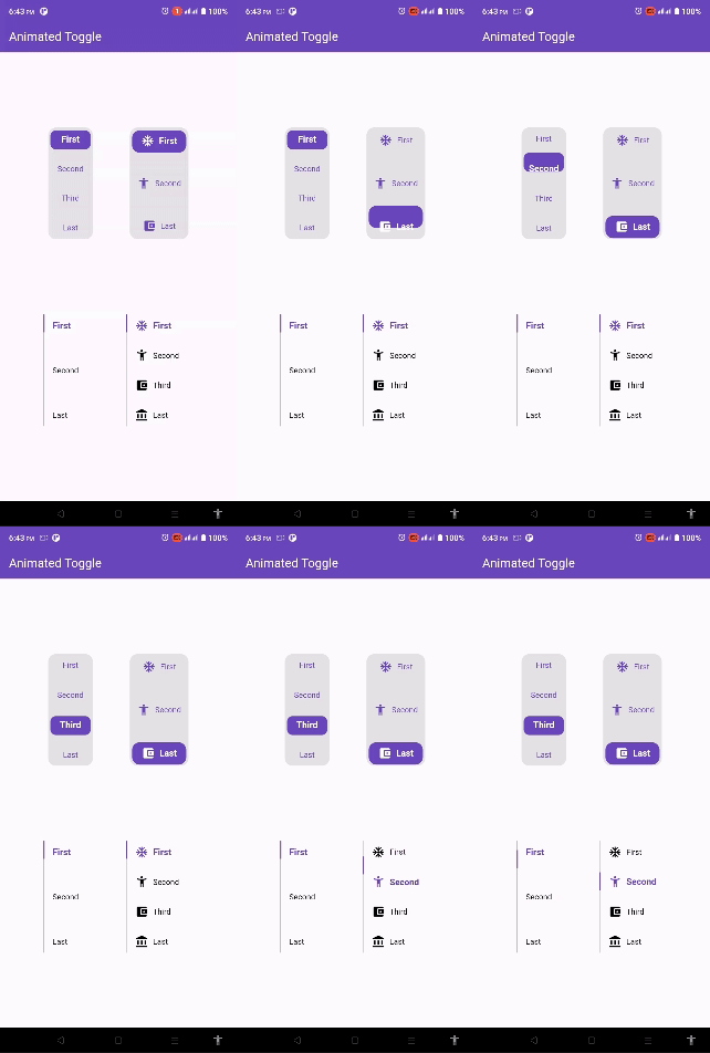
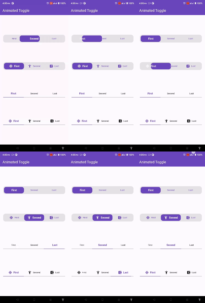
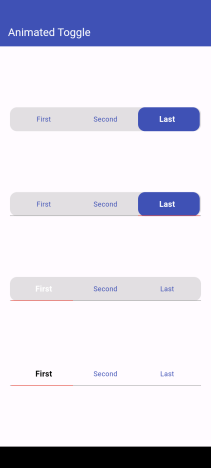
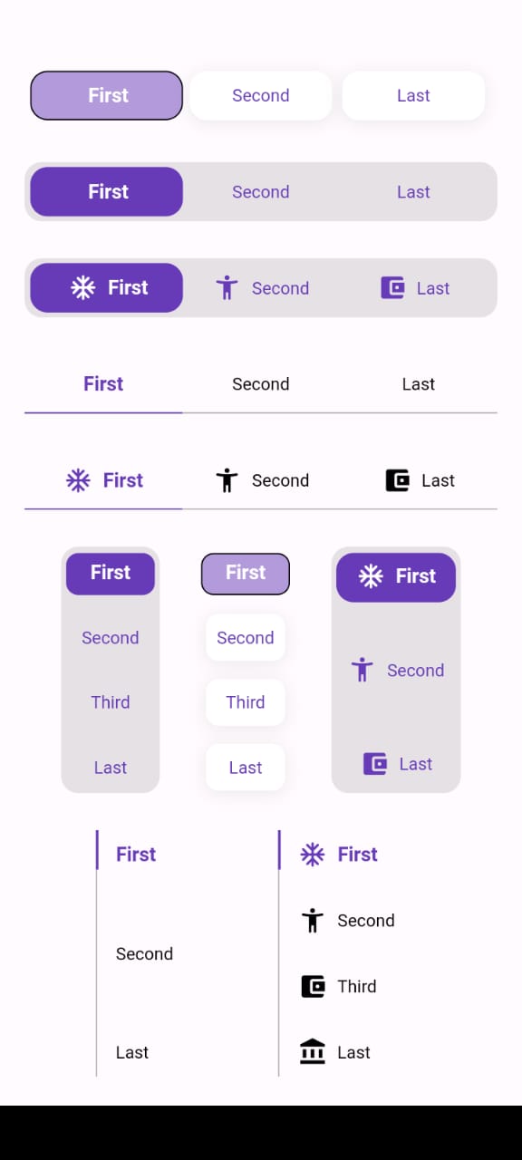
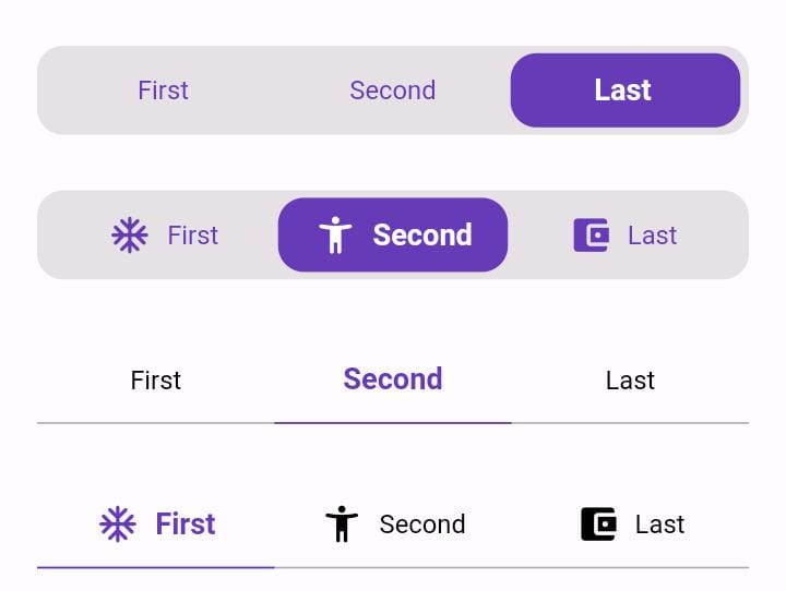
Animated Toggle Give you easy way to make your custom Animated toggle.
Installation
Add this to your pubspec.yaml:
dependencies:animated_toggle:^LastVersion
Features
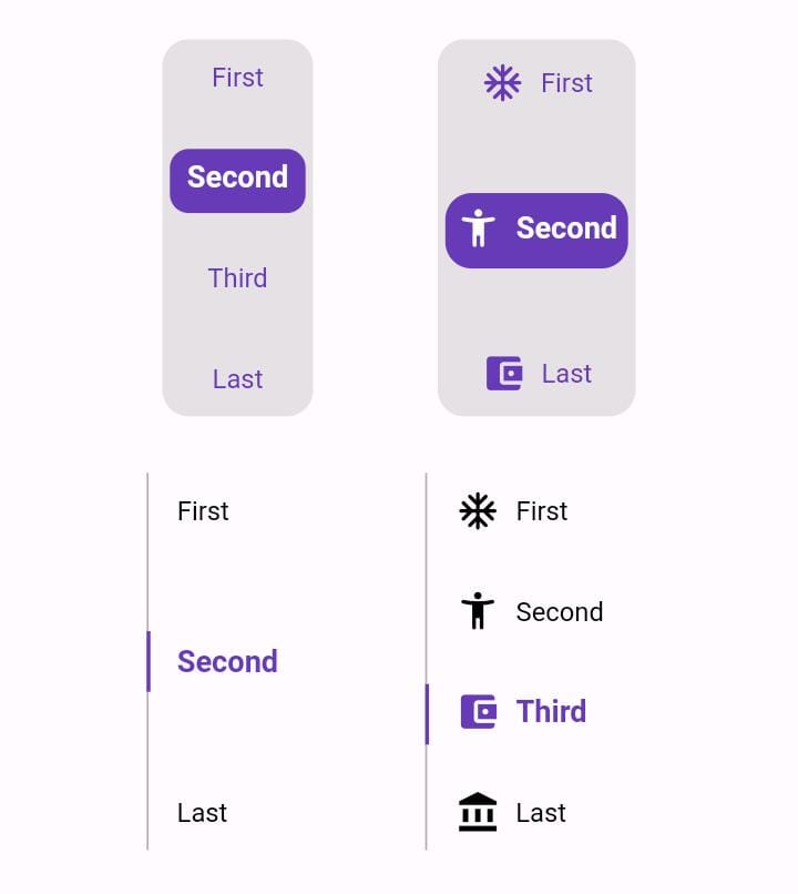
Easy to use the Animated Toggle Package you can handle all colors and width and the height and you can make it vertical or horizontal.
You can control the start from left or right if you need this for arabic or english or etc.
you can control the Text Style and the padding for the Animated Toggle.
Getting started
import'package:animated_toggle/animated_toggle.dart';
voidmain() {
}
// Start use th package in your State Widget
classMyAnimatedToggleextendsStatefulWidget{
constMyAnimatedToggle({super.key});
@overrideState<MyAnimatedToggle> createState() => _MyAnimatedToggleState();
}
class_MyAnimatedToggleStateextendsState<MyAnimatedToggle> {
@overrideWidgetbuild(BuildContext context) {
returnScaffold(
appBar: AppBar(
backgroundColor: Theme.of(context).colorScheme.inversePrimary,
title: constText('Animated Toggle'),
),
body: Center(
child: AnimatedHorizontalToggle(
taps: const ['First', 'Second', 'Last'],
// write you taps names
width: MediaQuery.of(context).size.width - 40,
height: 48,
duration: constDuration(milliseconds: 300),
initialIndex: 0,
background: Colors.black.withOpacity(0.1),
activeColor: Colors.deepPurple,
// here you can control the active text style
activeTextStyle: constTextStyle(
fontSize: 16, fontWeight: FontWeight.w600, color: Colors.white),
// here you can control the inactive text style
inActiveTextStyle: constTextStyle(
fontSize: 14,
fontWeight: FontWeight.w400,
color: Colors.deepPurple),
// the next 2 line if you need to put padding for the inactive buttons
horizontalPadding: 4,
verticalPadding: 4,
// the next 2 line if you need to put padding for the active button
activeHorizontalPadding: 2,
activeVerticalPadding: 4,
radius: 14,
// you can control the radius for the Animated widget
activeButtonRadius: 14,
// you can control the radius for the active button
onChange: (int currentIndex, int targetIndex) {
// write Your Personal Code Here
},
showActiveButtonColor: true,
// 'en' mean make the start from left other mean start from right
local:
'en', // her you can add the local to control the alignment like if you use en its the normal to start from left to right and if you use ar the will start from right to left
),
),
);
}
}
How to use Vertical Animated Toggle
classMyAnimatedToggleextendsStatefulWidget{
constMyAnimatedToggle({super.key});
@overrideState<MyAnimatedToggle> createState() => _MyAnimatedToggleState();
}
class_MyAnimatedToggleStateextendsState<MyAnimatedToggle> {
@overrideWidgetbuild(BuildContext context) {
returnScaffold(
appBar: AppBar(
backgroundColor: Theme.of(context).colorScheme.inversePrimary,
title: constText('Animated Toggle'),
),
body: Center(
child: AnimatedVerticalToggle(
taps: const ['First', 'Second', 'Third', 'Last'],
width: 80,
height: 200,
duration: constDuration(milliseconds: 300),
activeButtonHeight: 34,
initialIndex: 0,
background: Colors.black.withOpacity(0.1),
activeColor: Colors.deepPurple,
// here you can control the active text style
activeTextStyle: constTextStyle(
fontSize: 16,
fontWeight: FontWeight.w600,
color: Colors.white),
// here you can control the inactive text style
inActiveTextStyle: constTextStyle(
fontSize: 14,
fontWeight: FontWeight.w400,
color: Colors.deepPurple),
// the next 2 line if you need to put padding for the inactive buttons
horizontalPadding: 4,
verticalPadding: 4,
// the next 2 line if you need to put padding for the active button
activeHorizontalPadding: 4,
activeVerticalPadding: 2,
radius: 14,
// you can control the radius for the Animated widget
activeButtonRadius: 10,
// you can control the radius for the active button
onChange: (int currentIndex, int targetIndex) {
// write Your Personal Code Here
},
showActiveButtonColor: true,
// 'en' mean make the start from left other mean start from right
local:
'en', // her you can add the local to control the alignment like if you use en its the normal to start from left to right and if you use ar the will start from right to left
),
),
);
}
}
Additional information
Say to me in GitHub what you need to see in the package in the next update.
Wait for more feature soon.