

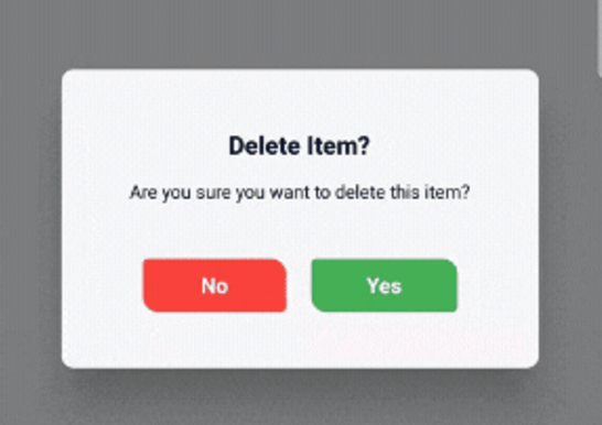
 v1.0.2
animated_confirm_dialog
一個可自訂的確認對話框 Flutter 套件,支援可選的 3D 翻轉動畫和現代化介面。
46喜歡 73近 30 天下載150Pub 分數
AndroidiOSWebmacOSWindowsLinux
MilakeSuraj/animated_confirm_dialog open-source repository details.

以下為英文專案原文快照,最新內容請造訪 GitHub。

A customizable Flutter package for displaying confirmation dialogs with optional 3D flip animations and modern UI. This package allows you to easily show stylish confirmation dialogs with a clean and modern design, making it highly customizable.

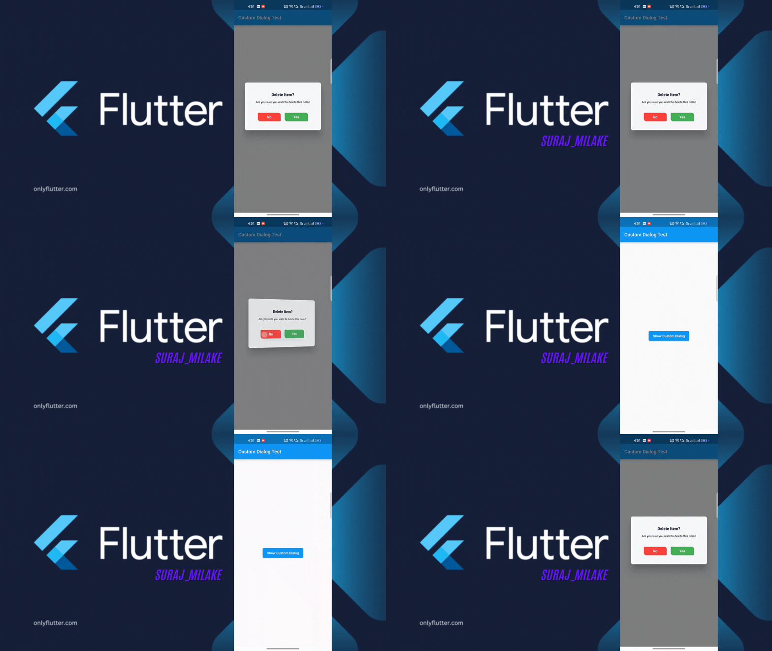
To use animated_confirm_dialog in your Flutter project, follow these simple steps.
Before starting, ensure that you have the following installed:
>=3.0.0>=3.1.3 <4.0.0pubspec.yaml file.dependencies, add the following line:dependencies:
animated_confirm_dialog: ^1.0.2
Once you’ve installed the package, you can use the showCustomDialog function to display the confirmation dialog. Here’s an example of how to use it:
import 'package:animated_confirm_dialog/animated_confirm_dialog.dart';

 showCustomDialog(
              context: context,
              title: 'Delete Item?',
              message: 'Are you sure you want to delete this item?',
              cancelButtonText: 'No',
              confirmButtonText: 'Yes',
              cancelButtonColor: Colors.red,
              cancelButtonTextColor: Colors.white,
              confirmButtonColor: Colors.green,
              confirmButtonTextColor: Colors.white,
              onCancel: () {
                // Action when cancel button is pressed
                Navigator.of(context).pop();
              },
              onConfirm: () {
                // Action when confirm button is pressed
                Navigator.of(context).pop();
              },
              isFlip: true, // You can set isFlip to true for 3D rotation effect
            );
You can customize various aspects of the dialog by passing different parameters. Below is a list of customizable options:
| Parameter | Description | Default |
|---|---|---|
title |
The title of the dialog. | 'Logout Confirmation' |
message |
The message displayed inside the dialog. | 'Are you sure you want to log out?' |
cancelButtonText |
Text for the cancel button. | 'Cancel' |
confirmButtonText |
Text for the confirm button. | 'Logout' |
backgroundColor |
Background color of the dialog. | Color(0xFFF5F5F5) |
titleColor |
Color of the title text. | Color(0xFF000000) |
messageColor |
Color of the message text. | Color(0xFF000000) |
cancelButtonColor |
Background color of the cancel button. | Color(0xFF007BFF) |
cancelButtonTextColor |
Color of the cancel button text. | Colors.white |
confirmButtonColor |
Background color of the confirm button. | Colors.white |
confirmButtonTextColor |
Color of the confirm button text. | Color(0xFF007BFF) |
onCancel |
A callback function triggered when the cancel button is tapped. | null (no action) |
onConfirm |
A callback function triggered when the confirm button is tapped. | null (no action) |
isFlip |
Enables a 3D flip animation when the dialog is shown. | false |
dismissible |
Controls whether the dialog can be dismissed by tapping outside. | true |
This project is licensed under the MIT License. You can view the full license in the LICENSE file.
You can support the library by:
依賴清單 3 項
{"sdk":"flutter"}{"sdk":"flutter"}^2.0.0先依使用情境篩選,再比較專案活躍情況,最後到原始儲存庫確認使用要求。
“A repository is the most basic element of GitHub.”
GitHub Docs — About repositories ↗