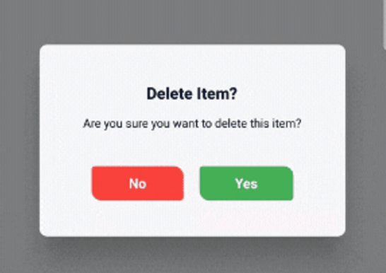
一個 Flutter 套件,提供可自訂的確認對話方塊,支援可選的 3D 翻轉動畫與現代、簡潔的使用者介面。它透過在確認動作期間提供流暢的視覺反饋來增強使用者互動。開發者可以輕鬆調整對話方塊的外觀、按鈕和行為,以符合其應用程式的設計語言。該套件支援多個平台,包括 Android、iOS、Web、macOS、Windows 和 Linux,確保跨裝置的一致體驗。
適用情境
用戶操作確認
表單提交驗證
刪除或取消操作
應用設定變更
入職步驟確認
安全相關提示
主要特色
可自訂的對話方塊樣式
可選的3D翻轉動畫
現代化且響應式的使用者介面
跨平台相容性
與 Flutter 的輕鬆整合
可設定的按鈕標籤與動作
適合對象
尋求精緻對話互動的開發者
需要直覺式使用者確認的應用程式
強調視覺反饋的專案
跨平台行動與Web應用
以UI為中心的Flutter應用
使用建議
可能需要額外的樣式設定以適應複雜主題
低階設備上的動畫效能
僅限確認使用案例
依賴 Flutter 的動畫框架
不適用於非互動式彈窗
原始 README
以下為關聯原始碼儲存庫的 README 原文快照,最新內容請造訪原始碼儲存庫。
animated_confirm_dialog
A customizable Flutter package for displaying confirmation dialogs with optional 3D flip animations and modern UI. This package allows you to easily show stylish confirmation dialogs with a clean and modern design, making it highly customizable.
Features
Customizable Dialogs: Easily adjust the title, message, and button text.
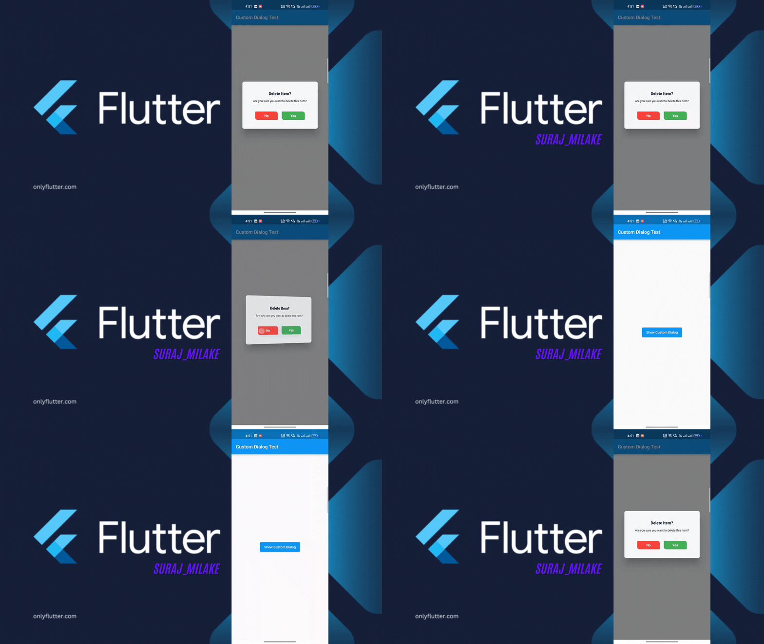
Animations: Includes optional 3D flip animation for dialog transitions.
Modern UI: A visually appealing, modern design with customizable button styles and colors.
Dismissable: Optionally control if the dialog can be dismissed by tapping outside.
Demo Video
Getting Started
To use animated_confirm_dialog in your Flutter project, follow these simple steps.
Prerequisites
Before starting, ensure that you have the following installed:
Flutter SDK: >=3.0.0
Dart SDK: >=3.1.3 <4.0.0
Installation
Open your pubspec.yaml file.
Under dependencies, add the following line:
dependencies:animated_confirm_dialog:^1.0.2
Usage
Once you’ve installed the package, you can use the showCustomDialog function to display the confirmation dialog. Here’s an example of how to use it:
import'package:animated_confirm_dialog/animated_confirm_dialog.dart';
showCustomDialog(
context: context,
title: 'Delete Item?',
message: 'Are you sure you want to delete this item?',
cancelButtonText: 'No',
confirmButtonText: 'Yes',
cancelButtonColor: Colors.red,
cancelButtonTextColor: Colors.white,
confirmButtonColor: Colors.green,
confirmButtonTextColor: Colors.white,
onCancel: () {
// Action when cancel button is pressedNavigator.of(context).pop();
},
onConfirm: () {
// Action when confirm button is pressedNavigator.of(context).pop();
},
isFlip: true, // You can set isFlip to true for 3D rotation effect
);
Customization
You can customize various aspects of the dialog by passing different parameters. Below is a list of customizable options:
Parameter
Description
Default
title
The title of the dialog.
'Logout Confirmation'
message
The message displayed inside the dialog.
'Are you sure you want to log out?'
cancelButtonText
Text for the cancel button.
'Cancel'
confirmButtonText
Text for the confirm button.
'Logout'
backgroundColor
Background color of the dialog.
Color(0xFFF5F5F5)
titleColor
Color of the title text.
Color(0xFF000000)
messageColor
Color of the message text.
Color(0xFF000000)
cancelButtonColor
Background color of the cancel button.
Color(0xFF007BFF)
cancelButtonTextColor
Color of the cancel button text.
Colors.white
confirmButtonColor
Background color of the confirm button.
Colors.white
confirmButtonTextColor
Color of the confirm button text.
Color(0xFF007BFF)
onCancel
A callback function triggered when the cancel button is tapped.
null (no action)
onConfirm
A callback function triggered when the confirm button is tapped.
null (no action)
isFlip
Enables a 3D flip animation when the dialog is shown.
false
dismissible
Controls whether the dialog can be dismissed by tapping outside.
true
Licence
This project is licensed under the MIT License. You can view the full license in the LICENSE file.