
 v0.2.0
simple_progress_indicators
帶有實色和漸變的簡單進度指示器套件。可用於顯示進度或進行簡單動畫。
40喜歡 7060近 30 天下載140Pub 分數
AndroidiOSWebmacOSWindowsLinux
帶有實色和漸變的簡單進度指示器 Flutter 套件。可用於顯示進度或簡單動畫。

{"sdk":"flutter"}{"sdk":"flutter"}^2.0.1以下為英文專案原文快照,最新內容請造訪 GitHub。
Simple progress indicators package with solid colors and gradients. Can be used to show progress or for simple progress bar animation.
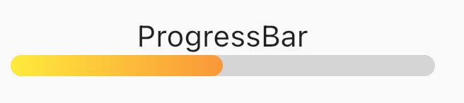
ProgressBar is a basic linear indicator widget. It's a Stateless Widget that produces basic horizontal rounded rectangle with optional background rounded rectangle underneath.
Include it in your build method like:
  @override
  Widget build(BuildContext context) {
    return const MaterialApp(
      home: Scaffold(
        body: Center(
          child: ProgressBar(
            value: 0.5,
            //specify only one: color or gradient
            //color:Colors.red,
            gradient: LinearGradient(
              begin: Alignment.topLeft,
              end: Alignment.bottomRight,
              colors: [Colors.yellowAccent, Colors.deepOrange],
            ),
          ),
        ),
      ),
    );
  }
It has several configurable parameters:
value - current indicator value, where 0.0 is 0% progress, 1.0 is 100% progresswidth - indicator width, defaults to 200.0height - indicator height, defaults to 10.0color - solid indicator fill colorgradient - gradient fill, accepts Gradient classbackgroundColor - solid indicator background color, defaults to transparentMinimum working widget requires only a value and color OR gradient property. NOTE: Specifying both properties is not accepted.
ProgressBarAnimation is a simple animating progress bar widget.
It animates ProgressBar widget for a given duration.
Animation starts at the time the widget is built.
It has several configurable parameters:
duration - 0% to 100% animation durationwidth - indicator width, defaults to 200.0height - indicator height, defaults to 10.0color - solid indicator fill colorgradient - gradient fill, accepts Gradient classbackgroundColor - solid indicator background color, defaults to transparentcurve - animation curve, defaults to linear. For other curves check CurvesProgressBarAnimation(
duration: const Duration(seconds: 2),
gradient: const LinearGradient(
colors: [
Colors.blue,
Colors.purple,
],
),
backgroundColor: Colors.grey.withOpacity(0.4),
),
AnimatedProgressBar is a ImplicitlyAnimatedWidget. It behaves like other flutter AnimatedFoo widgets. This animates value parameter changes for a given duration. Animation starts only when one (initial) value changes to other (final) value. See the example below.
It has several configurable parameters:
value - value widget animates to, need to be changedduration - initial value to final value animation durationwidth - indicator width, defaults to 200.0height - indicator height, defaults to 10.0color - solid indicator fill colorgradient - gradient fill, accepts Gradient classbackgroundColor - solid indicator background color, defaults to transparentcurve - animation curve, defaults to linear. For other curves check CurvesonEnd - callback to trigger additional actions (e.g. another animation) at the end of the current animationAnimatedProgressBar(
value: full ? 1.0 : 0.0,
duration: const Duration(seconds: 3),
gradient: const LinearGradient(
colors: [
Colors.amber,
Colors.red,
],
),
backgroundColor: Colors.grey.withOpacity(0.4),
),
For full demo check examples folder.
For issues and animation ideas visit issues section on github homepage.