搜尋套件、儲存庫與 APP 分類

simple_progress_indicators 封面
套件詳情v0.2.0

simple_progress_indicators

帶有實色和漸變的簡單進度指示器套件。可用於顯示進度或進行簡單動畫。

AndroidiOSWebmacOSWindowsLinux
近 30 天下載
7010
喜歡數
40
Pub 分數
140

安裝套件

flutter pub add simple_progress_indicators

套件介紹

根據套件公開資料產生的選型評估,僅供參考。

一個輕量級的 Flutter 套件,提供簡單的進度指示器,支援實色與漸變。非常適合顯示載入狀態或在應用程式中建立微妙的動畫效果。該套件容易整合,並在多個平台上提供乾淨、可自訂的視覺反饋。支援 Android、iOS、Web、macOS、Windows 與 Linux,適用於跨平台開發。專為尋求極簡但有效進度視覺化且無需複雜設定的開發者設計。

適用情境

  • 加載狀態指示器
  • 動畫進度顯示
  • 簡單使用者介面回饋
  • 跨平台進度條
  • 可自定義的加載動畫
  • 應用啟動畫面

主要特色

  • 純色進度條
  • 漸層支援
  • 最小設定
  • 跨平台相容性
  • 輕鬆整合
  • 輕量級大小

適合對象

  • 初學者 Flutter 開發者
  • 簡單的應用介面
  • 載入使用者體驗增強
  • 快速原型設計
  • 需要輕量級指示器的應用程式
  • 表單或下載中的視覺反饋

使用建議

  • 有限的自定選項
  • 無進階樣式功能
  • 不適用於複雜動畫
  • 適用於基本進度需求
  • 無內建的暫停/恢復控制
  • 依賴外部依賴管理

原始 README

以下為關聯原始碼儲存庫的 README 原文快照,最新內容請造訪原始碼儲存庫。

Simple progress indicators package with solid colors and gradients. Can be used to show progress or for simple progress bar animation.

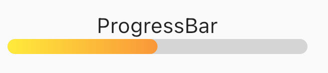
How it looks

Table of contents

Usage

Linear Progress indicator

ProgressBar

ProgressBar is a basic linear indicator widget. It's a Stateless Widget that produces basic horizontal rounded rectangle with optional background rounded rectangle underneath. Include it in your build method like:

  @override
  Widget build(BuildContext context) {
    return const MaterialApp(
      home: Scaffold(
        body: Center(
          child: ProgressBar(
            value: 0.5,
            //specify only one: color or gradient
            //color:Colors.red,
            gradient: LinearGradient(
              begin: Alignment.topLeft,
              end: Alignment.bottomRight,
              colors: [Colors.yellowAccent, Colors.deepOrange],
            ),
          ),
        ),
      ),
    );
  }

It has several configurable parameters:

  • value - current indicator value, where 0.0 is 0% progress, 1.0 is 100% progress
  • width - indicator width, defaults to 200.0
  • height - indicator height, defaults to 10.0
  • color - solid indicator fill color
  • gradient - gradient fill, accepts Gradient class
  • backgroundColor - solid indicator background color, defaults to transparent

Minimum working widget requires only a value and color OR gradient property. NOTE: Specifying both properties is not accepted.

ProgressBarAnimation

ProgressBarAnimation is a simple animating progress bar widget. It animates ProgressBar widget for a given duration. Animation starts at the time the widget is built.

It has several configurable parameters:

  • duration - 0% to 100% animation duration
  • width - indicator width, defaults to 200.0
  • height - indicator height, defaults to 10.0
  • color - solid indicator fill color
  • gradient - gradient fill, accepts Gradient class
  • backgroundColor - solid indicator background color, defaults to transparent
  • curve - animation curve, defaults to linear. For other curves check Curves
ProgressBarAnimation(  
  duration: const Duration(seconds: 2),  
  gradient: const LinearGradient(  
    colors: [  
      Colors.blue,  
      Colors.purple,  
    ],  
  ),  
  backgroundColor: Colors.grey.withOpacity(0.4),  
),
AnimatedProgressBar

AnimatedProgressBar is a ImplicitlyAnimatedWidget. It behaves like other flutter AnimatedFoo widgets. This animates value parameter changes for a given duration. Animation starts only when one (initial) value changes to other (final) value. See the example below.

It has several configurable parameters:

  • value - value widget animates to, need to be changed
  • duration - initial value to final value animation duration
  • width - indicator width, defaults to 200.0
  • height - indicator height, defaults to 10.0
  • color - solid indicator fill color
  • gradient - gradient fill, accepts Gradient class
  • backgroundColor - solid indicator background color, defaults to transparent
  • curve - animation curve, defaults to linear. For other curves check Curves
  • onEnd - callback to trigger additional actions (e.g. another animation) at the end of the current animation
AnimatedProgressBar(  
  value: full ? 1.0 : 0.0,  
  duration: const Duration(seconds: 3),  
  gradient: const LinearGradient(  
    colors: [  
      Colors.amber,  
      Colors.red,  
    ],  
  ),  
  backgroundColor: Colors.grey.withOpacity(0.4),  
),

For full demo check examples folder.

Animation demo

Additional information

For issues and animation ideas visit issues section on github homepage.

所屬分類

原始碼儲存庫

使用此套件的專案