

 v2.0.0
custom_sliding_segmented_control
允許您靈活地設定顯示控制項的 widget。您可以新增顏色、速度、大小、初始值、動畫等。
232喜歡 6.3萬近 30 天下載150Pub 分數
AndroidiOSWebmacOSWindowsLinux
自定義滑動分段控制項

以下為英文專案原文快照,最新內容請造訪 GitHub。
Allows you to flexibly configure the widget for displaying controls. You can add color, speed, size, initial value, animation and more.
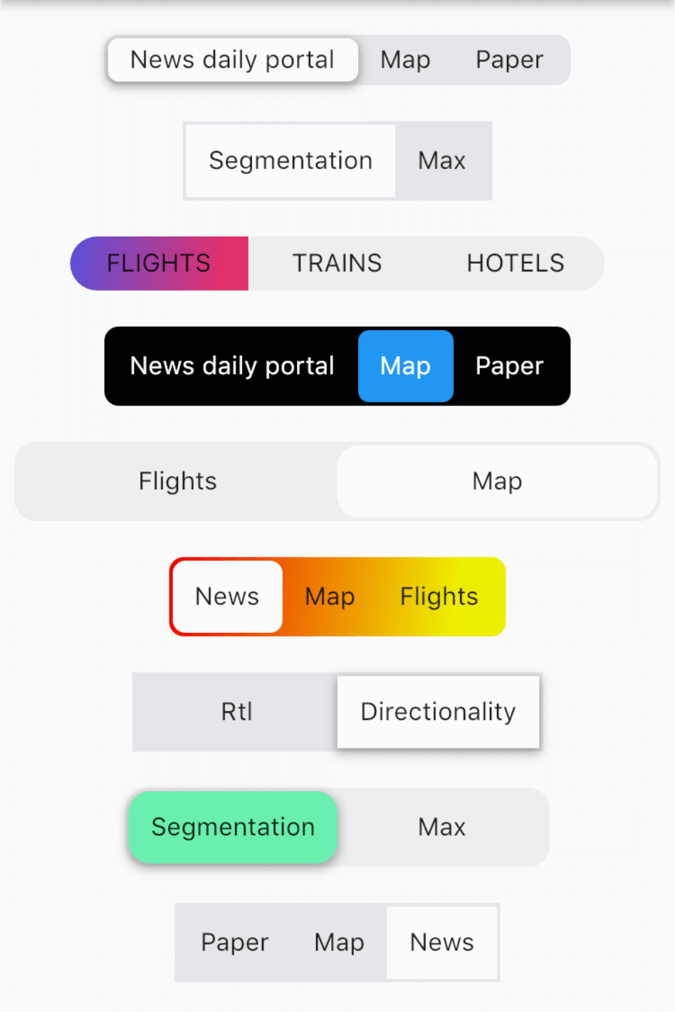
import 'package:custom_sliding_segmented_control/custom_sliding_segmented_control.dart';

CustomSlidingSegmentedControl<int>(
  initialValue: 2,
  children: {
    1: Text('News daily portal'),
    2: Text('Map'),
    3: Text('Paper'),
  },
  decoration: BoxDecoration(
    color: CupertinoColors.lightBackgroundGray,
    borderRadius: BorderRadius.circular(8),
  ),
  thumbDecoration: BoxDecoration(
    color: Colors.white,
    borderRadius: BorderRadius.circular(6),
    boxShadow: [
      BoxShadow(
        color: Colors.black.withOpacity(.3),
        blurRadius: 4.0,
        spreadRadius: 1.0,
        offset: Offset(
          0.0,
          2.0,
        ),
      ),
    ],
  ),
  duration: Duration(milliseconds: 300),
  curve: Curves.easeInToLinear,
  onValueChanged: (v) {
    print(v);
  },
),
依賴清單 5 項
^1.0.1{"sdk":"flutter"}^1.1.0{"sdk":"flutter"}^2.8.0先依使用情境篩選,再比較專案活躍情況,最後到原始儲存庫確認使用要求。
“A repository is the most basic element of GitHub.”
GitHub Docs — About repositories ↗