CustomSlidingSegmentedControl
Allows you to flexibly configure the widget for displaying controls. You can add color, speed, size, initial value, animation and more.
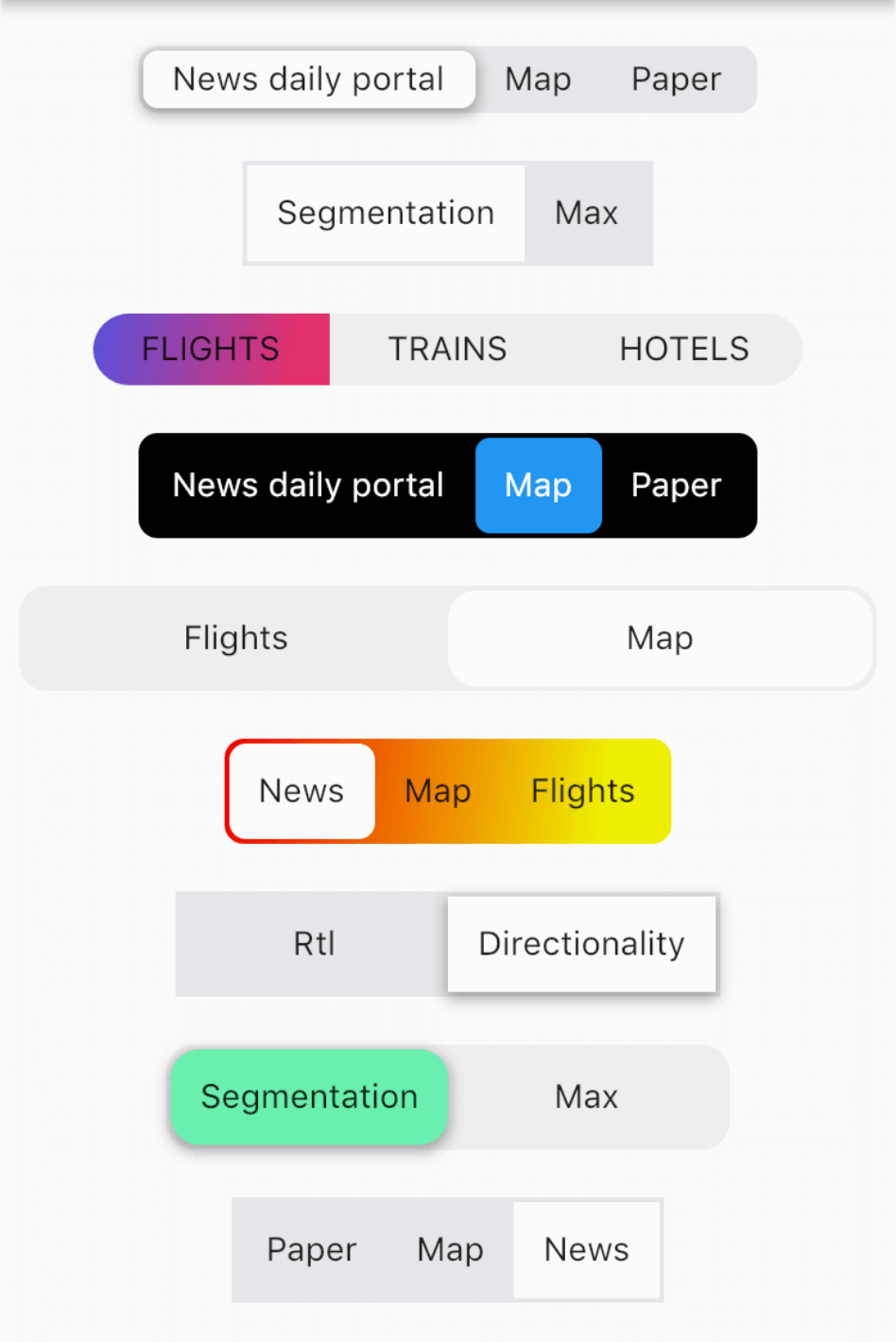
Example
import 'package:custom_sliding_segmented_control/custom_sliding_segmented_control.dart';

CustomSlidingSegmentedControl<int>(
  initialValue: 2,
  children: {
    1: Text('News daily portal'),
    2: Text('Map'),
    3: Text('Paper'),
  },
  decoration: BoxDecoration(
    color: CupertinoColors.lightBackgroundGray,
    borderRadius: BorderRadius.circular(8),
  ),
  thumbDecoration: BoxDecoration(
    color: Colors.white,
    borderRadius: BorderRadius.circular(6),
    boxShadow: [
      BoxShadow(
        color: Colors.black.withOpacity(.3),
        blurRadius: 4.0,
        spreadRadius: 1.0,
        offset: Offset(
          0.0,
          2.0,
        ),
      ),
    ],
  ),
  duration: Duration(milliseconds: 300),
  curve: Curves.easeInToLinear,
  onValueChanged: (v) {
    print(v);
  },
),
More examples

