
 v1.1.1
blurry_modal_progress_hud
與 modal_progress_hud 相似,這是一個簡單的 widget 包裝器,用於啟用模態進度 hud(模態進度指示器,hud = 頭部顯示)
42喜歡 361近 30 天下載150Pub 分數
AndroidiOSWebmacOSWindowsLinux
blurry_modal_progress_hud 是一個簡單的 widget 包裝器,用於啟用模態進度 HUD(頭戴顯示)

{"sdk":"flutter"}{"sdk":"flutter"}^2.0.0以下為英文專案原文快照,最新內容請造訪 GitHub。
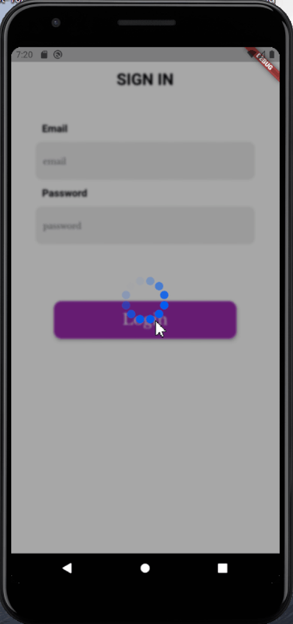
Just like modal_progress_hud this is a simple widget wrapper to enable modal progress hud (a modal progress indicator, hud = heads up display)
Image1
Image2
See example for details
Add the blurry_modal_progress_hud package to your pubspec.yml file.
dependencies:
  blurry_modal_progress_hud: ^1.1.1
Import the package into your dart file
import 'package:blurry_modal_progress_hud/blurry_modal_progress_hud.dart';
/// Wrap around any widget that makes an async call to show a modal progress
/// indicator while the async call is in progress.

/// The progress indicator can be turned on or off using [inAsyncCall]

/// The blurry effect's intensity can be be controlled using [blurEffectIntensity]

/// The progress indicator defaults to a [CircularProgressIndicator] but can be
/// any kind of widget. For this example the SpinKitFadingCircle package is used

/// The modal barrier can be dismissed using [dismissible]

/// The opacity of the modal barrier can be set using [opacity]

/// The color of the modal barrier can be set using [color]

/// The progress indicator can be positioned using [offset] otherwise it is
/// centered

BlurryModalProgressHUD(
    inAsyncCall: isLoading,
    blurEffectIntensity: 4,
    progressIndicator: SpinKitFadingCircle(
    color: purpleColor,
    size: 90.0,
    ),
    dismissible: false,
    opacity: 0.4,
    color: black97Color,
    child: Scaffold(),
);
Most of the parameters can be customized via the constructor
  BlurryModalProgressHUD({
    Key? key,
    required this.inAsyncCall,
    this.opacity = 0.3,
    this.color = Colors.grey,
    this.blurEffectIntensity = 1.0,
    this.progressIndicator = const CircularProgressIndicator(),
    this.offset,
    this.dismissible = false,
    required this.child,
  });
See the example for a complete sample app using the blurry_modal_progress_hud
Contact me via email edinjoey@gmail.com