搜尋套件、儲存庫與 APP 分類

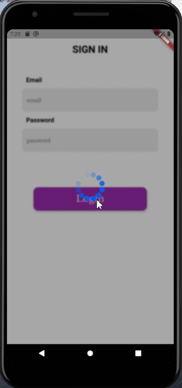
blurry_modal_progress_hud 封面
套件詳情v1.1.1

blurry_modal_progress_hud

與 modal_progress_hud 相似,這是一個簡單的 widget 包裝器,用於啟用模態進度 hud(模態進度指示器,hud = 頭部顯示)

AndroidiOSWebmacOSWindowsLinux
近 30 天下載
514
喜歡數
42
Pub 分數
150

安裝套件

flutter pub add blurry_modal_progress_hud

套件介紹

根據套件公開資料產生的選型評估,僅供參考。

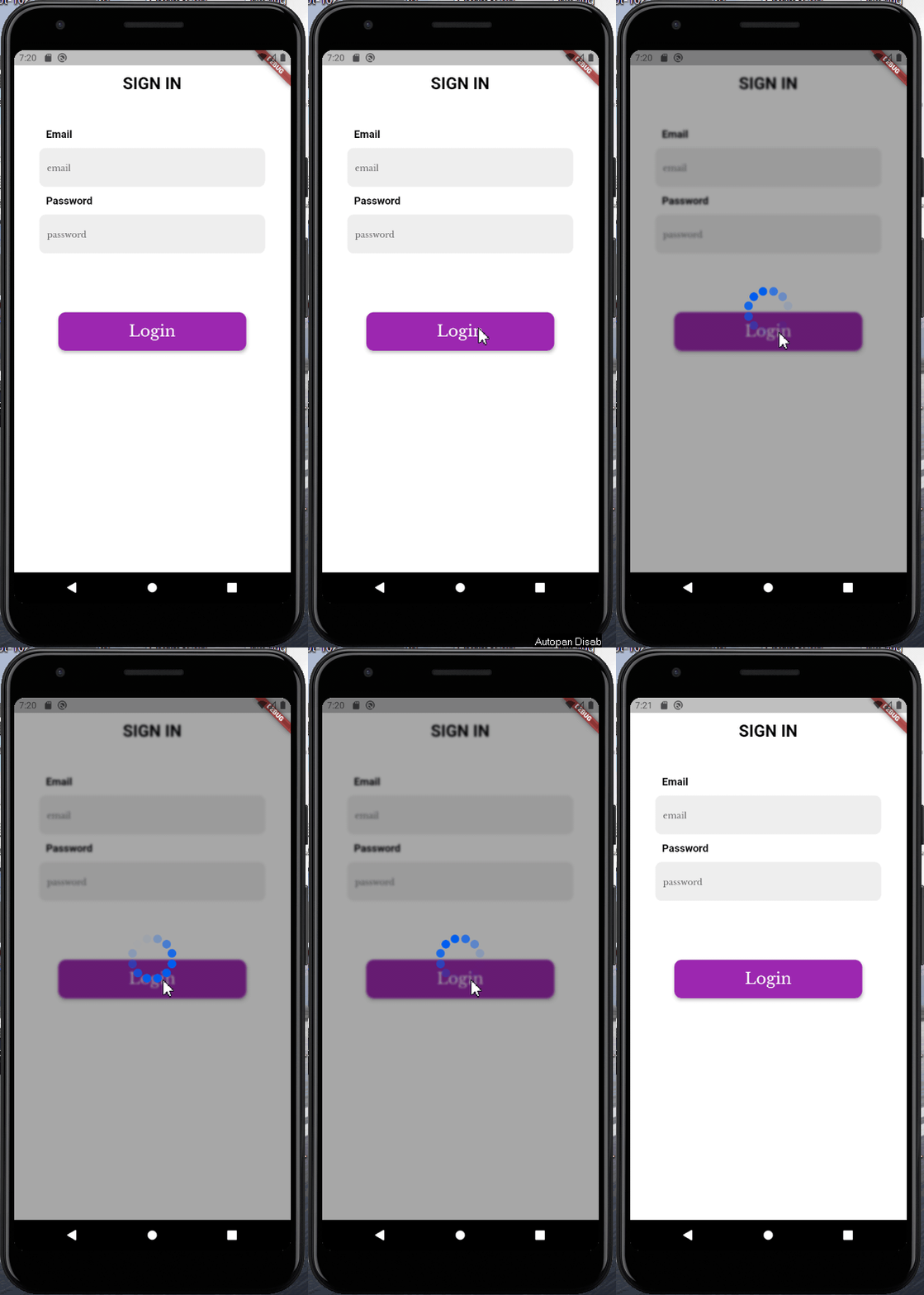
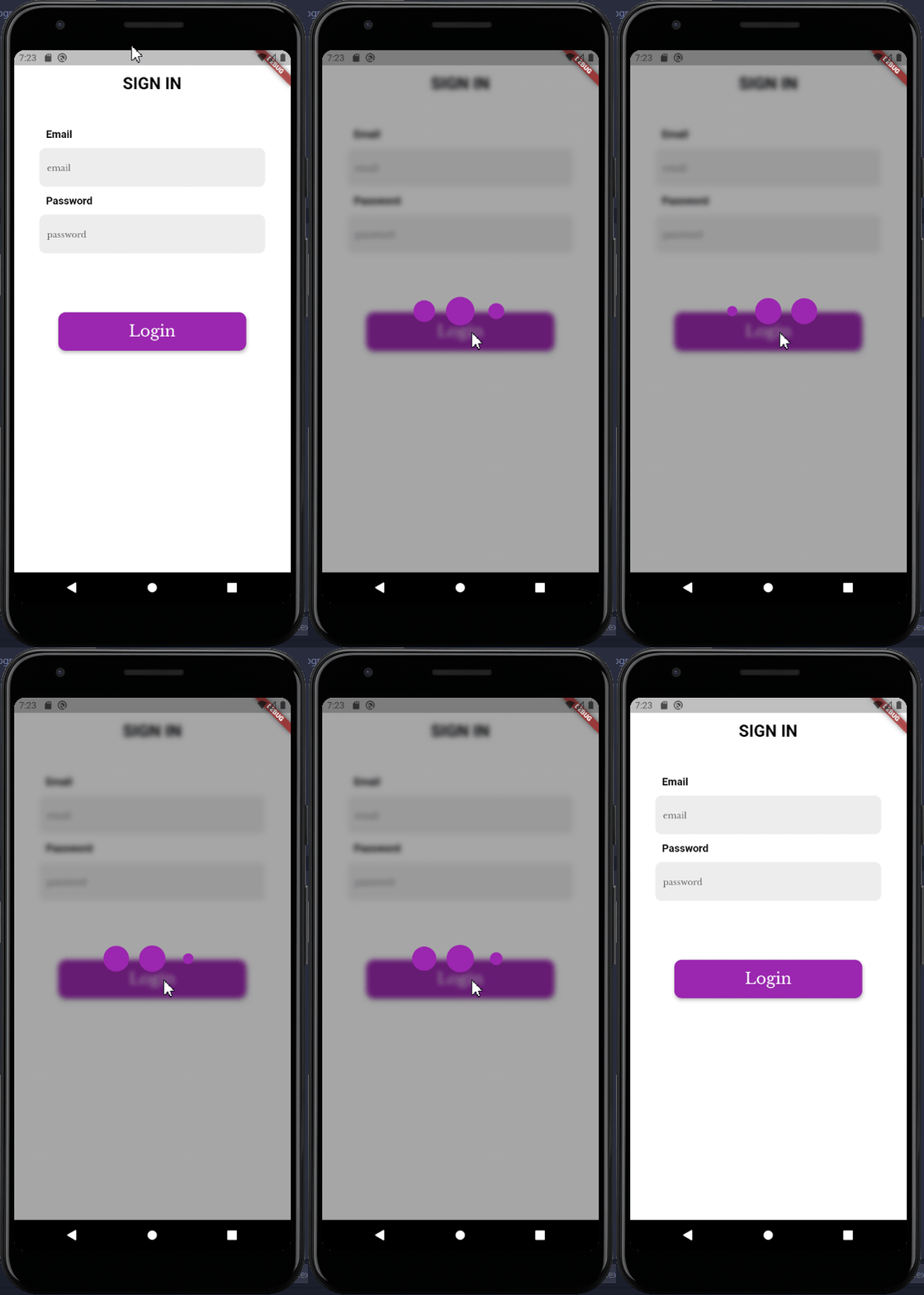
BlurryModalProgressHud 是一個 Flutter 小部件,會顯示帶有模糊背景的模態進度指示器,類似於 ModalProgressHud,但具有增強的視覺吸引力。它包裝一個組件樹,並顯示一個遮蓋底層內容的載入覆蓋層,為使用者提供異步操作期間的反饋。模糊效果透過創造現代、半透明的外觀來提升 UI。非常適合在多個平台上的載入狀態中改善使用者體驗。

適用情境

  • 在資料獲取期間顯示加載指示器
  • 透過非同步處理增強表單中的使用者體驗
  • 顯示網路請求的進度
  • 在行動應用程式中建立視覺上吸引人的覆蓋層
  • 在長時間執行的任務期間提升介面清晰度

主要特色

  • 模糊背景,現代美學
  • 簡單包裝器整合
  • 跨平台支援(Android、iOS、Web、macOS、Windows、Linux)
  • 可自訂的載入指示器
  • 輕量且易於實作

適合對象

  • 尋求精美加載UI的開發者
  • 需要微妙但有效加載反饋的應用程式
  • 旨在實現 Material Design 3 風格視覺效果的專案
  • 在非同步操作期間優先考慮使用者體驗的團隊
  • Flutter 初學者探索進度指示器

使用建議

  • 由於模糊渲染,可能會影響低階裝置的效能
  • 需要仔細考慮色彩對比度以確保可讀性
  • 不適合高對比度無障礙需求
  • 除了模糊和基本樣式外,自訂功能有限
  • 依賴於平台特定的渲染功能

原始 README

以下為關聯原始碼儲存庫的 README 原文快照,最新內容請造訪原始碼儲存庫。

blurry_modal_progress_hud

This is a clone and upgrade of modal_progress_hud

Just like modal_progress_hud this is a simple widget wrapper to enable modal progress hud (a modal progress indicator, hud = heads up display)

How it works

Image1

Image2

See example for details

Installation

Add the blurry_modal_progress_hud package to your pubspec.yml file.

dependencies:
  blurry_modal_progress_hud: ^1.1.1

Import the package into your dart file

import 'package:blurry_modal_progress_hud/blurry_modal_progress_hud.dart';

Usage

/// Wrap around any widget that makes an async call to show a modal progress
/// indicator while the async call is in progress.

/// The progress indicator can be turned on or off using [inAsyncCall]

/// The blurry effect's intensity can be be controlled using [blurEffectIntensity]

/// The progress indicator defaults to a [CircularProgressIndicator] but can be
/// any kind of widget. For this example the SpinKitFadingCircle package is used

/// The modal barrier can be dismissed using [dismissible]

/// The opacity of the modal barrier can be set using [opacity]

/// The color of the modal barrier can be set using [color]

/// The progress indicator can be positioned using [offset] otherwise it is
/// centered

BlurryModalProgressHUD(
    inAsyncCall: isLoading,  
    blurEffectIntensity: 4,
    progressIndicator: SpinKitFadingCircle(
    color: purpleColor,
    size: 90.0,
    ),
    dismissible: false,
    opacity: 0.4,
    color: black97Color,
    child: Scaffold(),
);

Options

Most of the parameters can be customized via the constructor

  BlurryModalProgressHUD({
    Key? key,
    required this.inAsyncCall,
    this.opacity = 0.3,
    this.color = Colors.grey,
    this.blurEffectIntensity = 1.0,
    this.progressIndicator = const CircularProgressIndicator(),
    this.offset,
    this.dismissible = false,
    required this.child,
  });

Example

See the example for a complete sample app using the blurry_modal_progress_hud

Contact

Contact me via email edinjoey@gmail.com

所屬分類

原始碼儲存庫

使用此套件的專案

暫無相關資料。