
 v1.13.0
cherry_toast
一種在 Flutter 中顯示 Toast 的新方法,設計優雅且帶有動畫效果
259喜歡 2160近 30 天下載150Pub 分數
AndroidiOSWebmacOSWindowsLinux
koukibadr/Cherry-Toast open-source repository details.

{"sdk":"flutter"}{"sdk":"flutter"}^1.0.4以下為英文專案原文快照,最新內容請造訪 GitHub。
https://github.com/koukibadr/Cherry-Toast/blob/main/cherry_toast_logo.gif?raw=true
A new way to display toasts in Flutter in an elegant design and animations
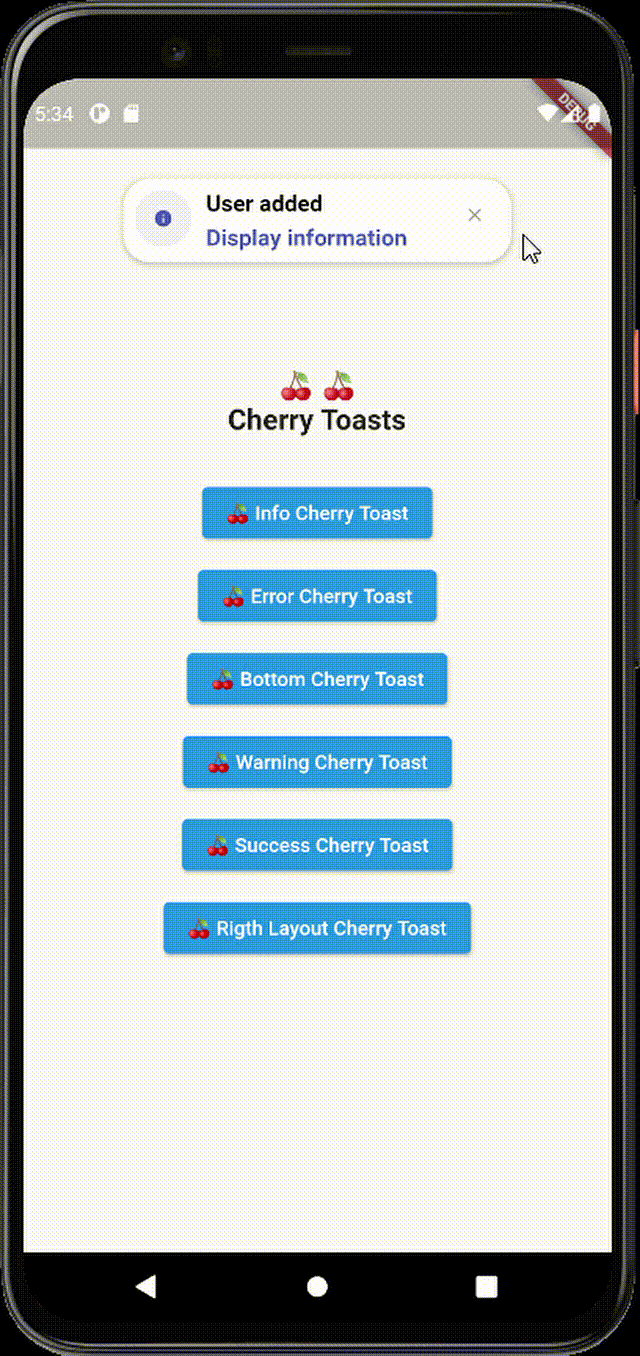
| info_cherry_toast.gif | error_cherry_toast.gif | bottom_cherry_toast.gif |
|---|---|---|
| warning_cherry_toast.gif | success_cherry_toast.gif | right_layout_cherry_toast.gif |
To add cherry toast to your project add this line to your pubspec.yaml file
dependencies:
  cherry_toast: ^1.13.0
/// Text widget displayed as a title in the toast
  /// required parameter for all toast types
  final Text? title;

  /// Text widget displayed as a description in the toast
  final Text? description;

  /// The action button displayed below description
  final Text? action;

  /// The toast icon, it's required when using the default constructor
  late IconData icon;

  /// The Icon color
  /// this parameter is only available on the default constructor
  /// for the built-in themes the color  will be set automatically
  late Color iconColor;

  /// Background color of container
  final Color backgroundColor;

  /// Box shadow color of container
  final Color shadowColor;

  /// Custom widget displayed at the place of the predefined icons
  final Widget? iconWidget;

  /// The icon size
  /// this parameter is available in default constructor
  late double iconSize;

  /// The toast display postion, possible values
  /// ```dart
  /// {
  /// top,
  /// bottom
  /// }
  /// ```
  final Position toastPosition;

  /// The color that will be applied on the circle behind the icon
  /// for better rendering the action button must have the same color
  late Color themeColor;

  /// The function invoked when clicking on the action button
  final Function? actionHandler;

  /// The duration of the animation by default it's 1.5 seconds
  final Duration animationDuration;

  /// The animation curve by default it's set to `Curves.ease`.
  final Cubic animationCurve;

  /// The animation type applied on the toast
  /// ```dart
  /// {
  /// fromTop,
  /// fromLeft,
  /// fromRight
  /// }
  /// ```
  final AnimationType animationType;

  /// Indicates whether the toast will be hidden automatically or not.
  final bool autoDismiss;

  /// The duration of the toast if [autoDismiss] is true
  final Duration toastDuration;

  /// The layout of the toast
  /// ```dart
  /// {
  /// ltr,
  /// rtl
  /// }
  /// ```
  final TextDirection textDirection;

  /// Display / Hide the close button icon
  final bool displayCloseButton;

  /// Define the border radius applied on the toast
  final double borderRadius;

  /// Define whether the icon will be  rendered or not
  final bool displayIcon;

  /// Define wether the animation on the icon will be rendered or not
  final bool enableIconAnimation;

  /// The attribute  is declaring a final variable named "width" of type double with a nullable value.
  /// width attribute define the toast width
  final double? width;

  /// The attribute is declaring a final variable named "height" of type double with a nullable type
  /// modifier.
  /// height attribute define the toast height
  final double? height;

  /// Enable taost constraints customization (by default it's null)
  final BoxConstraints? constraints;

  /// Indicate whether the toast animation is enabled or not
  /// by default the toast animation is enabled
  final bool disableToastAnimation;

  /// Indicate toast should inherit theme colors sheme, to apply in background
  /// and shadow color.
  final bool inheritThemeColors;

  /// Callback invoked when toast get dismissed (closed by button or dismissed automtically)
  final Function()? onToastClosed;

  /// Horizontal alignment display of the toast content
  final CrossAxisAlignment horizontalAlignment;

  /// The space rendered between the title and description widgets.
  final double titleDescriptionMargin;

  /// The space rendered between the description and actions widgets.
  final double descriptionActionMargin;
CherryToast.success(

title:  Text("The simplest cherry toast", style: TextStyle(color: Colors.black))

).show(context);
CherryToast.info(

title:  Text("User added", style: TextStyle(color: Colors.black)),

action: Text("Display information", style: TextStyle(color: Colors.black)),

actionHandler: (){

print("Action button pressed");

},

).show(context);
https://github.com/koukibadr/Cherry-Toast/blob/main/example/cherry_toast_animation.gif?raw=true
A new way to display toasts in Flutter in an elegant design and animations
CherryToast.warning(

description:  Text("All information may be deleted after this action", style: TextStyle(color: Colors.black)),

animationType:  AnimationType.fromLeft,

action:  Text("Backup data", style: TextStyle(color: Colors.black)),

actionHandler: (){

print("Hello World!!");

},

).show(context);
CherryToast.error(

description:  Text("Invalid account information", style: TextStyle(color: Colors.black)),

animationType:  AnimationType.fromRight,

animationDuration:  Duration(milliseconds:  1000),

autoDismiss:  true

).show(context);
CherryToast(

icon:  Icons.alarm_add,

themeColor:  Colors.pink,

description:  Text("A bottom cherry toast example", style:  TextStyle(color:  Colors.black)),

toastPosition:  Position.bottom,

animationDuration:  Duration(milliseconds:  1000),

autoDismiss:  true

).show(context);
CherryToast(

icon:  Icons.car_repair,

themeColor:  Colors.green,

description: const Text("هذا مثال تصميم من اليمين",  style:  TextStyle(color:  Colors.black)),

toastPosition:  Position.bottom,

layout:  ToastLayout.rtl,

animationType:  AnimationType.fromRight,

action: const Text("انقر هنا", style:  TextStyle(color:  Colors.green)),


animationDuration: const Duration(milliseconds:  1000),

autoDismiss:  true)

.show(context);
Of course the project is open source, and you can contribute to it repository link
If you found a bug, open an issue.
If you have a feature request, open an issue.
If you want to contribute, submit a pull request.