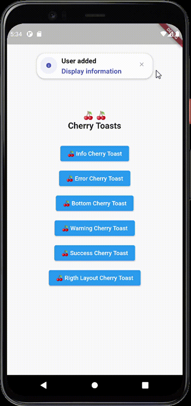
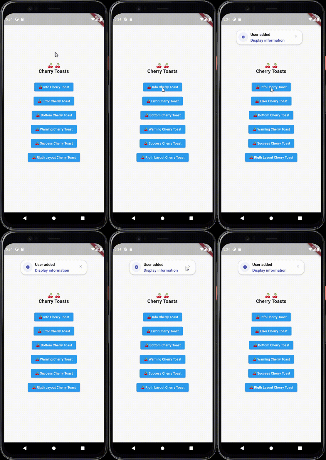
A new way to display toasts in Flutter in an elegant design and animations
Cherry Toast
Support all platforms
Top and Bottom display position
Customizable background color
Support RTL layout rendering (for arabic text)
Multiple built-in themes
Built-in animations
Support null safety
Elegant design
Full customizable
Heartbeat animation on icons
Customizable icon size and color and display
Dismissable notification
Customizable toast constraints, height and width
Installation
To add cherry toast to your project add this line to your pubspec.yaml file
dependencies:cherry_toast:^1.13.0
Parameters
/// Text widget displayed as a title in the toast/// required parameter for all toast typesfinalText? title;
/// Text widget displayed as a description in the toastfinalText? description;
/// The action button displayed below descriptionfinalText? action;
/// The toast icon, it's required when using the default constructorlateIconData icon;
/// The Icon color/// this parameter is only available on the default constructor/// for the built-in themes the color will be set automaticallylateColor iconColor;
/// Background color of containerfinalColor backgroundColor;
/// Box shadow color of containerfinalColor shadowColor;
/// Custom widget displayed at the place of the predefined iconsfinalWidget? iconWidget;
/// The icon size/// this parameter is available in default constructorlatedouble iconSize;
/// The toast display postion, possible values/// ```dart/// {/// top,/// bottom/// }/// ```finalPosition toastPosition;
/// The color that will be applied on the circle behind the icon/// for better rendering the action button must have the same colorlateColor themeColor;
/// The function invoked when clicking on the action buttonfinalFunction? actionHandler;
/// The duration of the animation by default it's 1.5 secondsfinalDuration animationDuration;
/// The animation curve by default it's set to `Curves.ease`.finalCubic animationCurve;
/// The animation type applied on the toast/// ```dart/// {/// fromTop,/// fromLeft,/// fromRight/// }/// ```finalAnimationType animationType;
/// Indicates whether the toast will be hidden automatically or not.finalbool autoDismiss;
/// The duration of the toast if [autoDismiss] is truefinalDuration toastDuration;
/// The layout of the toast/// ```dart/// {/// ltr,/// rtl/// }/// ```finalTextDirection textDirection;
/// Display / Hide the close button iconfinalbool displayCloseButton;
/// Define the border radius applied on the toastfinaldouble borderRadius;
/// Define whether the icon will be rendered or notfinalbool displayIcon;
/// Define wether the animation on the icon will be rendered or notfinalbool enableIconAnimation;
/// The attribute is declaring a final variable named "width" of type double with a nullable value./// width attribute define the toast widthfinaldouble? width;
/// The attribute is declaring a final variable named "height" of type double with a nullable type/// modifier./// height attribute define the toast heightfinaldouble? height;
/// Enable taost constraints customization (by default it's null)finalBoxConstraints? constraints;
/// Indicate whether the toast animation is enabled or not/// by default the toast animation is enabledfinalbool disableToastAnimation;
/// Indicate toast should inherit theme colors sheme, to apply in background/// and shadow color.finalbool inheritThemeColors;
/// Callback invoked when toast get dismissed (closed by button or dismissed automtically)finalFunction()? onToastClosed;
/// Horizontal alignment display of the toast contentfinalCrossAxisAlignment horizontalAlignment;
/// The space rendered between the title and description widgets.finaldouble titleDescriptionMargin;
/// The space rendered between the description and actions widgets.finaldouble descriptionActionMargin;