
 v2.5.1
elegant_notification
一個全新的 Flutter 套件,用於在螢幕頂部顯示通知,完全可自訂並內建主題
521喜歡 1萬近 30 天下載160Pub 分數
AndroidiOSWebmacOSWindowsLinux
koukibadr/Elegant-Notification open-source repository details.

{"sdk":"flutter"}{"sdk":"flutter"}^2.0.1以下為英文專案原文快照,最新內容請造訪 GitHub。
https://raw.githubusercontent.com/koukibadr/Elegant-Notification/main/example/elegant_notification_logo.gif?raw=true
An elegant notification to display important messages to users
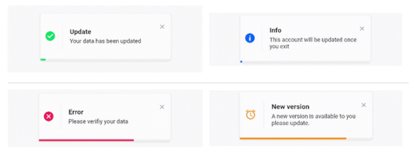
| success_notification.gif | info_notification.gif |
|---|---|
| error_notification.gif | custom_notification.gif |
Stacked elegant notification custom_notification.gif
To use this elegant notification package you need to add the dependency in pubspec.yaml file.
dependencies:
	elegant_notification: ^2.5.1
`
  /// The toast title widget
  final Widget? title;

  /// The toast description widget
  final Widget description;

  /// A secondary widget displayed under the description widget
  /// by default `action == null`
  final Widget? action;

  /// The color of the vertical divider between the icon and content
  /// By default it's null, which means it will use the default divider color = Color(0xffF3F3F3)
  /// You can customize the color by providing a specific [Color] value
  final Color verticalDividerColor;

  /// The notification icon, by default it's null.
  /// When it's null and using success, info and error the default icon is displayed
  /// When using the default constructor and icon is null nothing is rendered
  Widget? icon;

  /// The size of the icon, by default it's 20px.
  final double iconSize;

  /// The type of the animation set on the notification
  /// possible values
  /// ```dart
  /// {
  /// fromLeft,
  /// fromRight,
  /// fromTop,
  /// fromBottom,
  /// }
  /// ```
  /// default value `fromLeft`
  final AnimationType animation;

  /// The duration of the animation
  /// Default value `Duration(milliseconds: 600)`
  final Duration animationDuration;

  /// The toast animation curve by default the curve is set to [Curves.ease]
  final Curve animationCurve;

  /// The background color of the notification.
  /// By default it's set to white.
  /// For types constructors (Success, Info, Delete) this parameter is unchangeable.
  late Color background;

  /// The border radius of the notification widget
  final BorderRadius? borderRadius;

  /// The notification widget border
  final BoxBorder? border;

  /// How much the notification will take time,
  /// by default the duration is `3000 milliseconds`
  final Duration toastDuration;

  /// The notification shadow
  final BoxShadow? shadow;

  /// Enable or disable the progress indicator rendering.
  /// By default the indicator is displayed,
  /// for types constructors (Success, Info, Delete) this parameter is unchangeable.
  late bool showProgressIndicator;

  /// The color of the progress.
  /// By default it's blue
  /// for types constructors (Success, Info, Delete) this parameter is unchangeable
  late Color progressIndicatorColor;

  /// Progress bar indicator width, by default it's null so it takes the widget's width
  final double? progressBarWidth;

  /// Progress bar indicator height, by default it's null so it takes the widget's height
  final double? progressBarHeight;

  /// Progress bar indicator padding constraints
  final EdgeInsetsGeometry? progressBarPadding;

  /// The progress indicator background color
  /// by default it's grey
  final Color progressIndicatorBackground;

  /// Display or hide the close button
  /// by default the close button is displayed
  /// for types constructors (Success, Info, Delete) this parameter is unchangeable
  ///
  final bool displayCloseButton;

  /// Close widget rendered as the close function
  /// by default the close button is displayed, if you don't want it set `closeButton` to null
  /// for types constructors (Success, Info, Delete) this parameter is unchangeable
  final Widget Function(void Function() dismissNotification)? closeButton;

  /// Function invoked when user press on the close button
  final void Function()? onCloseButtonPressed;

  /// Function invoked when the notification is closed after the finish of the progress indicator
  final void Function()? onProgressFinished;

  /// Function invoked when the user taps on the notification
  final void Function()? onNotificationPressed;

  /// Function invoked when the user taps on the notification
  final void Function()? onLongPress;

  /// The long press duration of the notification
  /// By default it's set to `Duration(seconds: 2)`
  final Duration longPressDuration;

  /// Function invoked when tapping outside the notification
  /// Or when pressing the back button of the phone
  /// Or when tapping on the screen
  final Function()? onDismiss;

  /// Define whether the notification will be dismissed automatically or not
  /// By default `autoDismiss = true`
  final bool autoDismiss;

  /// The direction of the dismissible widget
  /// By default it's `DismissDirection.horizontal`
  final DismissDirection dismissDirection;

  /// The notification position in the screen
  /// By default the position is set to `Alignment.topRight`
  final Alignment position;

  /// The width of the notification widget
  final double? width;

  /// The height of the notification widget
  final double? height;

  /// If the notification is dismissible or not
  /// by default it's true
  final bool isDismissable;

  /// The margin between the notification and the edge of the screen
  final double notificationMargin;

  /// The options for the stacked mode
  final StackedOptions? stackedOptions;
`
ElegantNotification.success(
	title:  Text("Update"),
	description:  Text("Your data has been updated"),
  onDismiss: () {
      print('Message when the notification is dismissed');
  },
  onTap: () {
      print('Message when the notification is pressed');
  },
  closeOnTap: true,
).show(context);
ElegantNotification.success(
  width: 360,
  isDismissable: false,
  animationCurve: Curves.bounceOut,
  stackedOptions: StackedOptions(
    key: 'top',
    type: StackedType.same,
    itemOffset: Offset(-5, -5),
  ),
  position: Alignment.topCenter,
  nimation: AnimationType.fromTop,
  title: Text('Update'),
  description: Text('Your data has been updated'),
  onDismiss: () {},
  onNotificationPressed: () {},
).show(context);
ElegantNotification.error(
  width: 360,
  stackedOptions: StackedOptions(
    key: 'topRight',
    type: StackedType.below,
    itemOffset: Offset(0, 5),
  ),
  position: Alignment.topRight,
  animation: AnimationType.fromRight,
  title: Text('Error'),
  description: Text('Error example notification'),
  onDismiss: () {},
).show(context);
ElegantNotification.success(
  width: 360,
  isDismissable: false,
  animationCurve: Curves.bounceOut,
  position: Alignment.topCenter,
  animation: AnimationType.fromTop,
  title: Text('Update'),
  description: Text('Your data has been updated'),
  onDismiss: () {},
  onNotificationPressed: () {},
  shadow: BoxShadow(
    color: Colors.green.withOpacity(0.2),
    spreadRadius: 2,
    blurRadius: 5,
    offset: const Offset(0, 4),
    ),
).show(context);
ElegantNotification.info(
	title:  Text("Info"),
	description:  Text("This account will be updated once you exit"),
  icon: Icon(
		Icons.access_alarm,
		color: Colors.orange,
	),
).show(context);
ElegantNotification(
	description:  Text("Please verifiy your data")
).show(context);
ElegantNotification(
	title:  ("New version"),
	description:  Text("A new version is available to you please update."),
	icon: Icon(
		Icons.access_alarm,
		color: Colors.orange,
	),
	progressIndicatorColor: Colors.orange,
).show(context);
ElegantNotification.error(
	description:  Text("Please verifiy your data")
).show(context);
ElegantNotification.info(
	description:  Text('This account will be updated once you exit',),
	action: InkWell(
    onTap: (){
      print('Link pressed')
    }
    child:Text( 'Link',
      style:  TextStyle(
        decoration:  TextDecoration.underline,
        color:  Colors.blue,
      ),
    )
  ),
).show(context);
dismissDirection attributeElegantNotification.success(
width: 360,
position: Alignment.topCenter,
animation: AnimationType.fromTop,
title: Text('Update'),
description: Text('Your data has been updated'),
onDismiss: () {
print('Message when the notification is dismissed');
},
onNotificationPressed: () {
print('Message when the notification is pressed');
},
isDismissible: true,
dismissDirection: DismissDirection.up,
).show(context);
Of course the project is open source, and you can contribute to it repository link