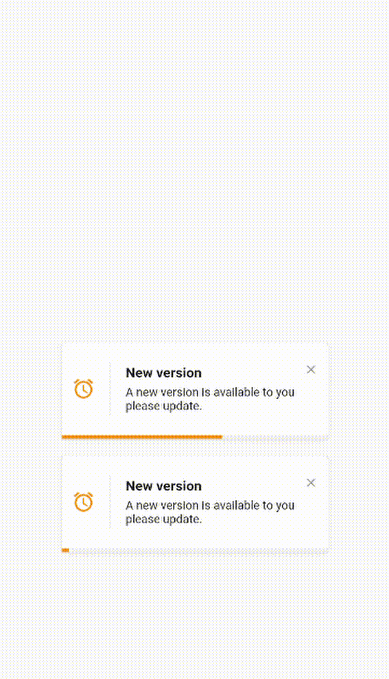
Elegant Notification
An elegant notification to display important messages to users
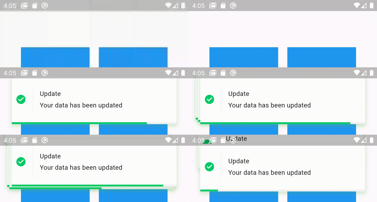
Stacked elegant notification
Features
- Display a top notification with animation
- A-stacked friendly toast
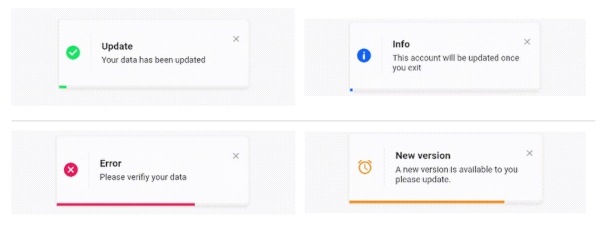
- Built-in themes (Success, Error, Info)
- Different display animations (fromTop, fromBottom, fromLeft, fromRight)
- Support for all display alignment positions
(TopLeft, TopCenter, TopRight, CenterLeft, Center, CenterRight, BottomLeft, BottomCenter, BottomRight)
- Support custom theme implementation
- on close and on progress finished callback handlers
- Animated progress bar indicator
- Customizable dismiss direction
- Background customization
- Animation duration customization
- Notification position customization
- Add clickable action widget to notification
- Notification dismiss customization
- Customizable notification dimensions (height and width)
- Customizable barrier dismission and on dismiss action
- Slide back animation
- Customizable close button
- Customizable border and border radius
- RTL support
Getting Started
To use this elegant notification package you need to add the dependency in pubspec.yaml file.
dependencies:
	elegant_notification: ^2.5.1
Parameters
`
final Widget? title;
final Widget description;
final Widget? action;
final Color verticalDividerColor;
Widget? icon;
final double iconSize;
final AnimationType animation;
final Duration animationDuration;
final Curve animationCurve;
late Color background;
final BorderRadius? borderRadius;
final BoxBorder? border;
final Duration toastDuration;
final BoxShadow? shadow;
late bool showProgressIndicator;
late Color progressIndicatorColor;
final double? progressBarWidth;
final double? progressBarHeight;
final EdgeInsetsGeometry? progressBarPadding;
final Color progressIndicatorBackground;
final bool displayCloseButton;
final Widget Function(void Function() dismissNotification)? closeButton;
final void Function()? onCloseButtonPressed;
final void Function()? onProgressFinished;
final void Function()? onNotificationPressed;
final void Function()? onLongPress;
final Duration longPressDuration;
final Function()? onDismiss;
final bool autoDismiss;
final DismissDirection dismissDirection;
final Alignment position;
final double? width;
final double? height;
final bool isDismissable;
final double notificationMargin;
final StackedOptions? stackedOptions;
`
Examples
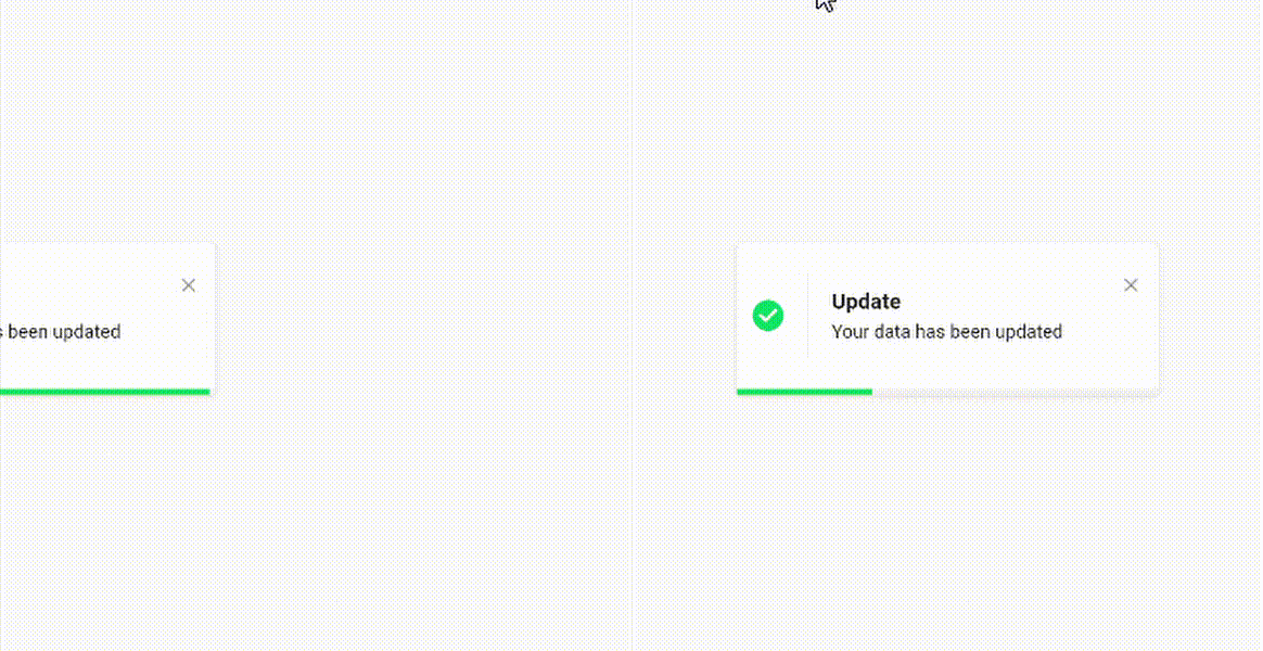
- Success theme animation example
ElegantNotification.success(
	title:  Text("Update"),
	description:  Text("Your data has been updated"),
  onDismiss: () {
      print('Message when the notification is dismissed');
  },
  onTap: () {
      print('Message when the notification is pressed');
  },
  closeOnTap: true,
).show(context);
- Stacked notifications Example 1
ElegantNotification.success(
  width: 360,
  isDismissable: false,
  animationCurve: Curves.bounceOut,
  stackedOptions: StackedOptions(
    key: 'top',
    type: StackedType.same,
    itemOffset: Offset(-5, -5),
  ),
  position: Alignment.topCenter,
  nimation: AnimationType.fromTop,
  title: Text('Update'),
  description: Text('Your data has been updated'),
  onDismiss: () {},
  onNotificationPressed: () {},
).show(context);
- Stacked notifications Example 2
ElegantNotification.error(
  width: 360,
  stackedOptions: StackedOptions(
    key: 'topRight',
    type: StackedType.below,
    itemOffset: Offset(0, 5),
  ),
  position: Alignment.topRight,
  animation: AnimationType.fromRight,
  title: Text('Error'),
  description: Text('Error example notification'),
  onDismiss: () {},
).show(context);
ElegantNotification.success(
  width: 360,
  isDismissable: false,
  animationCurve: Curves.bounceOut,
  position: Alignment.topCenter,
  animation: AnimationType.fromTop,
  title: Text('Update'),
  description: Text('Your data has been updated'),
  onDismiss: () {},
  onNotificationPressed: () {},
  shadow: BoxShadow(
    color: Colors.green.withOpacity(0.2),
    spreadRadius: 2,
    blurRadius: 5,
    offset: const Offset(0, 4),
    ),
).show(context);
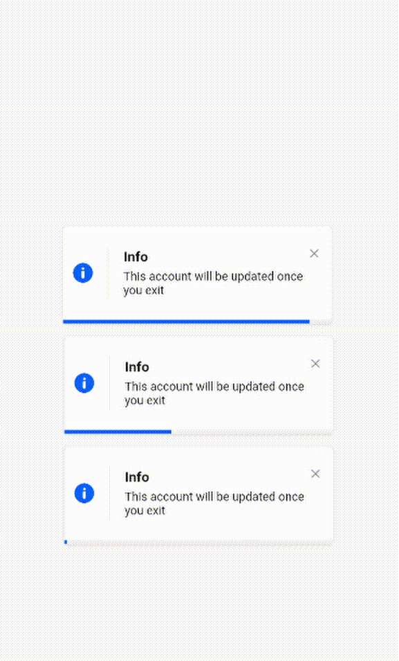
- Info theme animation with custom icon
ElegantNotification.info(
	title:  Text("Info"),
	description:  Text("This account will be updated once you exit"),
  icon: Icon(
		Icons.access_alarm,
		color: Colors.orange,
	),
).show(context);
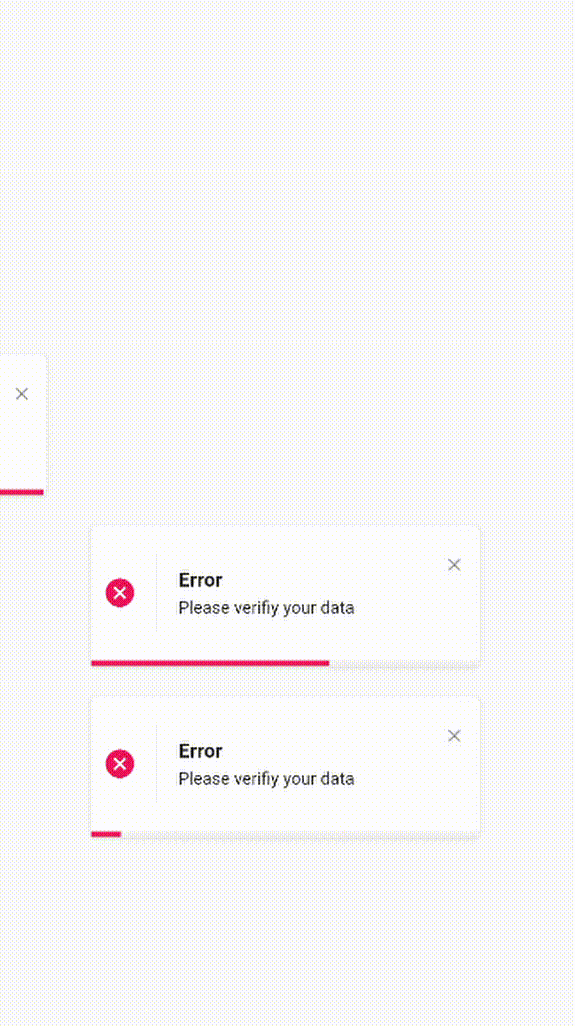
- Easiest way to display elegant notification
ElegantNotification(
	description:  Text("Please verifiy your data")
).show(context);
- Custom theme animation example
ElegantNotification(
	title:  ("New version"),
	description:  Text("A new version is available to you please update."),
	icon: Icon(
		Icons.access_alarm,
		color: Colors.orange,
	),
	progressIndicatorColor: Colors.orange,
).show(context);
ElegantNotification.error(
	description:  Text("Please verifiy your data")
).show(context);
ElegantNotification.info(
	description:  Text('This account will be updated once you exit',),
	action: InkWell(
    onTap: (){
      print('Link pressed')
    }
    child:Text( 'Link',
      style:  TextStyle(
        decoration:  TextDecoration.underline,
        color:  Colors.blue,
      ),
    )
  ),
).show(context);
- Using
dismissDirection attribute
ElegantNotification.success(
  width: 360,
  position: Alignment.topCenter,
  animation: AnimationType.fromTop,
  title: Text('Update'),
  description: Text('Your data has been updated'),
  onDismiss: () {
    print('Message when the notification is dismissed');
  },
  onNotificationPressed: () {
    print('Message when the notification is pressed');
  },
  isDismissible: true,
  dismissDirection: DismissDirection.up,
).show(context);
Contribution
Of course the project is open source, and you can contribute to it repository link
- If you found a bug, open an issue.
- If you have a feature request, open an issue.
- If you want to contribute, submit a pull request.
Contributors