
 v2.2.1
el_tooltip
ElTooltip,一個智慧定位的提示工具。用於在提示工具中顯示可自訂的 widget。
163喜歡 5130近 30 天下載150Pub 分數
AndroidiOSWebmacOSWindowsLinux
具有智慧定位的 Flutter 工具提示組件

{"sdk":"flutter"}{"sdk":"flutter"}^2.0.0以下為英文專案原文快照,最新內容請造訪 GitHub。
https://raw.githubusercontent.com/marcelogil/el_tooltip/main/develop/images/header.png
Add to your pubspec.yaml
dependencies:
  el_tooltip: <last_version>
Import the library and call the Widget ElTooltip() with the required fields child and content
import 'package:flutter/material.dart';
import 'package:el_tooltip/el_tooltip.dart';

void main() {
  runApp(MaterialApp(
    title: 'Flutter Demo',
    theme: ThemeData(
      primarySwatch: Colors.blue,
    ),
    home: const SafeArea(
      child: Center(
        child: ElTooltip(
          child: Icon(Icons.info_outline),
          content: Text('This is a tooltip'),
        ),
      ),
    ),
  ));
}
| Properties | Required | Default | Description |
|---|---|---|---|
| content | true | What will appear inside the tooltip. | |
| child | true | Widget that represent the button to activate the tooltip (no click method required). | |
| color | false | Colors.white |
Background color of the bubble and the arrow. |
| distance | false | 10.0 |
Space between the child button and the tooltip. |
| padding | false | EdgeInsets.all(14.0) |
Tooltip padding around the content widget. |
| position | false | topCenter |
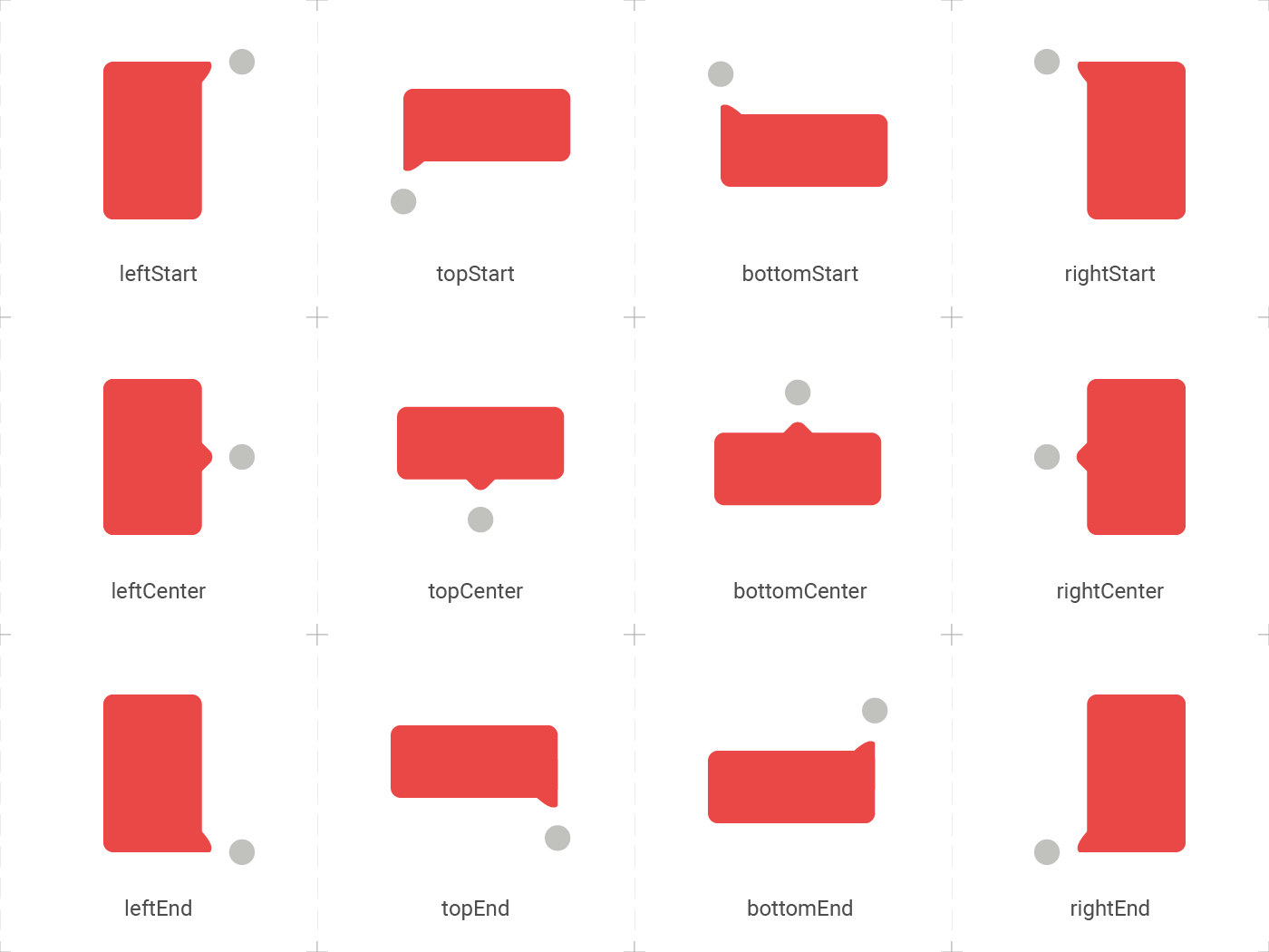
Desired position based on the Enum ElTooltipPosition. Can be topStart, topCenter, topEnd, rightStart, rightCenter, rightEnd, bottomStart, bottomCenter, bottomEnd, leftStart, leftCenter, leftEnd, |
| radius | false | Radius.circular(8.0) |
Border radius of the tooltip. |
| showModal | false | true |
Displays a fullscreen dark layer behind the tooltip. |
| showArrow | false | true |
Displays the arrow pointing to the child widget. |
| showChildAboveOverlay | false | true |
Repeats the child above the tooltip overlay. |
| modalConfiguration | false | ModalConfiguration() |
Configures the modal color and opacity if showModal is true. |
| timeout | false | Duration.zero (only disappears on click) |
How many time to wait for the tooltip to disappear. |
| appearAnimationDuration | false | Duration.zero (does not animate) |
Fade In animation duration. |
| disappearAnimationDuration | false | Duration.zero (does not animate) |
Fade Out animation duration. |
| controller | false | null |
ElTooltipController to show and hide the tooltip. |
https://raw.githubusercontent.com/marcelogil/el_tooltip/main/develop/images/placement.png
El tooltip header image was created using macrovector illustration on Freepik
Thanks goes to these wonderful people: