Widget that represent the button to activate the tooltip (no click method required).
color
false
Colors.white
Background color of the bubble and the arrow.
distance
false
10.0
Space between the child button and the tooltip.
padding
false
EdgeInsets.all(14.0)
Tooltip padding around the content widget.
position
false
topCenter
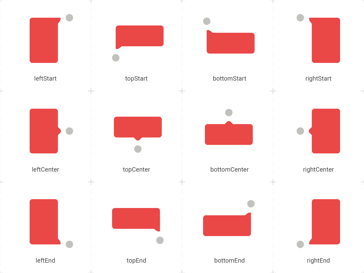
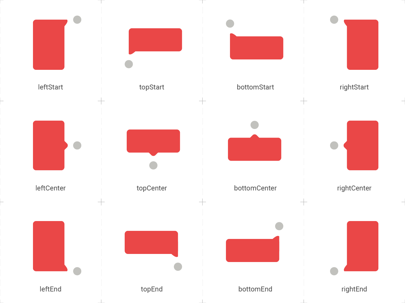
Desired position based on the Enum ElTooltipPosition. Can be topStart, topCenter, topEnd, rightStart, rightCenter, rightEnd, bottomStart, bottomCenter, bottomEnd, leftStart, leftCenter, leftEnd,
radius
false
Radius.circular(8.0)
Border radius of the tooltip.
showModal
false
true
Displays a fullscreen dark layer behind the tooltip.
showArrow
false
true
Displays the arrow pointing to the child widget.
showChildAboveOverlay
false
true
Repeats the child above the tooltip overlay.
modalConfiguration
false
ModalConfiguration()
Configures the modal color and opacity if showModal is true.
timeout
false
Duration.zero (only disappears on click)
How many time to wait for the tooltip to disappear.
appearAnimationDuration
false
Duration.zero (does not animate)
Fade In animation duration.
disappearAnimationDuration
false
Duration.zero (does not animate)
Fade Out animation duration.
controller
false
null
ElTooltipController to show and hide the tooltip.
↔️ El Tooltip available positions
El tooltip header image was created using macrovector illustration on Freepik